How to make Graffiti step-by-step guide. It's easy, when you know how to do it!
Hi!
I want to share my graffiti making technique, that i developed myself in practice.
Note, that it's all about finding your own style of expression, so you don't have to copy exactly everything - try to change something, do what fits you best.
I made it with graphics programme, working on layers make it easier, but you can make a sketch on a paper, and then try with real graffiti spray paints!
Let's get it started!
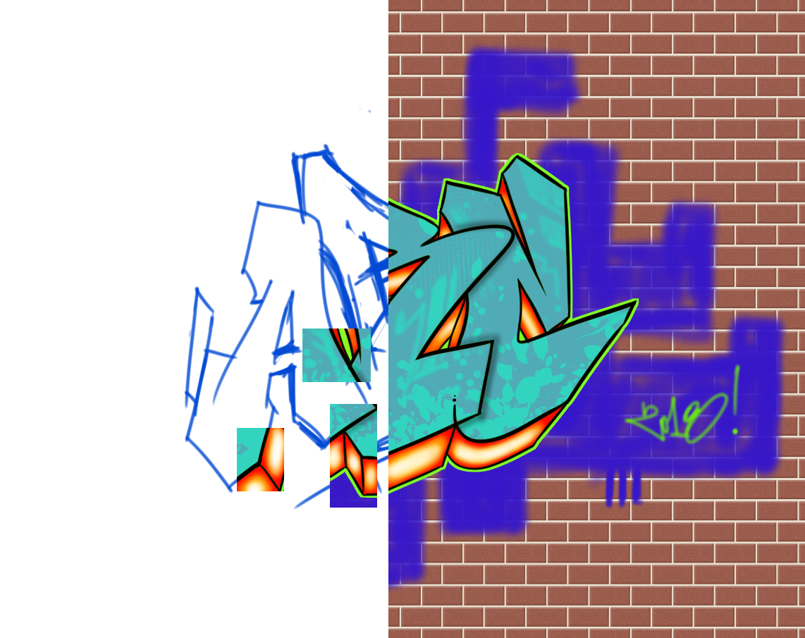
1. Sketch - getting shape of the letters
Try to make a sketch and decide what shape the letters will have.
tips:
- Make few sketches, if you like any, repeat it few times to perfect it
- Try to make fast pencil moves, as nice and sharp lines come from them, not from the slow ones
- Try to find your own style, letters don't have to be super easy to read. It's good until you know what's written there ;)

2. Contour/Outline of the letters
Work on a new layer and draw the outline of the letters. This is the most important part, because it shows how steady your hand is. It's not easy, so don't be afraid to train a particular line dozens of times before making the right one.
(When making real graffiti, this step is done after painting the letters inside first.)


Now add the 3D effect and also draw an outline of it. You don't have to do it the way it's here - choose whatever works fine for you. I made some helping lines.


3. Colouring the letters
In my opinion on of most enjoyable parts, when you can fully free yourself and paint letters just any way you like!
(When making real graffiti, you make it first, before painting the outline.)
tips:
- Try to mix two similar colours, if the outline is dark (black), try to use bright colours, to make contrast show the shape of the letters. If you use dark colours on the letters, use bright outline (white, bright yellow, blue, etc), so you also make the contrast.
- Look for your own colouring style, maybe there will be some puzzles, i like to mix two colours in various ways.
- As always in graffiti try to make it simple. Paintings are very colourful and complicated, but the colours and composition are chosen wisely. If you pick too many colours, your graffiti will start to look like a Disneyland. Colours are the key in this art i think.

Do the same with "3D effect" of the letters.


4. Background
Here we choose background in the programme, but when you paint, you know what is the surface and try to match your painting with it. Your graffiti will also have it's own background, which should correspond with the rest.


5. Backline, shadows, highlights, etc
Backline is the line, that "cuts off" the letters from the background. To get high contrast here, i made dark background and bright green backline aroundthe letters, to make the shape more visible. There are so many colours though, that it all stats to look a bit colour-overloaded.
You can add some highlights, shadows, whatever makes you happy :)

This is the final effect!
I hope this guide/tutorial helped you or inspired you to create.
Remember, that we have a great power of creation, and we should use it!
Thanks!
Wow, this is very interesting, thanks for sharing! It is inspiring indeed. I make murals but not so elaborated :D, kids stuff in rooms painted in acrylics but I want to make my own art with spray paint. Huuugs
Thanks! I was also painting some murals for kids and not only, but i used only graffiti cans, because it was my base technique ;) Spray is a great tool, just get the ones specially for graffiti, the ones for cars don't have so much pigment that the graffiti ones have, so they cover really good. You have to wear a mask thought and that's what i love in digital art - no paint dripping, no paint inhaling :) By the way, page with some of my arts is on www.brushlee.pl Cheers!
Congratulations! This post has been upvoted from the communal account, @minnowsupport, by centauri-alfa on steemit from the Minnow Support Project. It's a witness project run by aggroed, ausbitbank, teamsteem, theprophet0, someguy123, neoxian, followbtcnews, and netuoso. The goal is to help Steemit grow by supporting Minnows. Please find us at the Peace, Abundance, and Liberty Network (PALnet) Discord Channel. It's a completely public and open space to all members of the Steemit community who voluntarily choose to be there.
If you would like to delegate to the Minnow Support Project you can do so by clicking on the following links: 50SP, 100SP, 250SP, 500SP, 1000SP, 5000SP.
Be sure to leave at least 50SP undelegated on your account.
Yay! :)
Very good indeed.
Thanks! I've decided to share my knowledge, so it doesn't vanish in time haha :)
Now i see, that the 3D effect shadows below letters B and C should link together, so a small mistake... Well, even monkeys fall from trees ;)