The Color Conundrum! RGB, RYB, or CMYK!
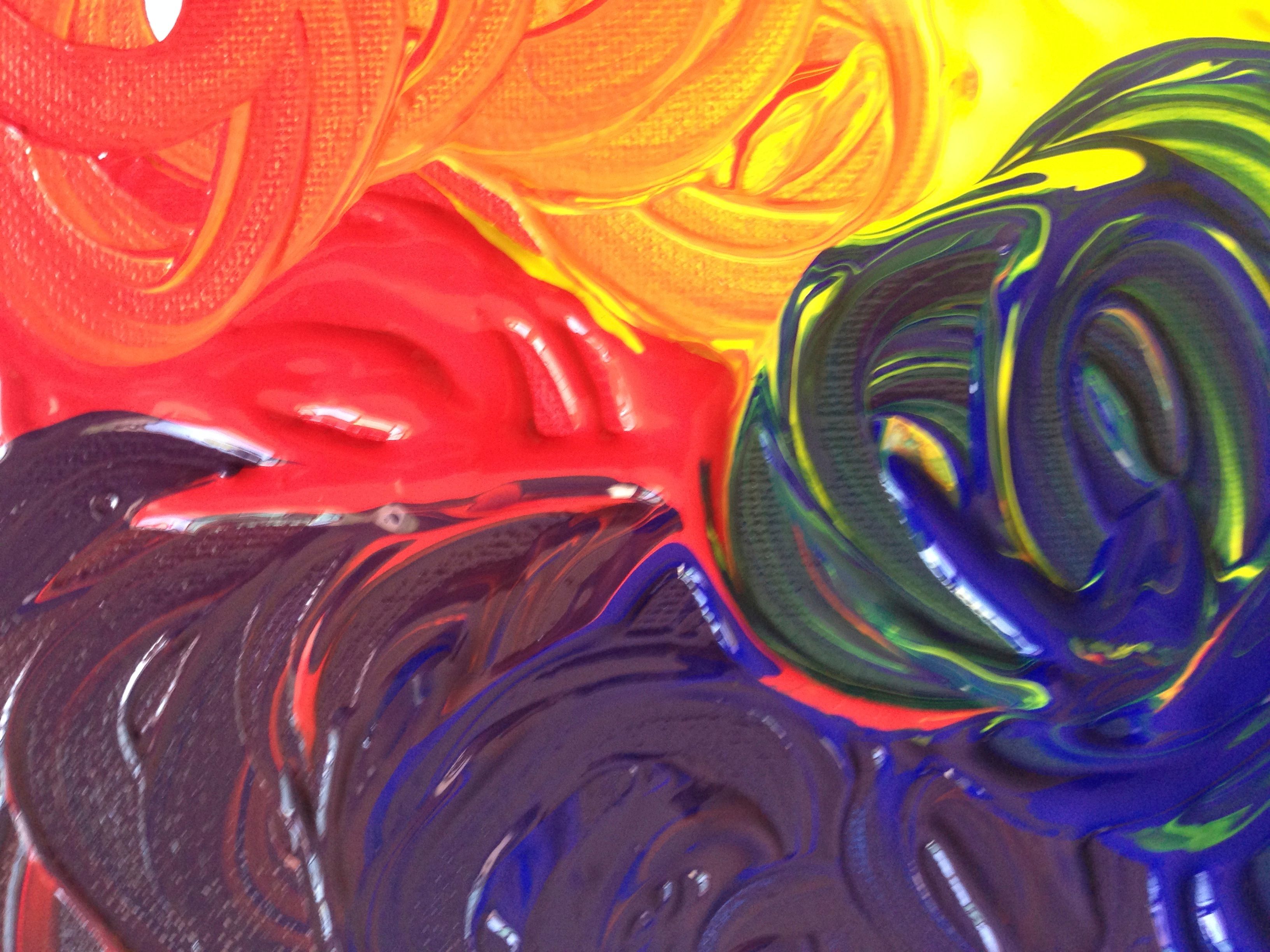
From the impossibly bright colors manufactured by man, to an abundance of colors we can conjur at will from a world where nature itself may hold certain hues in sparse reserve. There was a time when the fleeting glance of a flower or the momentary glory of a sunset would have been near enough the Only moments of startling beauty in our lives.
Not so anymore...
Indeed, even the process of gaining mastery over pigments for our own uses was an arduous and painstaking work of countless years and endless experimentation. We do not think twice these days to walk into a store and be presented with Hundreds or even Thousands of different hues to choose from. Indeed, we have the somewhat miraculous option even to gather the leaves themselves, or the flowers we find, and have Those Hues specifically conjured for our use on demand.
Whereas our ancestors were given to scour the wide worlds for rare beetles, pungent roots, raw minerals, butterfly wings, and snail shells to create the colors they could use, and even then, only at great cost!
Indeed, it is interesting to learn how many colors we may find less appealing were given to their own periods of vogue and conspicuous usage precisely because of their novelty, expense, or the status they gave as an unusual or uncommon color of their times.
But, as I mentioned before, we live at a time now where we are spoiled for choice!
For the artist, and the designer, The CHOICE of color is often All Important.
Colors not only often form the very substance of their work itself, but the Selection of color is perhaps among the most vital of skills for their craft and its success or failure at each and every step of the process.
And colors have not only their intrinsic appearance, but also a whole galaxy of relationships, conflicts, connotations, interactions, structures, secrets, and difficulties.
Indeed, whole books have been written on the symbolism and Language of color. And hundreds of years of thought and study have been spent upon developing a structure for their imployment.
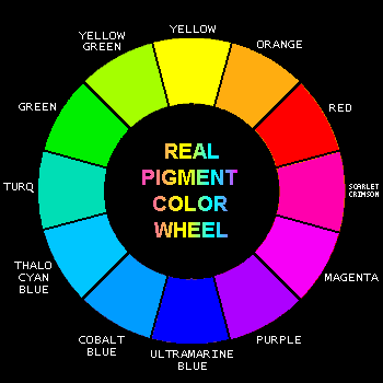
This structure, indeed the very backbone of the theory that has ordered mankind's use of color for Centuries, is I embodied in the Color Wheel.
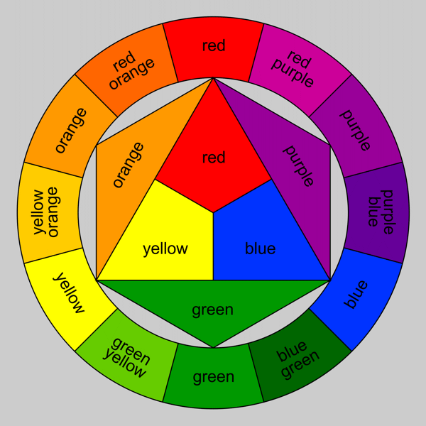
This simple design encompasses a whole world of relationships and logic found in the use of color for design. It has, in a manner of speaking, been proven to be proper through hundreds of years of successful employment. It could be argued that every time you have looked at a successfully designed color scheme, a pleasant mix of hues, a striking design, or a clever advertisement, that This wheel, or the relationships it establishes, is to be thanked.
How early on do we all learn that there are Three PRIMARY COLORS?
And that mixing those colors will give you all the other colors?
Those colors, as we have been taught for ages, are RED, YELLOW, and BLUE (RYB).
A logic proven time and again by the use of those colors to paint any number of pictures - with fingers, sprays, or brushes.
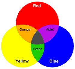
Moreover, we learn that mixing Red and Yellow will give us Orange, that mixing Red and Blue, will give us Purple, and mixing Blue and Yellow will give us Green... And mixing all three will give us variations of Brown, until in theory we get black...
Thus we have all the colors in the crayon box - Red, Orange, Yellow, Green, Blue, Purple, Brown, and Black.
Artists also know that the color opposites are represented by a primary, and the result of the mixture of the other two primaries...
So Red is opposed by Green, Yellow to Purple, Blue to Orange. And by mixing opposites, you can draw the color closer and closer to Grey...
A multitude of other structures and relationships can be formed around this basic shape, and understanding the use of it is among the most helpful tools any artist can use...
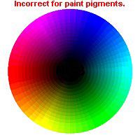
Unfortunately, however, it would seem that this color wheel is essentially WRONG.
Before delving into the New color wheel design, let me address another peculiarity of color use that was learned a while ago.
Color mixing when using paints (pigments) may be addressed with one color wheel, but the mixing of colors of LIGHT requires quite another wheel - indeed, it points us at a totally different set of primary colors.
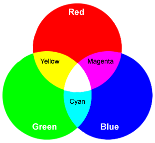
In This color relationship, Yellow is replaced entirely by the presence of a Green Light.
These color relationships (built upon the structures of light sensitivity within the human eye) are also demonstrably true.
The mixing of these colors of light upon a white background, which is to say a neutrally reflective background in an otherwise dark environment, has proven to be true.
Equal parts Red, Blue, and Green light shown upon the same spot will create an area of perceived White light.
This difference itself, that between the first and second color wheel, and the replacement of the primary color Yellow with Green while maintaining the use of Red and Blue, can seem a strange and unexplained difference.
Why would it take the shining of Both a Red AND Green light be necessary to create the perception of Yellow, while it takes indeed the Other Two of the primary colors of pigment - Yellow and Blue - to create the Green to begin with?
So, you seem to need Red and Green to get Yellow, but Yellow and Blue to get Green - but on one side, Red Yellow and Blue will get you Brown/Grey/Black, while on the other, Red Green and Blue will give you White!
All the time Yellow and Green themselves are given as "Primary Colors" of which no others can be mixed to create!
At least in the instance above, the colors Red and Blue are constant aren't they?
Actually NO.
With the creation of computers, and the use of printing methods, it turned out that while Yellow remained secure as a primary color (never mind the situation described above) both Red and Blue were, in fact INCORRECT primary colors themselves.
Were you to open up the nearest printing machine, you would quickly find that while there remains three primary colors utilized to create every other hue we see, they are no longer those you learned as a child.
The Red, Blue, Yellow color wheel has been Replaced by a wheel consisting of Cyan, Magenta, Yellow, and Black.
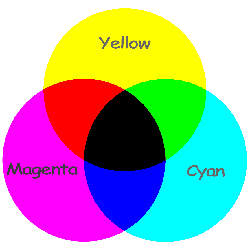
Here again, the use of these colors has been demonstrated to be successful in recreating every other hue we need. And some would say that Cyan seems to be near enough to an alternative color of Blue. While Magenta seems a sort of pinkish kind of Red...
And, this is not entirely wrong...
Perhaps in all of those years of scouring the seas and jungles for pigments, our ancestors simply never came upon a ready supply of the colors Cyan and Magenta... Perhaps our colors for Red and Blue were simply the nearest we could get?
Indeed. In terms of actually having to Look at them and Use them Daily, who Wouldn't prefer a lovely Blue to the funky brightness of a Cyan, or a bright red sports car to a bizarre pinkish Magenta one?
Could it not be simply a matter of choosing the hues we intend to actually Use?
Well, perhaps, but... No.
As a designer and artist, what concerns me about the new Cyan and Magenta color wheel is not the slightly odd resulting primary color options, but the impact it has on the greater structure created Around the wheel as made before!
The fact is, tweaking the primaries fundamentally alters every other color of the structure!
It means that Suddenly, the secondary colors that used to be Orange, Green, and Purple - have now become Red, Green, and Blue (sound familiar?)...
So Orange is no longer a simple mix of two equal primaries, but a tertiary color along the lines of Yellow-Orange from before - which itself has become a further step removed akin to Yellow-Yellow-Orange...
And Purple much the same...
Again, the part My brain gets stuck on is the asymmetry. While Orange and Purple become colors once removed from before. Green stays where it was. A proper secondary color...
But the Real issue for Designers comes in when you delve into Opposing colors.
As I stated before. Design for centuries has held that:
The opposite of Red is Green.
The opposite of Blue is Orange.
The opposite of Yellow is Purple.
A position held as true because of the demonstrable fact that the mixture of opposites drew your color closer to the brown/grey/black center...
Only Now, the New Color wheel would have you believe:
The opposite of Red is Cyan.
The opposite of Blue is Yellow.
The opposite of Yellow is Blue.
Imagine! The opposite of a "primary color" being a Primary Color itself!
And while this color scheme may prove correct for printing and generating colors on a screen, the fact remains that, though they may prove correct in some cases, we Know it also to be a fact that mixing Yellow and Blue does not get you Grey or brown - but Truthfully, GREEN...
So. We are faced in the end, not with certainty, but with a collection of demonstrable facts that simply do not correlate with each other.
Any artist or designer who attempts to turn to the CMYK color wheel for design structure in the same way the original RYB color wheel has been used, will find themselves subjected to bizarre and distasteful color relationships that simply do not read as rational to the human eye (in my opinion) no matter what the science may say.
The rationality behind this disconnect, and what it may say about the human condition is not doubt there to be discovered, but in the meantime, we remain puzzled by events and facing two equally useful and individually rational systems...
With the caveat for any artists facing the CMYT to remember...
I think a local optician may be able to arrange this, as can the visual impairment team in our local.
That about sums the confusion with color relationships. Hahaha. And you wrote that beautifully well. But every proposition seems to hold its truth until you put it against the other. All beautiful: the dynamism of it all.
Out of curiosity, why do you choose the centre indentation all through your posts? It's a bit not too relaxing to the eye. Lol. If you have a problem with editing markdowns, remember you have to close the section you applied an indentation on with
</center>. I hope that helps.Ah, yes... My apologies! This is only my 4th Steemit post and I've not yet gotten the hang of the use of commands. I am very pleased with the response however and I hope to write more soon!
I will try to remember to close my centering commands as you recommend. :)
I'm still working on getting a good format and I wanted to try the centering to see the effect.
I hope my future posts are an improvement!
Thank you for reading!