Hella Cool Colors - The good PromoArt! (Vol.2) (BattleBlox Illustrations)
Hi Everybody !
(All the images are my own creation and so I own the rights of them)

I've been developing some PromoArt for this project and I wanted to start sharing it with you guys, I will be posting one every few days, due that I have a lot of these! One artwork better than the another!
They mean sooooo much fun to me. The themes are amazing and the style is just great. Besides that, the game promises to be AWESOME!
Now let's see a little bit of step by steps!

At the beginning I made a simple rough sketch with black lines to show the client the idea I got in my mind based on his description (a viking on a medieval-fantasy world).
I also added some colors to put some mud on the illustration.
Based on this then we can talk about the different meaning of colors:
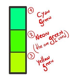
Let's just say that different colors represent different things. And in this case the green that we are using plays a major role. Check this out:
For this illustration I needed to play with the meaning of the dead skeletons brought to life. So I knew that green would give that meaning to the painting.
The 1st one is too relaxing and the 3rd one is way too warm and charming. But if it s about the Neon Green (the one in the middle), that's just perfect. You can even see how poisonous, toxic or even radioactive it is.
Then for the rest of the scene (without counting our square-shape viking) I applied a subtle transition from these radioactive greens to the gray-blue mountains right in the background.
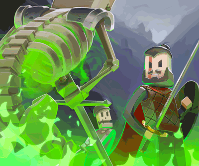
This is actually a really good element to play with since the subtle background transition pops the character out much more. Which was made with red assets and details on purpose: Red and green are complementary and reject each other just as black and white does ;).
When it's about composition, you can manage to take the different elements of the artwork and work on their shape in such a way that you can guide the viewer's eye to the focal point (which you should have!).
Every element here is helping to guide the eye to the Main character's head. Who is a prominent figure.
Can you see how many elements are helping to guide the eye? Even the ribs of the skeleton are helping to guide the eye to our viking!
great lol
This look awesome @anritco. Interested to see some more cool Artwork like this in future.. Just upvote this awesome work :)
awesome work
Thanks a lot! Will do ;)
Amazing! You just don't draw, you draw with psychology and science in it!! And LOL, I thought I am seeing what I want to see, and now you tell me that I am seeing what you want me to see!!!
Hahahaha precisely! That s what my work as an artist means xD
That's really cool. I love the science behind that one scene. Seems like your creating a great game. :)
One of many hopefuly! New projects are coming by <3
Great perspective you choose there. Your art makes my want a graphic tablet realy bad! xD
Hahaha try to get one bruh!
yes i have to, since Steemit i work so much with photoshop etc. ...Its really time for one^^
Diggin the work!!!
Keep it up. Wish you success.
Thanks a lot man!
Good post man .
Yes. Definitely talented!
Thanks!
too good
Great work of art .... we can say more than thousand words just by single photograph.... there is a lot of hard work of you behind this....
what... the... hell.
This post has received a 0.63 % upvote from @drotto thanks to: @dreamingirwin.