BLOODY BIG Illustration I made for Blizzard (Theory Behind it)
Hi Everybody!
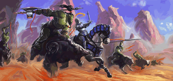
This is an illustration I made with Blizzard's World of Warcraft style, mixing it with my very own touch and technique.
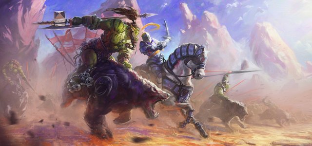
This illustration was a before after for my technique and style because I pushed my limits and got further than ever before! This is why I want to give you a little tour through the process and inside my head while doing it!
Yes Inside my head, BEWARE!
(Before we get started and to not put a "Credit: Anritco" under every single image: All the images are my own creation and I got the rights for them)
At the beginning I didn't really know what to do. I only knew that wanted orcs on it, a battle, a dynamic shot and I WANTED IT BIG. So I decided to start sketching some random thumbs.
As you may know and if not you should, this is the most important moment when it is about creating illustrations, concept designs and any art related thing: just as buildings need a good and solid base to be built, art is the same: You can't keep polishing something that has a bad base. Remember That.
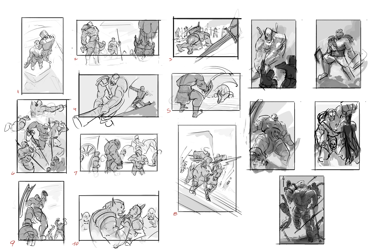
But nothing was working
What was the mistake?: I didn't have an idea! And so my base was too weak for building something that would hold such a ambitious illustration. So I decided to go with a last thumb kinda mixing all the little things that i liked at most from all those previous thumbnails. And the result was quite cool!
And even tho' it had several modifications through the process, the base was there, super solid! And I will tell you why:
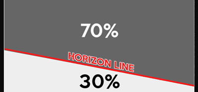
- The Horizon Line is placed not in an horizontal, but in such an angle that the dynamism of the whole piece been increased by FAR since before starting. Also a 30 against 70 proportion for the ground vs. sky was a good idea, since I wanted to show the characters in such a way that they would look BADASS. So the perspective is from bellow, making them look big and impetuous.
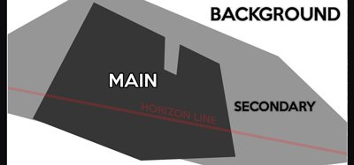
- The Distribution of the Shapes shouldn't be more than three shapes in total. One of the rules that are important at most is to Keep it Simple. And for this we need to put simple, low amount yet good quality of elements in the canvas. And of course the Distribution (how you place them) is something critical. You see, this is Composition territory, and it's important to keep in mind that how you place the shapes is how the viewer will read the image. So this point is critical. The simpler, the better the viewer will read, the better quality your image shall be.
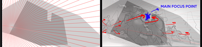
At the Left: perspective grid. At the Right: Focal Point Directions and Elements Lecture
- The Perspective plays a mayor role when it's about keeping the dynamism and depth in the image. Again, it s all thanks to how we arrange the elements in the image, the relation that we put between them and direction of lecture. Which means also to establish a nice and readable Focal Point thanks to the Elements' Lecture. What do I mean with this?: Since we want to keep the whole illustration simple, I recommend to put only one focal point. But for making it calling the attention even more we have to put secondary and maybe even background aligned in such a way that their lecture will help to put emphasis on the main focal point. See, this way your eye will catch from big, to small and the story will be told by itself:
General Main Idea: battle action scene.
Focus General Idea: conflict between races.
Main Focus: Fight against the heads of the battalions.
So all this wasn't for nothing: We got a solid base!... now what?
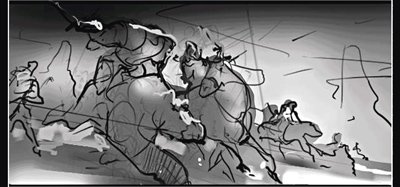
Easy peasy: Define better the shapes always remembering about the values!
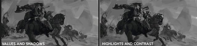
One of my favorite parts, because I'm a real lover of the grayscale and shadow-light analysis. I really like to go without any color first because it keeps the lecture simple. So you just focus in one thing a time and the chances for chaos and frustration (and so for failing) are lower. Here we also define shapes, characters, attitude, atmosphere, we reinforce the dynamism and we start playing with the mood of the whole artwork.
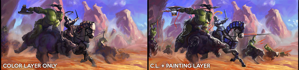
Now that we have a sketched (but yet defined) value base it's time for adding color: Many people tell me that my main feature or skill is about painting and coloring. Honestly I feel this is my weakest point. But still, I guess my talent is related to the amount of time I spend chasing that sweet tasty palette that express the mood I had in my guts. See, this time I knew since the beginning that I wanted to make a red dirty ground against BIG blue mass of sky in many different variations of blue-violet. I could see it there since the sketching up process! And all this chaotic colorful beauty against a radioactive green coming up from the main character: the orc. So the first step was to make a Color Layer over all the values I defined previously. Setting the whole picture into a general mood that worked until now so far. Once the color was there and was working (despite of the fact that i had to clean it up like crazy later) I put a Normal Layer Over all and started adding some contrast colors to the base I did, to help to reading and start placing some assets and features on the characters.
You see? Even tho' we put A LOT of colors onto the painting, the values are still the same, readable (and now even better because we have more contrast!). So always keep an eye on your values (even more after you put some colors! Because it is super easy to lost the track of the base after placing a lots of layers).
And then another funny part that all artists love: Rendering!
That's right! After we decided that the whole base (Composition -> Values -> Colors) is in it's place, we start rendering! Not much to explain here... just go and develop the image as much as you can!
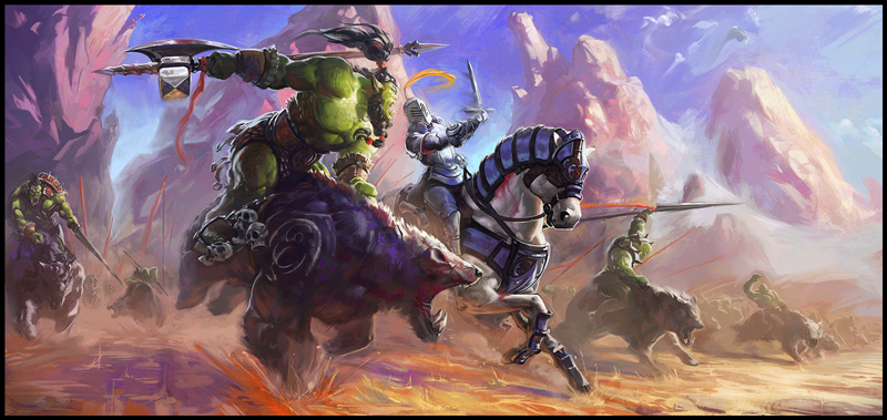
Not much to explain: worked on the atmosphere by adding some dust and making the depth loose. And defined better the lighting than the characters are receiving with that super juicy and tasty rim light on the corners of all the guys in the scene!!
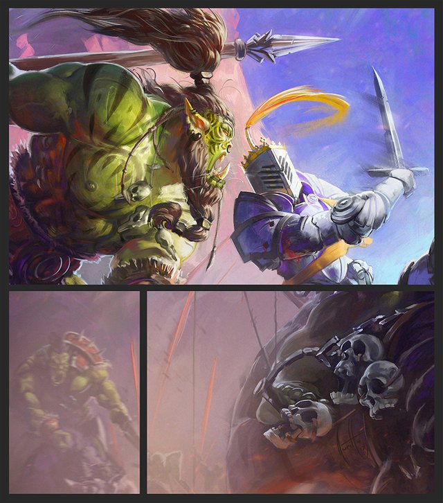
Added many more elements of interest, such as some funny skulls, some flags behind the orc, redefined the secondary characters and defined better the ground. Added a lot more of dust to help the atmosphere and placed few shot rocks at the very front to make the spectator feel part of the scene.
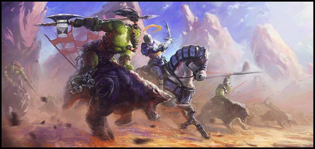
We do have a beautiful full-working painting now. But there is still something missing. What is it?
This is the step where I made from a beautiful painting an outstanding paint. And all thanks to the story telling! See, there is nothing attractive in an average orc fighting a fancy human soldier. But what if you add some tattoos, dreadlocks and pure rage on the lead-orc and a simple crown over the soldier to make him a king.
And BOOM!! Now our painting exploded in matter of content! And it seems ready to be finished!
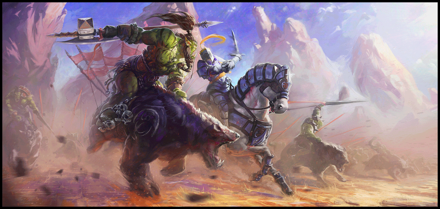
Some close ups for you!
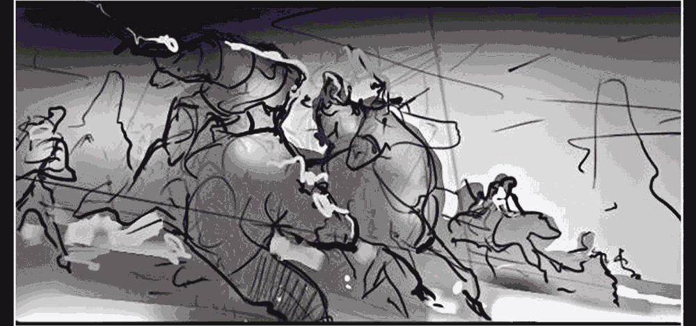
And let's go back to the old habit of compressing the whole process into single gif ;)
Thanks a lot for taking the time you took reading my words. Your support means a lot to me and making such post takes a lot of time! (Time I should be practicing actually).
So if you please can hit that upvote and make me time worth of your support I would really appreciate it! If not, drop me few words of love or hate down there! Insults are allowed in my post :D!
Thanks and bye!
Omg this is so amazing :3 didn't know we had people working for blizzard here in steemit.. I've tried digitsl paintings myself but nothing like this.
Much love and support my friend and best of luck in drawing.
-Goldie
Thank you so much for your wishes and encouraging words! I really, really appreciate it! If you want to follow the path of arts, you just have to go there and try hard, there is no magic behind this, just practice and studying as hard as you can =))
Very good work, and reference post on how to work! Thanks a lot!
Thanks a lot !!
Wow, great work on this! Was this just for fun? For work? A commission? I noticed the storyboarding at the beginning of your post - will this be one within a series of images?
Ohh I would love to! It would be amazing to just do more and more illustrations with this style. This was completely for fun and portfolio =)
Well, keep it up! This is great work. Who knows, maybe you can create enough of a portfolio that Blizzard could become interested. What a job that would be! I'm following you and looking forward to more art.
You are such a pro. You will get 1000 votes very soon. No need to thank me for commenting (that's what we do on Steemit and Steemit chat) unlike some people. It is a platform to support each other after all. Have a nice day.
How long until I vote... how long until I vote... itching to curate this quality :p
Silly question for you...where is steemit chat? I've either never seen it or didn't realize what I was looking at... :D
It's not that pretty or necessary if you just want to make money and have fun on Steem, but here you go =)
Thanks, sometimes you win a contest and just want to thank the person that puts you up for the contest "in person" instead of just in the thread, so its nice to know that option is available is all. :D
That's obviously up to you. =)
This is so incredible. You've just blown me away. I love Blizzard. <3
Hahaha I can't blame you! Blizz is awesome!
It really is! I used to be a HUGE WoW head for literally like a decade - so yeah, Blizzard has played quite a role in my life <3
I love it! I still have friends playing it, one of the best addictions <3
Maybe next one will be star citizen? :P
Awesome, I love finding good artists in this community, followed <3
Ohh muchas gracias @genyway !! Lo que haces es muy lindo! Tus diseños me encantaron, y vos sos más que hermosa! Followed =)
wow Muchas gracias <3 Espero poder diseñar algo tan genia como lo que haces en el futuro, saludos desde Venezuela!
Estoy seguro de que podes hacerlo! Si lo necesitas, te puedo dar una mano =)
Eso seria fantastico n.n
Encontrame en el chat de steemit o discord =)
Congratulations @anritco! You have completed some achievement on Steemit and have been rewarded with new badge(s) :
Click on any badge to view your own Board of Honnor on SteemitBoard.
For more information about SteemitBoard, click here
If you no longer want to receive notifications, reply to this comment with the word
STOPBy upvoting this notification, you can help all Steemit users. Learn how here!
Thank you @steemitboard !
super sweet ! I like the fact that you put elements of design on here to show people the process . resteemed and upvoted :)
Thank you so much @ekphoto !! You are awesome!
One of the best art posts I have seen on steemit, resteemed.
Thanks bro! I could say the same about your stuff, I just love it !!
Means a lot friend :D
Really enjoyed this post! you captured the emotion of the scene very well and I love all the details. Had to upvote and follow this. Keep sharing more :)
Thank you!! You flatter me! I will keep uploading cool stuff, I promise! =))