Understanding Colors in Artwork & Design - Complementary Colors
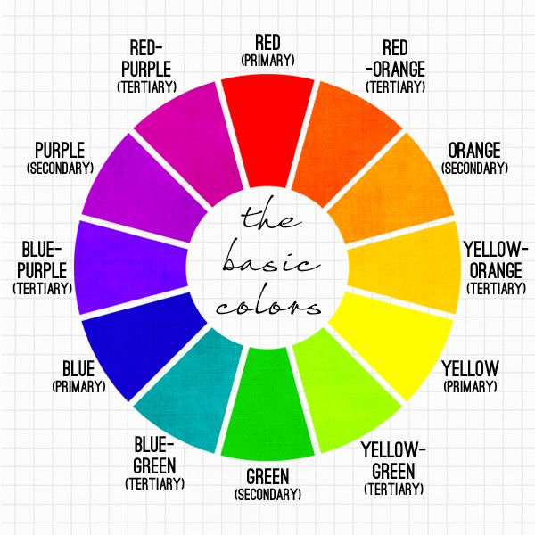
Have you ever been creating a piece of artwork or design and weren't sure what colors to use? There are a few basic principles to understanding color and how it can enhance a piece of artwork or the design of a room. Today I will explain it starting at the basics.
Complementary Colors
If you've seen the above image before then you should know what it is and this post might just be a refresher for you, but if you never have it is called a Color Wheel. It is fundemental to understand it when taking any type of education in art or design.
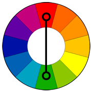
It is a very simple concept, and basically all you do is select a color you would like to use from the color wheel. For this example I am going to select the color red. I look at the wheel and follow the color opposite of it, which is green.
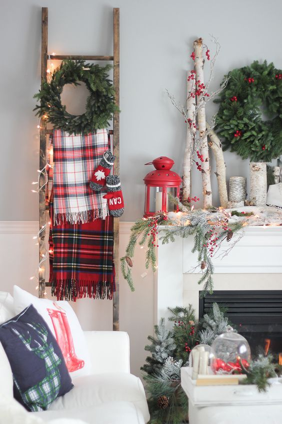
It is why during Christmas time the green and red decor goes together so well. It enhances both colors in the space and makes them look their best.
It is the same principle for every other color. Select the main color, follow it across to it's opposite side and that is the other color to select.
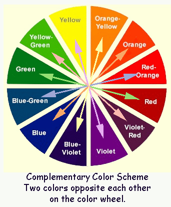
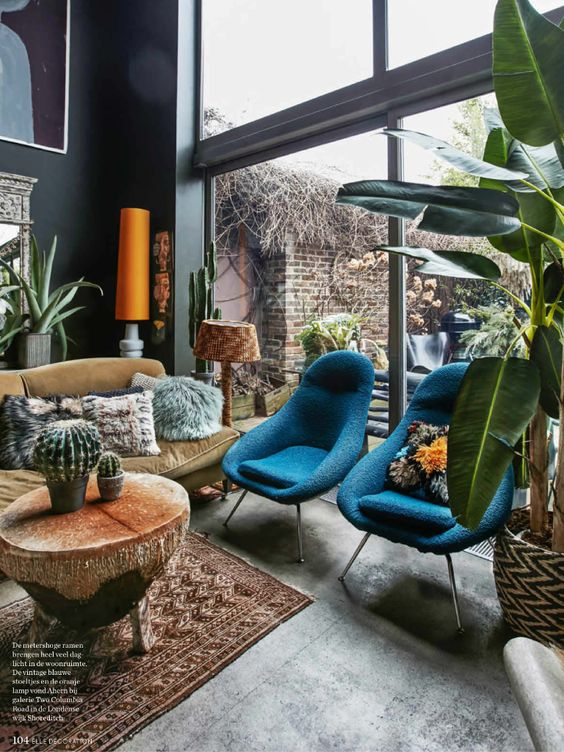
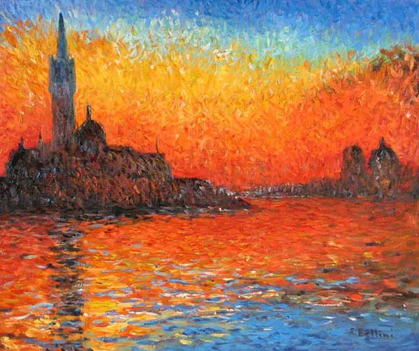
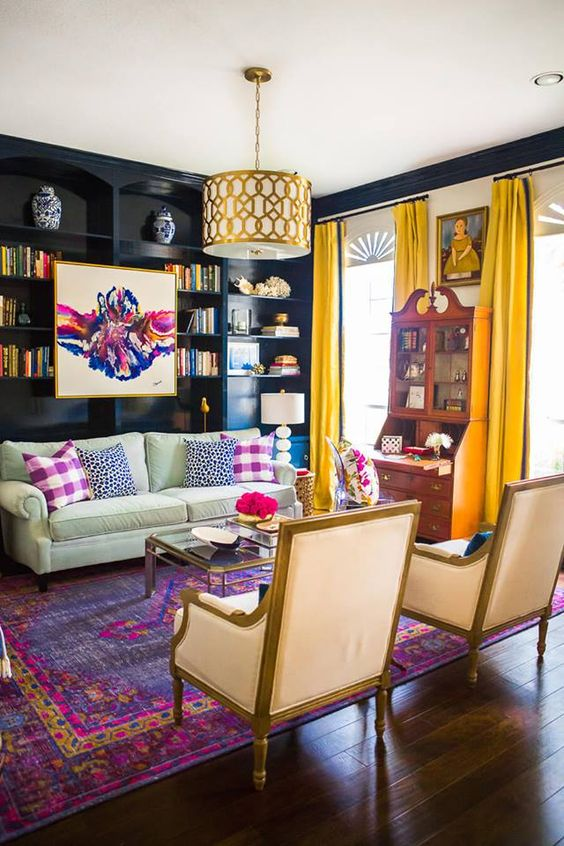
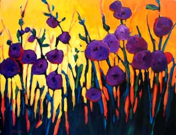
Below I will show some examples of complimentary colors in both art and design.
Orange-Blue Complementary
Purple-Yellow Complementary
Red-Green Complementary
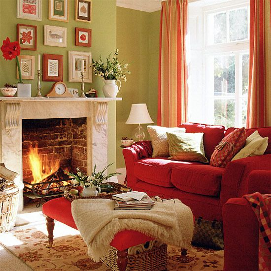

Of course, there are many other ways to select colors for designs based on the color wheel. But, this is the most basic and simple way to picking and placing colors together to create great visual appeal. Both colors really help each other stand out.
So if you are ever in need of inspiration of colors, remember this simple trick and your art or room will really pop!
❤️
Hi! I find it very difficult to work with the contrast you get with complementary colors u.u
But I will give it a try :)
Hi, you can always select colors that are a lighter shade, but complementary, to not have such a bold contrast :) pastel or lighter colors work just as well!
Yep! I also use adobe color wheel very often n.n
Very informational! I really love the yellow-violet combo but in this post, I see how blue and orange really goes well together! Nice work, girl. Thanks for sharing your insights about this :)
It's funny because I also love the violet combo, and love everything pink and violet, yet my house is all blue and white decor!
I'm reminded of the phrase that stuck in my head in art class, "Bright colors advance, dark colors recede." It's always good to know the complementary colors.
Yes, color tone really affects the mood of a space or piece of art as well.