A Drawing of a Mall
Mall
Hello Friends, welcome to my post for today. Today I just made a practice drawing of a mall, its not that much to brag about but I will try to make this post useful as possible for everyone. 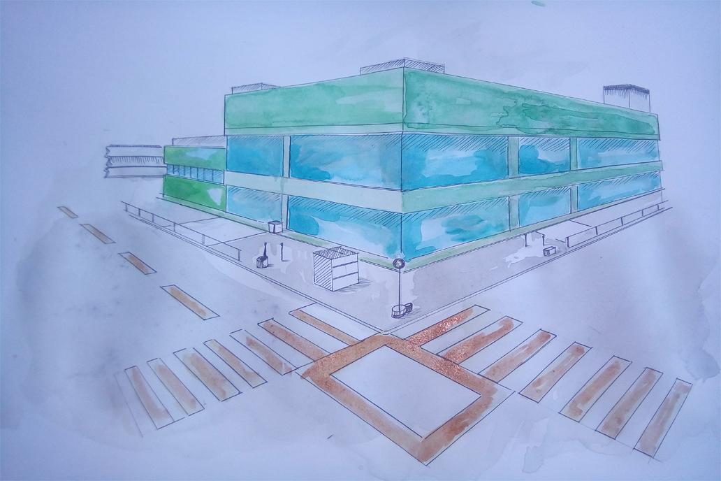
I am not an architect or an illustrator by profession but I do took some technical drawing classes before, so I think I can make this post possible. c:
Fort his drawing, I used:
• mechanical pencil 0.5mm
• Uni Pin Mitsubishi Pencil 0.5mm
• An A3 bristol board
• Water Color
• Brushes(of course)
• Ruler
I drew this drawing with no much reference, one thing that I do to visualize the mall is by making multiple horizon lines on the bristol board to find my proper vanishing point.
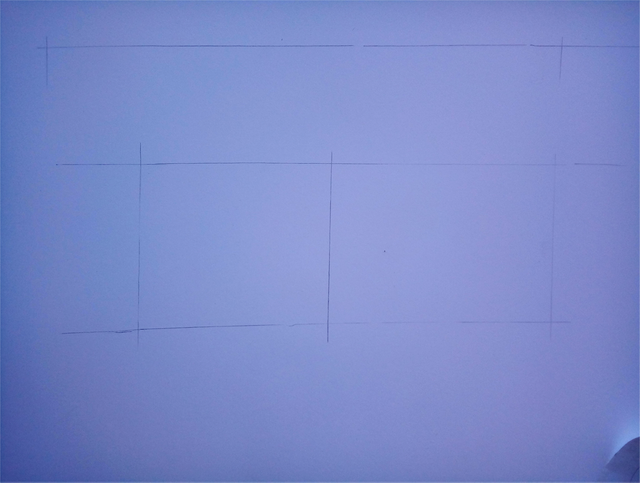
Visualizing this way takes some practice to achieve so if you find it difficult if ever you tried, just keep easy on yourself and watch some Youtube videos about perspective. I'm about to suggest D-tube videos but I think we don't have much videos about illustrating yet.
Maybe I'll try making videos on the future after I bought the right equipments for the videos. I'm open to donations guys... ;D
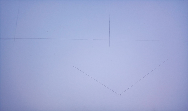
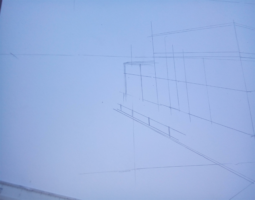
After seeing the proper angles and points, I then started dropping some straight standing lines.
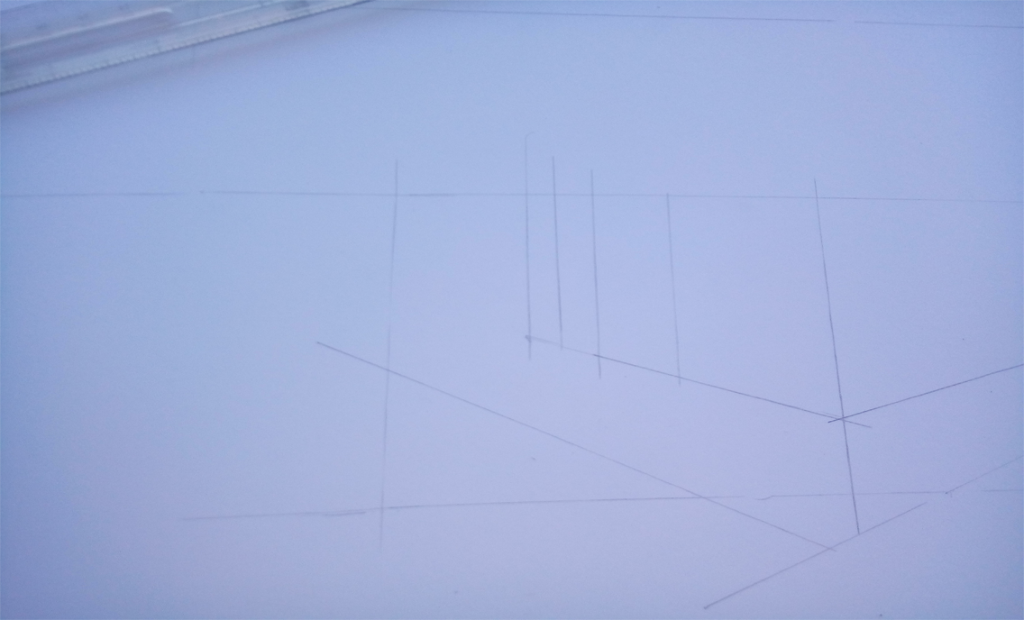
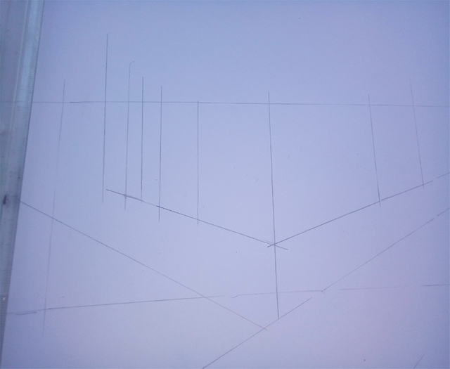 Added more lines for the details.
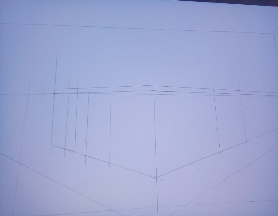
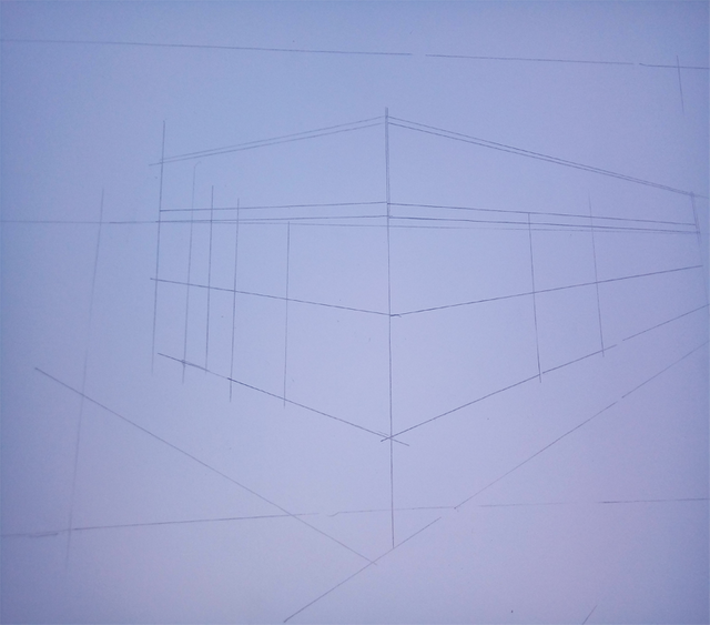 Added some hand rails.
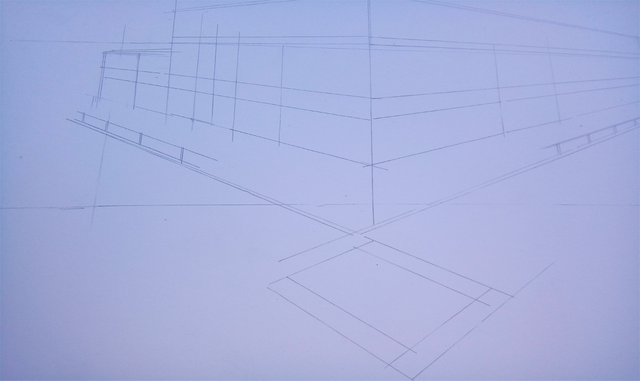 And some street details like lamp post and pedestrian lane.
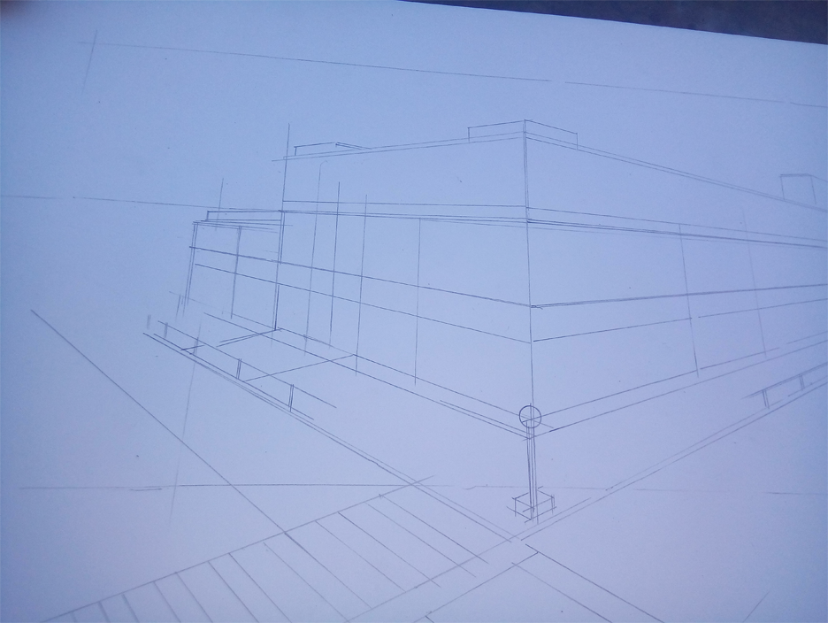
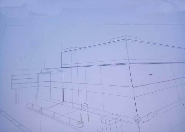
I added more details like telephone booths then started inking the drawing.
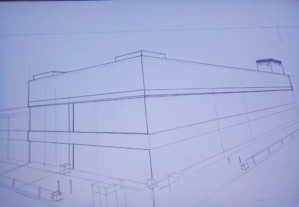 Inking is my most favorite process in drawing, I think this process of drawing makes me want to live longer. I just love that feel of making the dull pencil lines be covered and fleshed out with the satisfying black colors of an inking pen.
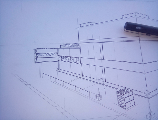
Nice.
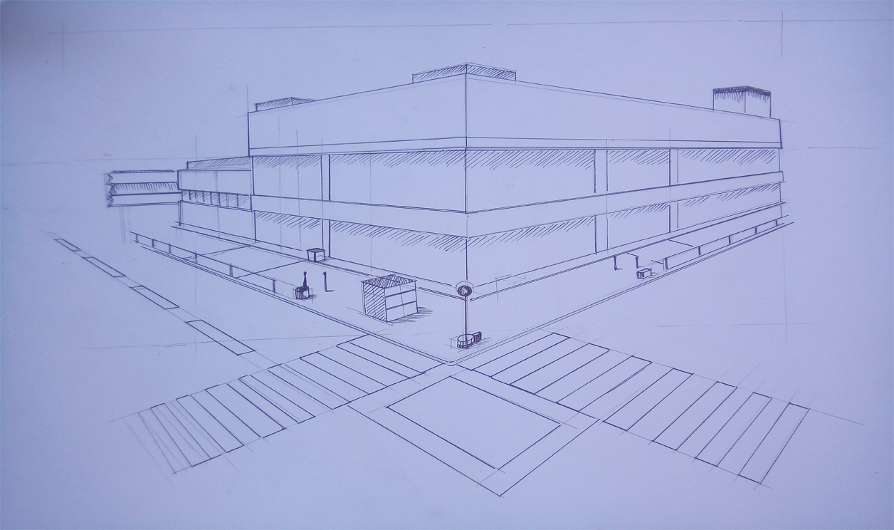
For the coloring process, just make your poster paint or water color be diluted with so much water until it turns trasparent. This kind of color rendering is called flat wash.
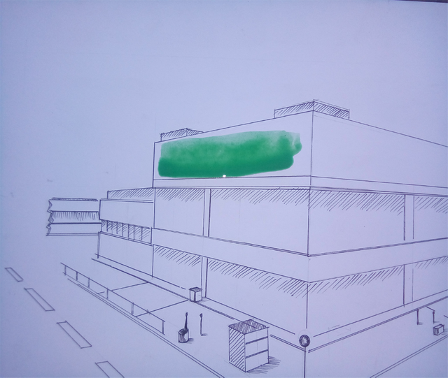
Just spread the color till its flat in color. No need to make the color perfectly even, just make it look presentably even.
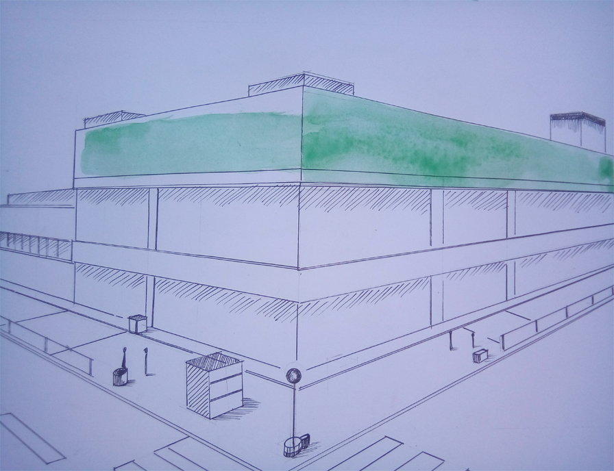
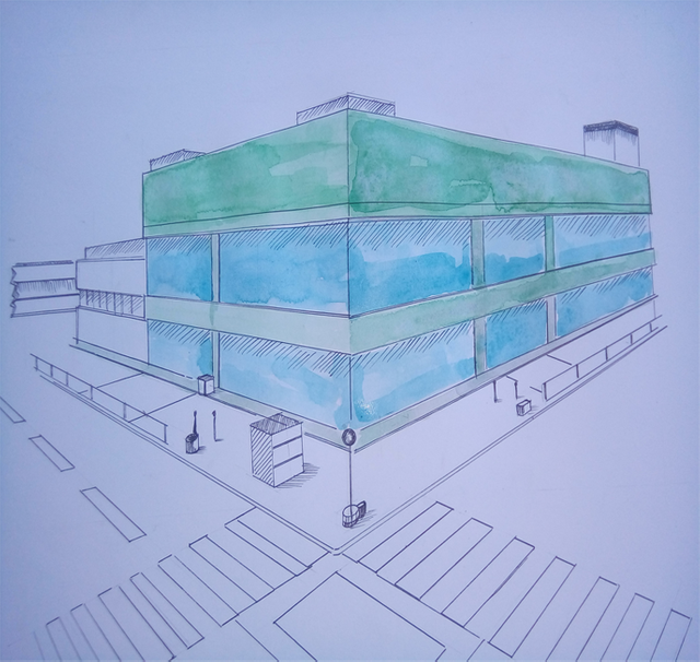
Now add variations of the same color on each area with a less diluted solution of water color/ poster paint on the desired areas. This will make the drawing more lively.
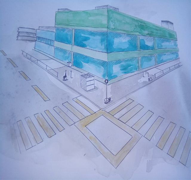
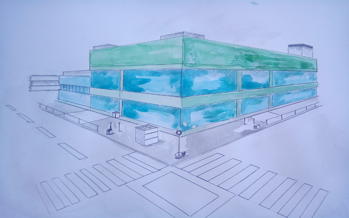 Color the cement with diluted gray and yellow on the pedestrian lane.
Hello @partycrash. Without much reference you did a good job.
I suggest you add spaces between photos and texts to make your posts look better.
Great post.
okay, will do sir.
done sir..
nice post, but it would be better if the drawing is clearer.