Microsoft's Arrow Launcher Keeps Getting Better
Android users probably already have taken advantage of being able to change their launcher (the app that controls what your device "looks/acts" like. Microsoft, even before their Windows Phone failed, was on Android with a lot of apps and games, some of which were not available on their own platform for some reason. Arrow Launcher is one of those apps, and it sure has changed how I use my Android devices (I have it installed on a tablet and my daily phone).
First a launcher, as mentioned already, is just the app that controls how your device acts and appears. This can include page transitions, how apps are arranged, what your homescreen looks like, etc. Once you enter a game or an app, the display settings of that program take over and it is just like every other Android device.
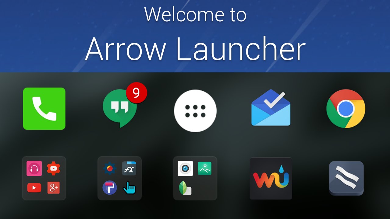
Arrow Launcher's front screen is populated by your most used apps. This is a great feature for someone like me. I am constantly using the same four to six apps/games regularly. Rather than having to go into the App Drawer to find those apps often, I simply unlock my device and they are there, on the homescreen. Just a click away and I am off to working or playing in my desired apps. That is a major time saver for me and a main reason I have used Arrow for over a year now.

Swipe to the left and you get a "Reminders" section. This is invaluable to people like me, people that are constantly taking notes but don't have a piece of paper or pen handy. Just type and add your item. You can even set a calendar reminder with the note so you can prepare for the future like paying a bill on a certain day or getting milk or something. Great feature and it is built into Arrow.
Swipe left again and you get a page of your most recent installs. The last 20 app/game installs you have on your device will be listed here. This is a cool feature that I never thought I would use but find myself using more and more. Much easier to swipe twice than to open the App Drawer and find the app (though there is a feature in the App Drawer).
Back at the main page, swiping right will get you to the newest stuff in Arrow launcher. This page is full of cards, similar to Google's launcher, you can edit what is here and make this your page quite easily. Mine has:
Recent which shows pics, apps, notes, text files, etc so I can easily go back to something I did recently without opening apps and searching.
Frequent Apps which is similar to the main page but available without swiping.
People shows my frequently interacted with contacts.
Reminders brings over the notes page information.
Documents is what it says, most recent stuff is listed here.
Calendar shows appointments and such.
Coinbase so I can see the up to date price on Bitcoin on my chosen service.
Weather so I can see what is going on without opening an app or having the widget suck up a ton of space on my homepage.
If there is a widget for something available, you can add it to this page.
Apps are arranged in a way similar to how they are on Windows Phone - alphabetically vertically. I prefer this method a lot versus the page after page style most launchers use. If you know the app starts with a certain letter, you can skip to that letter and access it immediately. It will always be in that section, no matter how many apps you install which could force it to another page under the usual style.
Arrow launcher is a great effort by Microsoft. I love it. I use it every day. If you are tired of the launcher that came with your phone, try out Arrow and give it a week to decide. I bet you will like it too.
Grab Arrow launcher on Google Play.