Anachapulco Design Contest Top 5 Entries: Which Logo Do You Like Best?
View this post on Hive: Anachapulco Design Contest Top 5 Entries: Which Logo Do You Like Best?
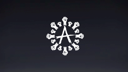
This post has been pruned from Steem by ELAmental. Please click the link to view article.
Truth, Love, Respect, & Honor.
Just wait for it! 😜
https://steemit.com/design/@themonkeyzuelans/esp-eng-anarchapulco-gif-actualizacion-update
For those that want to view @themonkeyzuelans' design update article.
That looks amazing, GREAT JOB @themonkeyzuelans!
Thank you! We hope everyone likes it as well 😜
That's truly amazing!
CONTESTANTS Feel free to post you updates in the comments of this article!
Hello, you can see my publication there I left my logo with some changes suggested. greetings and thanks.
Do you mean you made an updated version? If so, where did you post it?
https://steemit.com/anarchapulco/@edurley/2qs43u-anarchapulco-logo-design-contest
Nice looking updated entry @edurley!
Some design colors and gifs @elamental
https://busy.org/@edxserverus/final-edition-of-the-logo-and-banner-for-anarchapulco
Love it, check out the link everyone! There is another sick GIF in there and more design updates!
My vote goes to @themonkeyzuelans.
It's pretty balanced and dynamic and fresh.
Thinking one step forward, this is the one that let you use it full color, duotone, monochrome and works even in small sizes.
Thanks Monk! We really appreciate that you took the time to pay attention to those details 😁
The logos by @themonkeyzuelans are AMAZING!
@edxserverus, @opiman, @themonkeyzuelans
Im sorry but those three are #1 😂😂😂
Too good too freaking good
Yeah right! We should all get first place prizes haha Thank you!!!
I like different aspects of each design that advanced, might have to mix things up after the contest concludes. I am thrilled I had enough variance to be able to write such a comprehensive article promoting all these artists and their beautiful work.
These logos are all super cool. I would love to see a mix of the first three ones with Ouroboros circling around the A, creating a styling Alpha & Omega and with the playfulness and elegance of the first one.
That is a great idea, I wonder if something like that is possible... art collab collab.
Thank you for your continued support of SteemSilverGold
All are amazing. I wonder how #2 would look with #1's background.
Edurley I could read the best. For me the whole word Anarchapulco was new and with Edurley it is good readable (others the A disappears in the drawing) and it had mexican items included and a snake to emphasize some kind of agression required here as well.