How Branding can promote your Spaces

Branding, especially with places, have extended into being more than just logos. We've seen spaces being branded especially during the Olympics season wherein cities have created their own graphic identities. From the late 1970s German pictogram design to villages having their own, it has grew into a big business.
It's become a huge part in promoting a city, region or country as it tells an immediate eye catching story about these places. Cities are sort of competing with one another the way brands are as they aim to attract more tourists and future inhabitants. While this is happening only in very few places in Asia, it could be a vital thing to look into as the next step in your tourism strategy.
Here are a few examples of place branding and strategies you can pick up from each of them:
1 / NEW YORK CITY

NEW YORK BRANDING
This is probably the most popular and most successful branding move done by any city in the world. This "I LOVE NY" logo has been seen everywhere and has been recreated into all types of merch at this point. What you may have never thought of its origin and the difference it has made for the city.
Back in 1977, New York had a huge issue with financial insolvency and having immense challenges with employment. This made their crime rates go up immensely with unions creating campaigns like “Welcome to Fear City”. This obviously created so much apprehension with tourists and so people stayed far from it.
Their Department of Commerce turned to branding as a radical and last resort. They raised their tourism budget from $400,000 to $4.3 million and went for the biggest rebranding campaign they've ever done. Milton Glaser was hired to create the logo and it just skyrocketed from there.
New York became part of the world's most known brands by 1978 and their visitor count tripled in revenue. It shows how much power a simple but effective campaign can create in pushing a city from the bottom to the very top.
2 / HAMBURG

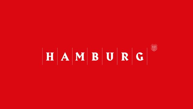
HAMBURG BRAND
In the past, Hamburg made use of marketing to accommodate all sorts of content while offering it to as many markets as possible. For the marketing team available, they felt stuck as it was the only way to work with the demands of all the stakeholders. This effected to having a lot of marketing thrown but it contained so much and aimed at too much that it made confusing messages. This led to no coherent image being created so altogether it was quite vague.
This changed in 2004 when the brand development was made into a top priority as they said goodbye to the traditional destination marketing and moved to strategic city branding. The city was managed as brand and dealt with online marketing which created more suitable topics and deleted the target group concept and went for a "one city - one brand" and focused on external connections.
This was a first because most cities used a multi-brand strategy and it required a lot of change. This brought about the Hamburg Marketing GmbH which was a sole company in charge of coordinating and managing the brand. From here, they were able to create control mechanisms and processes that led to the success of the city's marketing. It also brought about close collaborations which worked in boosting the city even more.
This is why place branding has to have a strategy in order to create a strong appeal. This appeal extends from getting workers for companies in the city to attracting businesses and tourists and of course, to heighten the population of locals.
3 / MELBOURNE

MELBOURNE REBRAND
Melbourne's cite rebranding was made by Landor. It's effectiveness is due it being both memorable and flexible.
The brand overall creates a fresh and energetic vibe and while it grows old in its existence, it's still able to work through time. It's identity has aged and progressed with the city which is the most important thing to accomplish as a brand. When there needs to be change, it doesn't have to start from scratch.

melbourne colors
Their goal was to show off the different sides of the city from being serious to vibrant. It was about capturing the passion of the people while maintaining a unified and flexible image for the city. Their main concept was to capture the place in its diversity. They did so with their variations of color, forms and structure. This allowed Melbourne as a brand to grow and evolve with the city.
This shows the importance of getting to the true core of the city so you can create a brand filled with its essence. It's authenticity is a huge part in what attracts people to make a visit.
4 / EDMONTON

edmonton brand
As seen from the logo, it looks quite simple but Edmonton's rebranding actually goes on a more complex route. This was brought about in their need to switch from being a resource based economy to an innovation-based one. To do this, they will need an increase in educated millennials, in addition to the talented locals.
Their new brand is a story that's directed and prepared for different audiences. They see the core of Edmonton to being inventive, open and cooperative. This brought upon the city's slogan “If you have the courage to take an idea to reality, to build, to make something, Edmonton is your city.”
It's former image created a vibe of toughness and roughness for the city. This makes it unattractive for most people. This is why the rebranding called upon the Make Something Edmonton. This is an online forum that local residents posts their stories of what they are creating and making.
It has become an award winning open project as it has engaged so many people to collaborate and showcase ideas. This focus on the citizens has brought upon a connected feeling with everyone viewing the site and makes you want to go. It created a seamless collaboration between digital marketing and a narrative. That is a true sign of a successful brand and their project only grows from there.
5 / AMSTERDAM

amsterdam rebrand
In 2004, Amsterdam got a rebranding due to its image of merely being a city focused on sex, drugs and canals. They wanted to show off how it was also an amazing place to live and work in.
Their form slogans consisted of “Amsterdam Has It” and “Small City, Big Business”. Both of which created a vague image of what the city was. The rebrand brought about "I amsterdam" which created a recognizable concept and identity. They are very proud of it and have the text loud and proud in front of the Rijksmuseum Amsterdam.
Its colors's origins are their coat of arms and the campaign overall gave the city the modern edge they needed. It was also able to bring for the the Europe's "sin city" vibes into another more acceptable route.
It was immensely been successful as their tourism and business went up. They also pushed themselves as part of the top five European cities with the best brand strength and cultural assets. Most of the visitors actually take a photo with the logo and apart from being a major part of its cultural identity, it has become a landmark.
This shows how far a rebrand can take you and how it can affect every visitor's stay into becoming a more welcoming and memorable one.
If you're a town, city, region or just about any place looking for a rebrand, we can help you make it happen. EOI Digital is a digital marketing agency that has result-driven strategies that will be sure to send your space into the top of it's category! Let's talk and get it started.
Posted from the EOI Digital Transformation and Marketing blog : https://agency.eoi.digital/digital-marketing/how-branding-can-promote-your-spaces/