You are viewing a single comment's thread from:
RE: First Merch by Amazon T-Shirt Approved!
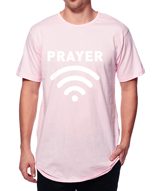
Nice shirt, nice design, nice message but I think the logo is too big. That style went out in the 1980s with Wham! Nowadays people don't want to be human billboards. It is like SHOUTING ON MESSAGE BOARDS WITH ALL CAPS... oh, sorry I got carried away. Peace out!
Hi @otage! @jerrybanfield is sending you 10.0 SBD tip and @tipU upvote :)
:)
@tipU - send tips by writing tip! in the comment, get share of the profit :)@otage thank you very much for your feedback here and in the comment below which inspired me to cancel my order for more shirts and resize the logo first because what you suggested also matches with what my wife said about the logo being too big now! I appreciate your help and here is a tip!
Naw dawg, big logos can still be cool if done right.
True dat! I'm referring specifically to the size of this logo. For example, on his red shirt the logo size and placement looked more reasonable (but I would still go smaller). Also for all those fans not as svelte as Jerry the curved logo will extenuate any bulges in that area. It might just as well say "beer belly" or "baby on board!"
Thank you for mentioning the logo size because that is one of the key questions I had for editing this design and now that you mention it that way I want Prayer to be the main focus and not the logo. If the logo is huge then prayer is not as easy to notice. Time to reduce the logo size!
No problem I like the way you reach out to the community for feedback. Thank you for all your informative posts!
Fair enough, I find design a subjective set of rules. Good call on the wifi lines accentuating the midsections of any lager bodies though!
I'd do something like this: