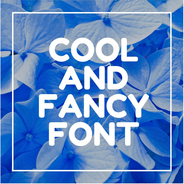
Fancy Fonts Enhance or Detract
In the realm of typography, the allure of fancy fonts is undeniable. These intricate and artistic typefaces possess the power to infuse creativity and uniqueness into textual content. However, the question often arises whether these elaborate fonts enhance or detract from the fundamental readability aspect.
Fancy fonts undoubtedly hold a charm that captivates the eye and gives a distinct character to written communication. Their ornate loops, intricate curves, and decorative elements evoke a sense of aesthetics that can elevate a piece of text. In contexts where design and aesthetics are paramount, such as invitations, branding, or artistic projects, fancy fonts can enhance visual appeal, leaving a lasting impression on the reader.

Yet, the allure of these fonts often comes at a cost: readability. The complexity of fancy fonts can, at times, hinder the legibility of the text. The intricate details that make these fonts captivating can also create visual noise that disrupts the reading flow. This disruption can lead to a frustrating reading experience, where readers may need help deciphering the words, ultimately diluting the intended message.
It's essential to recognize that readability remains a cornerstone of effective communication. While fancy fonts may seem enticing, their usage should consider based on context and audience. For longer passages of text, such as articles, essays, or reports, clarity and easy comprehension take precedence over aesthetic charm. In these instances, simpler, more straightforward fonts facilitate smoother reading and better information absorption.