Preparing SVG Files For Web Browsers

Introduction
SVG is an incredible format - There's nearly universal support of it in modern browsers. It allows you to present visuals to users without worrying about screen resolution. And SVG assets are typically smaller in file size than their bitmap equivalent, while looking better at any size. But, there are a few downsides to choosing SVG as your format for visuals on the web. Today, we’re focusing on a key area designers overlook when putting SVG’s into a website or web application: preparation.
When I talk about "preparation", I mean ensuring that your file looks exactly as intended when viewed in a browser. Contrary to common belief, it's not always as easy as saving your Illustrator document as a ".SVG" file. Let’s go over a few major issues with displaying SVG files in web browsers.
Fonts
When it comes to fonts, current browsers aren’t very savvy. And limitations aren't exclusive to the @font-face property; if your designs feature any text at all (even numbers, punctuation, special characters, etc.), your users may not be seeing what you want. Let's take a look at how web browsers handle an SVG file with type in it.
Font in the left image is "Palm Canyon Drive", created by Amy Hood and available here.
On the left is a design as it would appear in your SVG editor (Illustrator, Inkscape, etc.). On the right, the same design is presented as it might appear in a web browser. As you'll notice, we've got a problem with how that font is being displayed. Let's discuss why the web browser isn't displaying our file correctly.
When a custom font is installed on your computer, (unsurprisingly) it's correctly displayed in your SVG editor. The same is true when you view your SVG file in your own web browser (which is also why it's a good idea to check your designs after disabling a custom font). However, when users who do not have your custom font installed view that SVG file in their browser, their browser cannot find the font, and replaces it with a web-safe font. So instead of seeing your beautiful, script typeface, they get something like Times New Roman across their screen.
If you have a common, web-safe font in your SVG file, you might not have to worry about a browser selecting which font to display. But, it's still best to err on the side of caution and assume that no fonts will display correctly. Also, remember that many mobile devices only have web-safe fonts installed, and many of those users have no ability to install custom fonts.
Since we have a custom font in our project, we need it to display correctly for all users. In order to ensure compatibility, we need to convert it from a font to a shape. We'll accomplish this by outlining the font.
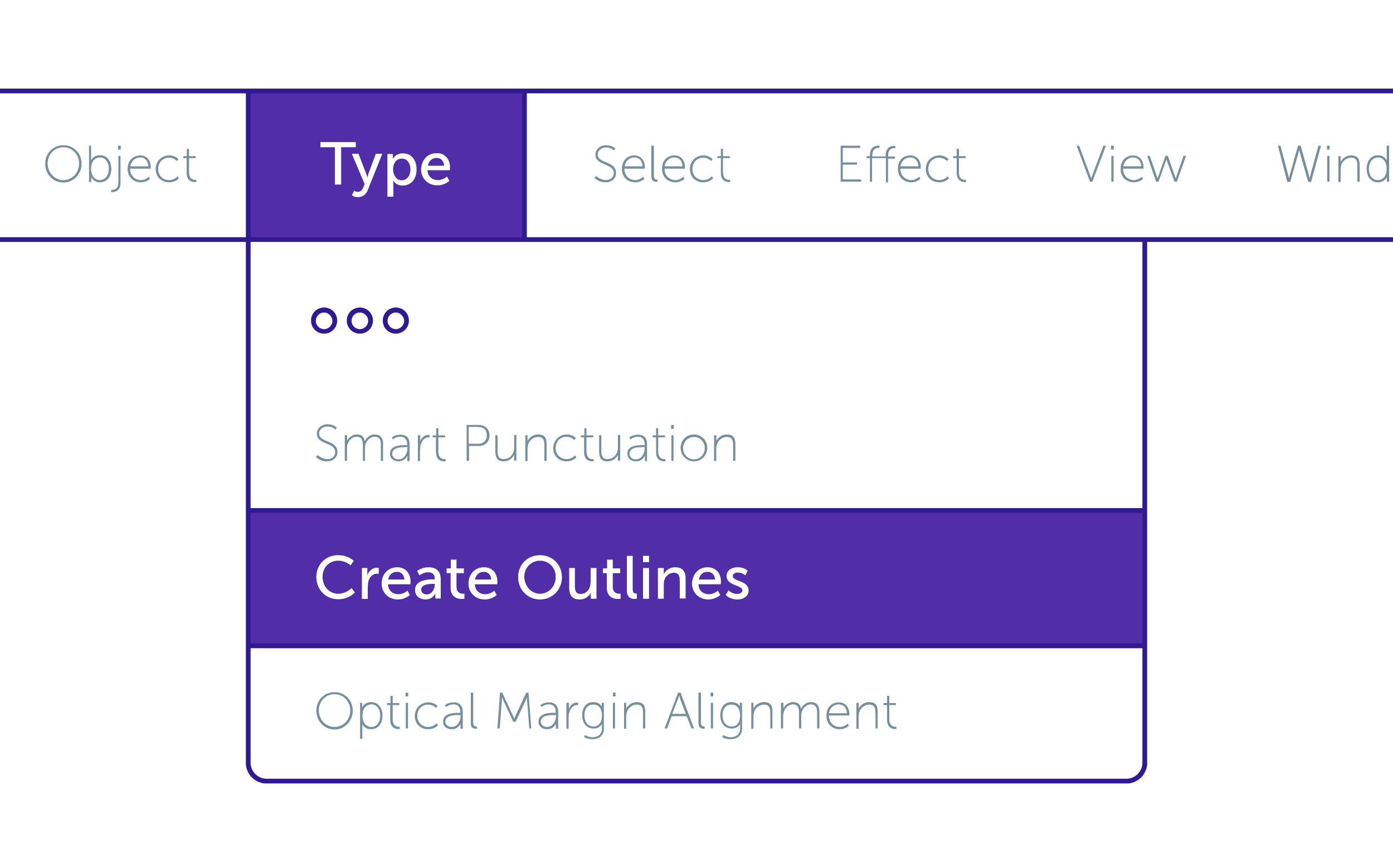
In Illustrator, select all text in your document (you can simply "Select" -> "All" elements as this will only affect text anyway). Under “Type” in the menu bar, find the “Create Outlines” option.
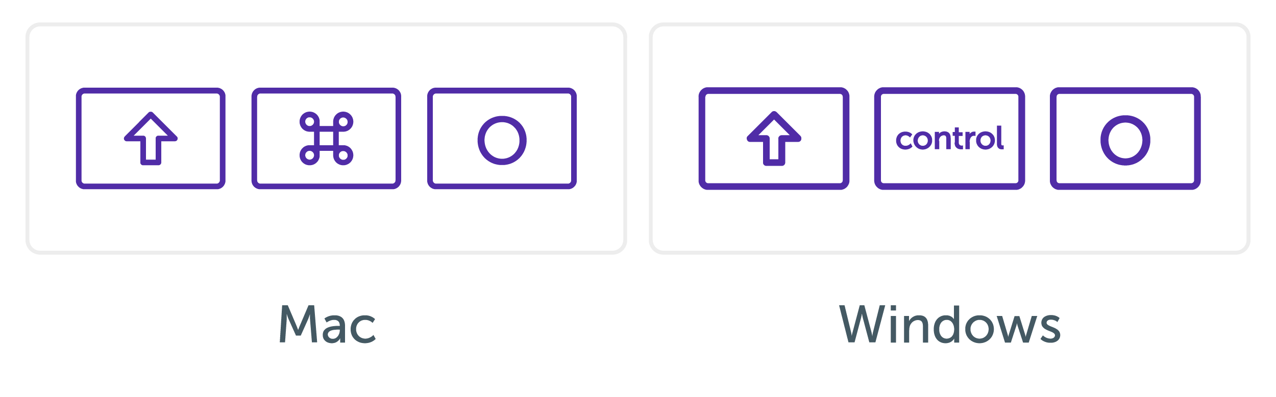
Alternatively, you can use the keyboard shortcut shift + cmd + O on Mac and shift + ctrl + O on Windows. After clicking "Create Outlines", Illustrator will convert your text to outline form, which is a series of points that any SVG compatible browser can display as you originally designed it.
The only caveat to this method is that it will make your text un-editable. As a safeguard, I suggest saving a version of the file as .AI (or whichever format is native to your SVG editor) and wait until you're ready to use the file to save it as .SVG, with all fonts outlined. This way, if you ever want to go back and edit the text, you won’t lose your font formatting.
Strokes
Another thing browsers can have difficulty displaying are "strokes" or borders commonly applied in SVG. This is less of an issue with modern browsers, but with SVG (especially when animating), strokes can be displayed incorrectly. If all strokes used in your work have straight edges and corners, and are aligned to the center, you shouldn’t have issues. However, as a general rule, it’s best to make your SVG assets as “dumb” (aka browser-readable) as possible.
Similar to how we handled fonts, the best way to ensure that your strokes appear correctly in browsers is to select all strokes (you can use “Select All” and it will only apply to strokes) Alternatively: use “Select Similar Options” dropdown —> “Appearance” and then select “Object” —> “Path” —> “Outline Stroke”.
If you use any custom strokes (custom brushes, pens, etc.), you will need to outline them, as there is absolutely no support (as of this writing) for custom stroke types in web browsers. Hopefully, this will change at some point but I would imagine it’s a long way off in the future if it does become reality. For now, outlining strokes, while saving an editable version, is your best bet to make sure users see your designs as they were intended.
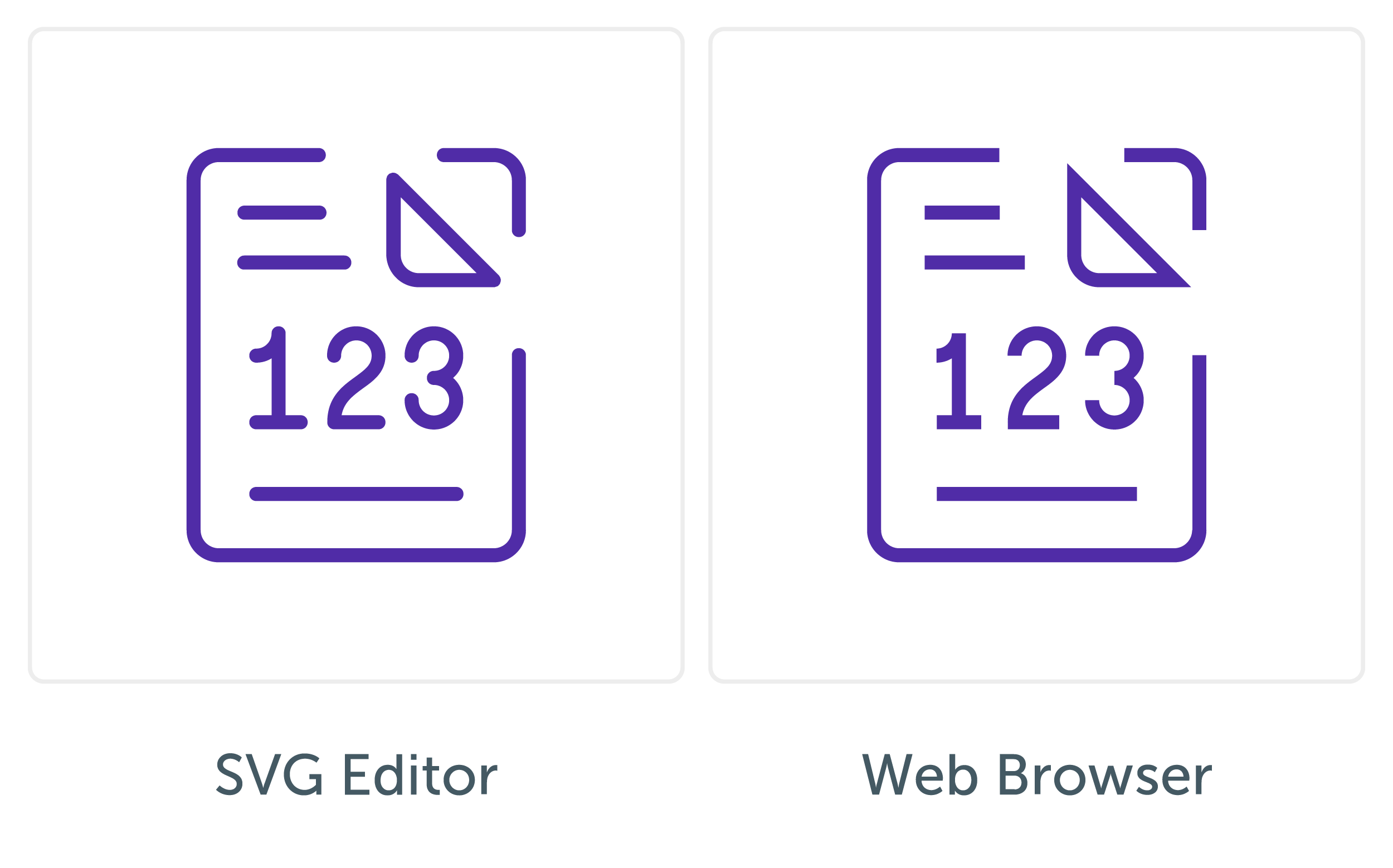
On the left is a design that features strokes with both "round joins" (rounded corners) and "round caps" (rounded ends). Additionally, the line below "123" is a dashed stroke pattern. On the right is the same design as it might be rendered in a browser. You'll notice that all corners now have a "miter join" (sharp corner) and "butt caps" (flat ends). Lastly, our dashed line is not read correctly and simply displays as a straight stroke with a flat end. Let's discuss why this is happening and how we can fix it.
These strokes display correctly in our editor because the software is directly controlling the preview image that appears on our monitor. Web browsers, however, don't always follow (or know how to follow) specific instructions of how to display SVG strokes.
Also, worth noting - If you have fonts with strokes, "Create Outlines" from the fonts first and then "Outline Strokes" and combine the shapes. If you create outlines from the strokes first, they will be ignored when you combine (or flatten) your assets.
Anchor Points
In general, if you Image Traced any part of your design, you'll likely have extra anchor points. This might not appear like a big deal visually, and you might think that the SVG file is small as is (30kb and below is pretty tiny after all). But it’s another way to ensure that your assets load as quickly as possible and still look their best.
Just as it's good practice to simplify our designs, it's useful to simplify our SVG assets. Like the other parts of this tutorial, Illustrator has a built-in way to simplify assets (conveniently called “Simplify”, found under “Path” in the menu bar). This method can work pretty well if you have simple shapes that you’d like to clean up. But, like many things, often the manual way is most effective. Select the object you’d like to simplify, and see how many anchor points are located along a line but are not actually affecting the shape.
If you Image Traced any part of your design, you’ll likely have extra anchor points.
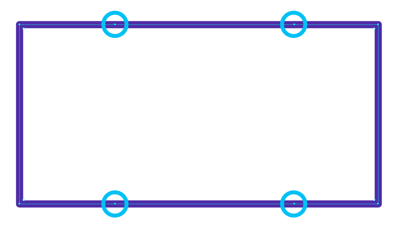
In this photo, we see a rectangle that is well drawn, but has more than 4 points (which, by definition, are unnecessary). We should delete these superfluous anchor points.
Each anchor point is extra data the browser has to process before displaying the image. While this might seem small, these data points can quickly add up. The fewer anchor points we have, while still maintaining our designs, the better.
Very useful info thank you
Great advice thanks.