15 Web Design Trends 2018 (Stuff You Should Know)
Here's a list of 15 web design trends you will see in year 2018. Everything needed to prepare for new card design, minimalist web design and scroll stories.
Let’s get this show on the road
1. Big Images
You may have seen a blog or two with HUGE cover images - such as my blog’s posts 😂.
Some may call them hero images…
In this day age, people are more visual beings. As a web designer, take advantage of this by giving your viewers great visual content.

Photo by Joshua Earle.
By using larger images, you grab the readers attention and give them a preview of what the article’s about.
Take your viewers to a whole new world with your images.

Photo by Mahkeo.
Here are some examples of using big images in web design.
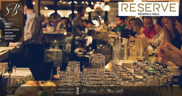
Above is a screenshot of sweetbasilvail.com.
Sweet Basil’s website takes advantage of the screen real estate, by using real photos of their restaurant as advertisement.
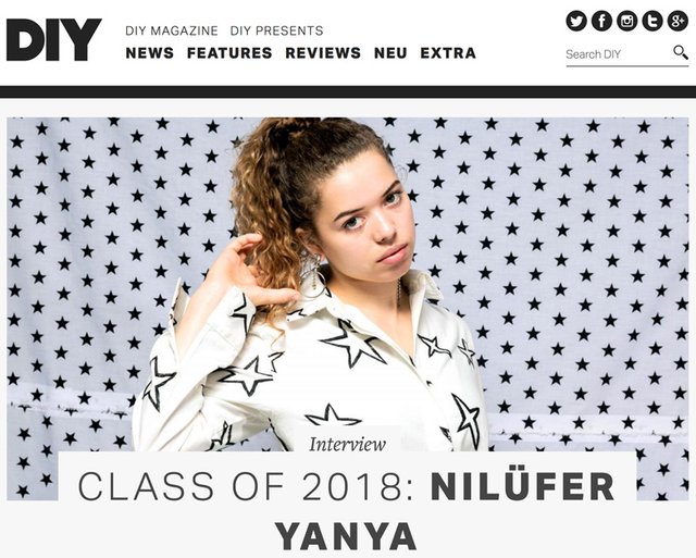
See how diymag.com uses big images in the screenshot below.
2. Video
Now that video has taken over the internet, designers have began incorporating it into their banners, hero images and backgrounds.
Awwwards.com has great examples of websites with video as part of their design.
Look:

Above is a screenshot of hellodesign.com.
And here’s another great example I found of a web design with video for you.

Above is a screenshot of neematic.com.
Find free stock videos for your website at Free stock videos – Pexels Videos. These videos are all free to use for personal or commercial use (attribution not required.)
3. Custom Illustrations
Below is a screenshot of flexmize.com.
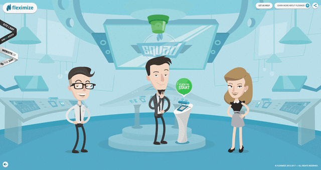
Notice, you can use digital art to attract your visitors to a button. Art can be used to convey your company’s mission, while gaining attention from the community.
Here's another great example at keepearthquakesweird.com.
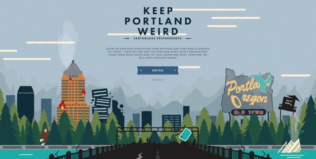
Both of these website examples have used digital art, as well as animation in their web designs.
This type of web design causes a natural discussion about your website and can even give you free publicity.
4. Scroll Stories
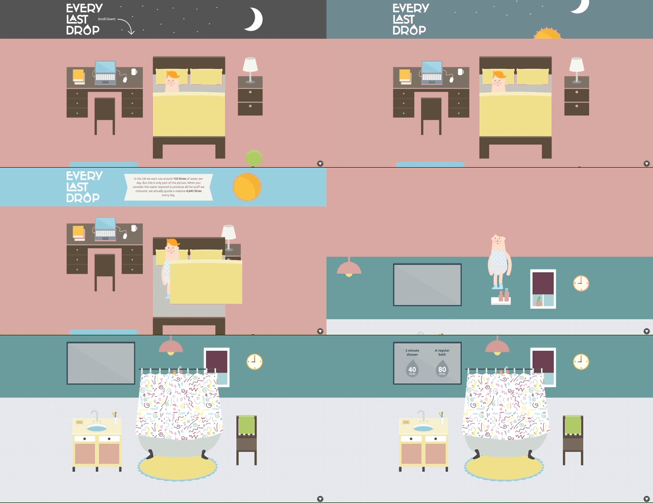
Above is an animated gif of everylastdrop.co.uk.
And here's another animated gif of hegartyonadvertising.com.
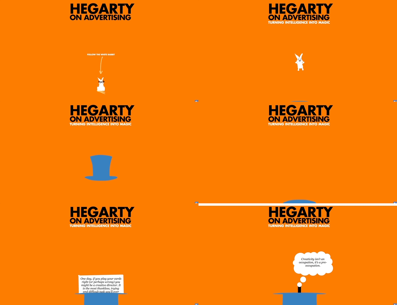
If these example gifs are taking to long to load, just follow the links and check them out yourself.
Keep in mind, these scroll story type web designs may take up more bandwidth than an average site for your user.
Learn how these are made:
If you want to build scrolling web designs, check out scroll magic.io. They have a JavaScript library that you can use, along with multiple scrollmagic examples to learn from.
5. Fancy Typography
Below is a screenshot taken of primeandfire.com.
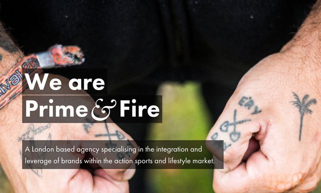
Here’s another example from the same site:
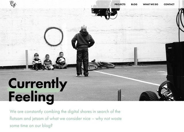
Lastly, check out how the website ilovemy.de uses typography in their design.
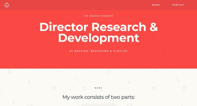
6. Gradients
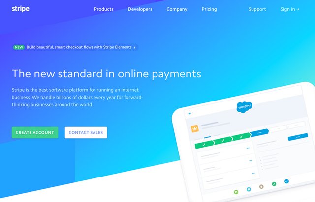
As seen in the screenshot below, stripe.com uses gradients in their website’s homepage.
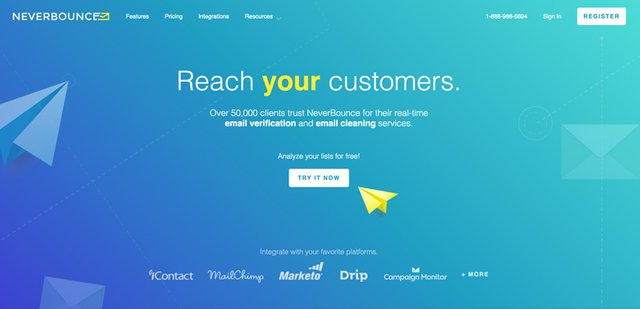
Similarly, check out how unbounce.com uses web gradients in the screenshot below.
As seen with stripe.com bold gradients can be used to make certain elements pop and place attention on them.
Learn how to use gradients in your web design at w3schools.com and developer.mozilla.org.
Personally, I have used w3schools.com to learn web gradients. With that being said, I feel it could be a great resource for you to start with too.
7. Vibrant Colors
In 2018, vibrant colors in web design will become way more popular amongst designers.
Below are some awesome examples of web design using vibrant colors.
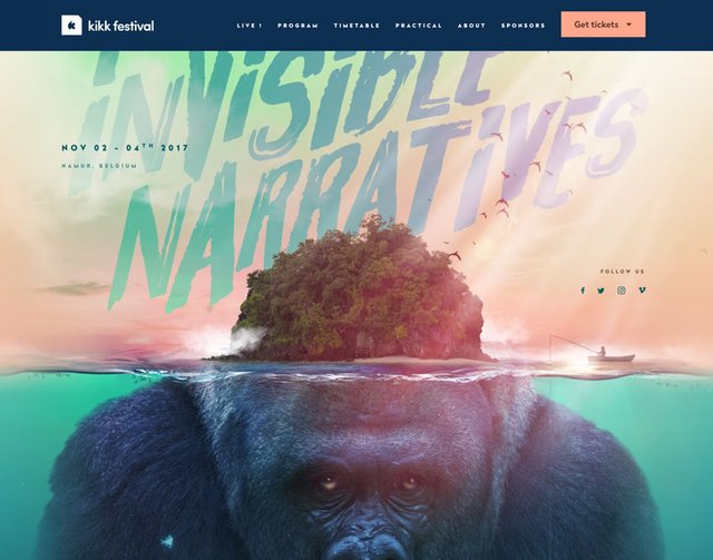
Above is a screenshot of the KIK Festival’s website at kikk.be.
The KIKK Festival uses artful vibrant digital illustrations on their website, as symbolism of the artistic community they represent.
And another great example is insidethehead.co.
Below is just one of their chapter illustrations. Notice how they use vibrant colors to portray their messages in a storybook fashion.
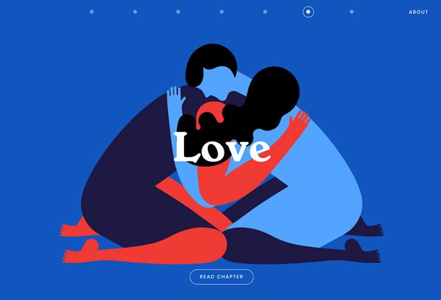
Each chapter represents the delusions, illusions and confusions of young adults.
8. Card Style Information Panels
If you’ve ever been to Wired’s website, you may have seen their use of cards to display their articles.
Check this out:
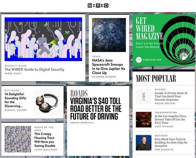
Above is a screenshot of how wired.com uses card design on their website.
They aren’t exactly the modern designed cards you may be used to seeing on the web, but they are cards nonetheless.
You may be thinking, that’s a great way to layout content for an online media company.
And you’d be right.
Here’s another great example:
Look at how awwwards.com uses card design for their blog articles.
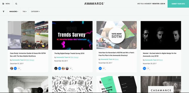
This goes to show how useful cards can be for displaying content, while maintaining a minimalist design.
How Social Networks Use Card Design
You may or may not have noticed it, but all of the popular social networks are using card design in one way or another.
Check this out:

Above is a screenshot of how Twitter uses cards for displaying individual posts.
Notice how they incorporate things such as their branding, post title, post excerpt, source URL, timestamp, Like count and even a user list of sharers.
And look at how Facebook Pages use cards:
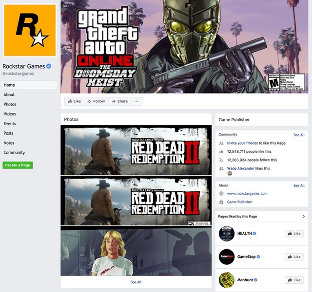
Above is an example of how Facebook uses card design throughout their site’s design.
Facebook Pages use cards to display content everywhere - The header, content area and even the sidebar.
When most social networks use card design, there’s a safe bet cards are great for scannability.
9. Minimalism
I know minimalism web design has been around for awhile now, but it will get even more minimal in 2018.
Take a look at these more recent examples of minimalist web designs.
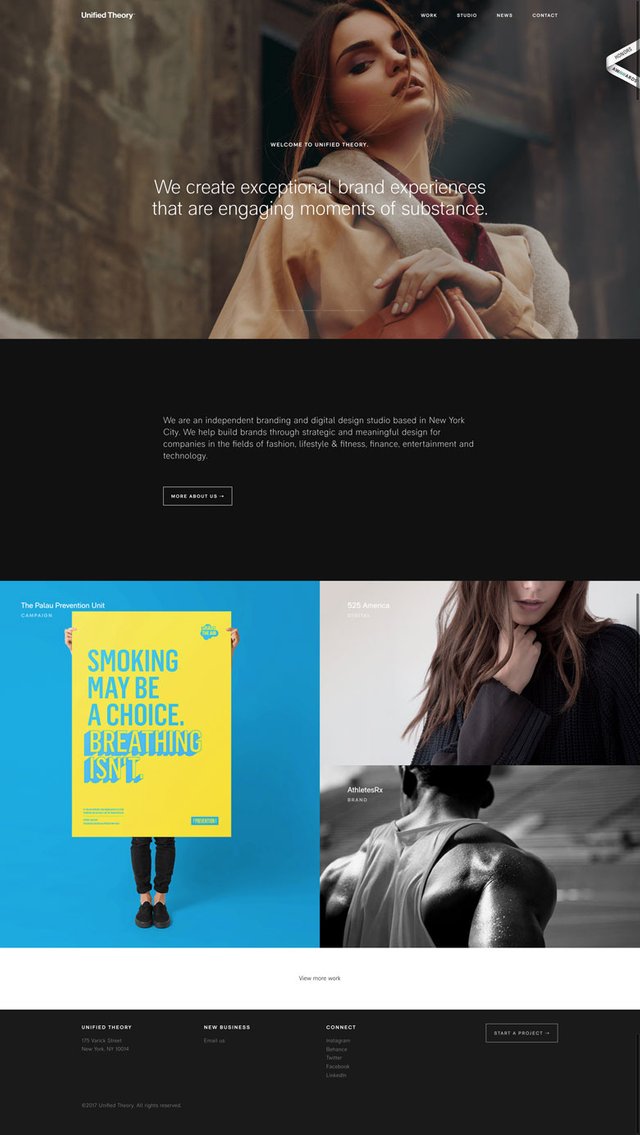
The above screenshot is of unified-theory.co.

Above is a screenshot of igotchamedia.com - A digital marketing agency.
Notice their web design still conveys what they do, while being minimalist.
And below is an example of how they use minimalism on their website’s “Services” section.
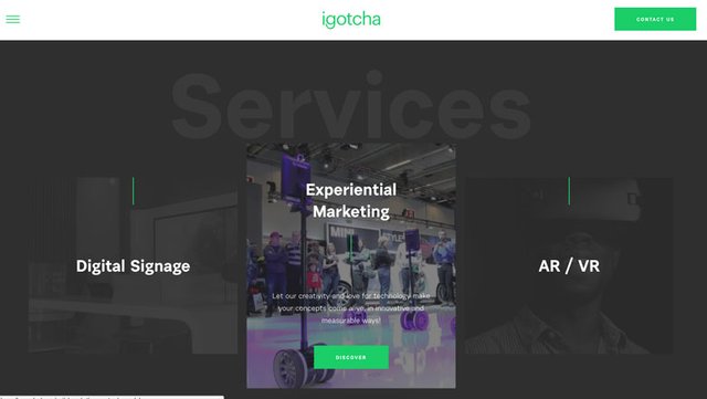
Minimalism works because it forces you to be more detail oriented in your design.
You may think minimalism is for artsy fartsy type web designers only…
Not exactly
With time and dedication, I know you can learn minimalist design too.
If you’re interested in learning the basics to minimalist web design, check out this minimalism basics article by TutsPlus.
Also, here’s a great video by TutsPlus I found for you to learn the core concepts of minimalism in web design.
10. Flat Design
Before Flat 2.0 was announced, in 2013-2014, Apple and Google began using flat design in their products.
Google even developed their own design language for flat design called Material Design for developers in 2014.
Flat design really took off after mobile operating systems began using it in 2016.
And you know what?
After being refined all these years since 2014, Flat 2.0 will be a key component in web design of 2018.
For instance, take a look at how clean betttter.com looks.
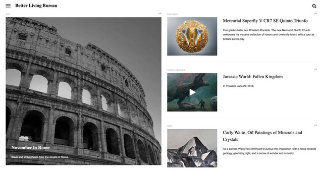
It’s a very friendly yet simple design.
Here’s another example - thehappyprints.com:
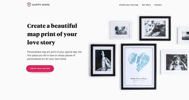
Notice, their message is clear.
By using flat design, Happy Maps was able to give you clear instruction, while using less than 40 characters in their copy.
Now, you may think Flat design is awfully similar to minimalist web design. You may be right, or these designers may just have combined the two trends.
Anyhow, Flat design is all about using basic color palettes with shadows and highlights for depth. Which leads me to my next two web design trends…
11. Shadows
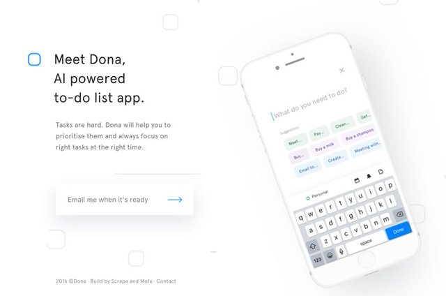
Take a look at how dona.ai uses shadow to draw in attention to fill out their email form.
12. Highlights
When light bounces off an object, it will normally catch your attention and put your focus onto the object.
Well, you can use highlights in your web design to get that same effect.
Look:
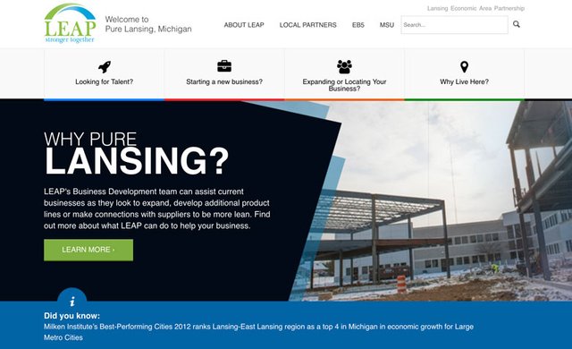
Check out how purelansing.com uses highlighting to put emphasis onto their “Learn More” button.
Use highlights to draw attention to an element, like the example below.
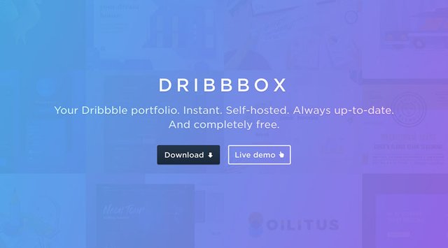
As seen in the screenshot above, dribbbox.com uses purely a highlighted border to draw attraction to their “Live demo” button.
13. Attention Span Content Widths
The width of your web design content matters.
Here’s why:
Nowadays, you and I scan for content and it’s becoming harder and harder to keep focus on longer strips of text.
To get around this, keep a width constraint on your content. I found 780px to be a good width.
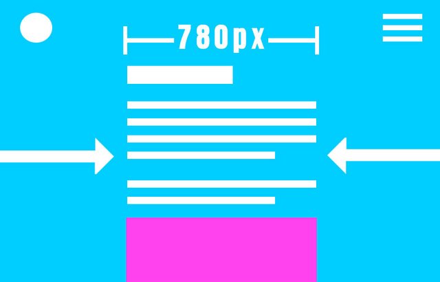
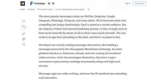
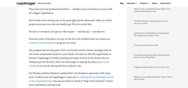
Site’s like medium.com and copyblogger.com use constrained widths for their blog article content.
Below is a screenshot of Medium’s blog.
And here’s a screenshot of Copyblogger’s blog.
14. Hover Effects
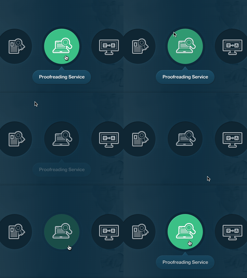
Hover effects in web design can be used on anything from whole boxes of content to buttons, to simple text links.
You could use hover effects to make animations, display tooltips or even make whole drop down boxes.
Check this out:
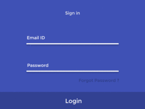
Above is an example of using a hover effect to display the input field of a web form.
And here’s an example of using a hover effect to display a tooltip.
15. Actionable Landing Pages
Tesla.com is a great example of an actionable landing page.
For example, there’s a clear message advertisement in the center, following with a list of simple two word buttons below.
See for yourself:
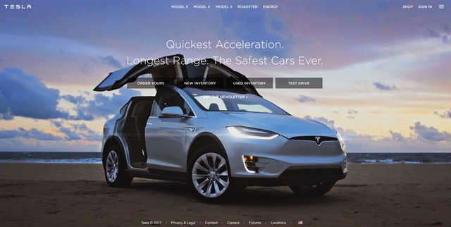
If you visit their website, you’ll notice they even use a background video, as I described in my post - 6 Common Magazine Design Trends Found in Today’s Web Design.
So you want to increase conversion on your landing page?
All you need to do is give your viewers simpler actions to take. Give them a select few obvious options to choose from.
That’s how these actionable landing pages work so well for conversion.
Take a look at paypal.com in the screenshot below.
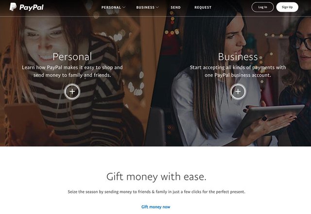
See how they give you two very clear choices on their landing page. Either start with a personal or business account.
In addition, theres an alternative message below that reads “Gift money with ease” following with a simple link to “Gift money now.”
By not making the viewer think, they are more likely to follow through with one of these options.
Wrapping Things Up
That’s it
In essence, you have now learned the 15 web design trends to prepare for year 2018. Keep these trends in mind when designing for the web in the new year.
Feel free to share this article and let me know in the comments below if you have other trends that we should see in year 2018.
Posted from my blog with SteemPress : https://divto.com/15-web-design-trends-2018/