You are viewing a single comment's thread from:
RE: MonaCoin (MONA): WXYXZ Complex Correction into April 23rd
On the top chart the wave 4 is lower than the peak of wave 1 it appears, and that would be breaking one of the EW rules, no?
On the top chart the wave 4 is lower than the peak of wave 1 it appears, and that would be breaking one of the EW rules, no?
correct, but idk. I feel like theres a small room for lenience. When you switch it to a line chart rather than a candle stick chart it doesn't show the extremities of the markets pushing the prices up for sometimes just a few seconds.
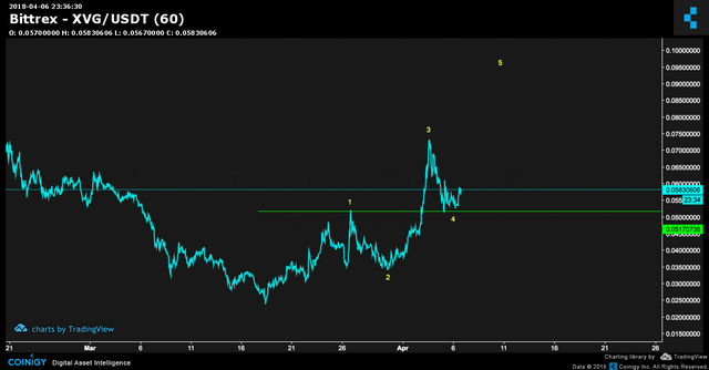
Like this:
sometimes when it looks like it makes sense but the rules are broken I just take a look here to see on the line chart. BUT, Idk thats just me and I heard someone else try this. But hopefully @haejin can give us some insight on this as well?