Is This The Perfect UI For The Steem Blockchain? - Review - 2nd Edition
IS THIS THE PERFECT UI FOR THE STEEM BLOCKCHAIN?
by @warpedpoetic | August 4, 2018
There are lots of applications on the steem blockchain that proffer alternatives to the steemit platform. This is not to say that the steemit platform is terrible but it is a work in progress and humans have notoriously limited patience. As a result, other options have been provided for those who find steemit to be lacking in some aspects of functionality as an interface for content creators.

There are several apps that service the content creators on steem blockchain and they range from android apps like esteem to website interfaces like busy.org. All these apps have been able in one way or another, to combine aspects that would make the user interaction with the steem blockchain much more enjoyable by providing functions that are sadly lacking on the steemit platform. As a result, there are many users who would make use of this alternatives instead of the steemit interface.
steempeak.com, @steempeak, is one of such alternatives. The brainchild of @asgarth, and @jarvie, it boosts features that some of the alternatives out there lack. Though new on the steem blockchain, the steempeak. come user interface has managed to catch the attention of content creators who are tired of jumping from one website to the other in order to stay abreast of all that is going on in their blog account by providing a single interface that serves as a conduit for all of the information they need for a complete command of their account.
The above may seem far flung but here are some of the features of the interface, so you can judge for yourself .
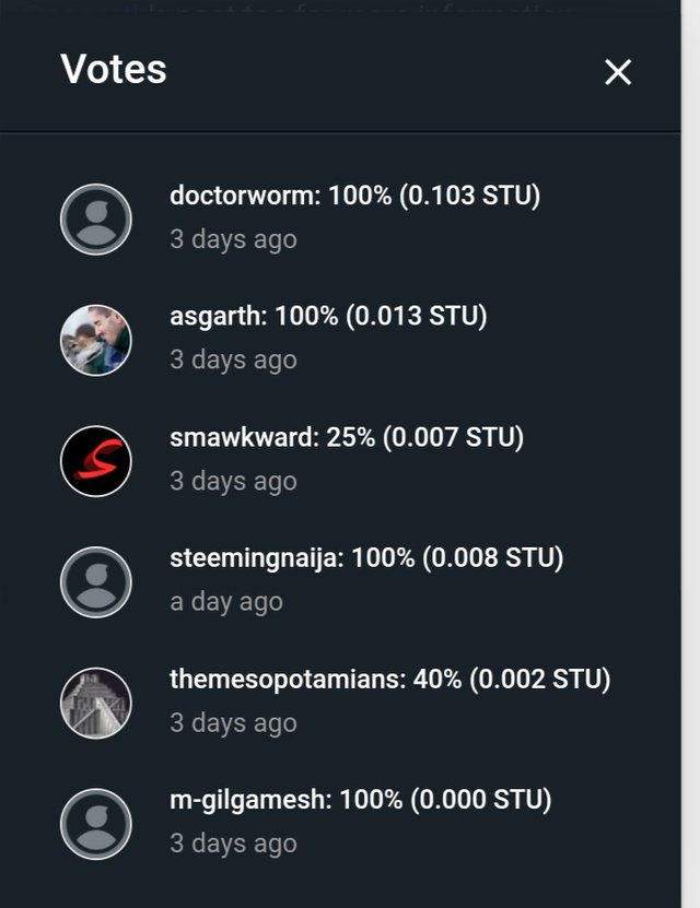
- You can actually see the names and avatar of everyone who upvoted your post as well as the percentage of their upvote.

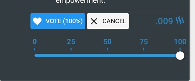
- You can control your voting weight without having to wait to get your steem power to 500.

- You can identify your outgoing and incoming funds in your transaction history. The outgoing transaction is coloured red while the incoming is coloured green. As a result, you can keep tabs on your money and comfortably create a profit and loss statement.
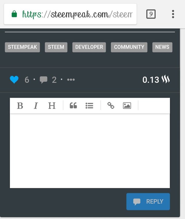
- For those who do not know how to use the markdown editor, the steempeak markdown editor has options at the top of the screen that makes it easy for you to utilize the markdown editing style.

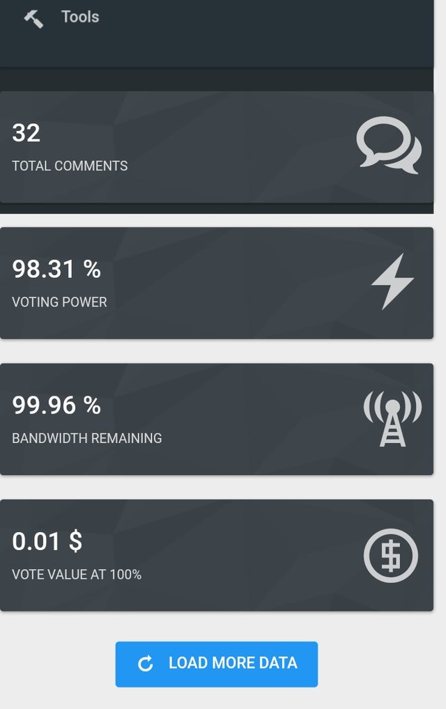
- There is the notification option that enables you to get info on activities on your blog; from comments to upvotes to transactions on your wallet. It has the dashboard too, where you can see graphs and pie charts of your vote traffic; both outgoing and incoming votes, number of comments, number of posts and more.

These are some of the things that we can’t find on the steemit platform.
The application has made an update to the interface and you can read up on it here; 13 NEW UPGRADES SINCE JULY 22. So if you are looking for some other platform on the steem blockchain with which to share your content, you can check this one out. I am checking it out, I tell you.
Note that all photos are of the mobile front-end. I could not access the front-end on a PC at the time of writing this. My laptop is asleep not the fault of the site. If you would prefer a look at the desktop version of the project, I suggest you check out this post by @littlescribe; https://steemit.com/steem/@littlescribe/your-steem-fantasies-have-finally-come-true. she did a superb video that gives all the feautres of the desktop version

Remember that we are recruiting, if you want to know more about this visit this post and if you want to participate here is the form that you must fill out

Posted from my blog with SteemPress : The Steem Times
Remember that we are recruiting, if you want to know more about this visit this post and if you want to participate here is the form that you must fill out

Posted from my blog with SteemPress : The Steem Times
Love the review looks good.
Also i'd call it the brainchild of @asgarth ... i only helped the child to grow after it was born. haha