Studio View - Cups - Your Opinion is Requested!
Hello friends,
In my last post I had just begun making pots on the potter's wheel for a sale coming up in early October. The sale is called "Cups and Coffee" where 6 of us potters will do a pop-up at a Vancouver, WA coffee shop for a few hours on a Saturday morning. Each of us will make about 20 items all focused on coffee and I have planned to use this as an excuse to come up with a gorgeous espresso cup, so I'll sell some of those, as well as tumblers and mugs.
getting an early morning start on throwing to avoid the 100 degree afternoons!
.jpg)
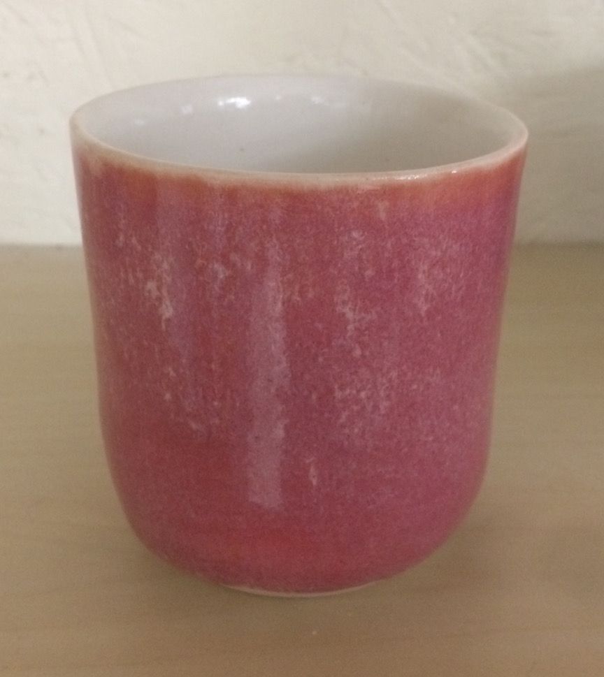
I've been messing around with a espresso cup forms but haven't found that one that's just right yet so what I'm showing here are glazed tumblers that show the some different glazing effects I've been playing with.
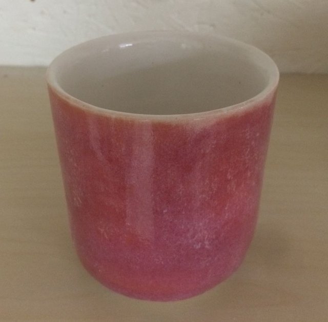
Which of these 4 glaze looks are your favs and why? There are 2 photos of each except one so don't be confused into thinking there are more than 4 cups.
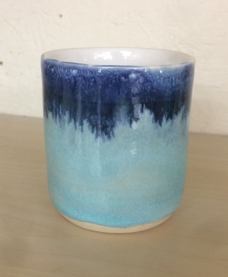
A turquoise and cobalt blue number, you can see the tumbler from 2 angles
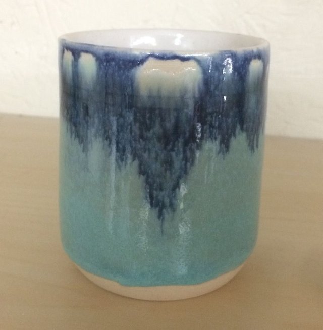
Then there's a layered effect that looks like a horizon with mountains in the distance and again from 2 angles
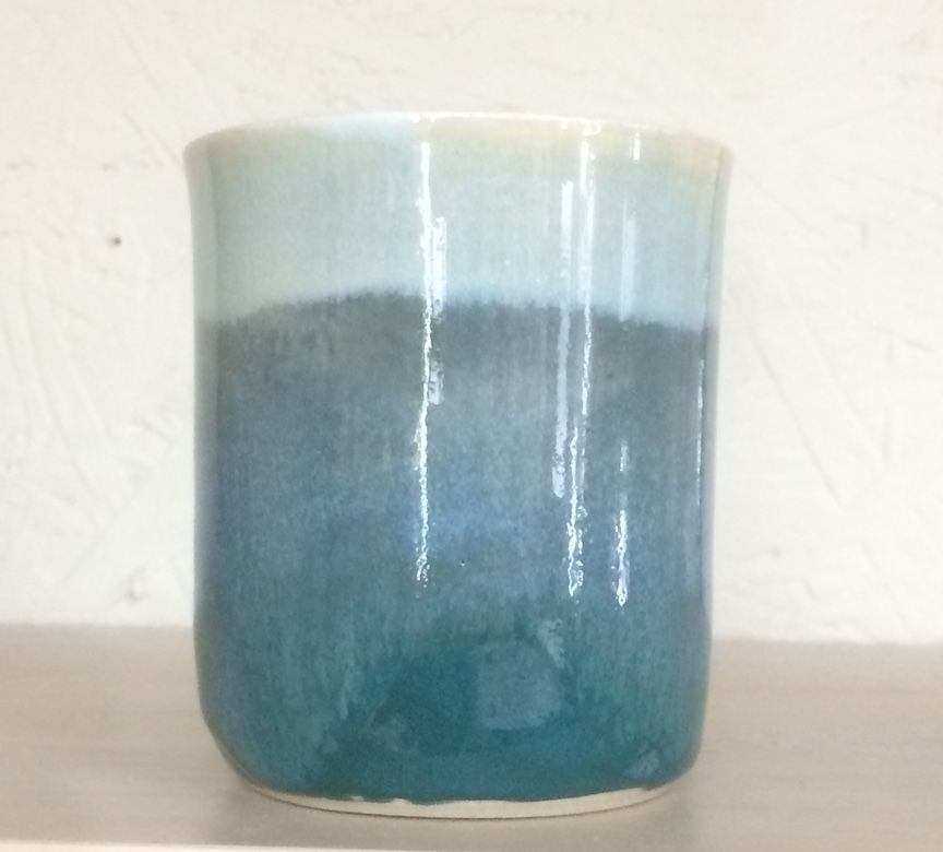
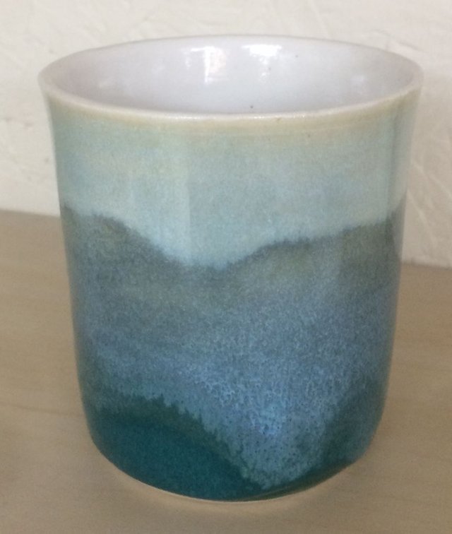
A watercolory sort of layered effect

And lastly another angle of the pink/orange/white at the top
Thanks for taking a look and supporting my blog and love to hear your thoughts on what sings and what's just 'eh'.
I like the red one.
I make ceramic too, and red has been a rare colour in ceramics, in the past. And it's still not so easy to blur. :)
thanks @paolobeneforti, you're opinion has a lot of weight since I love your work! I layered this glaze that's an orangey-pink (called Sunset Pink) over a very thin and uneven layer of white and got this kind of mottled look.
I like the last glaze because that just seems more coffee like. Whilst I like the blue designs they feel cooler so I wouldn't immediately associate them with coffee.
My two cents :-)
Cgee
thanks, I appreciate it! Your observation of the warm vs cool may explain why I love the horizon one so much but others who have visited my studio haven't really loved it whereas they bought up the others which weren't even for sale yet.
It's funny with things like this, you find that you fixate on a particular aspect of a piece. Then someone else comes along and says, oo I like that for so-and-so reason and it opens you up to appreciating your own work in a different way!
All good :-)
Cg
Hi. I found my way to you because I noticed you upvoted my @sndbox gif entry. So thank you for that.
They are all very nice pieces of pottery, but as for my favorite, I'd go with the watercolory sort of layered effect one. I feel it's rather timeless and I like the subtlety of it. It feels misty and dreamy.
Love your work. Given you a follow.
Thanks for sharing and good luck with your sale.
@animate
Hello @animate, so glad to hear you came over to look at my blog, thanks for your support and the feedback, I really appreciate it!
No problem. :)
I like turquoise and cobalt look,it looks amazing! How do you plan to sell them,online or offline? Maybe you can open online store?
thanks for letting me know your favorite, I like that one a lot too. As said in the post, we're having a pop-up sale
The mug in the fourth photo is pure awesomeness :O
thanks! I really like that one too...like a distant landscape
Great post @natureofbeing I agree with what you write, it's very interesting, good job! thanks for sharing , i love turquoise, I follow you, beautiful art, we must support ourselves as a community, I appreciate it if you I would give me a look at my last post and give me your opinion, greetings and success in everything :) to resteem
thank you @hectorjoachim for your opinion and support!
Dreamy cups !!! (Didn't expect anything less, clearly :D )
Congradulations for your atwork, I also design natural flower jewelry and I know how satisfying is to create. just create, no matter what, no matter the result. matters the fiiling you have when putting in motin your ideas and different materials. The dance between you and universe. Congradulations and keep up the good work!
To answer to you topic, the most beautiful piece is the one you feel like being the special one, at first seight. Mindless and heartfull.
Enjoy @nature.art:)
I'm not going to be very helpful at all because I like them all. Ok, I really like the red colouring, but I like the effects you achieved with the other blue views. Very promising for a beautiful experience with espresso!
thank you, your comment makes me smile big!
Nice!
I love coffee and I love hand made pottery! What a beautiful combo!
I am quite surprised you get 100 degree days in BC, it common here in Texas but up there too?? Is that normal or just crazy weather?
My favorites are the first one and the last one. Beautiful work.
Best Regards~*~
I'm in Portland, Oregon and we don't generally have 100 degree weather no. Usually we have a week or so in the 90s each summer but usually our summers are the most perfect I've ever seen - clear blue skies, 82, gentle breeze and low humidity but not too dry. This summer however we've had many weeks in the 90s and even up to 107 one day which is totally crazy weather. Thus the raging fires I think!
Yes I used to spend every summer in Seattle, LOVED it there. I remember in the summers it would be like 85 and people would be like HEAT TERRORIZING US!
Yes the earth is changing for sure....
yes the earth is changing, guess we need to change with her!
Yes, go with the flow~;~
And thanks for the feedback on the cups too ;-)), really appreciate it since I'm glazing in the coming days.
Oh good, glad you got something out of the feedback. Obviously everyones interpretation of beauty is different though I have had a lot of success in my time with my interpretation of aesthetics.
Wish you the best!