Steemit UI Redesign
With all the hype around the crypto market in the recent months, I started studying the technologies around it, in-depth. To be honest, there are a lot of BS in the field but also some really exciting projects. Steemit is for sure one of the most exciting I’ve found.

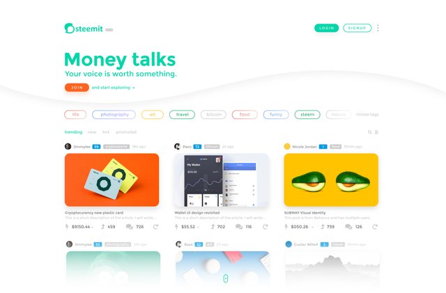
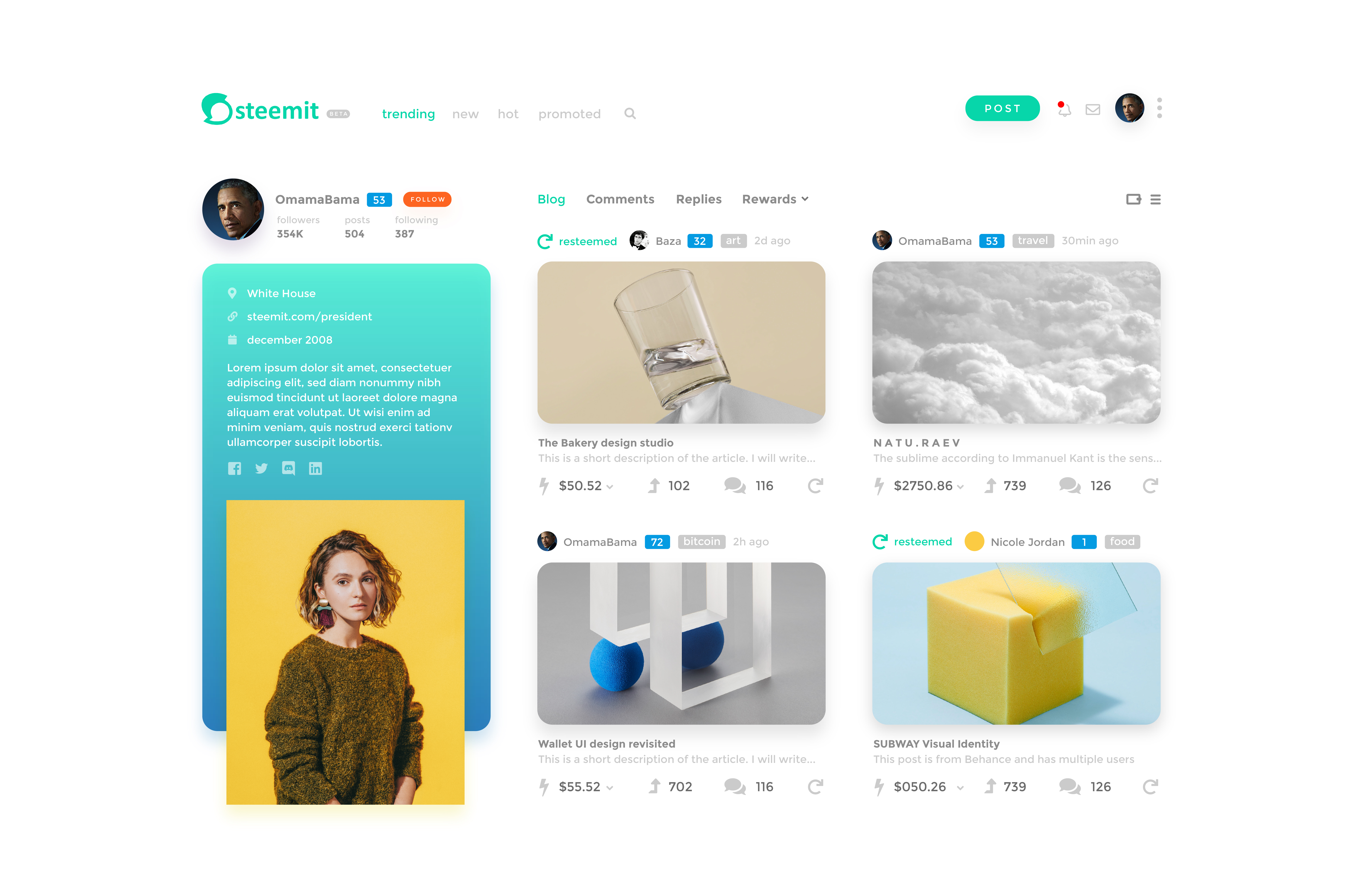
As a designer, I wanted to help in any way the Steemit team, even if it's just with a little idea. So I decided to put my skill to work and after 3 days this is what I've come up with. I'm sure the developers had already planned a great UI but as I mentioned early, this is just how I see it :)
Homepage

Profile page

Let me know your thoughts. I will take the all the feedback with an opened mind and heart. Also if someone from the steemit team needs the files I will share them for free.
Check the full res project: http://verii.co/portfolio/steemit-ui/
I'm the author of the design and layout but I hold no credit for the beautiful pictures used to simulate these images.
Credit to all the creators on Behance.
Super clean design, it looks beautiful. However it makes it hard to scan a lot of posts quickly and find the one I'm interested in. Maybe include a toggle to switch between grid and list view.
@deadbolt thanks a lot, mate! Actually, if you look on the left side near the magnifier icon there is a icon for that :)
Excellent work!
Thanks buddy! Glad you liked it
Cool ideas @lucandrei !
Have you checked out Utopian.io? You’ll be a natural there! @flauwy has awesome tutorials and videos on how to get into things there.
dudee! thank you so much! I will check those links out for sure. I wish you a wonderful day @drkent !
Likewise!