Mariner Painting Development
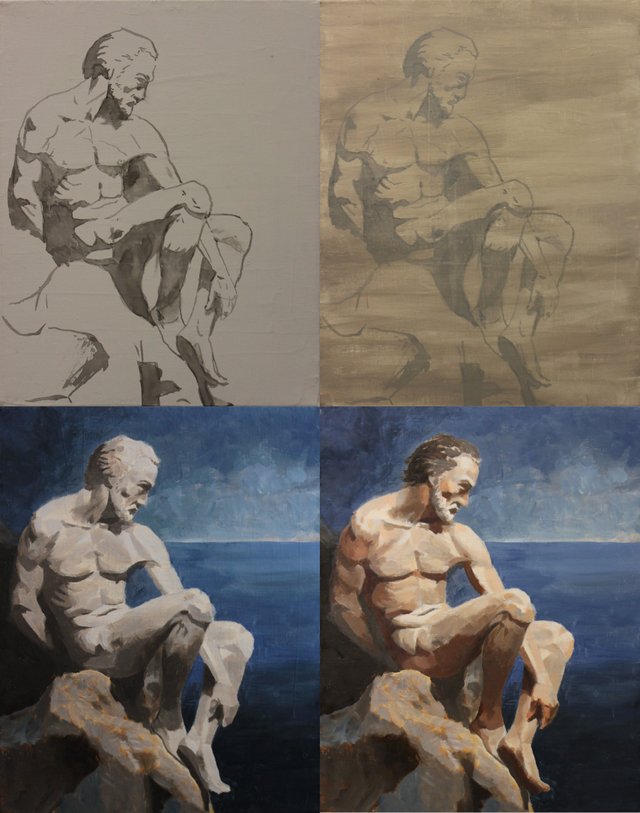
I did things a bit differently this time around. I marked out the drawing on the canvas in ink rather than pencil and I also blocked in some of the shadows to force me to concentrate on the values of the painting. While the ink at first appeared to be to stark, once I put the imprimatura over the ink, it subdued it rather nicely and provided an excellent beginning for the painting. After that the process was reasonably standard.
As you can see I progressed to the grisaille again paying attention to the values. My focus with this painting was to keep my values in correct relationship. I had finally come to realise, it was this aspect that was incorrect in many of my earlier works.
Some people put a great deal of work and detail into their grisaille, but I keep mine rather loose because a good deal of that detail is going to be lost in the following layers. Secondly, I'm a bit impatient and am trying to work as directly as possible.
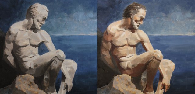
When I commence with colour, I am still working in a blocky fashion, but a bit more definition is starting to be added. I was attempting to place blocks of colour next to each other and avoid blending as much as possible. However, this requires a very good eye for the selection of colour in relation to the values. You can see I was off in a few places, but I feel I didn't do too badly. I figure practice makes perfect.
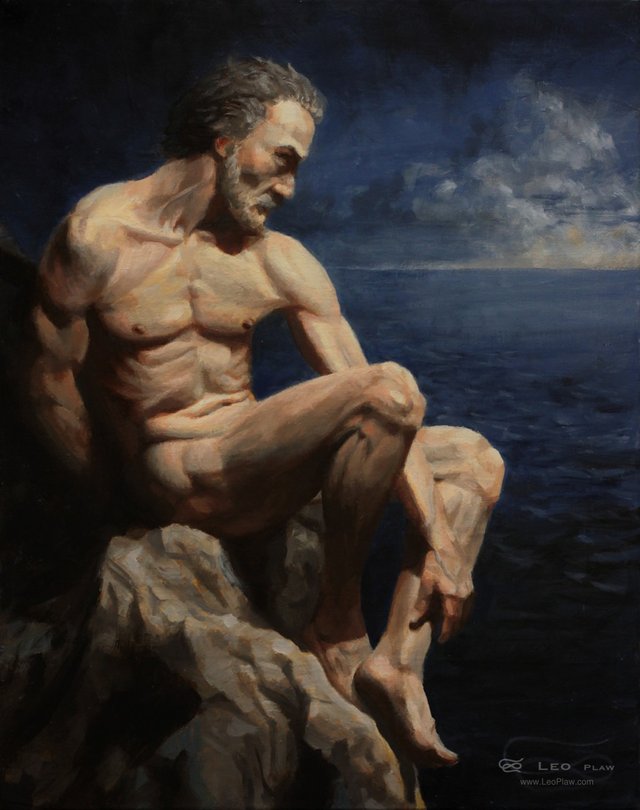
The final painting took on a bit more polish and detail than its beginnings. I'm still experimenting with doing time lapses of my painting process. Perhaps one day I'll be publishing some of those for you to look at.
Leave a comment below, upvote and resteem if you like it.
More of my artwork can be found on my website. LeoPlaw.com
And if it takes your fancy, subscribe to my newsletter.

So I'm looking but I still have no idea what you are talking about or doing. But everything from the beginning looks pretty good to my not-having-a-clue eye and the end result looks awesome XD
Thank you @ryivhnn! This might help you.
I love how the rock face and the musculature mirror one another. Another great piece in the making.
Thank you Donna!
I've said that I like this one many times but I'll say it again XD This is a very nice painting, @leoplaw ! I still love how you capture the lights and shadows in the twists and contours of the body's limbs... And I love the touch of life and redness at small parts of the figure. Specially on his hand, knees and cheek. They bring life !
Also love the sunset at the far, far distance, and the deep, dark blue sea, so calm and endless * ___ *
Thank you @veryspider! Yes, the hints of red on certain parts of the body are important. Skin is never one uniform colour, but has many subtle warm and cool variations.
This post was shared in the Curation Collective Discord community for curators, and upvoted and resteemed by the @c-squared community account after manual review.
Thank you!
ohh very amazing paiting and art have a great day
Thank you!