How I made my Impression Painting🎨 What is Impressionism? 🎨 Studying Further 🖌️ let's learn!
IMPRESSIONSIM
A style or movement in painting originating in France in the 1860's characterized by a concern depicting:
- Visual impression of the moment
- The shifting effect of light and color
Basically, impressionsim concentrates on showing the effects of light on things rather than clear and exact details.
Famous Impressionist Painters:
- Claude Monet
- Edouard Monet
- Vincent Van Gogh (considered post-impressionism)
- Pierre Auguste Renoir
- Edgar Degas
- Mary Cassat
- Georges Seurat
- Berthe Morisot
Lecture by Madoline Dela Rosa
Impression paintings or sketches are artworks that focus more on the effects of light and color in a particular scene or subject which the artist chooses
This is the basic idea I understood from our lecture the other day at Bai Hinang art exhibit art sessions.
My other thoughts:
It needs not to be too detailed this is quite a new thing for me since I am always used to drawing hyper-realism or realistic subjects in pencil. However, this is easier because there are less strokes.
Contrast and lighting should be emphasized the dark and light need to be contrasted, light to dark concept is useful for this style.
It's quick! It is done fast especially if you're copying a nature scene or chasing the natural effects of light on an outdoor scene.
There's no hard and fast rule on how to do it although, some elements of art still apply. Personally for me, art is art, so the elements and principles will never change. Some techniques and methods do but in general it is a process that remains unchanged when making art.
These are what I learned as I experienced painting it.
I want to read more! And discover more!
I want to know what other things I can find out about impressionsim like tips and works of artists.
My Art
Bai Hinang art workshop activity, Felcris Centrale, Quimpo Boulevard.
I'm very happy to have made this.

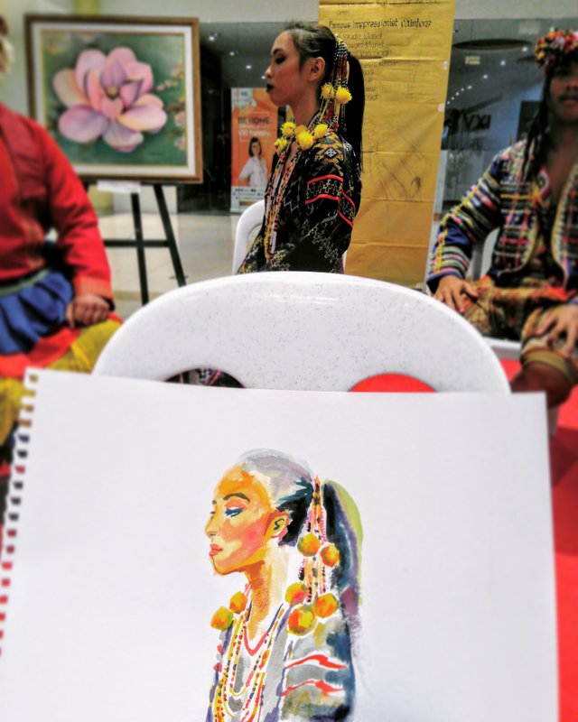
This is my Impression painting
Title: Impression No. 3
Medium: Watercolor on watercolor paper
Model: Kathara Dance Group dancer in Filipino Ethnic attire.
The workshop is about impressions but my work might seem post impressionistic since it focuses on color but I was aiming for impressions!
I painted this having a live model. It was my first time to paint live and to do impressionsim based on the lecture that was given by our instructor, ms. Dela Rosa.
I made five but I'll just use two as examples for now.
My Process:
Let me share what process and rules I applied in making this piece.
RULES:
🔸LIGHT TO DARK - it is important that every artist learns this rule. Shading and gradient applies too, start light to dark so you can level each shade neatly and avoid errors.
This also includes blending too.
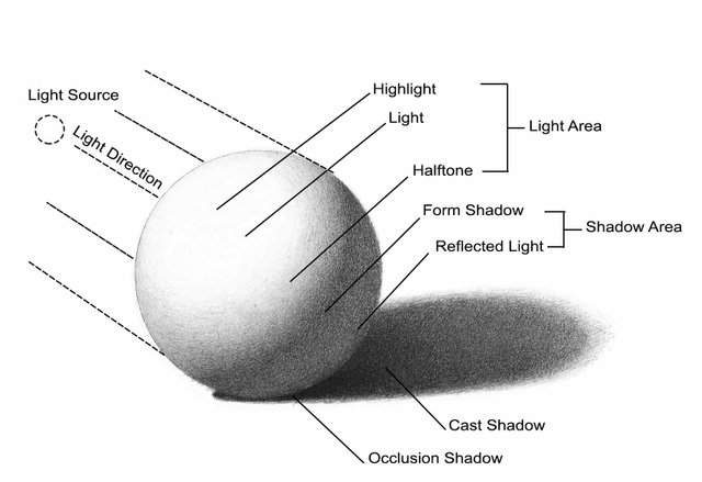
Image source
🔸 COLOR THEORY - The logical use of color. There are certain color combinations that look good together. This is it.
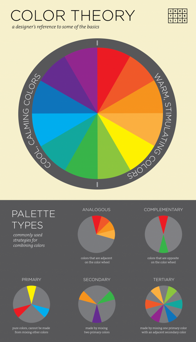
Image Source
As we go on, I will be using some color combinations in my art.
STEPS:
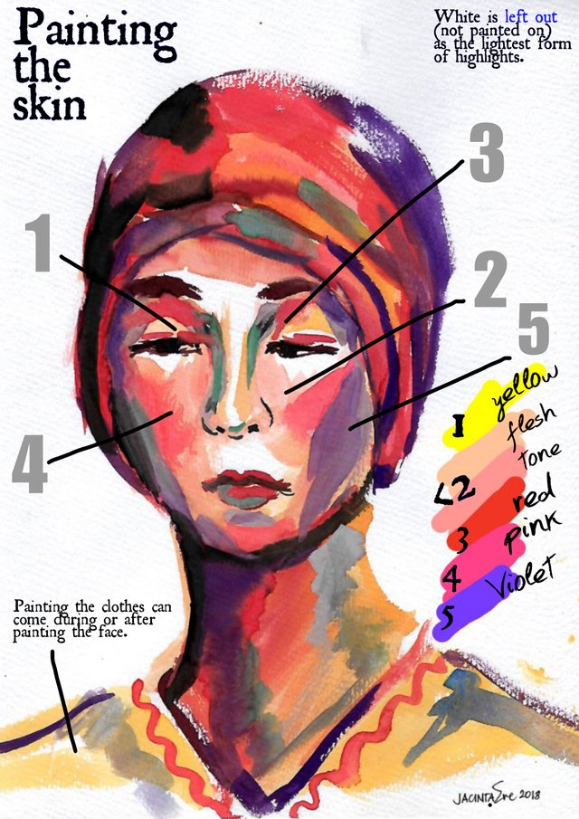
✏️ IDENTIFY SHADOWS, LIGHT and COLOR
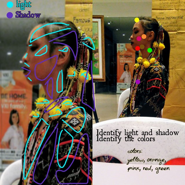
For this first step, it is always to observe your subject meaning we look closely where the light hits the subject and where the shadow is cast.
In my example I have marked the lighter parts with blue and I marked shadows with violet so the distinction is made. This is what we will apply when we are applying colors and light to dark method.
Also there are colors we can observe and we will use those colors to paint the subject. So, there is:
- Yellow - the light is yellow
- Orange and red - natural skin color
- Pink - this accents the red cheeks and make it more feminine and alive.
- Green - green adds more realism and balances the vibrance of warm colors.
- Purple - This will be the base of the shadow for darkest parts.
- Brown - commonly brown is dark shadow of orange.
Skin Tone
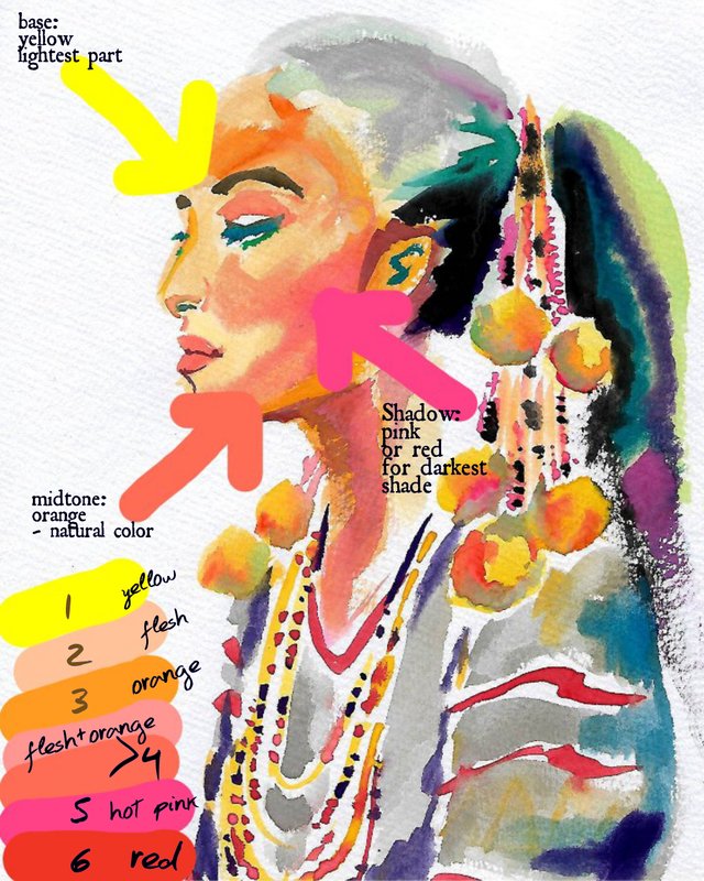
There are three arrows pointing to the face. Yellow, orange and red which serve as the base, midtone and shadow. Skin is reddish.
If your watercolor palette has flesh tone premix then use it. If none, mix white+yellow+red+a little green.
Notice how the yellow parts are lightest (where the light touches the face) then the dark parts are red and (you can add) brown.
Pink adds an accent and femininity to the shades. Impressions can be lively and colorful and that's what I am trying to apply here.
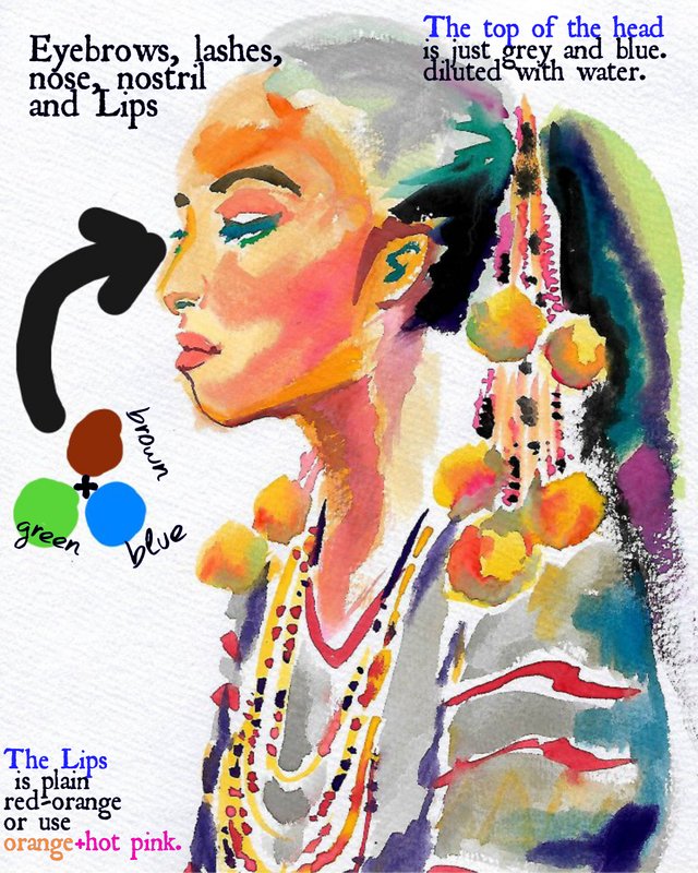
Why aren't the brows and lashes and nostril not black?
I used blue and green and some brown to draw the lashes, brows and the nostril because the light is supposed to be bright over her face so anything thats black under strong light tends to be lighter.
I used green and blue to make the colors stand out. Green and orange(skin) are split complimentary colors. So they make each other pop out.
Using black sometimes creates a hole like effect to the paper, so using dark shades of blue, green or brown will be enough.
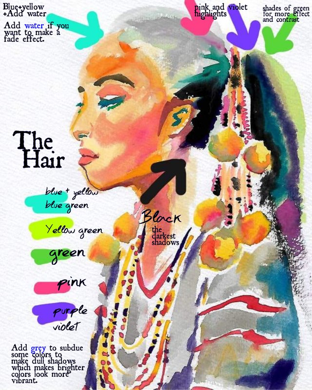
Why is the top of the head so pale?
See how the top of the head becomes white or very light when the light hits black hair, this is what this effect represents.
That is sky blue paint but it mixes a bit with some yellow that I put so it becomes green.
So the rest of the hair is green, brown, violet and black. I added some pink on the hair to accent the violet and add some design.
The head dress
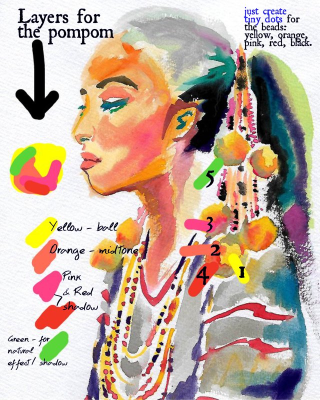
The head dress has beads which you can just place some dots. It does not need to be too detailed but rather use colors and lighting effects to present your subject.
The pompoms are important though. So here, we use layering.
- First make a yellow ballm flat and round just paint it!
- Add some orange around the outer parts of the pompom, this created the image that the ball has more roundness.
- Add red to emphasize its spherical shape, of course the bottom of the sphere had the most shadow.
- Pink color to add accent and more liveliness. It also helps add distinction to the shape, variation of color helps separate depth from one another. This way, the gradation is better shown.
- Green to add some realism or shadowy effect. In the painting the wet on wet paint creates a grey hue but that's just okay because shadow is grey!
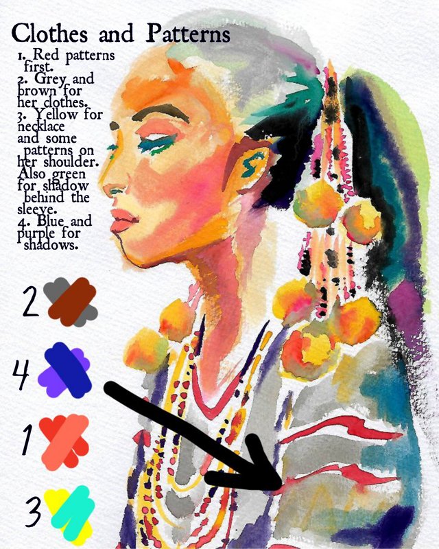
Remember, not so much details
The exercise here is about lighting effect so here I've emphasized just the grey clothes and purple and green shadows.
My color scheme repeats through all the processes, always yellow, orange, red green and pink.
Finished
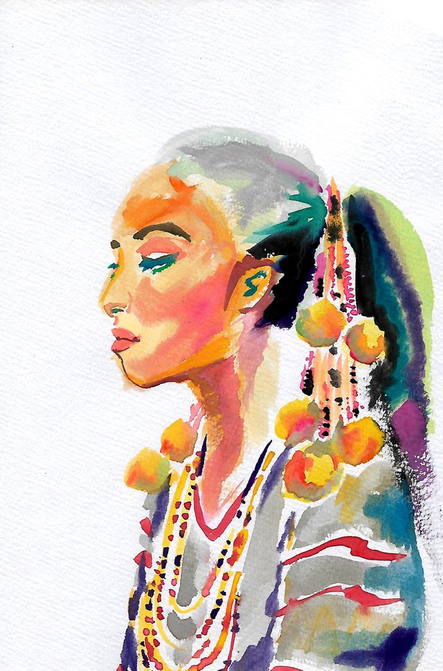
I only used black with the hair and lining the bottom of the chin thinly as it is the most dark area where theres least light.
Using black sparingly helps your art to float and not look too dull as this impression is supposed to be a colorful one.
NEXT
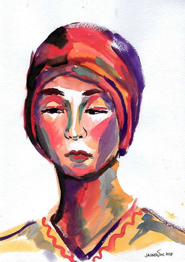
Title: Impression Painting No. 5
Medium: Watercolor on watercolor paper
Steps
Shadows and Light
I've identified the dark and light areas which I will follow in painting. Remember that catching the likeness of the person is important even if it's not detailed.
Shadows and light define the form and shape of the face so it is very important to color in the right hues and create the right flatness or bulge effect to cheeks, eyes, nose and all other parts.
I've also chosen to darken the colors and make it reddish because in person that's the dominant color.
The face
I started out with the yellow and flesh tone. So values 1-2-3 are the first colors I used to form the shape of the face. Leaving out some areas on the eyes, nose and mouth blank with paper white. That's called leave out method.
Then slowly using darker hues to slim out the nose and coloring he clothes and turban/hijab.
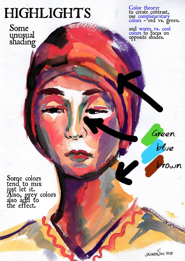
Using other colors like green and grey as highlights
Unusual highlights but it's effective. Using different colors to emphasize shape and shadows is advisable with impressionisms. I thought of using green to compliment red. It sort of came to mind naturally to use it as it is also a cool color vs. the whole face which is mostly warm.
This is the principle of balance.
✔️Principles of design (a part of art basics)
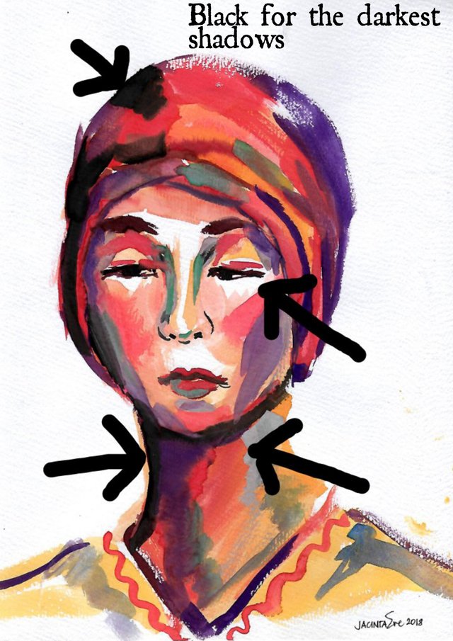
Adding black on one side mostly
Observe how I put black more here. Why?
The womans face was painted with a darker hue with stronger colors. So its shadow must also be darker to make it obvious.
Adding black for the eyes and shadows on the neck come later on.
Finished
I made a few others but these two were the best from all five I made.
My aunt gave me this a few months ago, upon reading it I felt clueless
But after this workshop, now I know why it was meant to come to me. God knows! 🕊️👏👏👏
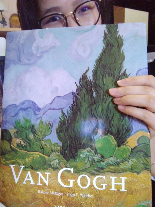
As listed above, Van Gogh is a famous impressionist
His life and struggle as an artist, as well as many other paintings of other impressionists are here.
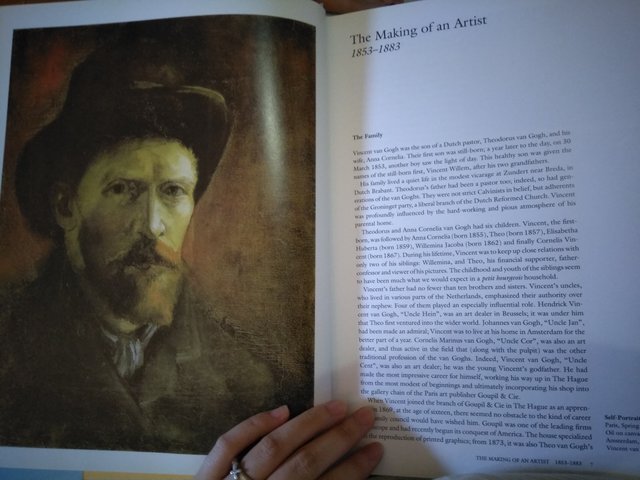
Reading about their ideas and lives are useful for me to gain perspective.
Compiled in the book are art samples and descriptions which I can use to base my future works.
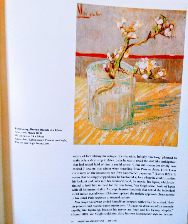
Like in this example, impressionism can be thin strokes or thick. They seem to be random strokes but afar they come together as one piece forming a realistic subject.
6 Tips to Help You Paint Like an Impressionist - CLICK ME!
I found a useful article and let's see what these tips are. You can click the hyperlink and read the detailed article.
1. Use broken color to create the illusion of depth and movement
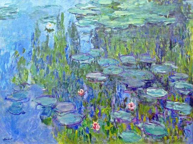
Claude Monet, Waterlilies, 1914
2. Use bold strokes to direct your viewer around the canvas
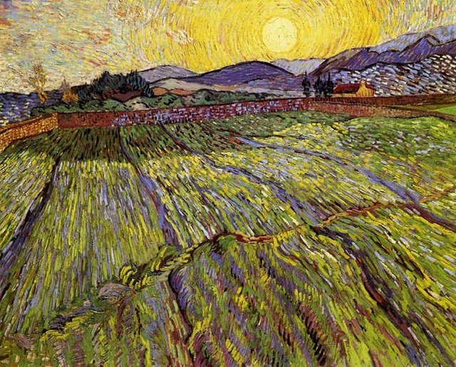
Van Gogh, Enclosed Field with Rising Sun, 1889
3. Use large brushes and try to capture form with as few strokes as possible
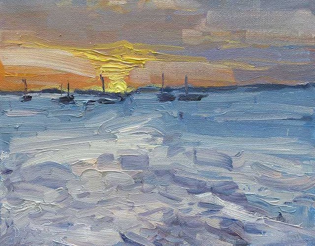
Sunset Study, Kingfisher Bay, Oil 10x12 inches
4. Use your palette knife to create interesting and sometimes dramatic effects
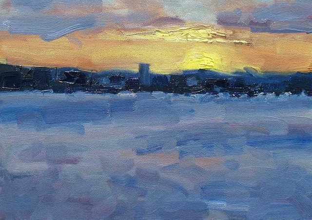
Brisbane Sunset Oil, 12x16 inches
5. Create stunning contrasts between warm and cool colors
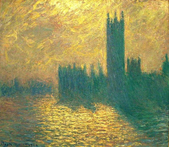
Claude Monet, Houses of Parliament, 1904
Note: the tips with images are sourced from the article in the hyperlink provided.
I read this article after I made my paintings. How many tips was I able to do? I think 1, 4 and 5.
Try everyday subjects
My instructor suggested I practice nature subjects, maybe landscapes, plants and trees and still life. Minimal strokes, color contrasts and flow and the feel of the moment.
Can impression be live painting/sketch or in pictures?
Both!
Long ago, people couldn't capture moments but with our technology today, we can.
Some photos came to mind when I think of doing some practice
My pictures ©️
I am so ready! 💪
Most artists do realism and portraiture, anime, surrealism, I think impressionism is refreshing.
Much more interesting than other styles since it is a vague art process to express a vivid scene in art.
If you happen to paint, maybe you can make an art style like this.
Give impressionism a try!
You might like it!
🌍🌎🌏
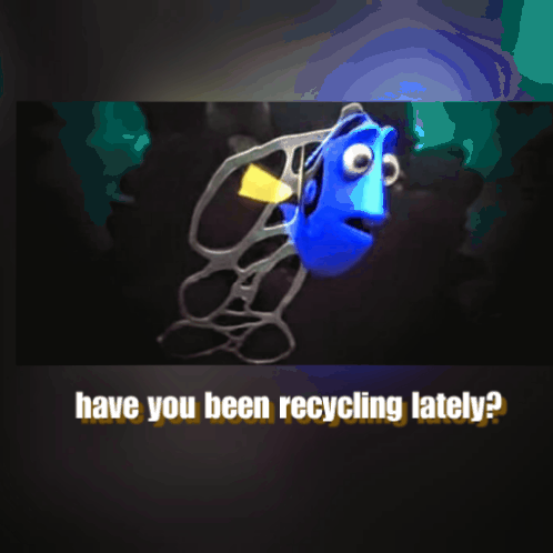
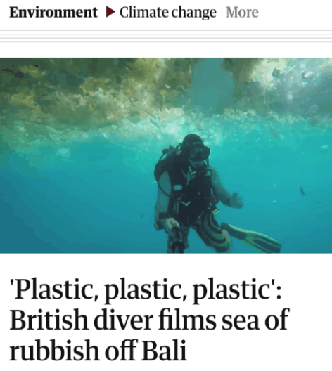
THE ENVIRONMENT CALLS FOR YOU
HELP SAVE HER ♥️✨🕊️
Follow me to be updated with news on environment and animals. This includes:
Daily updates
Petitions
Donations
For all animals and the environment.
WE DO NOT INHERIT THE EARTH FROM OUR ANCESTORS, WE BORROW IT FROM OUR CHILDREN
🌏🌎🌍
😱IT IS IMPORTANT TO VOTE FOR WITNESSES☝️
I recommend these
@steemgigs
@blocktrades
@precise
@cloh76.witness
@ausbitbank
SOME AWESOME BLOGGERS
You don't want to miss😉
@gems.and.cookies
@anomadsoul
@surpassinggoogle
@bayanihan
@topkpop
@sirsensei
@hiddenblade
@juliakponsford
@juliank
@bayanihan
@deveerei
@korinkrafting
@fukumineko
@vocafrost
@noellesevilla
@kneelyrac
@sukiyakii
@sethlinson
@helene
@mattphilleo
@deemarshall
🦄✨❣️🌼
Proud member of
#steemph
#artguildph
#untalented
#steemitachievers
#steemitbloggers
#gratefulvibes
#steem-cartoon
That's all folks!
XOXO 💋
@jacinta.sevilla


Join us @steemitbloggers
Animation By @zord189
Hi jacinta.sevilla,
LEARN MORE: Join Curie on Discord chat and check the pinned notes (pushpin icon, upper right) for Curie Whitepaper, FAQ and most recent guidelines.
Thank youuuuu!!! ♥️♥️♥️♥️♥️♥️♥️♥️♥️♥️(+_+)
beautiful blog with various paintings.
Thank you for viewing my post!
great watercolour art! Very clear explanation! A lot of useful information!
Thank you so much! :D I'm pretty excited to make some more with more natural colors and some landscape too.
Awesome illustration and explanation on impressionism!
I have been seeing you post these updates regularly and is awed by your artistic talent!
May you always find inspiration and share your art and advocacy.
Thanks @maverickinvictus
:D JUST KEEP STEEMING!!!!
Want to make a difference see :) 💪
Wow Amazing didn't regret joining you in one those art sessions.
You should keep practicing and posting. Share your latest self portrait 😉
Thanks! ♥️♥️♥️
Great art
Thank you
Thank youuuu
Congratulations, Gwapa! This is very informative. I ma also trying to do impressionism while learning the beauty of acrylic. ✨ Thanks for sharing!
Yes acrylic is nice! And it forms textures too! Go go go
salamat din 💋
Very informative post. The impressionism began with the picture of Claude Monet name is impression sunrise. He wants to establish his scientific thought by making several painting on one subject. He painted Rouen Cathedral at different times of the day. The purpose was to focus on that different light-shade can make a subject different in several time. And that was the great revolution of art. Dear friend @jacinta.sevilla, I feel strike from your post and it is my little contribution.
Wow great information thank you so much! :D
Interesting. Ill add that to my next post :D
Congrats for another curie sana kami naman ni papa mo macurie hehe.
Salamat po :D try mo po yung post na sobrang haba haha tapos yung madaming tips and learnings.
Wonderful artwork @jacinta.sevilla
Great explanations
Happy to find your artistic works via steemit
I've followed you
Keep in touch and keep the inspiration flowing thru your paitings
Feel free to enjoy some music of mine that i've posted thru my blogs
Regards @jacinta.sevilla