Achievement 4 by @hocus-pocus47

Image & Text Alignment
Like in the above, the image is beautifully centred. It can be placed on the left or right as seen in everyday blogs. This is not only for images but for text as well.
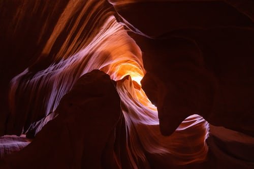
This is one pretty image.
It's the inside of a very large cave.
More text goes here just to keep up apperances.

This is achieved by using this code like so.
The same procedure is used for the image on the right. The only difference there is you'd have <div class ="pull-right">
Headings
To make a heading you only need to put "#" or the octothorpe (hash symbol) at the beginning of the line then add your text. There are 6 headings; using one "#" gives the first which is also the biggest and using 6 of "#" gives the smallest and the last. I'm sure you've figured out how the others too work by now. So we have:
Organ
Tissue
Cell
And is done by
Headings are usually centered and to do that you simply need to use this code; "<center> Your text goes here </center>". A good example is the first heading in this post.
Styling Text
You can bolden a text by placing it in between "** **" or "<b> </b>".
A text can be italicized by putting it in between "* *" or "<i> </i>".
To achieve a typewriter font place your text in between "``".
For strikethrough; "~ ~".
And for subscript and superscript you use "<sub> </sub>" and "<sup> </sup>" respectively.
Tables
Table creation is quite fun. It looks like stacking virtual blocks in my opinion and you'll soon see why. Below is a table that shows what I generally do at a point in time each day.
| Period | Function |
|---|---|
| Morning | Chores |
| Afternoon | Anime/Movies |
| Evening | Texting & Browsing |
And this is how it looks
Links
To create a link for an image or anything, you'd first need the link address you'd want to go to and put that in parenthesis. Now you enter whatever you'd want to serve as the click point (not sure if that's a term😅) and put that in square brackets. I'll put down the link to my introductory post as an example.
I'm pretty sure you'd want to know me, click here to know more.
The process to get our link in there now looks like this
For the post to look as it is, I had to justify it by using this code
So now it looks like this
Instead of
This makes one naturally enjoy watching or reading your posts because it has some uniformity to it.
I want to thank the #newcomerscommunity and @cryptokannon for the knowledge and motivating me to learn and know more about the intricacies of Steemit as a whole and enable me fit in.


You have been verified for this task and you may proceed to the next achievement task at your convenience.
Note:
Curators Rate: 3
Please continue to read and prepare from @cryptokannon Achievement tasks resources
Thank you
Hi, @hocus-pocus47,
Your post has been supported by @nattybongo from the Steem Greeter Team.
I appreciate it
Very nicely done. Keep steeming.
Thank you😁