Graphics Design Tabloid 01 -- Blockchain Saturday Logo.
Recently with the help of a friend, Alison, I was able to complete a logo set and a new banner for a blockchain startup. I'll like to store the details used in the design on here for referential purposes in the future.
I've been playing a lot lately with online graphics design tools such as canva.com, snappa.com, etc, in a bid to master them. While they're not exactly what a professional graphics designer would choose, these tools are great for beginners who want to get work done pretty quickly.
Here's a list of the tools I use currently. I shall be updating them as I discover more.
- Canva. -- https://canva.com
- Image colour picker -- https://imagecolorpicker.com
- Snappa -- https://snappa.com/app
- Flaticon -- https://www.flaticon.com
- Logomakr -- https://logomakr.com
- Figma -- https://www.figma.com
- Screely -- https://www.screely.com/
- Photoscissors -- https://online.photoscissors.com/
- Vectr -- https://vectr.com/pangoli super cool, no blurs.
- Pixlr -- https://pixlr.com/x/ good interface with shitty fonts.
- Infogram -- https://infogram.com/app/#/library Not tested.
Blockchain Saturday Logo and Banner Design
For the first design, I remodeled the #BCS #blockchainsaturday logo.
These are the icons used.
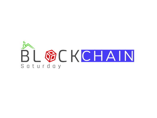

The rectangle underneath the "CHAIN" can be interchanged between blue, black and white, which are part of the colours of the brand. The colour eventually picked will depend on the overall theme of the design and the colour of the text.
For example, for creating an image with a dark background, the chosen text for the logo will be in white so it can be visible. The rectangle underneath the "CHAIN" can either be white or blue. Black won't work because the background of the image will be dark. we want the logo to stand out.
Also, the cube chosen to replace the letter "O" in "BLOCK" has to be picked based on the colour theme of the design too. The red cube works really nicely on a white background while the gold cube fits on a dark background.
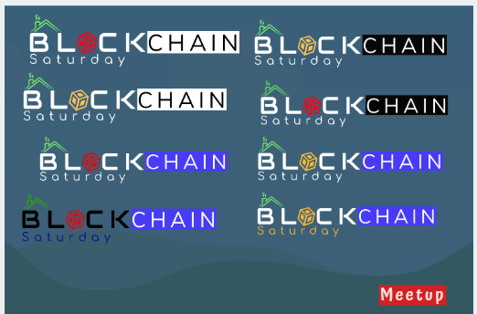
In general, I created only four logos, leaving out the icons (cubes, roof, and the rectangle). This is to allow flexibility when working on the logo. They are
- All white texts -- Where the Block, Chain, and Saturday are written in white texts.
- All black texts -- Where the Block, Chain, and Saturday are written in black texts
- Black and white texts -- Where Block and Saturday are written in black, and Chain is written in white.
- Black and white texts -- Where Block and Saturday are written in white, and Chain is written in black.
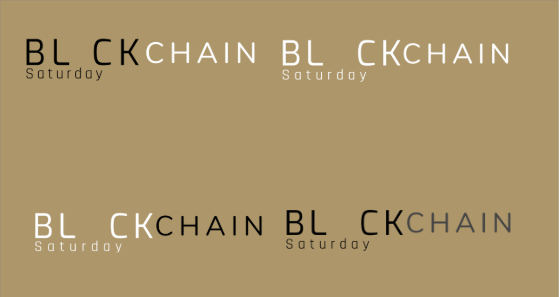
Every other sampled logo can be worked out using these 4 standards. The app used for the logo: Snappa.com.
Font Scheme
Text: Block.
Size: 117
Font: Exo
Letter space: 16Text: Saturday.
Font: Rajdani
Size: 50
Letter space: 17Text: Chain.
Font: Nunito
Size: 96
Letter space: 15Text: Meetup and Theme.
Font: Atma medium
Font size: 17.8
Font transparency: 91
Red background Colour: f41515
Colour scheme
For white backgrounds
Blue - 473bf6
Black - 000000
Red - da0c11
Green - 2fa609For black backgrounds
Brown: ffb932
Block: white
Chain: white
Blue: 473bf6
Green: 77f370
It should also be noted that the first font I used for the BLOCK was a font called Audiowide. I found it on Logomakr. It, however, didn't exist on Canva or on Snappa so I had to settle for EVO.
After all the logos were created, Alison and I collaborated on Canva.com to come up with the following designs.

.png)
Suggestions?
Congratulations @globinhoods! You have completed the following achievement on the Steem blockchain and have been rewarded with new badge(s) :
You can view your badges on your Steem Board and compare to others on the Steem Ranking
If you no longer want to receive notifications, reply to this comment with the word
STOPDo not miss the last post from @steemitboard:
Vote for @Steemitboard as a witness to get one more award and increased upvotes!