Making An Album Cover Ourselves // PART 5 // Designing The Packaging

Part 5
DESIGNING THE PACKAGING
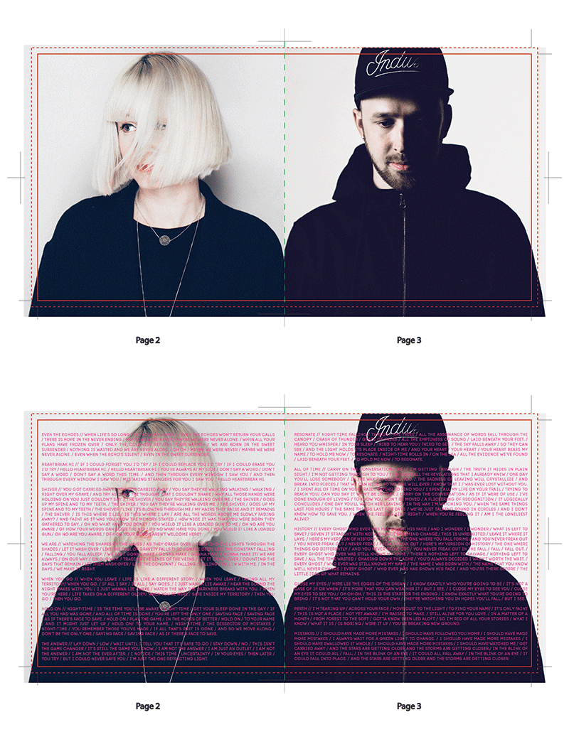
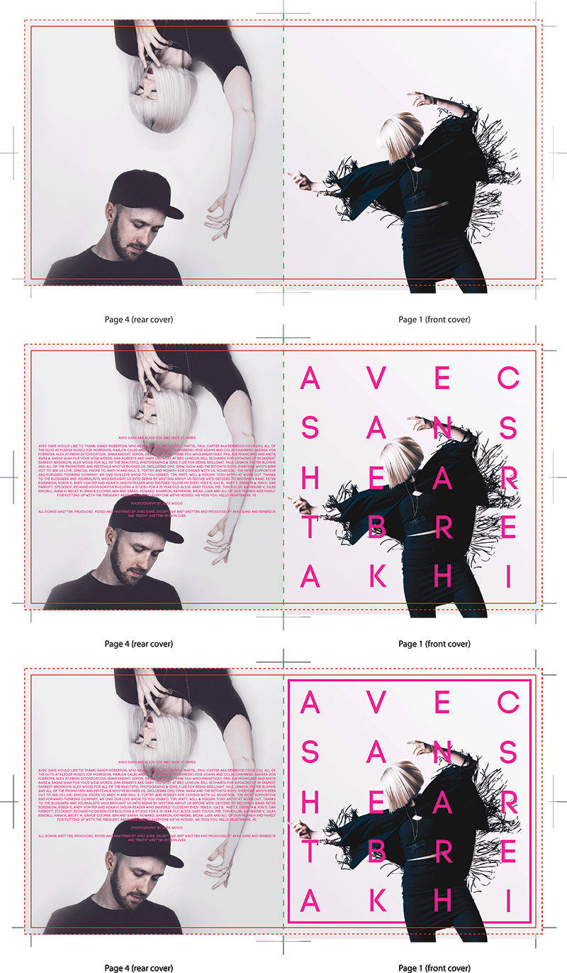
We now had exactly what we needed to start making the cover. From here on was fairly straight forward. We created a new file with the exact guidelines for the CD & Vinyl packaging. Using the band font we started adding in the various text layers and aligning them one by one. With the images of us being cut out we could create a slight pink to white gradient as a background and match the font colour to it. It was a case of fiddling and adjusting until it all felt right:


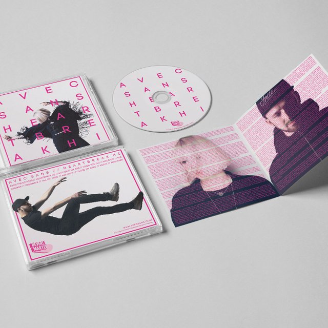
And there you have it! Finished artwork
So with a bit of DIY effort from us and the kindness of talented friends helping out, we had total creative control over our album art work.

Great post and nice design!
You guys have the right approach. Who knows best what visuals should represent them, better then the artists? When I do a project, I want to be involve in every step. Creative control must be cherish at all time. Ok now can we hear some?
Exactly. It's all about being indie these days!