#CLUB5050 - Concepts That Will Make Your Logo More Attractive (Design Blog)

Hello Guys, !!
Come back with me @atim1234
With that busy life I can't make posts as diligently as possible, but this time I want to share more tips with all of you about "Some Concepts That Will Make Our Logos Look More Memorable". What concept is that?

Let's Discuss
As I have discussed a lot, the logo is one of the most important things to pay attention to in a business, therefore, every business tries to make the logo as attractive as possible to make it more attractive.
Therefore, a logo will be more attention-grabbing if it is designed properly, and if it is wrong or even poorly designed, then get ready for your customers to run away from your business.
And here, I will share some Inspiration Logo Ideas that will be able to make your business logo more creative and of course more attractive

Logo With Product Purpose Concept
source image
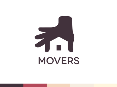
As in the "MOVERS" logo above, the hand icon that shows visually that this is a business that can help us for housewarming purposes.
And this is clear, a very interesting concept by just looking at the logo, people will know what the purpose of your business.

Element Repetition Concept
source image
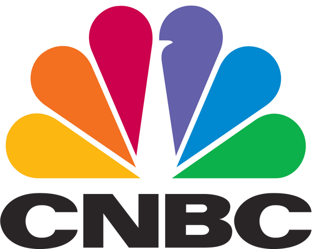
The CNBC logo is one of the logos that uses this concept very interestingly, repeating the basic elements that make up the peacock, and that way this logo will be easy for users to remember, and of course it will also be more interesting to look at.

Concept With Visualization Of The Meaning Of The Words In The Logo

source image
This is an interesting logo concept in my opinion and not just any logo can represent the nature of the meaning of the words in the logo.
As in this very creative logo where the letter S in the “Ilusion” logo is designed as negative space that forms like an illusion.

Logo Concept Combination of Objects and Words.
source image
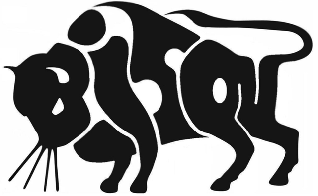
A logo with this concept will form all the words that are designed to form the items that represent it, such as the Bison logo, this is an interesting concept where the word BISON is set to resemble the shape of BISON.

Logotype Concept
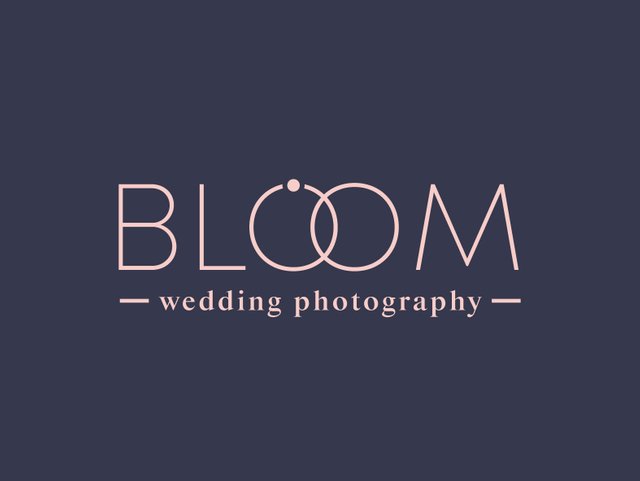
Not all logos require objects or images to represent them, there are also logotypes that only use "words" to represent the logo
source image
Like the example of the "Bloom" logo above, where this logo has a very interesting concept, by utilizing the two "O" letters in the word "BLOOM" and forming a pair of rings.

Well, those are some logo concepts that I think are very interesting that you can apply to your logo. Which logo concept do you like?
For those of you who need a logo,
You can contact me below !!!

Hopefully Helpful, Happy creative!
Thank you

Best Regards To :
@steem.skillshare
My social media
Instagram : https://www.instagram.com/abenk_bolang21/
Facebook : https://www.facebook.com/abenk.bolang21/
Twitter : https://twitter.com/abenkbolang
Email : [email protected]
Join Our Discord

50100200300400500
10002000300040005000
10000

Hello @atim1234, This is my personal opinion and suggestion that you could have emphasized the concepts used in each logo, that way readers will know what concept was used and how they can incorporate that concept in their own logos.
Yes, I will discuss many things about graphic design, and this is just a small start and I will share posts both tutorials related to design tips, and I will do when I have enough time to make posts like you asked.
I am not asking you to post a tutorial in my comment. I am just trying to suggest that you could have emphasized the part where each logo's concept was shared. Like you could have made it bold, so that users can see the concept clearly.
Ohhh, isn't it obvious in the sample image I shared?
If it is so obvious that a person can get the concept by just looking at the logo then what is the point of sharing such a tutorial? If you have shared the tutorial then you should make it such that even beginners know what you are talking about.
Why are you snobbish? You're the only one who doesn't understand the context of what I'm talking about
Congratulations, your nice post has been upvoted by the steem.skillshare curation trail!
please check out this post:
steem.skillshare curation trail post to get infos about our trail