You are viewing a single comment's thread from:
RE: SLC21/WK2: Introduction to Logo Design
Did you try using a serif font for your tagline to see the result?
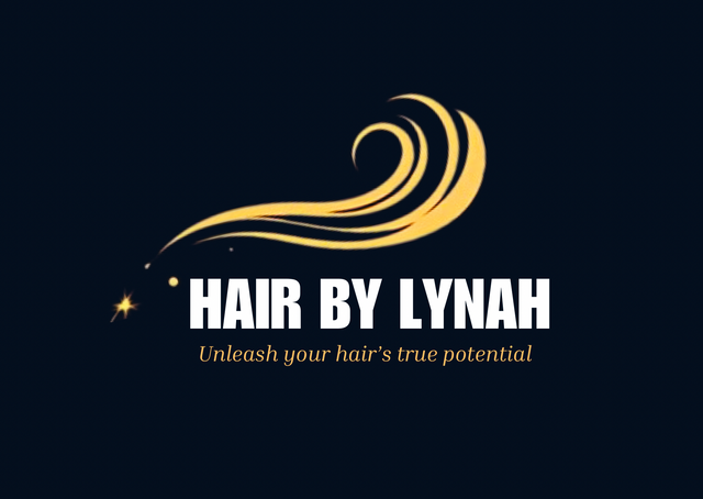
I just tried it now and the result looks great compared to the previous font I used. I changed it to inria serif font then clicked on italics icon to italicized it , see the result;

if you ask me to choose between the one you used for your cover image and the one you designed as practical, i think i would go for the first
Same here, the one on my cover page is more preferable to me. It’s more classy and calm with perfect color combinations.
Thank you for the review sir!
Smiles...am glad you love the result, we keep exploring, design has no limit, creativity is all in your mind, keep stretching. Thanks for your participation.
Yeah, it’s beautiful, I like the second outcome. Thank you so much for being a patient teacher 🙏🏻