Python Playground #2 - Crypto-analysis of Bitcoin, Altcoins and their correlations using Heatmap

Hi guys!!....
This is in continuation of the tutorial series "Python Playground".
View Part 1 in Steemit
View Part 1 in Utopian
In this tutorial session, we will analysing the cryptocurrency markets using Python language. There are so many cryptocurrencies around and we need to analyze the markets properly, otherwise we end up losing millions of investment.
The charts we will plot here are as follows:
'BTC price of single exchange i.e. Kraken' vs 'Date' - Here, data is fetched from Quandl API.
'BTC price of multiple exchanges' vs 'Date' - Here, data is fetched from Quandl API. It provides the BTC price data for many different exchanges. FYI, there is a support for converting into other fiat currencies.
'Altcoin's price' vs 'Date' - Here, data is fetched from Poloniex exchange. So, it provides many Altcoin's price data.
A heatmap of top 10 cryptocurrencies with each other - Here using the Poloniex exchange's price data, we will plot a tabular heatmap.
Note: All the plots in this tutorial is done using Plotly. Unlike Matplotlib, it's very modern and consists huge dataset which can be fetched using plotly API. Also, it is getting widely used in many tech companies because of its ability to plot complex charts using simple codes.
So, in order to do that we need to install few Python-based tools.
Installing tools
We will be using Anaconda for accessing the features.
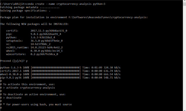
Create a separate environment. It's not necessary but recommended so as to avoid conflicts in case of multiple type of projects running in a PC/ laptop.
conda create --name cryptocurrency-analysis python=3
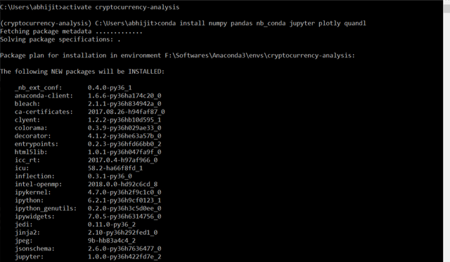
Now, enter into the environment so as to install the required libraries.
activate cryptocurrency-analysis
and then install the tools using
conda install numpy pandas nb_conda jupyter plotly quandl
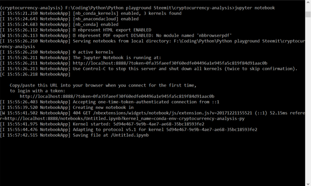
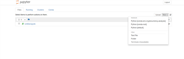
Open the jupyter notebook in your directory (where project files are to be saved)
Usejupyter notebook
Now, when the notebook opens, choose the correct shell (where all tools are installed)
After choosing the "Cryptocurrency-analysis" notebook it opens like this..
Coding
- Import the libraries -
Pickle is used for serializing and deserializing the bytes of data into a file.
Quandl is used for accessing data using languages - Python, R.
import os
import numpy as np
import pandas as pd
import pickle
import quandl
from datetime import datetime
Plotly is used for plotting the charts.

Plotly's offline mode enables to upload the charts into the server (one should have account in plotly) later.
The code is as follows:-
import plotly.offline as py
import plotly.graph_objs as go
import plotly.figure_factory as ff
py.init_notebook_mode(connected=True)
- Now, to download the data, use Quandl -
the code snippet of helper function is as follows:
def get_quandl_data(quandl_id):
    #changing the name from 'BCHARTS/KRAKENUSD' to 'BCHARTS-KRAKENUSD'
    cache_path = '{}.pkl'.format(quandl_id).replace('/', '-')

    print('Downloading {} from Quandl'.format(quandl_id))
    df = quandl.get(quandl_id, returns='pandas') #downloading the data from quandl_id using Quandl

    # Saving the file as .pkl format
    df.to_pickle(cache_path)
    print('Cached {} at {}'.format(quandl_id, cache_data))
    return df
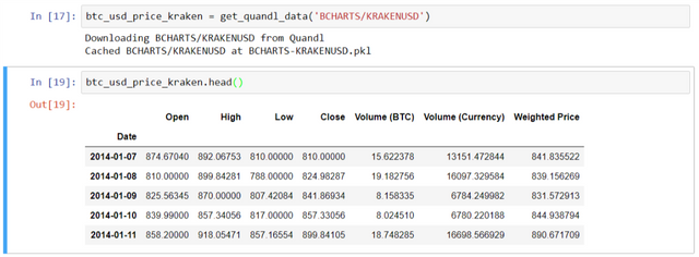
Downloading the data using the command below:
btc_usd_price_kraken = get_quandl_data('BCHARTS/KRAKENUSD')
View the dataframe as follows:
btc_usd_price_kraken.head()
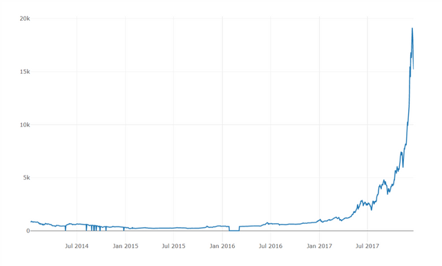
Next plot a simple chart b/w 'BTC price' and Date:
Code snippet:
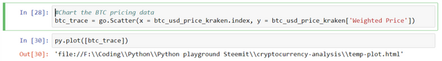
#Chart the BTC pricing data
btc_trace = go.Scatter(x = btc_usd_price_kraken.index, y = btc_usd_price_kraken['Weighted Price'])

py.plot([btc_trace])
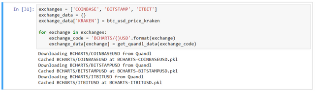
- Now, pull the data from more than one exchange -
exchanges = ['COINBASE', 'BITSTAMP', 'ITBIT']
exchange_data = {}
exchange_data['KRAKEN'] = btc_usd_price_kraken

for exchange in exchanges:
    exchange_code = 'BCHARTS/{}USD'.format(exchange)
    exchange_data[exchange] = get_quandl_data(exchange_code)
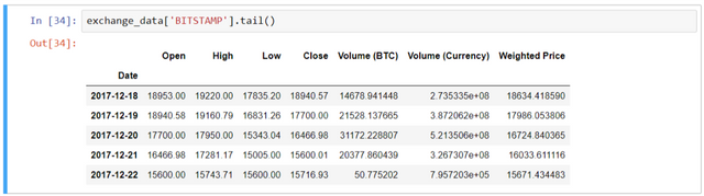
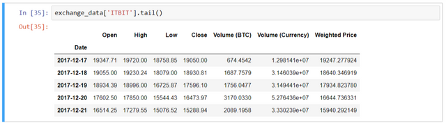
Visualize the data for each exchanges -
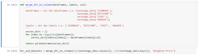
- Merge the Price data of different exchanges into a single dataframe -
def merge_dfs_on_column(dataframes, labels, col):
    '''
    dataframes = all the dataframes i.e. [exchange_data['COINBASE'],
                                          exchange_data['BITSTAMP'],
                                          exchange_data['ITBIT'],
                                          exchange_data['KRAKEN']]

    labels = all the labels i.e. ['COINBASE', 'BITSTAMP', 'ITBIT', 'KRAKEN']
    '''
    series_dict = {}
    for index in range(len(dataframes)):
        series_dict[labels[index]] = dataframes[index][col]

    return pd.DataFrame(series_dict)
# assign the function's output to a single dataframe
btc_usd_datasets = merge_dfs_on_column(list(exchange_data.values()), list(exchange_data.keys()), 'Weighted Price')
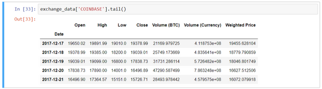
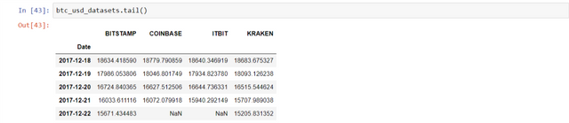
To check the values, use btc_usd_datasets.tail()
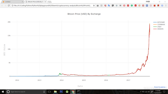
Plot the multiple exchanges price with date.
Use the code below:
btc_trace_bitstamp = go.Scatter(x = btc_usd_datasets.index, y = btc_usd_datasets['BITSTAMP'], name = 'BITSTAMP')
btc_trace_coinbase = go.Scatter(x = btc_usd_datasets.index, y = btc_usd_datasets['COINBASE'], name = 'COINBASE')
btc_trace_itbit = go.Scatter(x = btc_usd_datasets.index, y = btc_usd_datasets['ITBIT'], name = 'ITBIT')
btc_trace_kraken = go.Scatter(x = btc_usd_datasets.index, y = btc_usd_datasets['KRAKEN'], name = 'KRAKEN')

py.plot([btc_trace_bitstamp, btc_trace_coinbase, btc_trace_itbit, btc_trace_kraken])
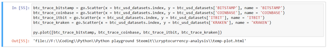
In the chart above, we find that there are values 'zero' for BTC which practically didn't exist. So, replace the values with 'NaN' using the following syntax:
# Remove "0" values
btc_usd_datasets.replace(0, np.nan, inplace = True)
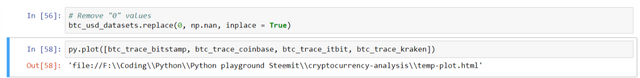
And plot the new chart using
py.plot([btc_trace_bitstamp, btc_trace_coinbase, btc_trace_itbit, btc_trace_kraken])
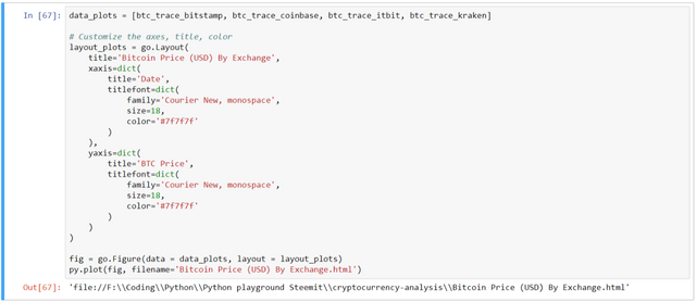
To customize the chart more like adding Title, Axes labels, color, filename ('temp.plot' by default)
The code for plotting the customized chart is as follows:
data_plots = [btc_trace_bitstamp, btc_trace_coinbase, btc_trace_itbit, btc_trace_kraken]

# Customize the axes, title, color
layout_plots = go.Layout(
    title='Bitcoin Price (USD) By Exchange',
    xaxis=dict(
        title='Date',
        titlefont=dict(
            family='Courier New, monospace',
            size=18,
            color='#7f7f7f'
        )
    ),
    yaxis=dict(
        title='BTC Price',
        titlefont=dict(
            family='Courier New, monospace',
            size=18,
            color='#7f7f7f'
        )
    )
)

fig = go.Figure(data = data_plots, layout = layout_plots)
py.plot(fig, filename='Bitcoin Price (USD) By Exchange.html')
Retrieve Altcoin Price data from POLONIEX exchange
Altcoins are cryptocurrencies other than Bitcoin.
We will fetch the top 9 cryptocoins' price data.
And plot the chart - 'price for each crypto' vs 'date' & a heatmap of all cryptos with each other.
- Define helper functions -
Code snippet for 'Helper function for getting JSON data':
def get_json_data(json_url, cache_path):
    print('Downloading {}'.format(json_url))
    df = pd.get_json_data(json_url)
    df.to_pickle(cache_path)
    print('Cached response at {}'.format(cache_path))
    return df
Code snippet for 'Helper function for formatting the Poloniex API and get the JSON data using 'get_json_data' function':
base_polo_url = 'https://poloniex.com/public?command=returnChartData¤cyPair={}&start={}&end={}&period={}'
start_date = time.mktime(datetime.strptime('2015-01-01', '%Y-%m-%d').timetuple()) # get data from the start of 2015 (i.e. 01-01-2015 in timestamp)
end_date = time.mktime(datetime.now().timetuple()) # up until today i.e. today in timestamp
period = 86400 # pull daily data (86,400 seconds per day)
def get_crypto_data(poloniex_pair):
'''Retrieve altcoin's data using Poloniex API '''
json_url = base_polo_url.format(poloniex_pair, start_date, end_date, period)
data_df = get_json_data(json_url, poloniex_pair)
data_df = data_df.set_index('date')
return data_df
Here, the poloniex_pair can be e.g. BTC_ETH, BTC_XRP, etc.
- Downloading data -
Code snippet:
## Downloading the Trading data
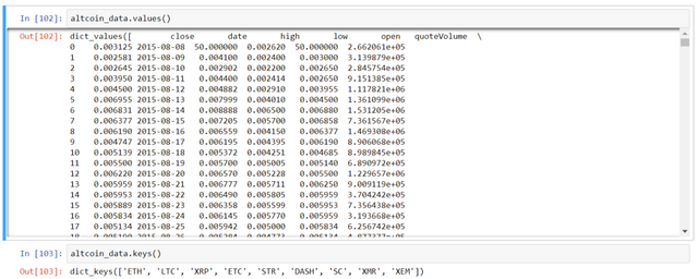
altcoins = ['ETH', 'LTC', 'XRP', 'ETC', 'STR', 'DASH', 'SC', 'XMR', 'XEM']
altcoin_data = {}
for altcoin in altcoins:
coinpair = 'BTC_{}'.format(altcoin)
altcoin_data[altcoin] = get_crypto_data(coinpair)
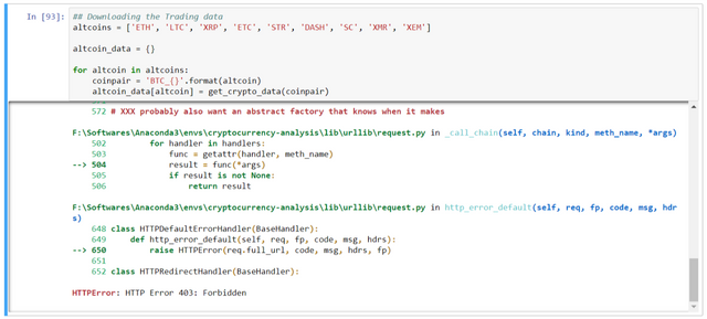
Here, we are actually facing problem in fetching the data. It is due to the reCAPTCHA being asked each time. FYI, it is done for security reasons. Although, this reCAPTCHA issue can be resolved using selenium. I shall cover in another tutorial.
Solution: Either download manually from Poloniex or change the exchange where the data is given without captcha problem.
So, we need to download from the link manually e.g.
BTC_ETH: https://poloniex.com/public?command=returnChartData¤cyPair=BTC_ETH&start=1420050600.0&end=1514125175.0&period=86400
BTC_LTC: https://poloniex.com/public?command=returnChartData¤cyPair=BTC_LTC&start=1420050600.0&end=1514125175.0&period=86400
.......and so on.
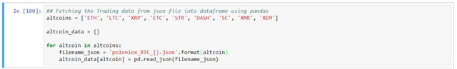
right click and 'Save as' .json format.
Now, in order to fetch the JSON data we will use pandas library.
I saved the file as 'poloniex_BTC_ETH.json' for coinpair - BTC_ETH
Code snippet:
## Fetching the Trading data from json file into dataframe using pandas
altcoins = ['ETH', 'LTC', 'XRP', 'ETC', 'STR', 'DASH', 'SC', 'XMR', 'XEM']

altcoin_data = {}

for altcoin in altcoins:
    filename_json = 'poloniex_BTC_{}.json'.format(altcoin)
    altcoin_data[altcoin] = pd.read_json(filename_json)
Visualize the data using altcoin_data['ETH'].tail()
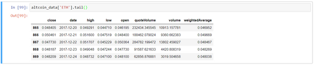
Now we have a dictionary of 9 dataframes (for each crypto), each containing the historical daily average exchange prices between the altcoin and Bitcoin.
- Convert altcoin's prices (in BTC, by default) to USD -
ETH (price_usd) = ETH(price_btc) * BTC(price_usd)
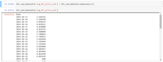
So, let's calculate the avg. BTC price using the code below:
btc_usd_datasets['avg_btc_price_usd'] = btc_usd_datasets.mean(axis=1)
NOTE: for calculation of 2 dataframes, always ensure that the index col is same. In this case, index col is 'date'. Otherwise, one will find NaN values.
Now, for calculation, set 'date' as index column of 'altcoin_data'
altcoin_data[altcoin] = altcoin_data[altcoin].set_index('date') # set the column 'date' to index for further calculation.
The code snippet for calculating altcoin's price in USD is as follows:
for altcoin in altcoin_data.keys():
    altcoin_data[altcoin]['price_usd'] = altcoin_data[altcoin]['weightedAverage'] * btc_usd_datasets['avg_btc_price_usd']
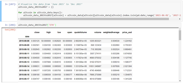
Visualize the data of 'altcoin_date' for 'ETH' and 'btc_usd_datasets' to see the values of altcoin in 'price_usd'
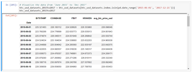
Few exchanges don't have the data for year 2011-2014. In order to compare the graphs for each altcoin we need to visualize b/w specific dates. E.g. June 2015 to Dec 2017
# Visualize the data from 'June 2015' to 'Dec 2017'
btc_usd_datasets_2015to2017 = btc_usd_datasets[btc_usd_datasets.index.isin(pd.date_range('2015-06-01', '2017-12-21'))]
btc_usd_datasets_2015to2017
# Visualize the data from 'June 2015' to 'Dec 2017'
altcoin_data_2015to2017 = {}

for altcoin in altcoin_data.keys():
    altcoin_data_2015to2017[altcoin] = altcoin_data[altcoin][altcoin_data[altcoin].index.isin(pd.date_range('2015-06-01', '2017-12-21'))]

altcoin_data_2015to2017['ETH']
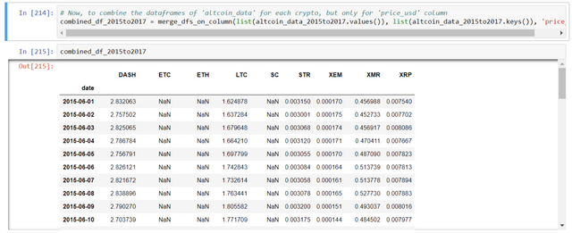
Now, to combine the dataframes of 'altcoin_data' for each crypto, but only for 'price_usd' column:
# Now, to combine the dataframes of 'altcoin_data' for each crypto, but only for 'price_usd' column
combined_df_2015to2017 = merge_dfs_on_column(list(altcoin_data_2015to2017.values()), list(altcoin_data_2015to2017.keys()), 'price_usd')
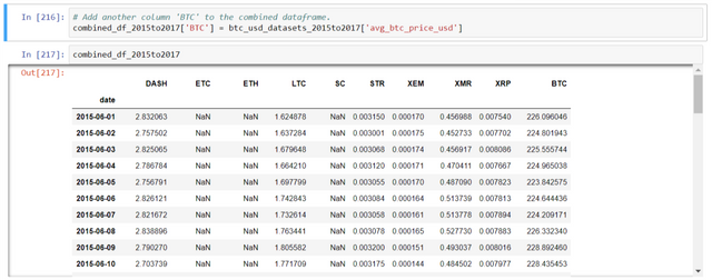
Also, the 'BTC' column has been added below:
# Add another column 'BTC' to the combined dataframe.
combined_df_2015to2017['BTC'] = btc_usd_datasets_2015to2017['avg_btc_price_usd']
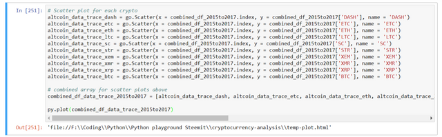
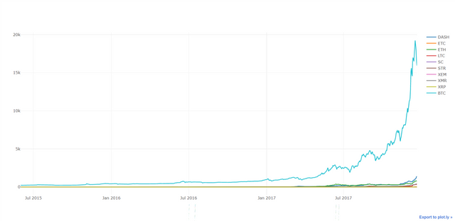
Now, simple plot is as follows:
Code snippet -
# Scatter plot for each crypto
altcoin_data_trace_dash = go.Scatter(x = combined_df_2015to2017.index, y = combined_df_2015to2017['DASH'], name = 'DASH')
altcoin_data_trace_etc = go.Scatter(x = combined_df_2015to2017.index, y = combined_df_2015to2017['ETC'], name = 'ETC')
altcoin_data_trace_eth = go.Scatter(x = combined_df_2015to2017.index, y = combined_df_2015to2017['ETH'], name = 'ETH')
altcoin_data_trace_ltc = go.Scatter(x = combined_df_2015to2017.index, y = combined_df_2015to2017['LTC'], name = 'LTC')
altcoin_data_trace_sc = go.Scatter(x = combined_df_2015to2017.index, y = combined_df_2015to2017['SC'], name = 'SC')
altcoin_data_trace_str = go.Scatter(x = combined_df_2015to2017.index, y = combined_df_2015to2017['STR'], name = 'STR')
altcoin_data_trace_xem = go.Scatter(x = combined_df_2015to2017.index, y = combined_df_2015to2017['XEM'], name = 'XEM')
altcoin_data_trace_xmr = go.Scatter(x = combined_df_2015to2017.index, y = combined_df_2015to2017['XMR'], name = 'XMR')
altcoin_data_trace_xrp = go.Scatter(x = combined_df_2015to2017.index, y = combined_df_2015to2017['XRP'], name = 'XRP')
altcoin_data_trace_btc = go.Scatter(x = combined_df_2015to2017.index, y = combined_df_2015to2017['BTC'], name = 'BTC')

# combined array for scatter plots above
combined_df_data_trace_2015to2017 = [altcoin_data_trace_dash, altcoin_data_trace_etc, altcoin_data_trace_eth, altcoin_data_trace_ltc, altcoin_data_trace_sc, altcoin_data_trace_str, altcoin_data_trace_xem, altcoin_data_trace_xmr, altcoin_data_trace_xrp, altcoin_data_trace_btc]

py.plot(combined_df_data_trace_2015to2017)
Customize the plot -
Code snippet:
# Customize the axes, title, color
layout_plots = go.Layout(
    title='Cryptocurrency Prices (USD)',
    xaxis=dict(
        title='Date (June 2015 to Dec 2017)',
        titlefont=dict(
            family='Courier New, monospace',
            size=18,
            color='#7f7f7f'
        )
    ),
    yaxis=dict(
        title='Crypto Price (in USD)',
        titlefont=dict(
            family='Courier New, monospace',
            size=18,
            color='#7f7f7f'
        )
    )
)

fig = go.Figure(data = combined_df_data_trace_2015to2017, layout = layout_plots)
py.plot(fig, filename='Cryptocurrency Prices (USD).html')
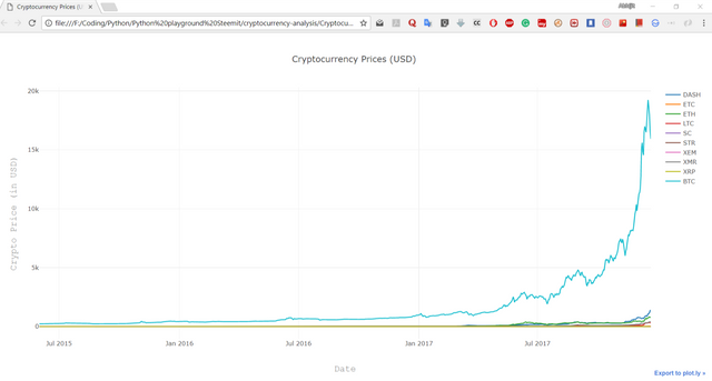
Here, due to Bitcoin's high price, other graph seems negligible.
- Correlations b/w cryptocurrencies -
Despite the exchangess price, the cryptocurrencies' price is slightly related. So, here we are going to find the correlation b/w cryptos.
We can test our correlation hypothesis using the Pandas corr() method, which computes a Pearson correlation coefficient for each column in the dataframe against each other column.
Code snippet :
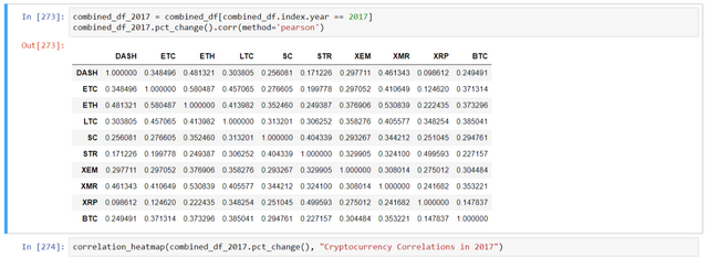
# Calculate the pearson correlation coefficients for altcoins in 2016
combined_df_2016 = combined_df_2015to2017[combined_df_2015to2017.index.year == 2016]
combined_df_2016.pct_change().corr(method='pearson')
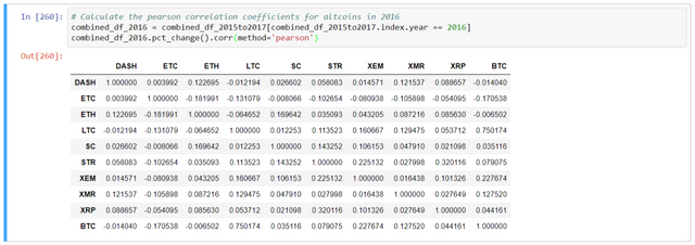
Here, the table implies -
Coefficient (close to 1 or -1) - strongly correlated or inversely correlated.
Coefficient (close to 0) - values tend to fluctuate independently of each other.
The helper function is defined as:
# Heatmap helper function
def correlation_heatmap(df, title, absolute_bounds=True):
    '''Plot a correlation heatmap for the entire dataframe'''
    heatmap = go.Heatmap(
        z=df.corr(method='pearson').as_matrix(),
        x=df.columns,
        y=df.columns,
        colorbar=dict(title='Pearson Coefficient'),
    )

    layout = go.Layout(title=title)

    if absolute_bounds:
        heatmap['zmax'] = 1.0
        heatmap['zmin'] = -1.0

    fig = go.Figure(data=[heatmap], layout=layout)
    py.plot(fig, filename=title+'.html')
The heatmap plotted using -
correlation_heatmap(combined_df_2016.pct_change(), "Cryptocurrency Correlations in 2016")
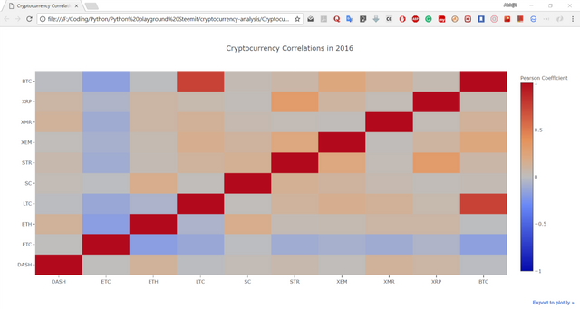
Here, the dark red values represent strong correlations (note that each currency is, obviously, strongly correlated with itself), and the dark blue values represent strong inverse correlations. All of the light blue/orange/gray/tan colors in-between represent varying degrees of weak/non-existent correlations.
Let's see the graph of correlations in 2017:
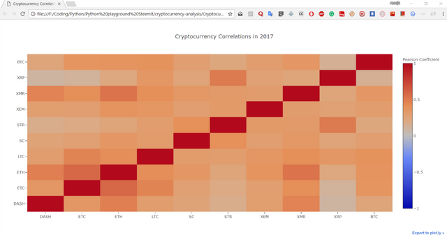
Huh. That's rather interesting!!!....
Conclusion
The charts show the cryptocurrencies plots with the date. And we can enable notification feature which would notify us about the price's uptick.
At last, the heat map shows that how cryptocurrencies are inter-related as per their coefficient values. Application could be huge in case of trading. One can predict the graph based on other cryptos values.
Now, you can try for other cryptocurrencies as well.
Give it a shot!!...
That's all for now........
Stay tuned for more such tutorials...
View in Steemit
Follow the series in Github
Posted on Utopian.io - Rewarding Open Source Contributors
Congratulations @abhi3700! You have completed some achievement on Steemit and have been rewarded with new badge(s) :
Click on any badge to view your own Board of Honor on SteemitBoard.
For more information about SteemitBoard, click here
If you no longer want to receive notifications, reply to this comment with the word
STOPThank you for the contribution. It has been approved.
You can contact us on Discord.
[utopian-moderator]
Hey @abhi3700 I am @utopian-io. I have just upvoted you!
Achievements
Suggestions
Get Noticed!
Community-Driven Witness!
I am the first and only Steem Community-Driven Witness. Participate on Discord. Lets GROW TOGETHER!
Up-vote this comment to grow my power and help Open Source contributions like this one. Want to chat? Join me on Discord https://discord.gg/Pc8HG9x