S18W1: Mastering the Markets with technical analysis.
Hello and welcome to my blog. I hope you all are doing well. New season of engagement challange is live with wonderful themes to explore. This is my first task of week in cryptoacademy which is about technical analysis .
- Designed by vistaprint

What is the importance of technical knowledge in trading? Describe the key components and information you can gather from a technical chart.
Technical knowledge or technical analysis is a method of analyzing charts of cryptos or stocks to predict the direction of market movement. It is done with the help of past price and volume data of assets under consideration.
Technical analysts have thoroughly studied charts over years and come up with chart patterns, important price levels like support and resistance, trendlines, and indicators. Some commonly used chart patterns include double top and double bottom patterns, head and shoulders patterns, flag and pole patterns, triangles, and pennants, etc. Similarly, some important levels include static and dynamic support and resistance and trendlines, etc.
These structures are manifestations of the psychology of traders, and we know the psychology of traders involves some factors that are inherent to human beings and keep on repeating over time. So, technical analysts explore these chart patterns or levels and materialize them.
Technical analysts have developed various indicators based on various parameters of cryptocurrencies like price, volume, and volatility, etc., that are used to predict the price movement of assets to be materialized.
Importance of Technical Analysis
Helps in predicting future market movement to be materialized.
Helps in the identification of signals like entry and exit points.
Helps in developing a proper trading system with a specific risk-reward ratio so that with an above-average win rate, traders remain in profit.
Helps in understanding market psychology.
- Technical analysis is very important for short-term trading like intraday and small-duration swing traders.
Components of Technical Analysis
As such, technical analysis is an umbrella term and has diverse components to analyze. The important components of technical analysis include price charts, volume and price, indicators, chart patterns, and important levels like support and resistance.
Charts
There are different types of charts, such as line charts, bar charts, Heikin-Ashi charts, and JC charts. The most commonly used chart type in technical analysis is the Japanese candlestick chart. They are the most popular type of chart used nowadays. More details will be shared in subsequent sections of this topic .
Japanese Candlestick chart
Price and Volume
The price of an asset over a particular time frame helps in understanding whether the price of the asset is increasing or decreasing. If the price of an asset is increasing, we can look for a buy position. On the other hand, if the price of an asset is decreasing, we can look for a sell position.
Spikes in volume correspond to spikes in the price
Similarly, the volume of an asset represents the number of shares or tokens traded over a particular time frame. The interplay of price and volume can help in understanding the market. If the price of an asset is increasing with an increase in volume, it means buyers have taken control of the market, signaling bullish sentiment. Similarly, if the price of an asset is decreasing with an increase in volume, it means sellers have taken control of the market, signaling bearish sentiment.
Chart Patterns and Levels
Support and resistance are important levels on price charts that represent areas of increasing demand and supply, respectively. Support is a price level where the decreasing price of an asset is expected to pause and bounce back. On the other hand, resistance is a price level where the increasing price of an asset is expected to pause and bounce back.
Support and Resistance levels - indicator
At support, there is a consolidation of buyers, marking an area of increasing demand and pushing the price up. Conversely, at resistance, there is a consolidation of sellers, marking an area of increasing supply and pushing the price down.
Similarly, we have uptrend and downtrend lines that represent areas of dynamic support and resistance, respectively. We call these levels dynamic support because the price continues to take support and form higher highs. Dynamic resistance is encountered from a downtrend line as the price continues to make lower lows.
Indicators
Technical analysis indicators are developed based on market data such as price, volume, momentum, and volatility, and they generate signals to be acted upon. Different indicators have different function based on their structure. Some may indicate support and Resistance levels ( Fibonacci and Pivot points ), overnight and oversold zones (RSi), direction and momentum in market (ADA) etc. So the role of indicators is to forcast the market movement and take positions accordingly.
Explain how to read candlestick charts and the significance of different time frames in trading.
To explain reading of candlestick charts, let's focus of Japanese candlestick charts as they are the most commonly used charts in the trading world.
Candlesticks represent the price movement of an asset for a particular timeframe, and candlesticks combine to form different chart patterns. If we analyze each candle for a particular timeframe, we will be able to notice the price changes taking place in a particular asset every second. The shape of the candle is determined by four parameters of an asset: opening price, closing price, high price, and low price.
The beauty of candlesticks lies in their ease of understanding despite the variety of information provided. The visual appearance of candles helps us understand the emotions linked to the market. A rally of green candles represents positive sentiments, while red candles indicate negative sentiments. Thus, candlestick charts represent both the technical and psychological aspects of trading and traders.
Different candles and candlestick patterns have psychology behind them, helping predict future market movements and gauge trading decisions. For example, the morning star pattern is indicative of bullish future movement, while the shooting star and evening star indicate forthcoming bearish market movements.
Anatomy of a Candle
Each candle represents an asset's information over a particular time period. Each candle shows the opening price, closing price, high price, and low price of an asset over a particular timeframe. The area of the candle between the opening and closing price is known as the real body of the candle. The price points above the opening price and below the closing price are known as the wicks or shadows of the candle. Wicks are shown as thin lines above or below the body. The difference between the top of an upper shadow and the bottom of a lower shadow represents the price range of an asset. The opening of a bullish candle is towards the lower side and the closing is towards the upper side; the reverse is true for a bearish candle.
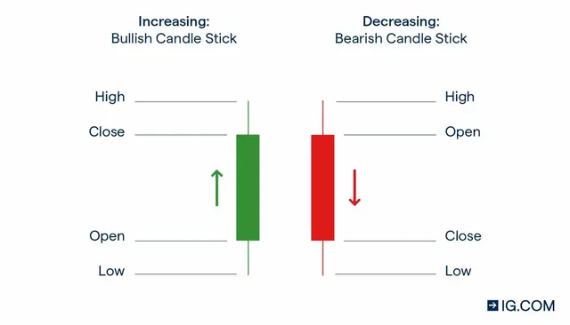
Bullish candles are represented by either green or white color on different trading software. In a bullish candle, the closing price is higher than the opening price. The lower side of the body of the candle represents the opening price, and the upper side represents the closing price. If the price of an asset during a particular timeframe goes above the closing price but closes below that high price, a wick will appear above the candle, representing the high price. Similarly, if the asset dips below the opening price but closes higher than the opening price, a lower wick will be formed. The lowest point of the lower wick represents the low of the candle. The difference in price between the high and low is known as the price range.
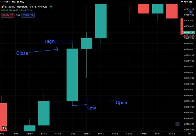
BTC/USDT showing OHLC of bullish candle marked with an arrow
If the overall price of an asset goes up over a particular timeframe, it is known as a bullish trend. It is not necessary that all the candles in a bullish trend will be green. There may be red candles in between, but overall, the market is dominated by bulls who push the price up.
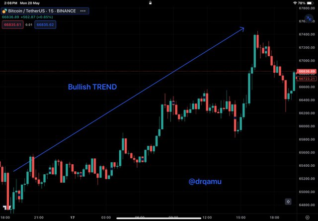
BTC/USDT chart showing a bullish trend
A bearish candle, represented by a red candle, is a type of candle where the closing price is lower than the opening price. In a bearish candle, the upper side of the body represents the opening price, and the lower side represents the closing price. If the price of an asset during a particular timeframe goes above the opening price but closes below the opening price, the high price is represented by a wick above the opening price. Similarly, if the asset dips down but closes at a slightly higher price than the closing price, a lower wick will be formed. The lowest point of the lower wick represents the low of the candle. The difference in price between the high and low is known as the price range.
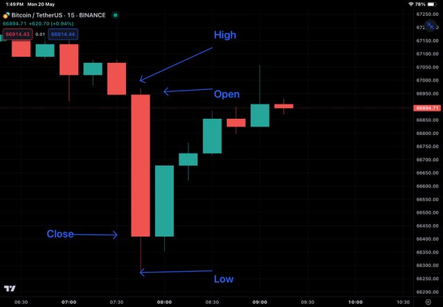
BTC/USDT showing OHLC of bearish candle marked with an arrow
If the overall price of an asset goes down over a particular timeframe, it is known as a bearish trend. It is not necessary that all the candles in a bearish trend will be red. There may be green candles in between, but overall, the market is dominated by bears who push the price down.
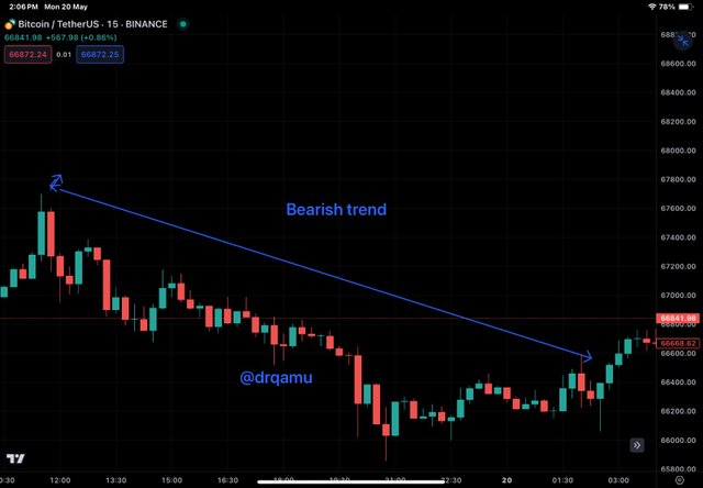
BTC/USDT chart showing bearish trend.
Significance of various timeframes.
The significance of different time frames is manifold. For investors or long-term swing traders, larger time frames are important, while for short-term scalping traders or intraday traders, smaller time frames are crucial. For example, an investor willing to hold an asset or a coin for one year would look for trends in larger time frames like months to years. For them, shorter time frames like days or hours hold no significance. Similarly, for an intraday trader, smaller time frames like 5 minutes, 15 minutes, or 30 minutes are important, as they need to square off their positions on the same day. Larger time frames like weeks or months are not significant for them.
Another important point to understand regarding time frames is the top-down analysis, which means that a trader or investor starts from a larger time frame concerning their reading or investing period and then moves down to smaller time frames. Larger time frames are used to understand the trend in the market, while smaller time frames are used to execute the position and ensure market entry. For example, an equity trader may analyze 4-hour, 1-hour, or 30-minute time frames to look at the overall trend but enter the market by analyzing 15-minute or 5-minute time frames.
Define chart patterns and differentiate between continuation patterns and reversal patterns. How can chart patterns be utilized to set effective stop-loss orders?
Chart patterns are specific and conspicuous figures formed in charts (candlestick) that help traders understand the ongoing trend and predict the likelihood of market trends in the near future. Some examples of chart patterns include head and shoulder pattern, double bottom pattern, double top pattern, cup and handle pattern, flag and pole pattern, etc.
A continuation pattern is one that is likely to repeat the prevailing pattern. An arbitrary system of continuation pattern suggests that a strong continuation pattern has three times more tendency to repeat itself, whereas a reliable pattern has two times more tendency, and a weak pattern has 1.5 times more tendency. Higher high pattern and lower low pattern are examples of continuous patterns.
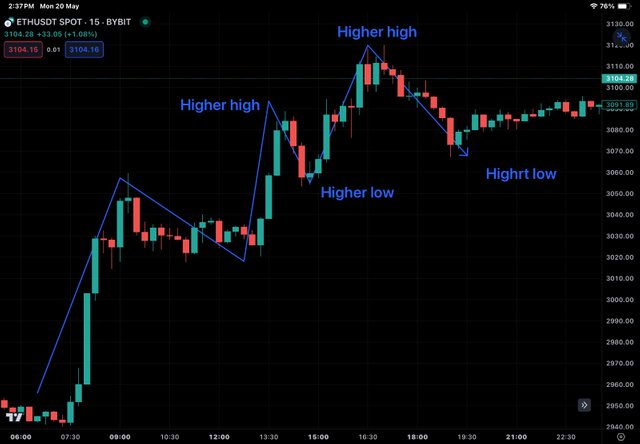
ETH/USDT chart showing higher high continuous pattern
A higher high pattern is a chart pattern where subsequent prices are higher than consecutive previous ones. It means buyers are in command of the asset.
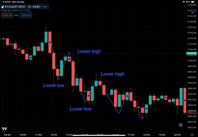
ETH/USDT chart showing lower low continuous pattern
A lower low is a pattern on the chart where subsequent prices are lower than the previous low. It means sellers are in command of the asset.
In a reverse chart patter, a newer trend is not similar to the previous trend, or we can say that a previous trend is changing to a new trend. In a Bearish reversal trend, subsequent highs are lower than previous highs. In a Bullish reversal trend, lows are higher than previous lows.
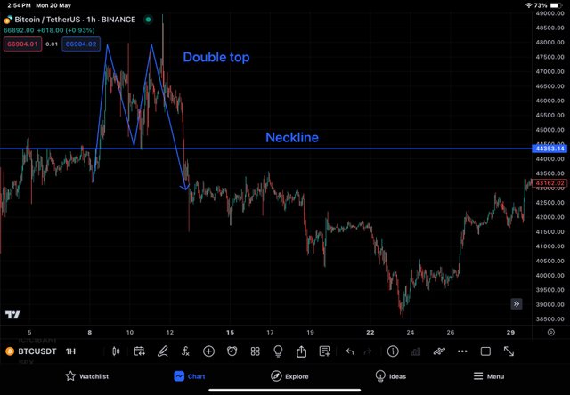
Reversal patterns - Double top pattern indicating forthcoming bearish trend
Other examples of reversal patterns are double top pattern and double bottom pattern, etc. Double top pattern, as the name implies, is a chart pattern in which two peaks of roughly the same price are seen on a chart and are usually seen at the end of a bull market. A double top can be understood as buyers dominating until the first peak, and then sellers dominate, causing the price to fall. The pattern then reverses. On finding this pattern, those who invested in the asset can exit to avoid losses.
Double Bottom pattern is similar to double top but in the reverse direction. Here, two minima are separated by a small peak. As the price is expected to rise, on sighting this pattern, buyers find it as an opportunity to enter the market.
Setting stop loss based on chart patterns.
In higher high pattern, each previous higher low acts as a support for the upgoing price rally. If the price breaks this support (higher low) , the pattern is invalidated. So this level acts as a stoploss for bullish position. Similarly, on a lower low continuous pattern each lower high acts as a stoploss. In double top and double bottom pattern , neckline acts a stoploss.
What is Trading View and how can it be used to apply technical indicators in real-time trading? Describe the relationship between support and resistance levels and how technical indicators can aid in understanding these concepts.
TradingView is an online charting platform used to analyze charts of stocks from all sectors, as well as commodities, cryptocurrencies, forex, and other global markets. The platform is comprehensive, allowing users to add multiple indicators and mark charts with trendlines, horizontal lines, info lines, triangles, rectangles, and more. Currently, it is the best available platform for traders, investors, YouTubers, and tutors. It is available in a web version as well as apps for Android and iOS users. Along with its use for trading purposes, it is also used for educational purposes by YouTubers and tutors.
Tradingview UI
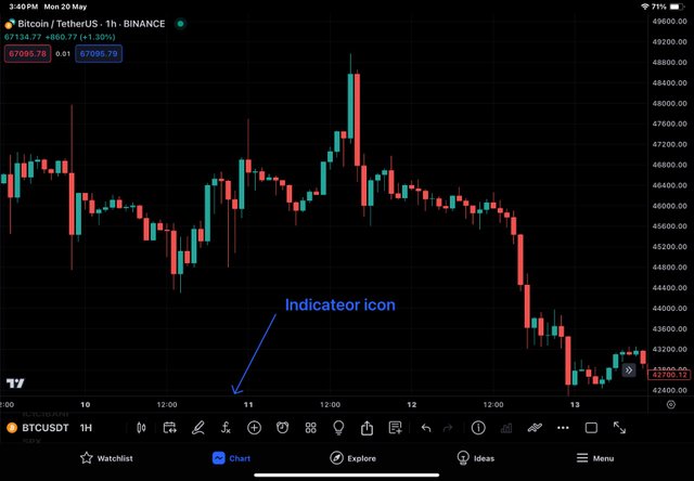
To apply indicators in trading view in relation time market, let's presume we are planning to trade BTC/ISDT and we have to use RSI indicator . We have to select BTC/USDT trading pair. Chart of the pair will load.
Click on indicators from the top menu. In my case, I have Indicators option at bottom of the chart.
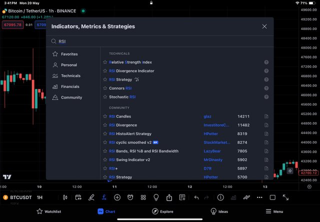
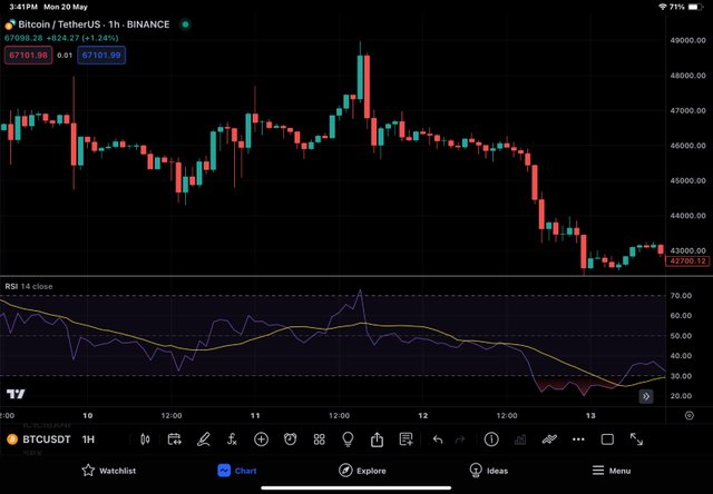
Next we type "RSI" in the search box provided and select same Indicator from the suggestions. Go back to your chart and you will find indicator loaded to the chart.
The relationship between technical support and resistance has already been discussed above, but for the sake of completion, let me mention the relationship between support and resistance here too. Support of an asset represents a price level from which a falling price of an asset is expected to bounce back and rise again, whereas resistance of an asset represents a level from which an upward price of an asset is expected to bounce back or fall again, except in the case of breakouts. So, at support, there is consolidation of buyers, and at resistance, there is consolidation of sellers. Support repeats the demand zone of an asset, whereas resistance represents a supply zone of an asset.
BTC/USDT chart showing support and resistance zones .
Technical indicators can help in finding these levels automatically without any exhausting exercise that we would otherwise carry out to determine the levels. One classical example of an indicator that can be used for identifying these levels is the Fibonacci retracement. Each Fibonacci level can act as support and resistance depending on the direction of price movement. For an upcoming price of an asset, any level above the current price can act as resistance, and any level below can act as support. This holds true for both uptrend and downtrend scenarios.
Provide an overview of pivot points and discuss their calculation and significance in trading. Explain how to configure and trade with pivot points, including strategies for pivot point reverse trading
A pivot point is a static indicator which means that it remains at particular price level throughout the trading session unlike oscillators or Moving averages that keep on moving. A pivot point for a day is basically average of high, low and closing price of previous day. A pivot has certain levels of support and resistance associated with it, that are calculated on the basis of main pivot point.
The concept of pivot point is simple.if the price goes above pivot point, it indicates bullish market and if it goes below the pivot point , it indicates bearish market. Based on main pivot point, different support levels (S1, S2, S3) are calculated and plotted below pivot point and different resistance levels (R1, R2, R3) are calculated and plotted above pivot point. These levels help traders understand and predict different levels of support and resistance in case price crosses one level.
Pivot Point Calculation and R1 R2 S1 S2 Pivot Levels Calculation.
Pivot point is calculated by taking average of previous day high, low and closing price. The support and resistance levels are deserved from pivot point as below :
P = Main pivot point - it forms the hallmark of the pivot point indicator from which other points are drawn.
S1 : First level of support below P .
S2 : Second level of support below p and one level below S1.
R1: First level of resistance above p.
R2 : second level of resistance above p and first level above R1.
Calculatiion of pivot points.
Let's suppose price of token X (hypothetical price) coin closed at $3 but in between it had made high of $4 and a low of $2 . Let's try to analyse different pivot levels.
Main pivot (P) = HIGH +LOW + CLOSE DIVIDED BY 3
P= 4 + 2 + 3 /3 = 3
So the next day P will be at 3 .
S1= (P x 2) - High
S1 = (3 x 2 ) - 4
S1= 6 - 4 = 2
S2 = P − (High−Low)
S2= 3 - (4- 2 )
S2 = 1
R1=(P×2)−Low
R1= ( 3 x 2) -2
R1 = 4
R2=P+(High−Low)
R2 = 3 + ( 4 - 2}
R2 = 5
Look at the beauty of these calculations
R2 = 5
R1= 4
P = 3
S1= 2
S2= 1
Depending upon the trading software used, you will have to apply pivot points on your chart . For this task i choose tradingview . So I will demonstrate it with help of tradingview app that I have already installed and logged into.
- Launch trading view app. Select the crypto asset to be explored. Let's say BTC / USDT. The chart will load.
- Next click on fx (indicators and strategies ) at the top as shown by arrow . The following page will load.
- Search for pivot point in the search bar. Than select pivot point standard.
- Go to chart and you can see pivot points applied.
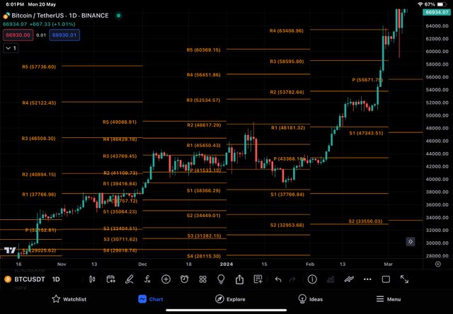
Pivots points
Working of Pivot Points.
Before looking at working of the pivot points, we should have basic understanding of what points are intended to show . Pivot point along with support and resistance levels are static indicators that help intraday traders to predict the trend of the market. When the price of an asset crosses above the main pivot point (P) , it indicate the Bullish trend of the market and when it crosses below the main pivot point (P) or towards the direction of man pivot point from resistance levels , it indicates the bearish trend of the market and therefore it acts as signal indicator for the traders.
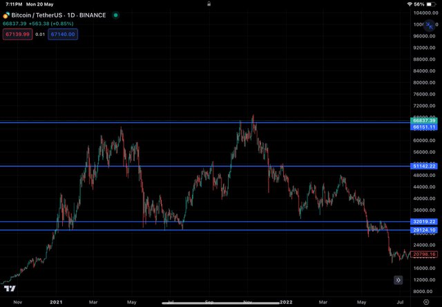
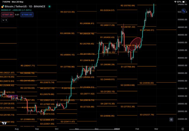
BTC/USDT CHART - PIVOT POINTS
Look at BTC/USDT graph above. At the beginning of above graph, we see that price movement in upward direction crossing main pivot P (encircled ), so it should give a buy signal to trader in the wake of forthcoming bullish trend. If a trader follows pivot point indicator, you can see in the graph above that he would have huge profit because Bullish trend continues till the price touches R5. Then the price correction started taking place.
Pivot Point Reverse Trading.
Pivot point reverse trading basically show us how an asset price respect the support and resistance and reverse its direction from these levels. Look at chart below
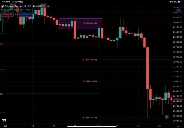
BTC/uSDT chart
As BTC price started dipping below the main pivot (rectangle) line towards S1 and so bearish trend is expected. Here a trader can take short position and price dropped till it touches S3.
BTC/USDT chart - Pivot points .
Next, we notes that LPR ( low price rejection) has started as indiced by wicks and which should be perceived as exit signal for sell trade or entry signal for buy trade. We noticed that price has immediately touched S2. Then a huge bullish trend followed which could have given huge profits to the pivot trader .
Hi @drqamu! Your post provides a comprehensive overview of technical analysis, and I found your explanation of chart patterns and their role in setting stop-loss orders particularly insightful. The differentiation between continuation and reversal patterns is very practical for traders looking to anticipate market movements. Excellent work!
Nice to hear that. Thank you for your feedback on various sections of my post .
TEAM 2
Congratulations! This post has been voted through steemcurator05. We support quality posts, good comments anywhere and any tags.Thanks
Your post provides a comprehensive overview of technical analysis highlighting its importance in trading. Understanding chart patterns and pivot points can indeed help traders make informed decisions. Good luck with the contest
Nice to hear that you find it comprehensive.
Thanks for valuable feedback .
Thank you, friend!

I'm @steem.history, who is steem witness.
Thank you for witnessvoting for me.
please click it!
(Go to https://steemit.com/~witnesses and type fbslo at the bottom of the page)
The weight is reduced because of the lack of Voting Power. If you vote for me as a witness, you can get my little vote.
Thanks
Hi there. I really enjoyed reading this post. I am already familiar with technical analysis and also try to use it on trading. Your explanation learned me new things about pivot points and ways to use ta on your trading activities. This is really helpful to me. Thanks for this post. I look forward to see more of this from you.
Nice to hear that .
Thank you
Excellent understanding of the topic from yor side drqamu.
100%. As a swing trader and a scalp trader technical analysis has been of utmost help to me whenever I have to open or close a trade.
Good to hear that you are doing trades .
Good luck
Greetings friend,
You've shared a great entry, which basically explains all the important things about trading in a way that's easy to understand. It talks about stuff like candlestick charts, chart patterns, and pivot points, which are like tools traders use to make decisions. It's great because it helps everyone, whether they're just starting out or have been doing this for a while. And the part about using TradingView, which is a tool for analyzing markets, is really useful too. All the best.
Thank you for your kind feedback.
Wow such nice article you tried friend. It's really nice that you used some special hard work to reach this point and I appreciate that.
Thank you .
Has hecho un post de lujo con gran dominio y conocimiento en el tema, además nutrido de gráficas muy esclarecedoras.
La parte de los puntos de pivote, totalmente desconocida por mí es reveladora y versátil. Esta herramienta facilita enormente la comprensión del sentimiento del mercado, las tendencias, las zonas de soporte y resistencia, así como los momentos de colocar las ordenes de stop-loss que minimizan las perdidas en el trading. Me pareció genial.
Saludos, éxitos y bendiciones.
Nice to hear that my post was somehow helpful for you .
Thank you .
¡Saludos y feliz día!