Take a look at the STEEM chart 🤔
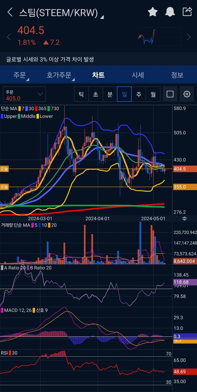
This is the daily candlestick chart. The AB ratio is plus. However, unfortunately, the MACD is minus. So, even if the STEEM price succeeds bouncing again, the price will be likely limited of increasing rate in the short-term.
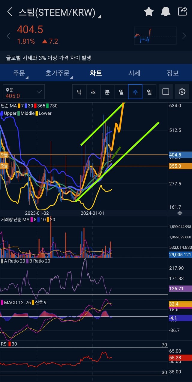
But, the weekly candlestick chart is better. The AB ratio is above 0, and the MACD as well. So, if the STEEM price rises again, it will be bullish in the mid-term.
This comment is for rewarding my analysis activities. Upvotings will be proceeded by @h4lab and @upex
Congratulations, your post has been upvoted by @upex with a 100.00% upvote. We invite you to continue producing quality content and join our Discord community here. Keep up the good work! #upex
Congratulations, your post has been upvoted by @nixiee with a 47.89250670380496 % upvote Vote may not be displayed on Steemit due to the current Steemit API issue, but there is a normal upvote record in the blockchain data, so don't worry.