Whaleshares Website Redesign: new team member and more design concepts
As many of you already know, Whaleshares website entered a total redesign with many improvements in mind. That's why Whaleshares dev team welcomes a new member — @andrejcibik, a young and promising web/graphic designer who has already contributed to the ongoing redesign of whaleshares.net with several posts and will share more soon.
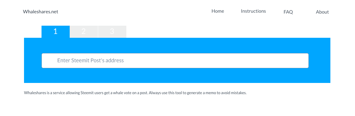
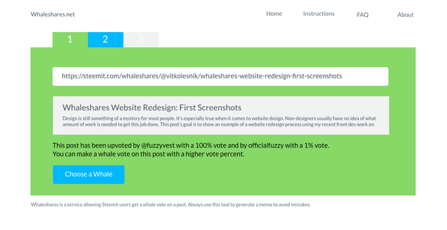
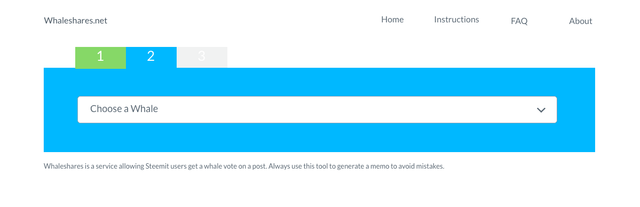
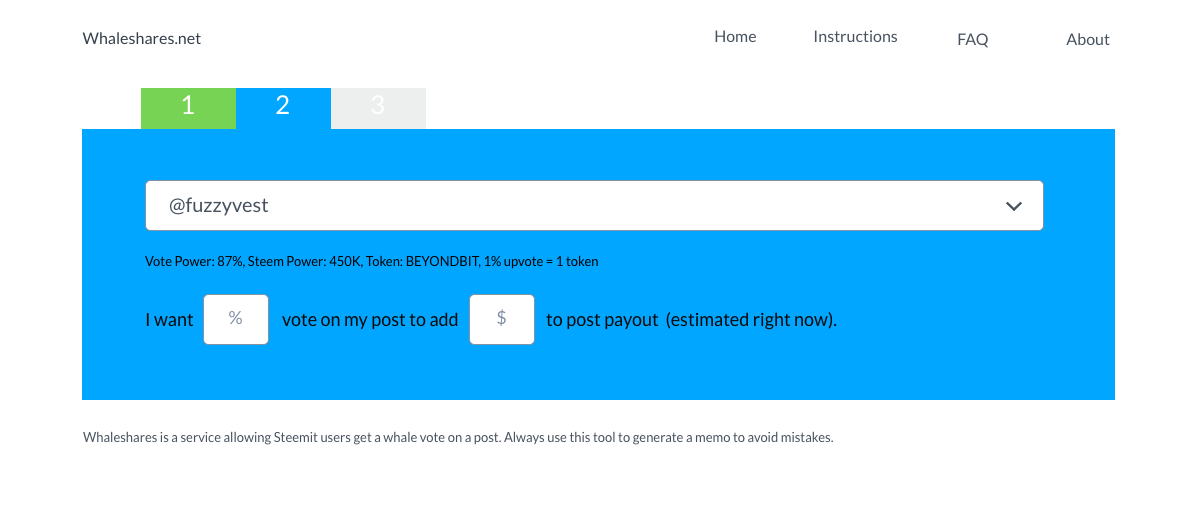
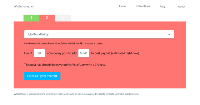
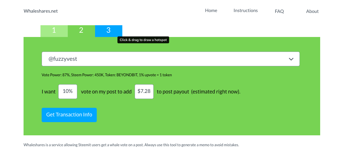
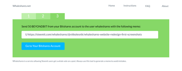
Meanwhile after getting your feedback I decided to explore further the idea of a minimalist 3-step structure described in my previous post by adding tab background colors to show current state.

You can see the full screen version here.
Do background colors make navigation easier or more complicated in your opinion? Are bottom buttons needed for non-geeky users to switch between the tabs? Any other observations?
The central problem I am trying to solve is this: how to keep this tool as functional, clean and easy to use as possible for newcomers while taking into account it's many use nuances. I'm also trying to keep content with and height above the fold for most devices. I didn't yet decide on graphic style — need as much feedback as possible on this idea before going further.
By the way, if we use this or similar version, it will be javascript heavy (the only drawback of minimalism :), so if you're a seasoned jQuery coder, feel free to drop me a line on discord.
Looking forward to your comments!
Hey! that's a nice minimalist design. I feel there is some problem with the contrast :) the backgrounds are very vibrant againt black text. I'm a graphic designer too so you are welcome to follow my content too :)
Thank you for the feedback!
You are more than welcome! also you are welcome to follow me :)
Congratulations! This post has been upvoted from the communal account, @minnowsupport, by vitkolesnik from the Minnow Support Project. It's a witness project run by aggroed, ausbitbank, teamsteem, theprophet0, and someguy123. The goal is to help Steemit grow by supporting Minnows and creating a social network. Please find us in the Peace, Abundance, and Liberty Network (PALnet) Discord Channel. It's a completely public and open space to all members of the Steemit community who voluntarily choose to be there.
If you like what we're doing please upvote this comment so we can continue to build the community account that's supporting all members.
It's much much better now, user has a full control and have a power to decide how much vote percentage they want to receive. That unlike before, user seems like groping in the dark.
Thank you!
This post has received a 0.26 % upvote from @drotto thanks to: @banjo.
You got my vote and a resteem :]
Thank you!
The colors and all are throwing me off, but the data layout and functionality it is coming along nice. I will reach out to you in discord.
Thanks for the feedback, see ya on discord!)