Logo For TimeTable

Repository
https://github.com/ulan17/TimeTable/issues/7
Previously this project did not yet have a logo, so I offered to make a logo for the project and the project owner agreed and then asked me to contact the PO via telegram. After discussion, the project owner receives a new logo for the project.
Issue Link
Chat on telegram
Pull Request Link
Details
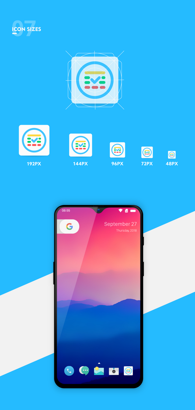
Timetable is an Android Application, which allows you to save timetable, homeworks and notes. Timetable is an Android App for students.
Logo Result
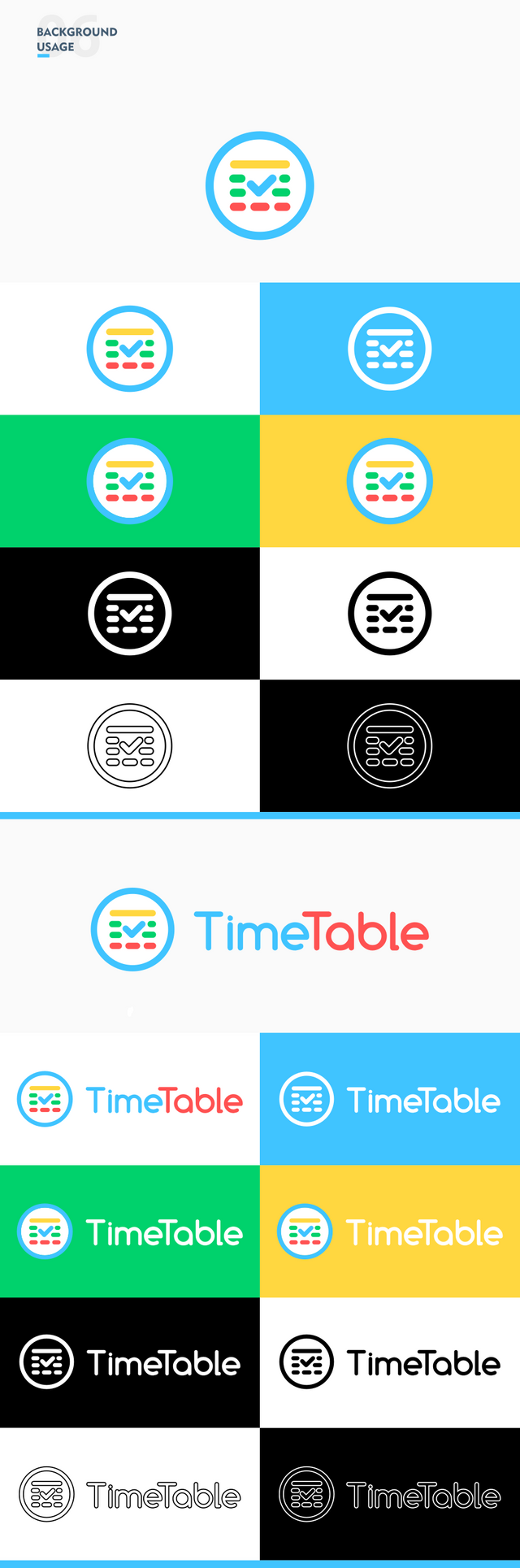
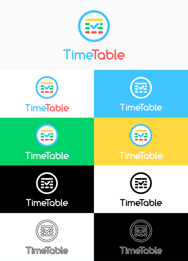
Benefits / Improvements
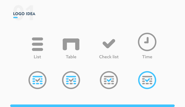
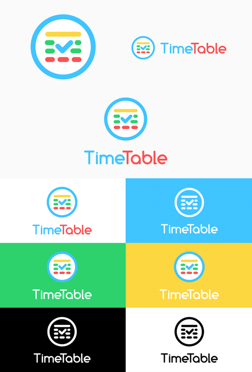
In this logo, I combine several elements, namely list, table, checklist and time.
List means that this app can manage a list of homework and notes.
Time and Table are inspired by the name of the app.
A checklist has the meaning that this app can complete homework schedules or other assignments.
This logo is intended for students. Therefore I made this logo have characteristics such as fresh, colorful, simple and unique and simple.
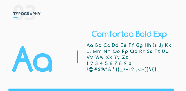
The font that I use is Comfortaa font. This font has a style that is fun and interesting for students. Then this font also has a rounded corner so that it matches the logo.
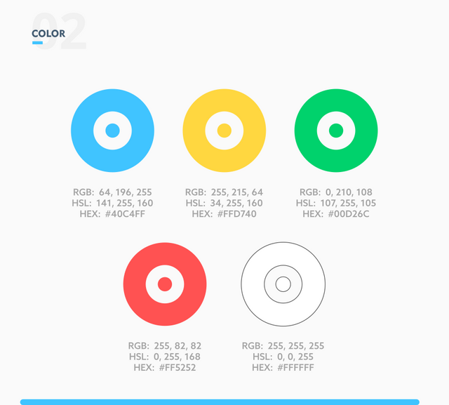
I use a combination of 5 colors on this logo and choose blue and white as the base color so that this logo looks cheerful, fun, neat and clean.
The font that I use is Comfortaa font. This font has a style that is fun and interesting for students. Then this font also has a rounded corner so that it matches the logo.
I use a combination of 5 colors on this logo and choose blue and white as the base color so that this logo looks cheerful, fun, neat and clean.
Proof of authorship
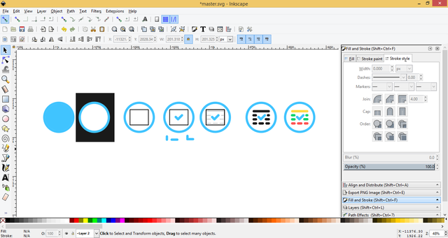
Tools
Inkscape (Logo Design) and Adobe Illustrator CS6 (Export to other vectors)
Original files
Drive Link
Font Link
Mockup Link
Proof of Work Done

This work is licensed under a Creative Commons Attribution 4.0 International License.
Hey, zularizal.
In your presentation you are saying, "Time and Table are inspired by the name of the app." However neither time nor table is clearly seen as the prior objective. Lıst and checkmark icons are obvious but I can't say the same for table icon nor the time icon.
And for displaying the alternatives, do you think this is the best way to show it, I think you can simplify it by displaying 3 version ( only logo, logo horizontal and logo vertical ) then apply color alternatives to one of them. This way you can avoid redundant repetition.
Just an example to show what I'm trying to tell;
Your contribution has been evaluated according to Utopian policies and guidelines, as well as a predefined set of questions pertaining to the category.
To view those questions and the relevant answers related to your post, click here.
Need help? Write a ticket on https://support.utopian.io/.
Chat with us on Discord.
[utopian-moderator]
Thank you for your review, @oups! Keep up the good work!
Nice work!
Posted using Partiko Android
Hi @zularizal!
Your post was upvoted by @steem-ua, new Steem dApp, using UserAuthority for algorithmic post curation!
Your post is eligible for our upvote, thanks to our collaboration with @utopian-io!
Feel free to join our @steem-ua Discord server
Hey, @zularizal!
Thanks for contributing on Utopian.
We’re already looking forward to your next contribution!
Get higher incentives and support Utopian.io!
Simply set @utopian.pay as a 5% (or higher) payout beneficiary on your contribution post (via SteemPlus or Steeditor).
Want to chat? Join us on Discord https://discord.gg/h52nFrV.
Vote for Utopian Witness!