New Logo for RxBattery
![]()
Details
Android library monitoring battery state of the device with RxJava and RxKotlin
Links

Benefits / Improvements
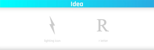
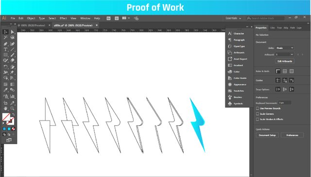
The project owner wanted a simple, neat and beautiful logo. I also searched how best to express the battery. I often saw a typical battery icon or a lightning icon. It was the simplest energy symbol among them. I combined this symbol with R. In this way,
Simple
Neat
Memorable
a logo was created.

This work is licensed under a Creative Commons Attribution 4.0 International License.
I like the idea very much it reflects the energy (battery) and the R letter, but it's too abstract I mean it's too hard to see at first sight. Of course when you know where the idea came from you can relate it to R letter but it might be better to exaggerate a tiny bit more with the curves to make it look like R more. Just a personal opinion.
We are suggesting this to every utopian contributor that these posts should be more reader-centric and shouldn't be prepared just for moderation with just the requested parts. I'd like to see more information about the process, and design desicions.
For example was this the first idea you come up with, didn't you have any alternative solutions. Did you start with pen and paper and tried a few alternatives as sketches or you had the idea at the very beginning so you go straight to the end version. I can see you also presented your logo in a box like app icon in the GitHub issue, however I can't see those in here. You almost didn't mention the presented green version. Additionally I like the dark backgrounded app icon more. This kind of details could enrich the post and makes it pleasurable to read.
Your contribution has been evaluated according to Utopian policies and guidelines, as well as a predefined set of questions pertaining to the category.
To view those questions and the relevant answers related to your post, click here.
Need help? Write a ticket on https://support.utopian.io/.
Chat with us on Discord.
[utopian-moderator]
Thank you for your review, @oups!
So far this week you've reviewed 3 contributions. Keep up the good work!
Thank you for your recommendation. this was my first idea. I offered this and accepted the project owner.
So I did not make another version. To offer every variation means hundreds of alternatives. I allow the project owner to shape it.
FedEx, Carrefour, Ziraat Bank etc. in a similar structure. So I think this logo is very useful.
Thank u again.
To make it clear, I didn't mean to say it's not useful or something else. As I said I like the design a lot. What I mentioned above are just it would be better if you explain those things in your post. A presentation shouldn't be just include images, there should be the idea, the process, the choices.
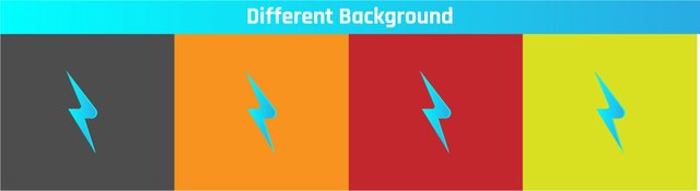
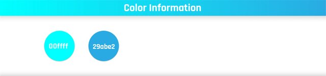
I choose a bright blue color why, because it gives that energetic feeling. You could have used red color instead. If you don't provide any information why would anyone read it?
I choose sans-serif font why, because serif fonts are thinner and usually used by luxury and corporate branding. This is why I go with a sans-serif.
etc.
I didn't get what did you mean by those samples, as far as I know FedEx and Carrefour both uses negative spaces and an arrow to imply movement. I can only relate it to Ziraat's logo since it shaped as wheat with the tczb letters.
Now it was clearer. thanks for the explanation.
It's like,
"While red represents a harsh energy, blue represents a cleaner and more useful energy. I chose blue because it was white and blue in lightning color."
right?
Hey @yasujizr
Thanks for contributing on Utopian.
We’re already looking forward to your next contribution!
Want to chat? Join us on Discord https://discord.gg/h52nFrV.
Vote for Utopian Witness!
Well. Nice idea. Btw, one think. You need to learn how to give save zone on logo design. 😀
Thank you for the suggestion. I've looked at it a few times. Is there any source you can recommend?
Congratulations @yasujizr! You have completed the following achievement on Steemit and have been rewarded with new badge(s) :
Click on the badge to view your Board of Honor.
If you no longer want to receive notifications, reply to this comment with the word
STOPDo not miss the last post from @steemitboard:
SteemitBoard and the Veterans on Steemit - The First Community Badge.
Hi there, I'm currently looking for a talent for simple logo design task for 10 Steem. If you are interested give me a ping at Discord, fr3eze#8617.