Pictures in Comments Get Cut Off - Images Not Mobile Responsive
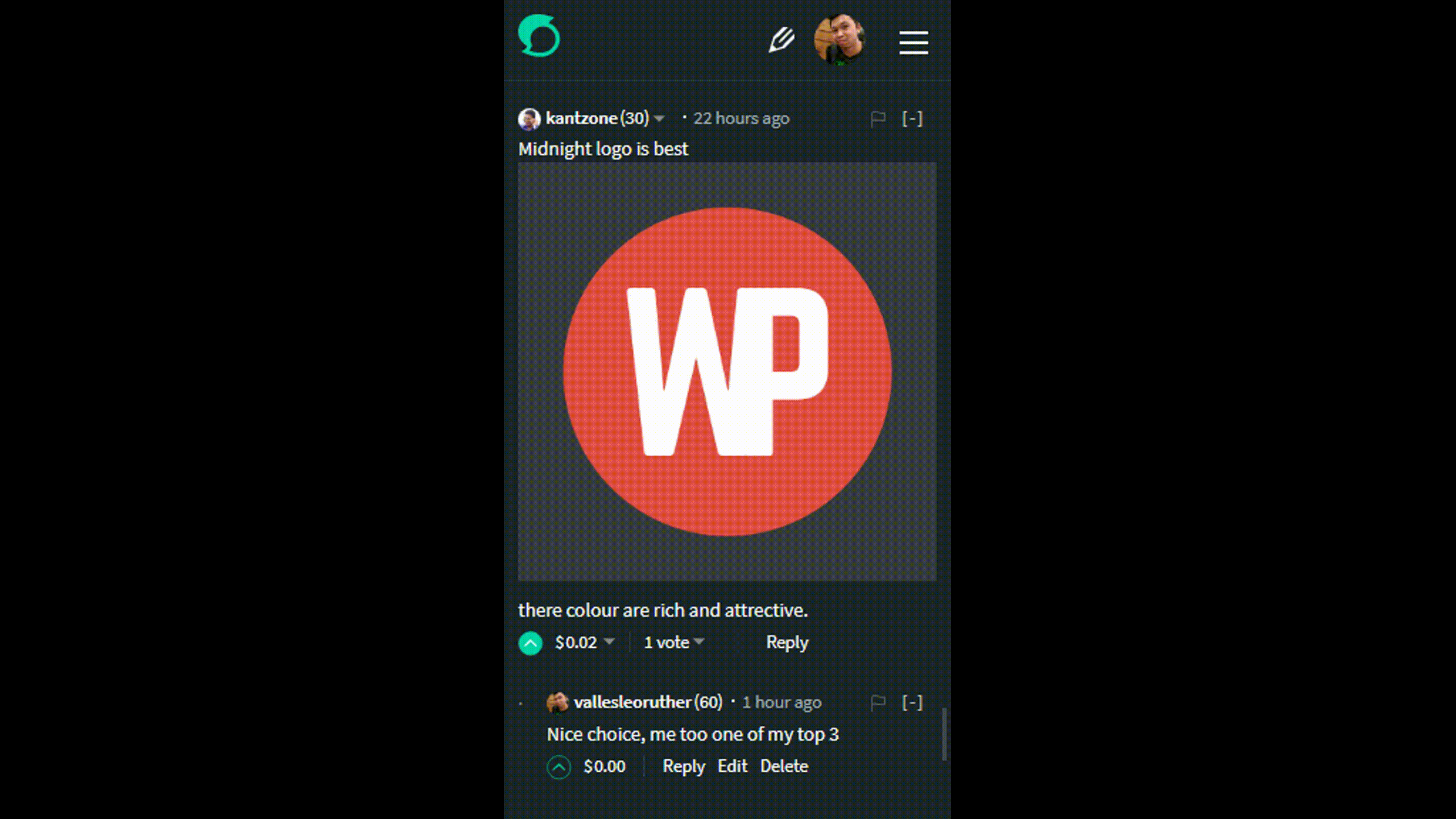
As I was browsing on Steemit on one of my posts someone commented an image to point something out. I was browsing using my Android Phone here is what it looks like:
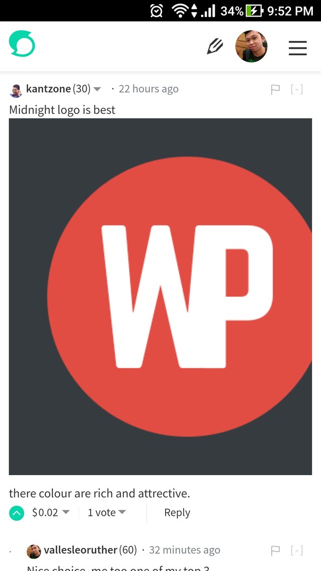
As you can see the image is cut off when the comment is viewed on a mobile phone
Bug Information
Browser: Google Chrome 62.0.3202.84
Operating System: Android 7.1.1
Phone: ASUS Z01BDA
I then decided to test it on desktop if the bug still persists. I then made tests to the common browsers on Windows.
Google Chrome
Version: 62.0.3202.94 (Official Build) (64-bit)
Operating System: Windows 10 64-bit
Firefox
Version: 57.0 (64-bit)
Operating System: Windows 10 64-bit
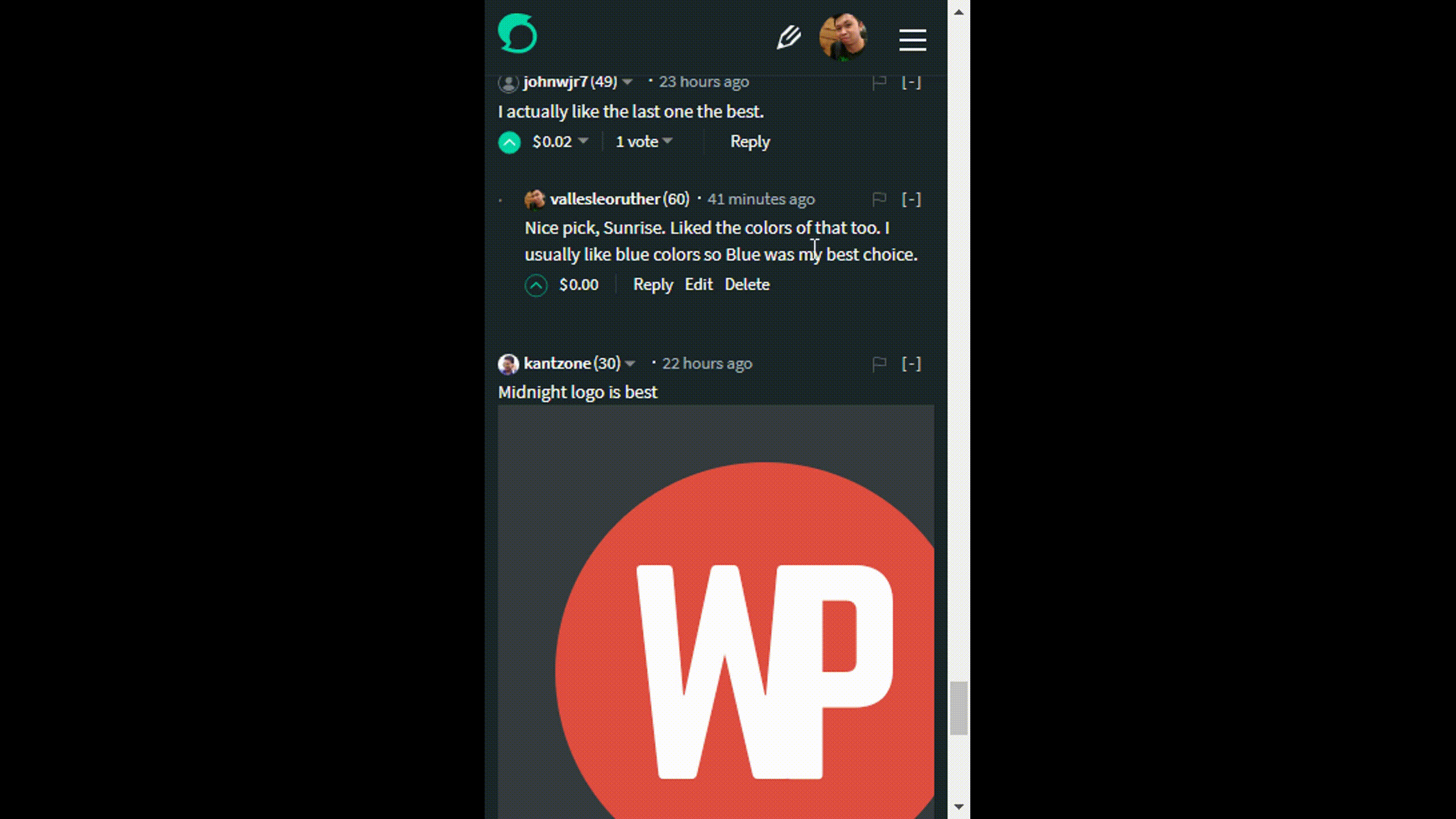
Opera
Using Device Toolbar on Opera View on Iphone 5
Version: 49.0.2725.39 (PGO)
Operating System: Windows 10 64-bit
Proposed Fix
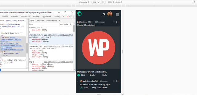
Using Chrome's Developer Tools I tinkered with the css code to fix the problem, on the 400px breakpoint a media query will be needed to fix it:
@media screen and (max-width: 400px) {
           .Comment__body .Markdown.MarkdownViewer--small img {
                            max-width: 100%;
           }
}
After applying the fix
Posted on Utopian.io - Rewarding Open Source Contributors
Nice your post @vallesleoruther
Thank you for the contribution. It has been approved.
You can contact us on Discord.
[utopian-moderator]
Hey @vallesleoruther I am @utopian-io. I have just upvoted you at 3% Power!
Achievements
Suggestions
Human Curation
Community-Driven Witness!
I am the first and only Steem Community-Driven Witness. Participate on Discord. Lets GROW TOGETHER!
Up-vote this comment to grow my power and help Open Source contributions like this one. Want to chat? Join me on Discord https://discord.gg/Pc8HG9x
Thanks for showing us how to fix it! The code and the video add so much value.
Thank you very much for the wonderful comment @lehi