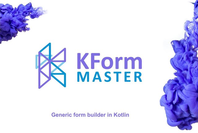
Logo Proposal for KFormMaster
DETAIL
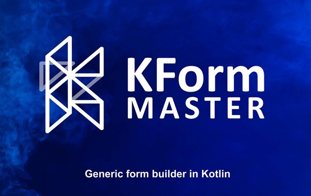
KFormMaster is a form builder that uses a RecyclerView to programmatically add form elements such as text fields, headers, buttons, and dropdowns.
In this logo design for "KFormMaster", I contacted directly the owner of the project in Github, I presented two (2) different proposals (one with vibrant colors and one in a single color), as can be seen in the request request. After conversations with the owner a proposal is selected.
REPOSITORY
LINKED TASK REQUEST
This logo contribution is not an entry of a task request on Utopian, I directly search for valuable project that I think needs logo in Github. Here is Github issue link where I tried to propose my logo to project owner.
ISSUES SOURCE
MERGE SOURCE

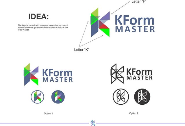
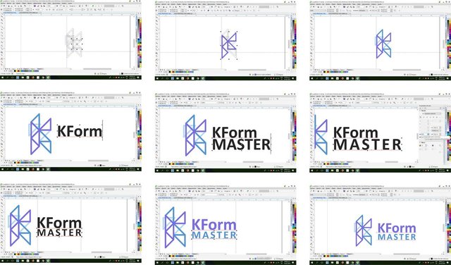
INITIAL PROPOSALS
These are the proposals presented to the project owner.
COMPARISON
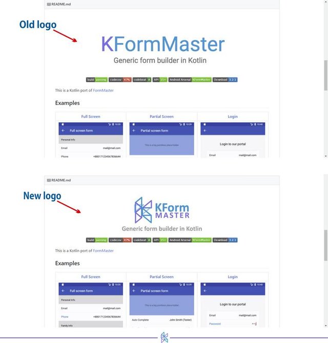
Previous logo versus new logo.
BENEFITS
I decided to make a very simple and memorable logo. This initial proposal is formed by several triangles arranged in such a way that they create an abstract image of the letter "F" and the letter "K", in this first option I used vibrant and striking colors, I combined it with a thick but very readable font, separated into two lines; then I presented another very similar proposal but the triangles are in a delineated form, this last option being chosen by the owner.
What benefits does this logo bring to the KFormMaster project?
- KFormMaster had a previous logo, so my logo gives KFormMaster a new identity.
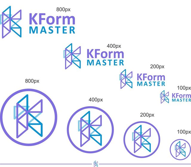
- A simple logo with multiple versions to use in different environments (profile, social networks, github readme, website, etc.).
- Modern design and easy to remember.
- Minimalist
- Great visual impact.
PROOF OF AUTHORSHIP
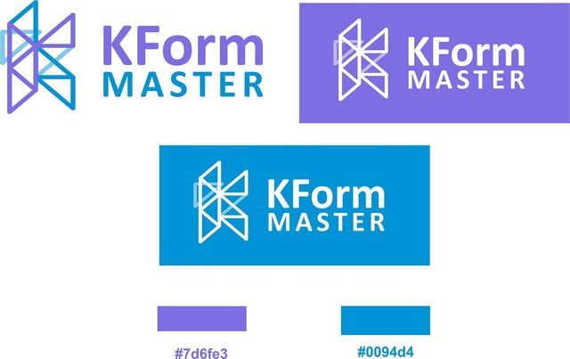
COLOR
In the selected proposal the client was very direct when deciding the colors used, for this reason I do not present a variation of other colors, with blue (# 7d6fe) and blue (# 0094d4) being selected since these are soft colors and are those used in the previous logo.
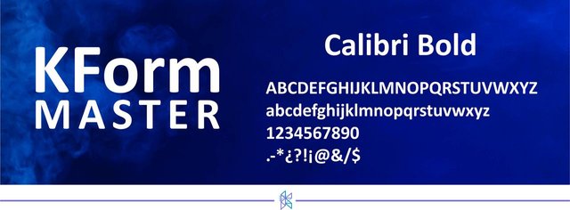
TIPOGRAPHY
To accompany the logo design, I decided to use the Calibri Bold font.
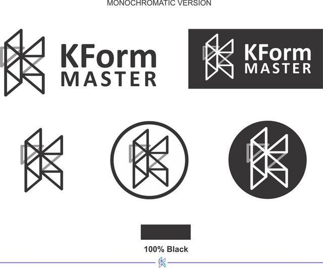
DIFFERENTS SIZES
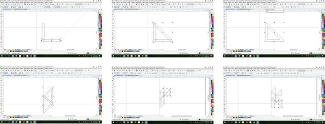
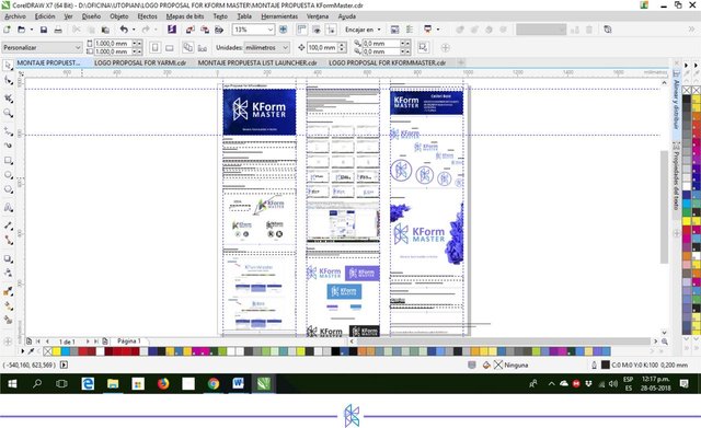
FINAL DRAFT
RESOURCE
Corel Draw X8 - Photoshop CS6 - image 1 from: freepick - image 2 from: freepick - Font: Calibri Bold
GITHUB ACCOOUNT
FILE DOWNLOAD

This work is licensed under a Creative Commons Attribution 4.0 International License.
Thank you for your contribution, Well done! However the letter F is not really noticeable
Your contribution has been evaluated according to Utopian policies and guidelines, as well as a predefined set of questions pertaining to the category.
To view those questions and the relevant answers related to your post, click here.
Need help? Write a ticket on https://support.utopian.io/.
Chat with us on Discord.
[utopian-moderator]
Hi, @nilfanif, I am grateful for your assessment, and I respect your opinion, but here you say that the owner is not using the logo, I send you proof that he is currently using the logo
https://github.com/TheJuki/KFormMaster/blob/master/README.md
I do not understand why you say that the OP is not using the logo
Hey @area-55
Thanks for contributing on Utopian.
We’re already looking forward to your next contribution!
Contributing on Utopian
Learn how to contribute on our website or by watching this tutorial on Youtube.
Want to chat? Join us on Discord https://discord.gg/h52nFrV.
Vote for Utopian Witness!