Crypto Charts Analysis #2 Ripple (XRP) 5th July 2017
***Disclaimer***
Please keep in mind : The risk of loss in trading can be substantial. I am not offering financial advice nor am I telling you how or what you should be trading. I will simply be applying charting techniques I have learnt over the years. If, of your own free will, you decide to trade never trade with money you cannot afford to lose and if you do trade, try to spread out your trades on multiple assets. A diverse portfolio is much better than only holding a single asset.
***End of Disclaimer***
Hi fellow Steemians, fellow investors, traders and crypto enthusiasts. Today while looking through the charts I came across the USD/XRP charts. I set it to the daily time frame since this helps even out the charts a bit and also gives a decent overview of what is happening to the pair.
Ripple
Ripple has made some pretty nice gains since April.
- Open as at 20/03/2017 @ $0.00672000
- Highest peak to date was on the 17/05/2017 @ $0.39887000
- Current price @ $0.25112000
So to calculate percentage gain we use the following formula :
(Price Sold - Purchase Price) ÷ (Purchase Price) = Percentage Gain
So greatest percentage gain was: ( 0.39887 - 0.00672 ) ÷ 0.00672 = 5835.57%
Current percentage gain is : ( 0.25112 - 0.00672 ) ÷ 0.00672 = 3636.9%
This is all very interesting and amazing seeing such gains but what do the charts say?
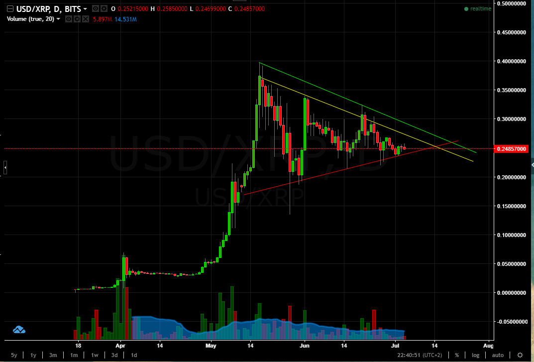
USD/XRP has been forming a Bullish Pennant. This pattern is normally seen as a period were people are taking profits, like a resting period. In such patterns traders wait for break above the resistance line and a continuation of the trend. On this chart I have drawn two resistance lines. One in yellow and one in green. The yellow resistance level is more aggressive since price has offered a decent amount of resistance, pushing prices down, however was not strong enough to stop the candles from breaking it and at one point also closing above it. The green line is a much stronger and safer resistance level. Here prices have found a wall and dropped upon touching it.
The support level has been drawn in red and is a rising trend line. Like the resistance levels, this support level is relatively sound. Prices have pierced through it a couple of times and quickly retreated back above it into the pennant.
So what could we expect with USD/XRP?
Firstly we would need a candlestick to break close above the resistance line which makes up the top part of the pennant. Without this confirmation you could end up seeing a reversal, meaning you would have purchased at a high price, if the price falls.
If we get the upward break where could the price push too? To calculate this we could take two approaches.
Approach 1 :
Step 1:
Measure the flag pole. The flag pole is the upward move, from where the price started pushing up right up to the top of the pennant. The chart below shows this measurement.
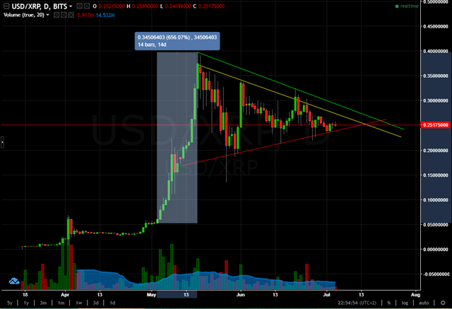
That's quite a pole!
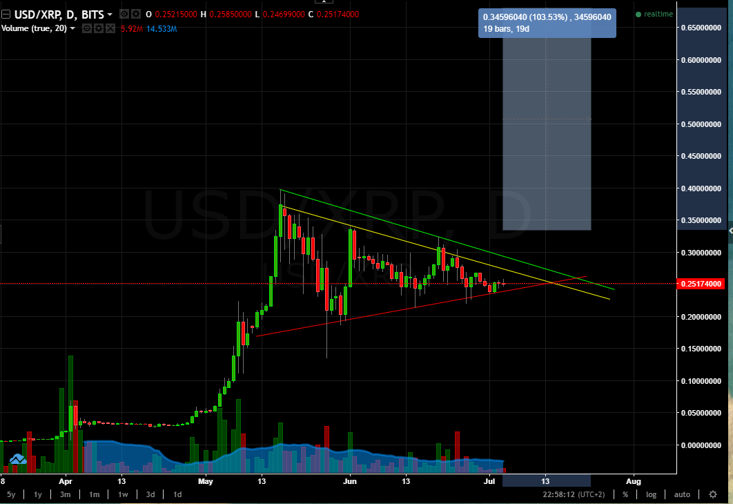
Step 2:
This is highly dependent on where the breakout candle closes. We need this price since the possible target is calculated on this closing price. To calculate this you would add the pole height to the close price of the breakout candle. This would be your target price. The chart below shows the measuring tool plotting out where the price would reach were there a breakout candle to close at around 0.3459.
To put these together in a more complete chart take a look at the below chart.
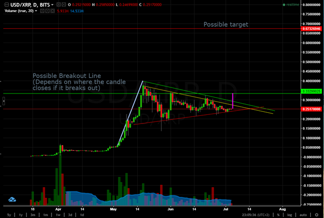
In the above chart we can see the pole (thick grey/light-blue line), where in this possible scenario the break out candle closes @ approximately 0.33. This would be a relatively safe entry and we would like to see the price move up to approximately 0.67. If you are looking for where to exit if the trade goes against you, you could close the trade if the price moves too far down and goes past the last swing low.
Approach 2:
You could take a different approach and use a pure risk to reward ratio of 1:3 for your profit target and stop loss. As is shown in the chart below.
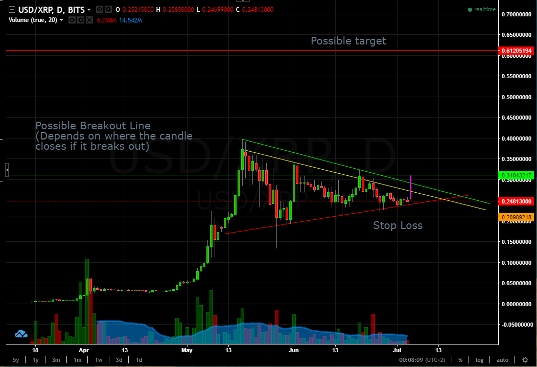
On this chart the take profit target is calculated on the amount of risk we are willing to take (within reason). The current support can easily be the previous swing low. Here I have used a wider stop loss and used the two previous swing lows (swing 2 and 3) since they form a double bottom and have placed my stop loss just below it.
Then the following calculations are done to find out take profit price:
1. (entry price) 0.31043217 - (stop loss) 0.20989218 = (difference) 0.10053999
2. 0.10053999 x 3 = (take profit distance from entry) 0.30161997
3. (entry price) 0.31043217 + (take profit distance from entry) 0.30161977 = (take profit price ) 0.61205194
So fellow Steemians, investors, traders and crypto enthusiasts what is your take on where the price of USD/XRP is going? Do you agree or disagree with this analysis or do you have your take on what the chart is showing and which direction USD/XRP will take.
If you want to check out my other blog posts check me out @nimda and up vote if you found this interesting and comment below. Thank you.
Further reading
Bullish pennant chart pattern forex trading strategy
This is one of the first posts I see which explains trading in an understandable way! Thanks for sharing! 😎
Thanks :) I really appreciate it and glad you are finding my posts informative :)
great technically analysis. Very helping in understand XRP
Thanks for your comment :) and I'm very happy you found it helpful.
Very good post. I was about to post a similair thread. I do believe most coins are currently overrated. But the future lies in blockchain. I found this amazing platform: https://www.coincheckup.com This site did all the research for you. It's truly amazing. See: https://www.coincheckup.com/coins/Ripple#analysis For a complete Ripple Research report.