RE: Most Important Bitcoin Chart Ever
Here’s my update to the “Most Important Bitcoin Chart Ever”.
Remember I’m the guy who was perma-banned from BCTalk for “multiple posting” my emphatic suggestion to buy LTC under $6. And then within a year LTC went to $360. Lol. So “sshhh” don’t shout about this post. Leave it buried as it is in a BCTalk Speculation subforum thread with the non-clickbait, misleading topic title…where there’s actually some interesting discussion of this comment post.
Wouldn’t want the “5 second attention span”, know-it-all-easily-offended Millennials to buy BTC below $10k when it’s probably going to $1 million within 18 months. I’ve been telling everyone since Jan 30, to accumulate as much BTC as possible below $4k and now that ship has sailed never again to return to shore.
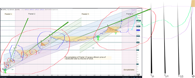
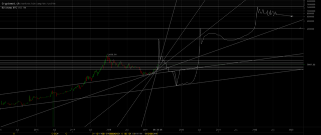
Notice I posit that the “hidden” topology for John Mcafee’s math is the fractal “pattern within a pattern” of two peaks (which I have circled in red or blue) after a #1 followed by the #3 to #5 peak. Essentially the Topological Data Analysis in the annotated chart below is considering relative time separately from relative price, i.e. time is ignored and price is dominant (which is the antithesis of Armstrong’s models) for identifying the #1, #2, #3, #4, #5 and the circled classes of peaks.
(click to zoom)
The current #3 to #5 peak underway which I have projected in color cyan, is corresponding to the preceding two blue-circled peaks, which is why it should end up as a proportionally greater increase then the two prior #3 to #5 peaks.
Also note that the coming #5 (for the prior blue-encircled peaks) will complete the second of the large red-circled peaks. Thus I have encircled in purple a #3 which will follow, corresponding to said large red-encircled peaks. I also encircled in purple the prior analogous smaller price action to give an indication of the pattern of the price action that might follow.
The above analysis indicates that Bitcoin has no top, because for even the large red-circled peaks (2nd one posited to be forthcoming) will also be grouped as a blue-circled peak to be followed by repeat of the pattern forever (per John Nash’s Ideal Money thesis in which the corrupt fiat float against the stable Ideal Money fulcrum and QE themselves into oblivion, i.e. Bitcoin is a form of discipline on the guaranteed failure of collectivized budgets).
BTC will continue to rise in price as nation-states (fiats) die. I have been blogging about the demise of the nation-states. The nations will QE into oblivion. The Sovereign Debt Crisis has Spread to 119 Countries building to 33% global unemployment after 2032 and collapsing real-estate at the epic conclusion of the sixth 51.6 year wave of the 309.6 cycle.
CORRECTIONS: note in my haste, I committed some mistakes when drawing on the above chart:
The 3rd (right-most) green trend line (drawn as a slender triangle) should have its left-most tip originating from the inception (low starting point) of the 1st (i.e. from Bitcoin’s launch or left-most) blue-circled peak. This would increase the slope just slightly, but not alter the general posited proposition that Bitcoin is headed over $0.4 million by Q1 2020 at the latest. Although I am not convinced that these said green trend lines are valid and meaningful.
The first two small red-circled peaks should be both shifted down by one peak each. This is rather important as it impacts my additional analysis below.
There should be 5th and 6th small red-circled peaks on
Nov 04, 2015andJun 18, 2016.
Additional Analysis
| Bitcoin Price | Date | Days† | Bitcoin Price | Date | Days† |
|---|---|---|---|---|---|
$0.0008 | Oct 05, 2009 | 269 | $15.40( $12.50) | Aug 17, 2012 | 1317 |
$0.0030 | Mar 17, 2010 | 493 | $7.60 | Aug 19, 2012 | 1319 |
$0.0025 | May 22, 2010 | 498 | $9.74 | Oct 26, 2012 | 1387 |
$0.008 | Jul 12, 2010 | 549 | $271( $165) | Apr 10, 2013 | 1553 |
$0.08 | Jul 17, 2010 | 554 | $50 | Apr 16, 2013 | 1559 |
$0.03 | Aug 29, 2010 | 598 | $65 | Jul 05, 2013 | 1639 |
$0.18 | Sep 14, 2010 | 614 | $1241( $972) | Nov 30, 2013 | 1787 |
$0.01‡[ $0.06‡] | Oct 08, 2010 | 638 | $153( $206) | Jan 14, 2015 | 2197 |
$0.50( $0.35) | Nov 06, 2010 | 667 | $502 | Nov 04, 2015 | 2491 |
$0.14 | Nov 10, 2010 | 671 | $294 | Nov 11, 2015 | 2498 |
$0.17 | Dec 07, 2010 | 698 | $352 | Jan 16, 2016 | 2564 |
$1.10 | Feb 10, 2011 | 763 | $779 | Jun 18, 2016 | 2566 |
$0.71 | Mar 18, 2011 | 799 | $472 | Aug 02, 2016 | 2763 |
$32( $19) | Jun 08, 2011 | 881 | $19666 | Dec 17, 2017 | 3265 |
$2.00 | Nov 17, 2011 | 1043 | $3122 | Dec 15, 2018 | 3628 |
$7.25 | Jan 05, 2012 | 1092 | $78664 | ? | ? |
$3.85 | Feb 16, 2012 | 1134 | $208,460 | ? | ? |
† Since Bitcoin’s launch on January 9, 2009.
? Projected values below.
( ) Values in parentheses the “real body” of the weekly candlestick for the Brave New Coin data (c.f. charts linked below) when it differs significantly.
The following versions of the chart (originally inspired in 2014 by @Trolololo) more clearly display and annotate some of the price features (but I posit they’re incorrect models):
(click to zoom>)
(click to zoom>)
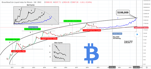
John Mcafee cited “acceleration” when he increased his Bitcoin price prediction from $500,000 to $1 million by the end of the year 2020.
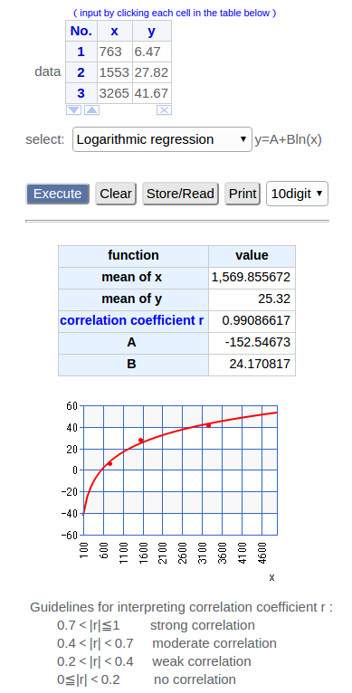
From the data above we can see evidence of increasing velocity for example in the relative height of each #3 relative to time:
| Low | High | Ratio | Days† |
|---|---|---|---|
$0.17 | $1.10 | 6.47 | 763 |
$9.74 | $271 | 27.82 | 1553 |
$472 | $19666 | 41.67 | 3265 |
But note the acceleration of the velocity (i.e. the rate of increase in velocity) is apparently decelerating, although (at least in the model below) the velocity will never revert to deceleration (and below I posit that it’s actually sinusoidal so it decelerates and then accelerates then decelerates inexorably):
Whereas the relative height of the small red-circled peaks and the blue-circled #3 - #5 peaks are decelerating!
And I noticed that the cumulative relative height of each two preceding small red-circled peaks equals the height of their succeeding blue-circled #3 - #5 peak:
| Reds’ Low | Reds’ High | Reds’ Relative Height | Blue’s Low #3 | Blue’s #5 | Blue’s Relative Height |
|---|---|---|---|---|---|
$0.03$0.01‡ | $0.50( $0.35) | 1735‡ | $1.10 | ($19)$32 | 1729 |
$2.00 | ($12) | 6 | ($165) | ($972) | 6 |
($206) | $779 | 4 | $19666 | $78664? | 4? |
‡ This $0.01 is suspect (as a potential fat-fingered drop from $0.06) because only a few BTC traded at this price on Mt. Gox as opposed to the 1600 BTC that traded on Mt. Gox at the $0.03 price on August 30.
But wait there’s an inconsistency! That projected #5 at $78664 would form a blue-circle peak, but it was already preceded by a pair of blue-circled peaks, and as we see by example of the small red-circled peaks, pairs of the same class of peaks must be delimited by an intervening larger class of peaks. So to rectify the inconsistency, thus a large red-circled peak must form on this coming #5!
Each pair of same class peaks is followed by a larger class peak. This is why I circled in purple the transition (going to a #3) after the second (of the pair, i.e. the 4th on the chart) red-circled peak instead of the transition to the first (of the pair, i.e. the 3rd on the chart) red-circled peak.
I posit this is also why the 2011 #3 to #5 (i.e. the #5 height) was so much larger, because it was implicitly (although can’t be seen on the chart because no pricing data before July 2010) forming a transition to the first of a large red-circled peak (along with forming the first of blue-circled peak) as depicted on my variant of the chart.
The other two charts I linked above are fooled by viewing the all the classes of peaks as the same curve. They are not all on the same curve and instead are topologically distinct waves! This requires very abstract thinking.
My analysis of that inconsistency is I believe a form of Topological Data Analysis (TDA, c.f. also) which John Mcafee apparently refers to as “point-set topology” as the justification for his famous prediction $1 million Bitcoin price before the end of 2020.
Why Topological Data Analysis Works
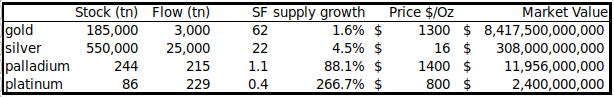
Tangentially, @infofront who originally on BCTalk had referred us to the chart that is the focus of this blog, today also correlated my observation above (i.e. the increasing height of #3 and decreasing heights of all other peaks including #5 aka #1) to a stocks-to-flows-ratio, pricing model for BTC peaks. Note I had originally mentioned the stock-to-flows ratio model in §Bitcoin Likely to Replace Gold as a Reserve Asset of my blog Bitcoin Rises Because Land is Becoming Worthless in the context of arguing that Bitcoin is becoming an international reserve asset.
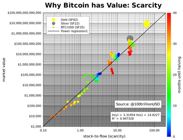
Modeling Bitcoin's Value with Scarcity
@infofront wrote:
I made a post on BCTalk a while ago on why I thought it was strange that the stock-to-flow multiple for the previous bubble was so low.
The bubbles went from nearly 14x stock to flow, to 11X S/F, to 3x S/F. The downtrend in stock-to-flow bubble multiples was accelerating too quickly. My more recent thought were gravitating toward the next S/F multiplier “filling in the gap”, by being around 6-7X. (Stock to flow price post 2020 halving will be $55,000)
With your model in mind, and the “double bubble” pattern, with 3s being micro bubbles, followed by the real bubbles (5s), I have a new take on Plan B's graph:
The 3s and 5s correspond with the 3s and 5s on your chart. Mostly self explanatory, but 3s could be increasing at an increasing rate. 5s could be decreasing at a currently unknown rate.
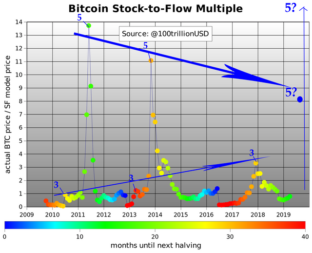
Astute! I had forgotten about that S/F ratio. Indeed, but I wouldn’t think of it as “filling the gap”. My model posits that it’s an oscillating cycle that will repeat inexorably. This is apparently what John Mcafee means where he tweeted that Bitcoin is never in a bubble.
@PlanB’s S/Fs blog elaborates:
Power Laws and Fractals
A power law is a relationship in which a relative change in one quantity gives rise to a proportional relative change in the other quantity, independent of the initial size of those quantities. [6]. Every halving, bitcoin SF doubles and market value increases 10x, this is a constant factor.
Power laws […] reveal an underlying regularity in the properties of seemingly random complex systems. Complex systems usually have properties where changes between phenomena at different scales are independent of the scales we are looking at. The picture we take at one scale is therefore similar in some way to the picture we take at another scale […] We see this in Bitcoin too: 2011, 2014 and 2018 crashes look very similar (all have -80% dips) but on totally different scales (resp. $10, $1000, $10,000), if you don't use log scales, you will not see it […] In fact, parameter 3.3 in the power law function above is the 'fractal dimension'.
As the #3 rises to become a #5 for the second of a large red-circled peak, then I posit #5 may rise again to 14X and the subsequent #3 may decline to 1.
| May 2020 Halving | S/Fs Valuation | 14X Multiplier |
|---|---|---|
| Before | $6250 | $6250 × 14 = $87500 |
| After | $55000 | $55000 × 14 = $770k |
Detailed Scenario Charts
Last one has precisely computed timing:
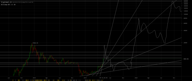
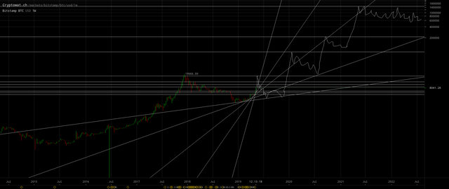
(click to zoom)
More details and computations to follow in a reply to this post because this post would otherwise have exceeded Steem’s annoying 16KB post size limit.