Using BeautifulSoup and Pandas to look at vegan mental health
I started out writing this blog in response to people telling me they believed that my post about my top ten of pervasive vegan myths was based on nothing but my opinion and not in any way based in science. I already did a Jupyter Notebook based blog post on one of the ten, longevity claims, where I showed that in the data-set underlying the China Study, cholesterol, saturated fat and animal protein were actually all in the top ten of food stuff most positively associated with longevity.
In the second place of my top ten of pervasive vegan myths, I pointed out that among other concerns, there were mental health issues associated with a vegan diet, and that given the rise in both veganism and suicides among young adults, there was reason to suspect increased suicide risk could be part of the vegan equation.
I have a 13-year-old kid myself, and I keep being shocked how dangerous vegan-adjacent nutrition advice keeps getting directed at this age group. This week, for example, blogger Quirine Smit was featured in the local WWF Rangerworld publication. A publication aimed specifically at this vulnerable group. She was claiming meat and cheese are destroying the planet and hurting the animals. A message that is likely to resonate with this age group. A message also that I hope to show is not without risks.
When I started writing this blog, my prime objective was to objectively show that claims that a vegan diet is safe for all stages of life aren't supported by the data. Data that I looked at before in a more superficial way.
While working on my blog though, two things happened. The True Health Initiative scandal reared its head, and the associations I ran into while working on this post turned out to be strong enough to be interpreted as sufficient to show causality for people who happened to have missed out on advances in causal inference in recent decades. Something that pretty much includes the True Health Initiative, as an organization whose stated goals include "combating false doubts". My own take on science is quite different. Multiple fields of science are currently plagued by the misguided idea that uncertainty is bad and that false certainty somehow is better than no certainty at all. It is my strong conviction that we need to be combatting false certainty" instead. That we should embrace uncertainty as a first step from false certainty towards new knowledge.
With these two things combined, I now ended up with two partially conflicting goals for this blog post. The first showing that there are no reasons to believe a vegan diet is safe for mental health, and the second showing that despite a strong association, making an actual causal claim, such as claiming that low meat intake is directly causal towards suicide, is absolutely uncalled for.
My third goal for this post, as for my other Jupyter-Notebook made posts before it, is to help you, the reader interested in nutrition, get comfortable with some of the core technical aspects of looking at nutritional data with Jupyter Notebook, python and some specific Python libraries useful for getting a feel for the raw data. The data used for this post is all from Wikipedia pages. All the images in this post are generated by matplotlib and pandas, using the Wikipedia data.
Today, I want to focus on web-scraping data using the Python urllib and BeoutifulSoup libraries, and getting that data into a Python Pandas data frame for further processing. Pandas I feel can be considered an in-code excel for Python and Jupyter Notebook. I hope that after reading this post, you will want to try and use Jupyter Notebook for yourself. The learning curve for Python, Jupyter Notebook and Pandas isn't half as steep as that for, for example, R Studio, and I feel for anyone interested in nutrition, gaining some data skills is absolutely essential. Always look at the raw data if you can and don't trust the conclusions from papers without having looked at the data yourself.
Importing dependencies
As I've done before in my blog post, I'm again using pandas and Jupyter notebook to write this blog post. And the first thing we should start of with is import our dependencies and allow Jupyter notebook to do inline plotting.
# urllib for fetching web pages from wikipedia
import urllib.request as rq
# BeautifulSoup for parsing wikipedia HTML pages
from bs4 import BeautifulSoup as bs
# Think of pandas as excel for python
import pandas as pd
# scipi stats for getting p-values on our pandas correlations.
from scipy import stats
# allow inline graphs for jupyter notebook
%matplotlib inline
Fetching and parsing a HTML page with urllib.request and beautifulsoup
We fetch a page from wikipedia using urllib. We start of with the web page containing a table with per country suicide numbers. Lets also get the page for per country meat consumption.
wikipedia = 'https://en.wikipedia.org/wiki/'
page1 = rq.urlopen(wikipedia + 'List_of_countries_by_suicide_rate')
page2 = rq.urlopen(wikipedia +
                   'List_of_countries_by_meat_consumption')
Now, the next thing we need to do is use the beautifulsoup library for parsing the HTML pages.
s1 = bs(page1, 'html.parser')
s2 = bs(page2, 'html.parser')
After parsing, we find the right HTML table in the HTML pages. If we look at the source of the HTML pages with our browser (CTRL-U), we see there are multiple tables. The ones we are after have a class attribute that is set to "wikitable sortable". We go and find these tables in the parsed HTML page and pick the right ones using an index.
t1 = s1.find_all("table", attrs={"class": "wikitable sortable"})[1]
t2 = s2.find_all("table", attrs={"class": "wikitable sortable"})[0]
Now we run a little loop over the HTML table to get the relevant fields into a pandas dataframe. Let's start with suicide.
#To get the data into a Pandas dataframe, we need to create a list of Python dicts
objlist = list()
#A HTML Table consists of rows. We process each row and turn it into a Python dicts with the relevant fields.
for row in t1.find_all('tr')[2:]:
    obj = dict()
    obj["cy"] = row.find_all('td')[1].find_all('a')[0].getText()
    obj["suicide_all"] = float(row.find_all('td')[3].getText())
    obj["suicide_male"] = float(row.find_all('td')[5].getText())
    obj["suicide_female"] = float(row.find_all('td')[7].getText())
    objlist.append(obj)
#Turn the list of dicts into a pandas dataframe. We will use country ("cy") as index for our data frame.
suicide = pd.DataFrame(objlist).set_index("cy")
#Lets have a shoet look at part of the data.
suicide.head(10)
| suicide_all | suicide_female | suicide_male | |
|---|---|---|---|
| cy | |||
| Guyana | 30.2 | 14.2 | 46.6 |
| Lesotho | 28.9 | 32.6 | 22.7 |
| Russia | 26.5 | 7.5 | 48.3 |
| Lithuania | 25.7 | 6.7 | 47.5 |
| Suriname | 23.2 | 10.9 | 36.1 |
| Ivory Coast | 23.0 | 13.0 | 32.0 |
| Kazakhstan | 22.8 | 7.7 | 40.1 |
| Equatorial Guinea | 22.0 | 10.8 | 31.3 |
| Belarus | 21.4 | 6.2 | 39.3 |
| South Korea | 20.2 | 11.6 | 29.6 |
We do the same for meat
#To get the data into a Pandas dataframe, we need to create a list of Python dicts
objlist = list()
for row in t2.find_all('tr')[2:]:
    obj = dict()
    obj["cy"] = row.find_all('td')[0].find_all('a')[0].getText()
    meat = row.find_all('td')[2].getText()
    #Some of the rows don't contain a valid number for meat, we skip those.
    try:
        obj["meat"] = float(meat)
        objlist.append(obj)
    except:
        pass
meat = pd.DataFrame(objlist).set_index("cy")
meat.head(10)
| meat | |
|---|---|
| cy | |
| Algeria | 19.5 |
| American Samoa | 26.8 |
| Angola | 22.4 |
| Antigua and Barbuda | 84.3 |
| Argentina | 98.3 |
| Armenia | 45.8 |
| Australia | 111.5 |
| Austria | 102.0 |
| Azerbaijan | 32.0 |
| Bahamas | 109.5 |
Combining data frames
The next thing we need to do is combine the two dataframes into one. We do this by joining the two dataframes on the country column. Because we have given both data frames the same index ("cy"), we can use the join function of our met dataframe to combine it with the suicide dataframe. We do a so-called inner join with the two data frames. The result is a new dataframe containing the combined data for those rows with a country name that exists in both data frames. If you are familiar with SQL databases, this should be a familiar concept.
#Create a combined data frame
df = meat.join(suicide, how='inner')
#Have a quick look at part of the data frame
df.head(10)
| meat | suicide_all | suicide_female | suicide_male | |
|---|---|---|---|---|
| cy | ||||
| Algeria | 19.5 | 3.3 | 1.8 | 4.9 |
| Angola | 22.4 | 8.9 | 4.6 | 14.0 |
| Antigua and Barbuda | 84.3 | 0.5 | 0.9 | 0.0 |
| Argentina | 98.3 | 9.1 | 3.5 | 15.0 |
| Armenia | 45.8 | 5.7 | 2.0 | 10.1 |
| Australia | 111.5 | 11.7 | 6.0 | 17.4 |
| Austria | 102.0 | 11.4 | 5.7 | 17.5 |
| Azerbaijan | 32.0 | 2.6 | 1.0 | 4.3 |
| Bahamas | 109.5 | 1.6 | 0.5 | 2.8 |
| Bangladesh | 4.0 | 6.1 | 6.7 | 5.5 |
Correlation
Now that we have both tables inside of a single dataframe, we can look at the correlation between meat consumption and suicide.
#List all pearson correlation factors for meat and each of the suicide columns.
df.corr(method='pearson')["meat"]
meat              1.000000
suicide_all      -0.093812
suicide_female   -0.277786
suicide_male     -0.001067
Name: meat, dtype: float64
We notice something quite interesting right here. For the ladies, the correlation coefficient is a whopping -0.278 while for men it is a mere 0.001. These could be just random, so let's look at the p-value for our female suicide data.
#We need to use the pearson correlation function from scipy to also get the p-value
r,p = stats.pearsonr(df["meat"], df["suicide_female"])
r,p
(-0.2777858788033683, 0.0003600971764218618)
A p-value of 0.00036, or to state it differently, if this is all purely random, there would be a chance of 360 in a million of such a strong result. That's quite a low probability. We can thus safely reject the hypothesis that the association between meat consumption and suicide is purely random. Note though that non-randomness in no way implies a direct causal link. But let for one moment act as if it did and look at the R squared.
#R-squared as percentage
100*r*r
7.716499446255962
Now, if we assumed a model where low meat consumption is a causal factor in suicide (what we shouldn't do without looking at a wider range of causes and a solid causal model), we would be able to ascribe 7.7% of all female suicides to a lack of meat.
A p-value of 0.00036 can't just be dismissed. But what does it mean? Does it mean there is a causal link? Does it mean that eating too little meat leads to people killing themselves? And if we combine this highly significant result with the R-squared of 7.7%, does it mean that 7.7% of female suicides could have been prevented by eating more meat? That tens of thousands of deaths from suicide yearly can be attributed to a lack of meat?
If you have been reading too many nutrition science papers, you probably think it means just that.
Let me give some spoilers: No, it does not!
What it does mean however is that there is a strong non-random association between a cluster of variables that includes low meat consumption, and female suicides. Think of it as a crime scene. Someone was stabbed to death in a dark room and low-meat just happens to be the first person to leave the room after the crime. We don't know yet if there are any other people left in the room who might be responsible for the crime. What we do know is right now low-meat is our first suspect. Maybe low-meat killed our victim. Maybe he had an accomplish. Or maybe low-meat is completely innocent and while he was in the room with whoever stabbed our suspect, low-meat had nothing to do with the crime.
While it may be premature to throw low-meat in jail for causing women to commit suicide, claiming low-meat is innocent of this crime is equally uncalled for.
Looking closer at the data
There are multiple reasons why we don't want to make any causal assumptions yet. One is the fact that we have zero ideas about a causal model where lack of meat consumption in women, yet not in men causes people to commit suicide.
But first thing first, let us look why making causal assumptions at this point is a bad idea.
df.plot.scatter(x='meat',y='suicide_female')
<matplotlib.axes._subplots.AxesSubplot at 0x7f2808e8fdd8>
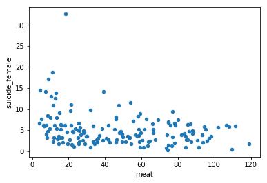
As we see in our scatter plot, despite of our highly significant correlation, we see quite a lot low-meat data points that don't map to high suicide rates for women. What we do see though is that the number of high suicide datapoints increases as meat consumption goes down.
A first testable model: vegetarianism
One hypothesis we might want to look at is that differences in per country distribution of meat consumption differs greatly. What if only zero or zero-adjacent meat causes female suicides. We would expect to see a much clearer picture and higher correlations, especially in the low regions of the graph if we looked at the per country vegetarians table. Lets fetch that table from Wikipedia.
#Fetch the aditional HTML page from wikipedia
page3 = rq.urlopen(wikipedia + 'Vegetarianism_by_country')
#Parse the HTML
s3 = bs(page3, 'html.parser')
#Get the appropriate parsed HTML table.
t3 = s3.find_all("table", attrs={"class": "wikitable sortable"})[0]
This table needs a tiny bit more processing. Sometimes the number of vegetarians is expressed in a single percentage, sometimes the number isn't that sure, and its depicted as a range, We shall take the average between the min and the max of the range when that happens.
def to_veg_count(st):
    #Test if veg cell contains a range.
    if "–" in st:
        #Split up into the two parts of the range
        parts = st.split("–")
        #Both parts should be perventages
        if "%" in parts[0] and "%" in parts[1]:
            #Get the two numbers
            r1 = float(parts[0].split("%")[0])
            r2 = float(parts[1].split("%")[0])
            #Return the mean of the range
            return (r1 + r2)/2
        else:
            #Parse problem of a range row.
            return None
        #Test if a percentage
    elif "%" in st:
        #Get the number.
        return float(st.split("%")[0])
    else:
        #Parse error, neither a percentage nor a range
        return None

#To get the data into a Pandas dataframe, we need to create a list of Python dicts
objlist = list()
for row in t3.find_all('tr')[2:]:
    obj = dict()
    obj["cy"] = row.find_all('td')[0].find_all('a')[0].getText()
    veg = row.find_all('td')[1].getText()
    val = to_veg_count(veg)
    if val:
        obj["vegetarians"] = val
        objlist.append(obj)
#Convert the list of dicts to a Pandas dataframe
vegetarians = pd.DataFrame(objlist).set_index("cy")
#Inner join the vegeterians data with the suicide data to get a second combined dataframe
df2 = vegetarians.join(suicide, how='inner')
#Have a peek
df2.head(10)
| vegetarians | suicide_all | suicide_female | suicide_male | |
|---|---|---|---|---|
| cy | ||||
| Australia | 12.0 | 11.7 | 6.0 | 17.4 |
| Austria | 9.0 | 11.4 | 5.7 | 17.5 |
| Belgium | 7.0 | 15.7 | 9.4 | 22.2 |
| Brazil | 14.0 | 6.1 | 2.8 | 9.7 |
| Canada | 9.4 | 10.4 | 5.8 | 15.1 |
| Chile | 6.0 | 9.7 | 3.8 | 16.0 |
| China | 4.5 | 8.0 | 8.3 | 7.9 |
| Czech Republic | 2.0 | 10.5 | 4.2 | 17.2 |
| Denmark | 5.0 | 9.2 | 5.2 | 13.2 |
| Finland | 4.0 | 13.8 | 6.8 | 20.8 |
Again we look at the correlations.
df2.corr(method='pearson')["vegetarians"]
vegetarians       1.000000
suicide_all      -0.034417
suicide_female    0.345610
suicide_male     -0.163782
Name: vegetarians, dtype: float64
r,p = stats.pearsonr(df2["vegetarians"], df2["suicide_female"])
r,p
(0.34561014844099264, 0.038962605896753495)
100*r*r
11.944637470540496
r,p = stats.pearsonr(df2["vegetarians"], df2["suicide_male"])
r,p
(-0.16378232513036997, 0.3398411158872703)
100*r*r
2.682465002511022
Almost 12%, more than the 7.7% we got for our meat/suicide association, but as we have much less data points, our p-value is only just low enough to be statistically significant at all, nothing close to the p-value for meat. Again, lets look at the scatter plot.
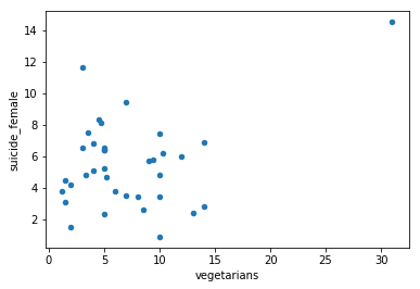
df2.plot.scatter(x='vegetarians',y='suicide_female')
<matplotlib.axes._subplots.AxesSubplot at 0x7f2806192668>
( )
)

Wow, seems like our correlation might be mostly be down to one outlier data point. India. There are two ways to look at this. One is that India with its high percentage of vegetarians is the only country where there is enough of a vegetarian subgroup to allow to carry the harmful effects of a vegetarian diet above other causes os suicide enough to show up in the scatter plot. The other is that India is just a by chance outlier and our hypothesis is wrong. Given that the scientific process urges us to favor the null hypothesis, we should, for now, assume the last. We assume for now India is an outlier that should be ignored for solid data analysis purposes.
Let's look again but now without India. And to be consistent, let's do the same for meat.
noindia_df2 = df2.drop(['India'], axis=0)
noindia_df2.corr(method='pearson')["vegetarians"]
vegetarians       1.000000
suicide_all      -0.266581
suicide_female   -0.134584
suicide_male     -0.278434
Name: vegetarians, dtype: float64
stats.pearsonr(noindia_df2["vegetarians"], noindia_df2["suicide_female"])
(-0.1345837750299958, 0.4408201996211073)
stats.pearsonr(noindia_df2["vegetarians"], noindia_df2["suicide_male"])
(-0.27843378630817345, 0.10531305549644847)
No statistical significance left after removing India, and the polarity of our associations actually inversed. Safe thus to reject our vegetarians' hypothesis.
Now let's look at what dropping India did for our meat data.
noindia_df = df.drop(['India'], axis=0)
noindia_df.corr(method='pearson')["meat"]
meat              1.000000
suicide_all      -0.083772
suicide_female   -0.262683
suicide_male      0.002677
Name: meat, dtype: float64
stats.pearsonr(noindia_df["meat"], noindia_df["suicide_female"])
(-0.26268253062064834, 0.0007914201535371475)
Well, it turns out vegetarianism was a dead-end road. If we discard India as outlier, the correlation for meat goes down from 0.278 to 0.263 increasing the p-value from 0.0003 to 0.0008. The correlation for vegetarianism, without India, turned into probabilistic noise.
To summarize, because India is the only data point with the potential to transcend the level of probabilistic noise, it is quite impossible to tell if India, on its own, is just a random outlier, or if its high female suicide rates are the result of its high level of vegetarians. In a criminal investigation, vegetarianism would likely walk free before making it to court.
A second testable model: animal foods
Now let's look at another hypothesis. What if not a lack in meat, but animal foods is the problem. Vegetarians still drink milk and eat eggs. We could try to look at vegans, but there are too few data points in our table to do so. Instead, let us look at milk.
#Fetch the 4th Wikipadia web page
page4 = rq.urlopen(wikipedia +
                'List_of_countries_by_milk_consumption_per_capita')
#Parse the HTML
s4 = bs(page4, 'html.parser')
#Get the parsed HTML table
t4 = s4.find_all("table", attrs={"class": "wikitable sortable"})[0]
#Put the data from the HTML table into a list of dicts as before.
objlist = list()
for row in t4.find_all('tr')[1:]:
    obj = dict()
    obj["cy"] = row.find_all('td')[2].find_all('a')[0].getText()
    try:
        obj["milk"] = milk = float(row.find_all('td')[3].getText())
        objlist.append(obj)
    except:
        pass
#Convert the list of dicts to a Pandas data frame
milkies = pd.DataFrame(objlist).set_index("cy")
#Inner join with the suicide data.
df4 = milkies.join(suicide, how='inner')
#Have a peek at the combined data
df4.head(10)
| milk | suicide_all | suicide_female | suicide_male | |
|---|---|---|---|---|
| cy | ||||
| Finland | 430.76 | 13.8 | 6.8 | 20.8 |
| Montenegro | 349.21 | 7.9 | 3.6 | 12.6 |
| Netherlands | 341.47 | 9.6 | 6.4 | 12.9 |
| Sweden | 341.23 | 11.7 | 7.4 | 15.8 |
| Switzerland | 318.69 | 11.3 | 6.9 | 15.8 |
| Albania | 303.72 | 5.6 | 4.3 | 7.0 |
| Lithuania | 295.46 | 25.7 | 6.7 | 47.5 |
| Ireland | 291.86 | 10.9 | 4.2 | 17.6 |
| Kazakhstan | 288.12 | 22.8 | 7.7 | 40.1 |
| Estonia | 284.85 | 14.4 | 4.4 | 25.6 |
df4.corr(method='pearson')["milk"]
milk              1.000000
suicide_all       0.031270
suicide_female   -0.181872
suicide_male      0.120519
Name: milk, dtype: float64
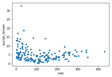
df4.plot.scatter(x='milk',y='suicide_female')
<matplotlib.axes._subplots.AxesSubplot at 0x7f2805deb3c8>
stats.pearsonr(df4["milk"], df4["suicide_female"])
(-0.1818715919171018, 0.016950492615505172)
Note the left half of the graph looks quite a lot like the meat graph, while the right part of the graph looks basically random. Again the association is statistically significant at a p<0.01.
We can now conclude that low-milk for sure was in the darkroom with low-meat when the crime happened. At this point, low-meat, given the p-values, is still our prime suspect.
Testable model three: Only real-low animal food intake matters.
Now, if we assume a deficiency driven causal link that applies to something found in both meat and milk, we would expect a much higher absolute correlation coefficient if we looked at just the left part of the scatter plots.
Let us look at meat once more first. Like before, we keep India out for reasons we discussed.
lowmeat = df[df["meat"] < df["meat"].max()/4].drop(['India'],
                                                   axis=0)
lowmeat.corr(method='pearson')["meat"]
meat              1.000000
suicide_all      -0.252286
suicide_female   -0.306312
suicide_male     -0.151440
Name: meat, dtype: float64
As we expected, our correlation went from -0.26 for the whole graph to -0.31 for the part of the graph with the bottom 25% meat intake. Let's do the same for milk.
lowmilk = df4[df4["milk"] < df4["milk"].max()/4].drop(['India'],
                                                      axis=0)
lowmilk.corr(method='pearson')["milk"]
milk              1.000000
suicide_all      -0.352417
suicide_female   -0.378256
suicide_male     -0.288449
Name: milk, dtype: float64
As with the meat, the absolute correlation went up. But this time much more dramatically. we went from -0.20 to -0.38, an R squared of 14%. So how about p-values. We dropped the number of data points, so we should expect lower p, let us look where we are on those.
stats.pearsonr(lowmeat["meat"], lowmeat["suicide_female"])
(-0.30631161544326857, 0.01635483840934748)
stats.pearsonr(lowmilk["milk"], lowmilk["suicide_female"])
(-0.37825560972747774, 0.0002370584365104405)
As expected, the p-value went up for meat, and at 0.016, we are still in the statistically significant range despite having fewer data points. But look at milk. Our p-value actually went down from 0.0170 to 0.0002 despite having less data points. This once more shows we were on the wrong track looking at vegetarians, but it also suggests strongly that we must be on to something.**
Remember we skipped men in our analysis, but now we are zoomed in a bit more to the problem, it is time to give men a second look and see how they are doing at this level
stats.pearsonr(lowmeat["meat"], lowmeat["suicide_male"])
(-0.15143990975644295, 0.24399941857300125)
stats.pearsonr(lowmilk["milk"], lowmilk["suicide_male"])
(-0.2884486068590971, 0.005832119702993646)
While we do have an R square of 2.3%, we don't have significance for meat. For milk though, we are getting close to the levels we have for females.
I think we can conclude that for men, the available data is insufficient. at least for meat, to say anything useful at this point.
To summarize, low-meat has been demoted from prime suspect. The new prime suspect now is really low milk intake.
looking at the relation between low-milk and low-meat
For meat, it might even be so, if there is a strong association between meat and milk consumption, that the association between meat and suicide is the result of meat consumption acting as a proxy for milk consumption levels. Let us investigate. A good start, like always, is looking at the data graphically.
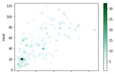
df_both = noindia_df.join(milkies, how='inner')
pl = df_both.plot.hexbin(x='milk', y='meat',
                         C='suicide_female',
                         gridsize=32)
df_both = noindia_df.join(milkies, how='inner')
pl = df_both.plot.hexbin(x='milk', y='meat',
                         gridsize=32)
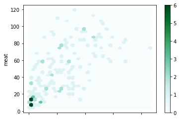
r,p = stats.pearsonr(df_both["milk"], df_both["meat"])
print("R-squared=", 100*r*r,"%")
print(r,p)
R-squared= 43.896871366912755 %
0.6625471407146268 1.4037300541990545e-21
Look at the first plot as a suicide heatmap on a meat and milk landscape and the second plot as a histogram for counties in the meat/milk landscape. As ew can see, both for countries and suicide, there is quite a cluster near the origin. It thus is clear that low milk consumption and low meat consumption are part of a cluster of circumstances that together are strongly associated with suicide among women.
One thing that stands out is that there are no low-meat data points that arent also low-milk data points.
It is possible meat consumption is just a proxy for milk consumption, but at this point we don't know. We know milk consumption isn't just a proxy for meat consumption, but for the rest of it, we don't even know what other variable ranges might be part of the same cluster. Remember how strong our meat association was, strong enough for many an epi paper author to suggest causality. But with milk and vegetarianism data weighing in, our meat association starts to crumble, despite the strength of the association. The case for milk might crumble in similar ways when other cluster variables are discovered.
The most important thing though these graphs tell us, is that there really are no low-meat high-milk countries. Whatever we do processing the available data to gauge the relationship between milk, meat, and suicide, there is nothing we can do to test speculations about the effects of a low-meat high-milk diet. This means, while we might be able to arrive at the conclusion that low-milk is highly likely to be safe in a high-meat context, the data we have won't be able to allow us to ever say that low-meat is likely to be safe in a high-milk context. This again means our India vegetarians' data-point will remain without company. We have one single data point, one unreliable witness, accusing a low-meat high-milk diet of being deadly.
Fourth testable model: shared-nutrient deficiency
Before we close this analysis though, there is one thing remaining we must look at. One more hypothesis. What if deficiency regarding a nutrient found in both milk and meat is causal towards female suicide?
Let A be meat consumption and B be milk consumption. If we assume meat has a quantity of our unknown nutrient , while milk has x times this same quantity, then if we look at different values for c for the linear equation A+cB, we could see a distinguishable peak in suicide where c=X.
If c is very small, then the p-value for A+cB towards suicide will be equal to the p-value for A towards suicide. If c is really large, then the p-value for A+cB will be equal to the p-value for A towards suicide. If meat isn't just along for the ride and if there is a shared essential nutrient of what meat has a substantial amount, then we should see at least a hint of a single downward spike diversion from a noisy curve that simply moves from the p-value value for meat to that for milk.
#We go a bit more low level, import numpy and matplotlib
import numpy as np
from matplotlib import pyplot as plt

#Function to get the p-value for the correlation between our composite at given value of 'c'
# and female suicides.
def try_for_c(c):
    #(re) fill the composit column using given value for c
    df_both["composit"] = df_both["meat"] + c * df_both["milk"]
    #Take onle the one 4th of the data set with the lowest values for the composite
    lowcomposit = df_both[df_both["composit"] < df_both["composit"].max()/4]
    #Return the p-value for the pearson correlation for the bottom 25% data set chunk.
    return stats.pearsonr(lowcomposit["composit"], lowcomposit["suicide_female"])[1]

#Turn the try_for_c function that takes a value for c into a function object that works on a vector.
cmap = np.vectorize(try_for_c)

#Create a vector of x values from 0.0001 (10^-4) up to 10,000 (10^4) spread evenly on a logaritmic scale.
x = np.logspace(-4, 4,500)
#Get the p-values according to our try_for_c function for all of the x values in our logspace.
y=cmap(x)

#Plot the p-values against c.
plt.plot(x,y)
plt.xscale("log")
plt.yscale("log")
plt.show()
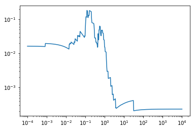
Another model shown unlikely to be correct by the data. It seems now very unlikely that there is a single nutrient shared by meat and milk which its sufficient intake has a strong causal link towards female suicide.
Embracing uncertainty
So where does this lead us? Lets sumarize:
- We have a strong negative association between eating meat and female suicide R=-0.28, p=0.00036
- If we discard India as possible outlier, this changes to R=-0.26, p=0.00079
- If we look at just the bottom 25% range of meat intake only, this changes to R=-0.31, p=0.016
- With a limited number of data points, we see a barely statistically significant but high R association between vegetarianism and female suicide. R=0.35, p=0.039.
- If we discard India as a possible outlier, this changes to R=-0.13, p=0.44
- We have a moderate negative association between consuming milk and female suicide R=-0.18, p=0.017
- If we look only at the bottom 25% range of intake, discarding India again, this changes to s strong association, R=-0.38, p=0.00022
- There is a massively robust correlation between milk and meat consumption (R=0.66 p=1.4e-21)
- Our test of a mechanistically viable single-nutrient causal path showed this model to be invalid.
We could continue, like some epi studies tend to opt for, by wildly adjusting for known risk factors. There, however, are strong reasons not to go that path. A full discussion of these reasons falls outside of the scope of this blog post, however. For those interested, try reading up on do-calculus and the math and science behind scientifically adjusting for. The core idiom should be that it is not safe to adjust for anything unless you already have at least a partial causal model that justifies the specific adjustments.
So what can we conclude from the data we have?
What we can conclude from the data we have is that :
- Really low levels of meat and milk intake are part of a possibly much larger cluster of variables with a strong association with female suicide.
- It is highly unlikely that this association is purely random. It is however very much possible though that one or even both variables are just along for the ride.
- Given the data available, it is impossible to claim that a vegan diet, devoid of both milk and meat, is safe from a mental health perspective.
- It is, however, almost equally impossible to claim a vegan diet, devoid of both milk and meat is causal towards female suicide.
- It is possible and likely that low meat intake is just a proxy for low milk intake, given the strong association between meat and milk intake and the information the hexbin plot showed us. It is unlikely, given the data that low milk intake is a proxy for low meat intake.
- The single data point from India regarding vegetarianism is likely though far from certain to be spurious.
Closing
I hope this blog post accomplishes my three goals for it:
- Show that concerns for the effects of a vegan diet on mental health are justified.
- Show the importance of embracing uncertainty when looking at data like this, and not leap to conclusions of causality.
- Show how Python Pandas, Beoutifullsoup, urllib, numpy and scipy, combine into a powerful toolkit for looking at web published public data sources, like the per country stats from Wikipedia.
To be honest, I mostly skimmed through some of your post as I am not interested enough in the subject to study it to a great depth. However, I was worrying that you saying there is not evidence for this or that decision meant you were ignoring the need to live in a world where many of our decisions have to be made even while not having enough data/proof to justify our making such a decision.
I would like to see some method of taking into account that if we have a 13 year old son who is vulnerable to certain schools of thought which could be harmful to him (but not proven so) that a curve shows that the information we have (and maybe adding to that our own anecdotal exeriences) show that we would be justified in countering the claims of those who may be trying to harm our child by claiming their rather sketchy information is fact.
In other words, are there political reasons for pushing a certain school of thought or if not political, are there economic reasons, or religious reasons.... those should weigh against their claims, reducing their right to make claims if they do not have exhaustive factual proof.
I don't know if what I was trying to say come through....
However, there is one other point I consider extremely important, and yet no non-vegetarians ever seem to mention it.
We are accused of killing creatures of this Earth....and it is true to tens of millions of cattle, sheep, chickens and so on are killed, but in number of lives lost, they are nowhere close to the number of lives lost thanks to vegetarians.
On a farm of a friend, I see his cattle in the fields, with buck, zebra and so on wandering among them, taking advantage of the safety and the food availability.
On the vegetable farm of another friend, I see the land (crops) being sprayed and thus, even on that tiny plot of land, he is killing millions of insects and small kinds of life, including our precious bees and butterflies.
I would say vegetarians are responsible for at least 100 to 1000 times* the number of lives being lost, so how can they claim following a vegetarian lifestyle is ethical? They are destroying our planet!! - How Dare They!! (*numbers can only be estimated, but the lower number is justified from my above example given, whereas the possibility of the true number being closer to the larger number is horrifying).
I wrote this blog post mostly in response to comments I got on this post, where at #2, I say that the association in time between increased suicide rates among young adults and increased numbers of vegans and vegetarians in that age group should be of concern.
A few people pointed out this was post-hoc-ergo-propter-hoc reasoning, and to be fair, up to a point it is. It is however not the only line of evidence pointing at the potential danger of a diet low in animal products on mental health.
So in this post I tried to show another line of evidence pointing to the potential mental health issues with a vegan diet.
When however I found out about the strength of the associations involved I started to get worried people reading my post might draw false certainty from the data. For that reason I wrote the second part of the blog post in order to put the strength of the association into perspective.
I think the crime scene metaphor covers thins quite decently. We know a crime took place. low-meat was the first to flee the crime scene. Vegetarian India was the 8 year old found holding a bloody knife, and low-milk, low-meats big brother, was also on the crime scene turned out to be a more likely suspect than low-meat. Maybe one of them did it. Maybe they did it together, or maybe there are other people still hiding on the crime scene and all three just happened to be in the wrong place at the wrong time.
One thing is sure though. Until someone explains away the evidence with a solid mechanistically sane causal model that fits the data, you don't want your 13-year-old kid anywhere close to anyone of the three identified suspects.
Congratulations! Your post has been selected as a daily Steemit truffle! It is listed on rank 9 of all contributions awarded today. You can find the TOP DAILY TRUFFLE PICKS HERE.
I upvoted your contribution because to my mind your post is at least 4 SBD worth and should receive 253 votes. It's now up to the lovely Steemit community to make this come true.
I am
TrufflePig, an Artificial Intelligence Bot that helps minnows and content curators using Machine Learning. If you are curious how I select content, you can find an explanation here!Have a nice day and sincerely yours,

TrufflePig