The Story and Meaning of #7 Iconic Logos

An iconic logo became that way for a reason. Here, I break down what each logo’s story and meaning are and share what insights you can gain from these iconic examples.
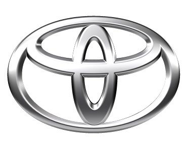
Toyota
Many know that Toyota's logo forms a "T" for Toyota, but few realize that there is a deeper meaning. The three ellipses within the logo actually represent three hearts. One ellipse is the heart of the customer, another represents the heart of the product. The last ellipses are the heart of progress in the field of technology.
From a design perspective, this is exactly what a business should look for in an abstract logo. Deeper meanings are what make abstract logos great, as they help the logo tie into the brand's core values.
McDonald’s
BMW
Few realize this, but BMW actually began as an aircraft manufacturing firm. They only began producing cars and motorcycles because the Versailles peace treaty forced them to stop producing aircraft after WWI. In WWII, BMW again began producing aircraft engines, even making some of the first jet engines during the war!
Why is BMW's history in aircraft manufacturing and design important? Because it's such a big part of BMW's history that it helped shape their logo. Have you've ever wondered what the BMW emblem’s blue and white quarters represent? If so, it's actually meant to look like a propeller in motion.
The white is an aircraft's prop and the blue is the sky as it peeks through. A very neat logo that is relevant to the history of the company.
The BMW emblem is a perfect example of using simplicity in logo design. They could have made the logo an actual prop, but in making it so simple it's easy to remember and replicate across marketing materials.
![]()
Adidas
The Adidas logo is interesting because originally, their logo had no meaning. The "Three Stripe Company" as they called themselves, simply put three stripes on everything because they could. Even their second logo design, the trefoil didn't have much meaning.
But, their most recent redesign has introduced a lot more meaning into the iconic three stripes. They've angled and placed the three stripes so that their logo now resembles a mountain. This is symbolic for the challenges that people must overcome in both exercise and life. It also represents how Adidas products are up to the challenge. The kicker is, it does all this while remaining true to the original three lines.
Adidas is a great example if you're redesigning your logo and aren't sure how to incorporate more meaning while remaining true to your original branding.

![]()
Domino’s
Domino's is actually an example of what not to do when coming up with a design for a logo. No, I'm not talking about the current logo, I'm actually referring to what it was originally intended to be.
Originally, a new dot was supposed to be added for every new store opened. While it sounds neat on paper, the idea was abandoned after a year and I'm sure you can figure out the reason. You simply can only add so many dots to the logo before it becomes too much.
To put things in perspective, there'd be over 10,000 dots by now if they had stuck with the original design idea.
The takeaway here is: don’t be overly ambitious when creating a logo. Understand the limits of logo design, and try to keep things on the simpler side. Remember - the simpler your logo is, the more memorable it'll be!
Original Article: The Story and Meaning of #7 Iconic Logos