Steemit.com Updates: Design and Security
New homepage layout
We've been busy synthesizing community feedback and designing ways to improve Steemit.com. Over the next few weeks, we'll be rolling out a series of changes to the User Experience (UX) and User Interface (UI).
To kick things off, we've started a series of small improvements to the homepage which are explained below by our Head of Design, Pon Kattera:
Putting people first
We've included the author's profile picture alongside each blog post. It's the people within our community that makes Steemit special and we hope this small change helps to deepen the connection between you and your fans.
Improve the scannability of each blog post and separate the key actions
We changed the layout of the post summary. By separating the author and timestamp from the key user actions (like upvote and reblog), it's now easier to quickly scan posts with elements in predictable, consistent places.
A picture is worth a thousand words
We've built a new expanded blog view layout. This gives you another more visual layout to browse posts. There is a toggle so you can quickly switch between the compressed and expanded views.
A new right sidebar on desktop
Yes, it does look a little lonely out there right now but this new structure sets us up for some new content items currently in development.
Design is never done.
In this period while we're testing new designs and rolling out changes, there are some visual inconsistencies scattered across the site. We're acutely aware of this and we’re working hard to unify the design and make it better.
Improving security
The following pull requests help make condenser (steemit.com) more secure.
Accidental private key sharing
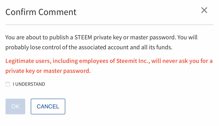
Pull request 1763 added a warning to users who accidentally paste their private keys in the memo field when doing a wallet transfer.
Malicious link warnings
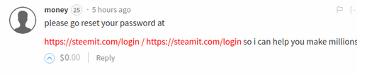
Pull request 1839 will prevent malicious links from being clickable and will show the actual URL behind them. The text will be changed to red to warn users. Any link where the actual URL does not match the URL that is being displayed will be changed.
You will now see something like this:
Instead of:

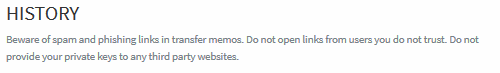
Pull request 1822 added a warning to the wallet history to caution users about potentially malicious links that may be sent as wallet transfer memos.
Change to hide-post logic
Pull request 1838 updated the logic to show and hide posts so that any user’s post can be hidden if it receives enough downvotes. Previously users with a reputation of 65 or higher were exempt from being hidden. This will prevent malicious users from being able to use a hijacked level 65+ reputation account to post links without being hidden by downvotes.
Other changes
“Submit a Story” was changed to “Post” in pull request 1768.
Pull request 1808 updated the “Claim Rewards” button so that users know it is in progress, and cannot click it a second time while it is still working.

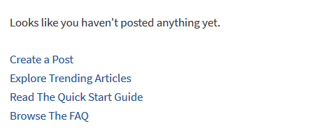
The user profile page that users see if they view their own blog when they haven’t made any posts yet was updated to have new links. (Pull request 1785)
Pull request 1787 ensures that hashtags found in a post are only added to the categories if they don't exceed the limit of five. This will prevent users from getting a validation error if they use more than five hashtags in the post body. #fun #hashaway
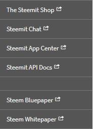
Links were added to the main menu for "The Steemit Shop" and the "Steem Bluepaper" (Pull request 1724).
Pull request 1804 made several updates to the FAQ page to clarify the stolen account recovery process.
More to come
The recent changes to steemit.com are the first of many that we will be making to the website layout over the coming months, so stay tuned and Steem On!
Team Steemit
I'm really glad about this level of communication, for a while it felt you guys were like:
Different jobs, different roles, different priorities.
Lol! Well I'm glad you no longer feel that way! 😁
Community Liaison, Steemit
No actually quite happy with the Steemit team, I have massive respect for you guys, pioneers of disruptive technologies managing a community of non-tech users accustomed to the look and feel of maturized social media platforms that have +10 years of R&D invested already.
Still thought the comic was funny.
Also their's a difference between the front-end and server developers.
The people who work on the uierinterface, aren't nececairly the same people that work on the server, neither are those people working on the block-chain tech.
the stability of the network is most likely not the responsibility of the people who work on the UI.
LOL, LMAO!! So true, but I hope after this update post, it changes, and they rather throw out the new logo guy!!
😂👍🏾
LOL, LMAO!! So true, but I hope after this update post, it changes, and they rather throw out the new logo guy!!
Well I, for one, think the changes are absolutely beautiful. I'm really, really excited to see what you guys have planned for the future. Pon, I want to personally thank you and your team for the awesome work you've put in. I'll admit that when I heard a new design team would be making changes to the site I was worried. It's such a make or break moment for a platform like Steemit - it has to be beautiful and appealing or nothing else matters. So great work, and looking forward to seeing the new Steemit.com as it rolls out over the next few weeks up to years end!
I wish to request a Compressed view. Well, a truly compressed view. I have seen this come up time and again in discussions with the most active curators on Steem. Many curators have noted that the new UI is actually a step back from the previous one in terms of information density and discoverability. Curators have a unique need, which these changes currently ignore. Something akin to Reddit would be a boon for curators who scan through hundreds, if not thousands of posts, every day.
Of course, I'm aware most casual curators (i.e. regular users) don't care, but given that there are two view options already, I don't see a drawback to adding a third for an important group of people who shape the content on this network.
Part of the post summary redesign was to create markup that would enable us to create different layout views in the future with simple CSS changes. The truly compressed view for curators was definitely a part of our thinking for this structural change.
Before designing a truly compressed view, I'd love more insights from curators in the community. For example, do you want exactly the same information to be displayed, but more compressed? Is there information in the summary that we could remove without affecting your ability to quickly curate?
For me, current information is necessary, except maybe that brief summary could be shorter, but make everything more compressed with lots of posts in the view, so that I can browse through them more quickly.
We might be able to do without the picture (included with the post) or even the brief summary under the title. The things that absolutely cannot go are the title and poster. I'd say everything else is pretty negotiable, depending on how much more screen real estate is freed compared to what was removed.
Great! Is there any other information that we're not providing that would be useful?
The preview pictures also make steemit.com very bandwidth hungry. Keeping in mind that much of our user base comes from regions where internet data is at a premium, a compressed view that does not display or preload pictures would be very helpful.
Pack more posts within a single view. Reddit is pretty good in that sense. Loving the design update btw @pkattera!
The author's name on trending page and blog needs to return where they were. When reading the trending page, logic wants it that we look at post's title first and then possibly look at the author's name.
The way the author's name are displayed in relation to the post's titles make it appear as if it's the author's name that is being published. Titles are being published not author's name. The intents of authors are being published and transmitted in the post's title first and foremost. This is were the reader's mind should be drawn first and very unequevically. This is where the novelty is and intention are being conveyed.
A lot of what we see is being picked up and process by our brain unconsciously first. The way we design and display things mean something.
Right now the display seems to mean that what is being published are the author's name. When our brain understand it's the titles that are published and we have to make a constant effort to look at the titles first, our brain is constantly telling itself "Don't look at the elephant" so to speak and that's pretty much impossible. Our brain have millions of years of evolution of constant analyzation of what it is faced with. It's been annoying me to the point I instantaneously switch from steemit to stage.steemiz.io when the new design came out.
Also I totally agree with @liberosist post about the number of titles display on a page. And I feel like this need mentioning, I browse Reddit ever day for more than an hour for many years on end now and I almost never look at any author's name.
Reddit is the top 8 most visited website on the internet the most similar website to Steem in the top 20 probably top 100 and not matter what some people think about its designed, it still hasn't prevent it to be as popular as it is. In my opinion Reddit is really well designed, simple yet efficient.
I look forward to sharing with steemit more of my ideas and understanding about how I see things on the subject, pun intended.
That's great to hear! Now that we have your ear, I have made a more detailed post about it here - https://steemit.com/curation/@liberosist/suggestions-for-a-compressed-view
Please leave your feedback.
Great – thanks for taking the time do this! I'll leave my comments your post.
This is a great point, but I kinda want to chime in here. I'm not exactly a curateur extraordinaire (I know it's probably not how you say it in French... it should be, though) but I would very much like to see such an option to help make browsing authors, especially new authors, easier. I think the community in general would benefit from this.
In as much as the word "curator" that we are using here does not have the usual meaning (1. A person who manages, administers or organizes a collection or 2. One appointed to act as guardian of the estate of a person), there is no reason to not use the word curateur with a new meaning in French.
So curateur extraordinaire or extraordinaire curateur seems very good to me.
I like this guy! Somebody crack open the bubbly, a new phrase is now in circulation on Steemit.
I like it!
Community Liaison, Steemit
Ok. What of the problems with commenting and upvoting. What is the latest dev about them?
Hey @yaanivapeji we discuss this in our last post, I'll include the relevant portion here for your convenience: "The Steemit development team takes any issue that impacts the usability of the website very seriously. We have multiple performance monitors in place, which are running on the website 24/7, and we are alerted instantly if the site ever goes down. We track many metrics that inform us of how long things are taking as users are interacting with the website. We know when there are issues. We also appreciate the many alerts that we receive from users when they notice something that could be wrong. We may not always communicate publicly about every challenge we face, but you can rest assured that we are actively working to resolve all issues as quickly as possible."
Thanks for your feedback!
Community Liaison, Steemit
Thank you
That would belong in the dev blog. Also, this post seems to be mostly about aesthetic functionality more than the gears of the system, so to speak.
I'm liking the changes so far!
I'd love to see an improvement where I can categorize posts within my own blog. Not sure if that's in the plans or not?
Here's to that idea. We need some deep improvements when it comes to managing our blogs. I mean, at the moment, the only way to get to a post you made months ago is to scroll through every single post you made between now and then. Categories and a good archive calendar would be freaking awesome!
It's great that you are improving things but here is my 2 cents worth so far.
The site still doesn't work and I still can't vote so I'm using Steem Stage.
https://steemitstage.com
The tag list would be better on the right hand side where it used to be, and could be combined with the links area.
Both of those things are a total waste of space and could be drop down menus.
I often look at Steemit on my tablet and the bad use of space is a real issue on a tablet.
What I want to see is the entire first line of the post, as I could before.
And what I want to be able to do is comment and vote with no spinning wheel. On Steem Stage I can, but on Steemit I still cant.
Only thing I miss on Steem Stage is all the Steemit More Info stuff.
I'm excited for what's coming. I'm liking those changes @pkaterra
Will this also work for accidentally copy-paste key here in the reply section?
Especially happy the see some of the security warnings... sadly, they seem more and more relevant these days. And-- as Steemit continues to grow-- more and more people will ill intent will swoop in here and try various scams and schemes to separate the unaware from their wallets.
Well done - I like it so far :)