[ STEEMIT REVIEW ] eSteem Mobile App for Android Full Review (Screenshot by Screenshot)
Two weeks ago I saw the Steem Mobile App for Android created and designed by @good-karma with NetSolutions. I believe this is also his software company.
Just like my previous post on the app beta version, I will be doing another review on the new design and more feature-rich eSteem Mobile App for Android.
DEVICE USED:
Samsung Note 2 (GT-N7100)
Android 4.4.2
Kernel Version: 3.0.31-2177951
Build Number: KOT49H.N7100XXUFNI4
WARNING: Multiple images ahead. Please brace yourself and fasten your seatbelt.
Let's Start!
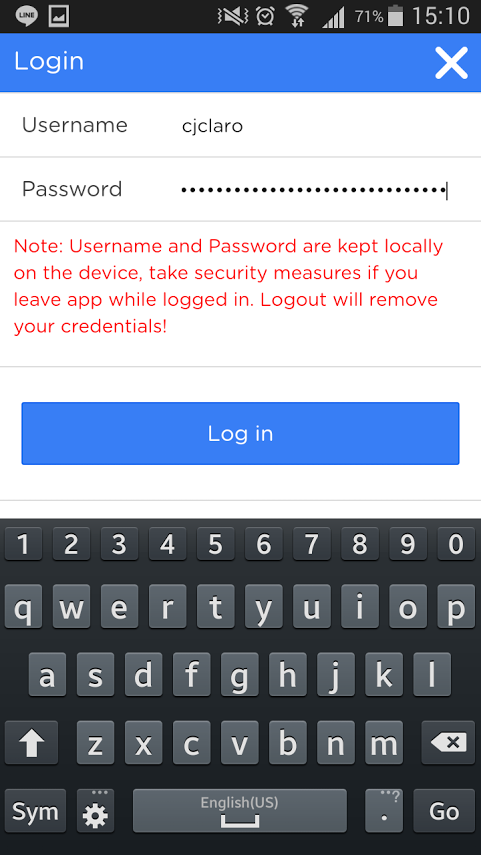
THE LOGIN SCREEN
The previous version I used did not require any password. The new version makes the app more secure.
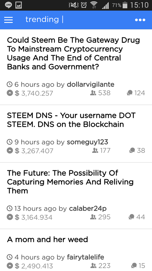
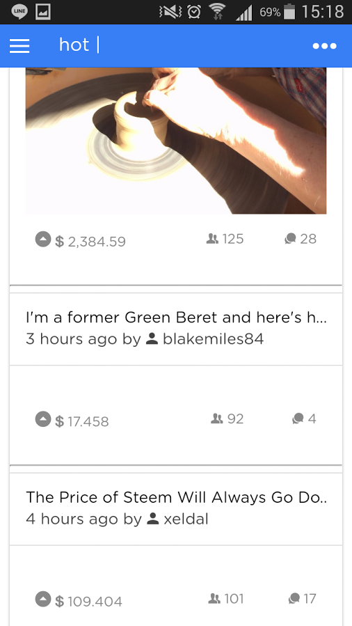
THE MAIN STREEM (trending)
As soon as you have successfully logged in, the app displays posts in the trending category. As you can see, the posts are displayed in three sections: (1) Title; (2) time since publication and author's name; (3) the reward, number of upvotes, and the number of comments.
There are five (5) posts initially displayed on the main streem. A "Load More" blue button allows you to load additional 5 more posts. Pressing the Load More button displays additional 5 posts.
The image below is in the "Compact View" Mode.
You won't be able to see any images embedded on the post. This is very useful when you have a slower internet connection and you want more posts displayed on the main streem. I think this is very clever.
Let's see the Card View on the next image.
THE CARD VIEW
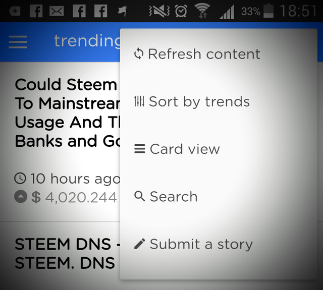
To switch to the Card View, press the three dots on the upper right corner of the app.

A context-menu appears with several options. Choose Card View to display the posts with a primary image.
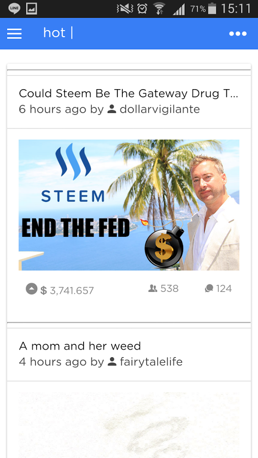
The post with image in the Card View mode.
POST WITHOUT AN IMAGE IN THE CARD VIEW MODE
A post that does not contain an image looks bare. I would recommend therefore to at least embed an image to your post to make it look appealing when displayed on eSteem app.
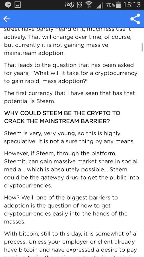
THE FULL POST VIEW
This is the full post view. Notice the "share" icon is readily available on the upper corner of the app and opposite to it is the "back" button. You will see the detailed content of the post right here. The images is well-displayed, too. I particularly like the font used on the Title of the post. It looks clean and very readable.

FULL POST: THE BODY OF THE POST
Headings are also displayed cleanly.
FULL POST: THE COMMENT SECTION
In the image, the "upvote" and "downvote" icons are seen together with the rewards and number of replies to the post. Notice that the upvotes number drops to the next line. This is probably because of the space of the canvas and also the size of the font used. Changing the orientation of the phone to horizontal position corrects this glitch.
The number on the right side of the commenter represents (and I can only assume) the number replies to comment.
It's also noticeable image embedded in the reply/comment space. Links are also displayed properly. There seems to be no problem displaying images in the reply/comment section.

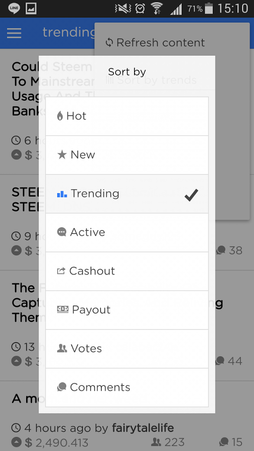
CHANGING TO TAGS/CATEGORIES
Open the context-menu and choose "Sort by...". The following dialog box displays your options.
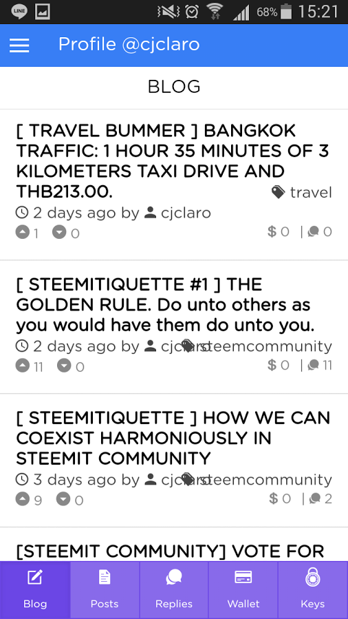
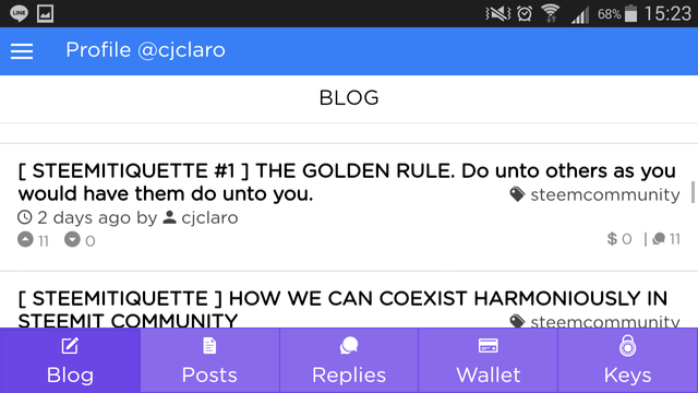
THE USER PROFILE: THE BLOG SECTION
The user profile defaults to the BLOGs posted by the user. You can see the Title, time elapsed after publication of post, author (of course), the primary tag used, number of upvotes/downvotes, rewards, and the number of replies.
Looking at the second blog post, you will notice that the tag and the author's name overlap each other making it a little hard to read. This is however not the case if you change your phone's orientation to horizontal as seen on the next image.
Horizontal View
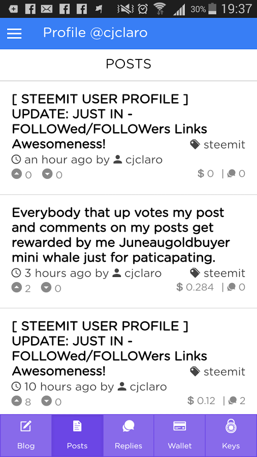
USER PROFILE: THE POSTS SECTION
Looking good here. Again, the display may be distorted by overlapping elements like the author's name and the primary tag of the post.
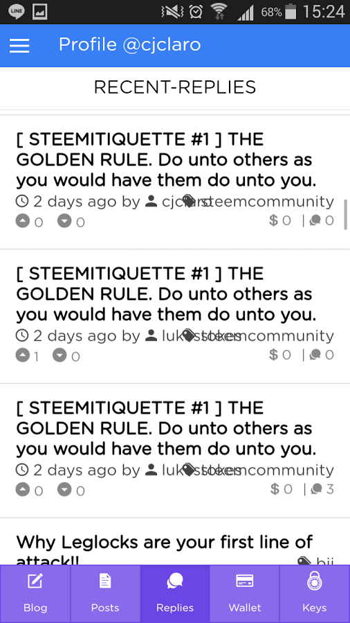
USER PROFILE: THE RECENT-REPLIES SECTION
Notice again the overlapping elements. Just switch to horizontal orientation if this bothers you. It doesn't bother me much.
USER PROFILE: THE WALLET SECTION
The screen looks good. Next screenshot is the Transaction History.

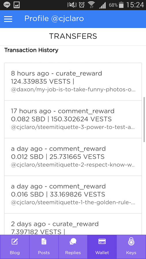
WALLET TRANSACTION HISTORY
Looking good, as well.
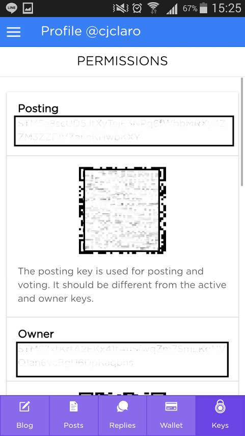
USER PROFILE: KEYS / PERMISSION
The QR Code is actually a nice feature.
SUBMITTING A STORY
This one is still under development. I sure hope the editor is a much better version of the editor found in #steemit site.

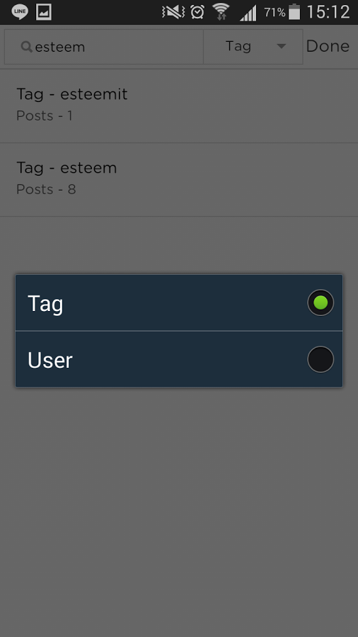
THE SEARCH OPTION
The search option allows you to search by "tag" or by "user".
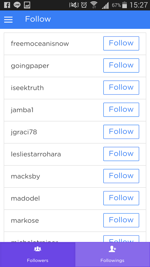
THE FOLLOW/FOLLOWING SECTIONS
This screenshot says about my followers. However, these people I am already following. But the button indicates that I have not followed them yet. This has to be checked.
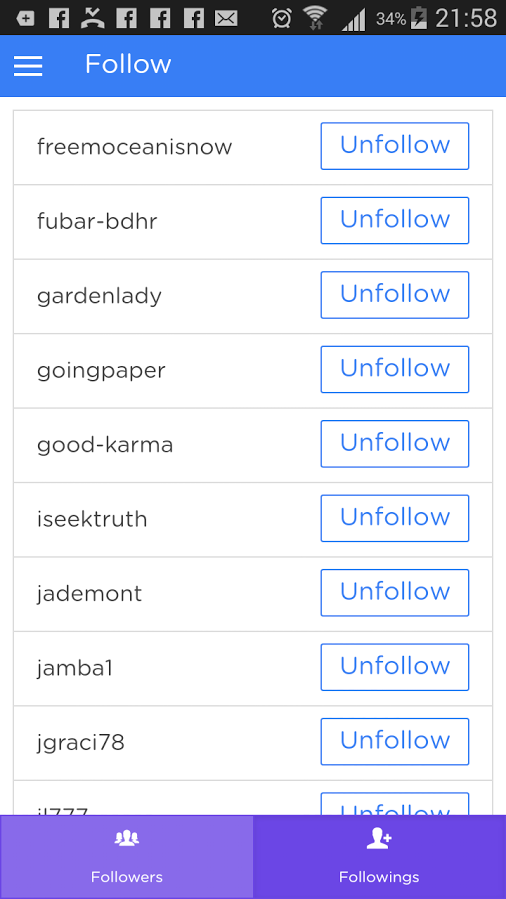
FOLLOWINGS
These are the people I follow. Looks correct to me.
Other Areas
You may also check out the Market and the Settings section of the app and tell us what you think.
CONCLUSION
Overall, I find it really very intuitive and useful for those who are on the go. This app could be a good candidate to be an official steemit app.
Go to Google Play Now and download!
Thanks so much! Reviews of technology like this are important, especially about Steem apps.
Thank you for the feedback and review @cjclaro, most of functionality improved, but waiting iOS initial release to push next updates to all app stores
good to know @good-karma. will continue to follow the app's development. keep it up! ;-)
Thank you, yours was the only review I could find.