***STEEMIT*** Branding #2: How to grow your account with flair / create your own logo!

Inspiration
Do you have any favourite content creators here at Steemit, and you sometimes have a look at how they arrange their posts and what you like about them, and how it could inspire you to make your blog a little better? Well I do :). One of the very first accounts I stumbled upon, when I visited the Steemit platform as a super newby, was the blog of @papa-pepper. I loved his posts about animals and homesteading and the humour with which he writes. I was, and still am, amazed at the amount of posts he produces, and I actually enjoy looking through all of them. And I also really liked (still like) how he has a very explicit and coherent branding - his name papa-pepper, his profile image of the little red pepper, and especially.... those cute little images of peppers which he uses to brighten up his post.

Another content creator who uses logo and page breaks in his Steemit account real nicely, is @funtraveller for his project @photocircle. I feel these details add color to a post, and with funtravellers account it also adds a sophisticated look. Where papa-peppers images are a bit more goofy, which goes very well with the humour in his posts, in funtravellers blog the images have a professional quality.

Branding
If you want to grow your account here on Steemit, and want to have a follower base that will be upvoting you consistently, then having clarity on how you want to brand yourself will really help! If your name, profile picture, logo and lay-out and choice of images all work together, then people will not only recognise you, they might even remember you, and very soon a lot of them will be looking forward to your next post!
Steemit challenges
I gave you two examples of accounts where I really liked how the branding worked out. But I realise my own account still needs some work ;). One of the challenges we face here on Steemit, is that once you've created your account and picked a username, that name stays with you FOREVER. That's a long time. I came to Steemit thinking I could just as well give it a try. Not thinking I would like it so much. So I just went with a variation of the name we had for our YouTube account (thinking my husband and I would be working together on this account too, which never really happened, it's more my thing). I had to do a variation of that name because Steemit didn't allow that many characters.
So... if you, like me, already have a username... then either you did a great job on thinking that name through and it fits with how you want to brand yourself and with the topics you will be posting about. If that is you, then congratulations! It will help you! Or you're like me, and if there would be an opportunity to change your username, you'd definitely find a better suiting one. But I don't want to get your hopes up, because the opportunity just simply isn't there. And we'll have to manage anyway. Good for us, there are other things we can do! And creating a logo, or some of those colourful images which help brighten up your posts and make people remember them more quickly, is one of them!
What do you want to be remembered for?
Before going into the details of making a logo (which we will get to in tomorrow's post), we need to think about our branding in a more general way. I started this sequence yesterday, and in my post about branding and consistency, the next steps in building your Steemit account we discussed some important branding related topics. The questions I put at the end of that post, for you to think through related to your branding, were all on the topic of who you are as a writer and what your style will be. With your logo, or other account related images, you would want to capture both the style of your blog and give an impression of the content of your topics.
Remember @papa-pepper? The name and logo and images all relate to food (which he grows himself) and nature (which he loves) and probably is some reference to hot-headedness too, which makes it all rather funny. You get an impression of both content and style! Same for @funtraveller - the neat and crisp logo immediately connect to photography and give a professional impression. You know you can expect quality posts and curation efforts regarding photography in his account.
So now, for us to step up to the next level of branding our Steemit accounts, we'll have to find something that symbolises our content and style in a way that we like best!
Highest excitement
There's a guy who I've watched a lot of videos from. His name is Darryl Anka, and he channels an entity called Bashar. And one of the things he talks about, is following your highest excitement. He says that our excitement is always a message from our higher self to our 'regular self'. It's as if there's a part of us standing on a mountain top, looking way into the future and way into the past (because after all, the experience of time is very much subject to the experience of having a body), and when our physical self is moving in a direction that best fits our purpose, we get a heads-up by being excited. Our highest excitement is actually an amazing road sign to follow, when we're thinking on how to proceed. Nothing too difficult - just choosing what you like more over what you like less. Just following your natural interests.
I love his topics, recommended food for thought!
Stress!?
The above was a little interlude, as its very probable that at this very moment, your head is racing and you are thinking - what symbolises both my content and my style!? What catches my topics and my character, both in one image!? And even the idea of having to come up with something like that gives you a complete brain freeze. Or maybe not, maybe you already know exactly what to do next. Which would be amazing :). But if you're feeling the pressure, then relax and realise that you already have your interests, already have your favourite items and colours and you have your style. Now you'll have to let all of those come together into something you feel carries (some of) the gist of you.
The questions to ask yourself
Here are some questions you could consider, which might help you get started with thinking about logo's and style and branding images:
- What is the quality of your content and character like? More towards funny or more towards professional, more serious or more light-hearted, more poetic or more practical?
- What is a general theme among the topics you post about? Is there one interest that stands out and which carries the gist of your blog? This can be very explicit, like funtravellers colour lens image. Or a more subtle reference, like the pepper referring to a lot of things - nature, food, a certain character. If your blog covers a lot of topics, think of what part of you comes back in each of your posts, and how you could capture that.
- What are your preferences in style and colour? Are there objects or symbols you have a natural liking of, which are dear to you?
Sneak preview
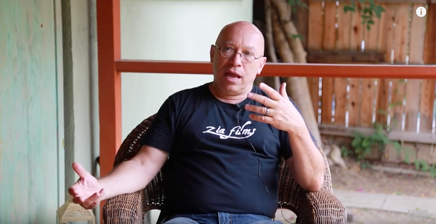
Yesterday I got this new wave of energy and enthusiasm to expand my Steemit efforts and work a bit more on the quality and consistency of this blog. And the moment I thought I really wanted to add some logo art, I also realised what I wanted it to be. The hint is on my T-shirt. And since it's hardly a hint, I can just as well give away the surprise ;). One of my favourite 'items' (?) is... a unicorn! I'm just really fond of them. For me, they resemble a bit of magic, of possibility, of life being full of surprises. And of living life always ready to be surprised, ready to be awed, ready to be enchanted. There's so much magic in the world! Not just the fairy like magic, but the magic of life which is so awesome beyond comprehension, and the magic of us human beings and how we can live our lives in such a way that every moment embraces more wealth and beauty than we ever thought possible. And if there is anything I would love to continuously share with the world around me, then it is that sense of wonderment and awe and how to enjoy life's magic all the time.
As I was thinking about my brand and what characterises my style and content, I just felt that a unicorn would really do the trick. Lol. So I took out my pen to draw one, then sat behind my computer to pour it into a digital image. And I loved doing it and I also love what came out of it, but the details of that process and how you can also make your own logo, is what tomorrow's post will be about!

Thanks for reading and thanks for your support! Let me know if this was useful and if you're struggling with how to brand yourself, let me / us know in the comments section and it will be fun to help each other along. See you in tomorrow's post!
Really insightful.
Thanks for this piece
Thanks!
Great post. I have been thinking about adding a logo to my posts. I do have a footer that has my picture and account name but I was also thinking about having a logo that people can remember me by. Making my own page breaks would be cool as well.
I'm probably gonna see what I can make on Canva and if it is something I like, then voila!
Yes I like your footer :). I think more of those little extra's add to the general impression people have of our posts. Makes the reader feel you put in that extra effort to give them a great reading experience. Would love to see what you come up with!
I'm thankful for your post @amritadeva, not only about the mention, but mainly because of the learning I got from it :)
I'm still trying to develop my layout, and your insight is a good reference for me.
Regards to @papa-pepper, I myself have been reading his posts once in a while, he actually serves as one of my inspirations here in Steemit :)
Wow, and I already like your lay-out so much! :) How are you trying to develop it more? I'm happy this post was useful :). And thanks a lot for resteeming!
I'm thinking to refine few details, add more images in replacement to words, and add moving clips or gifs to it :D I think it will take me a month to do all of this, lol. The result should be fun!
P.S. since I already mention my plans to the blockchain, I must fulfil it :)
Lol. It does work that way, doesn't it? I make promises here too, for that same reason - I'll have to keep my word :). Sounds like great plans! Looking forward to see how things turn out.
Really insightful.
Thanks for this piece
Cool idea. I do have a logo but have never used it on steemit.