Visualizing STEEMIT Internal Market 09 March ‘18 – BlockChain Business Intelligence
Steemit’s internal market is used on a daily basis. For many the transaction is simple. SBD earned as post rewards is converted to STEEM. However for some, the internal market is also used to trade SBD/STEEM on a daily basis.
One of the benefits of using the internal market is zero cost. Unlike other exchanges, there is no cost in using Steemit’s internal market to trade. But there is also some drawbacks. One of which is the lack of visualisations. The Steemit internal market only shows Market Depth, open orders and a limited view of recent closed orders.
To address this issue of lack of visualisations and to aid those that wish to trade SBD/STEEM on the internal market, I have devised some visualisation which I intend on sharing daily.
Over time I hope to improve on this report by adding more analytics that will aid in your decision making.
Snapshot taken 10:15 GMT 9 Mar. 18. Time shown GMT
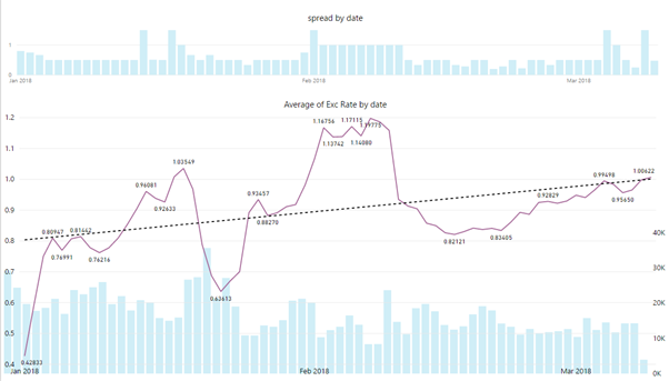
1 Jan ‘18 to Present – Daily Spread, Average Daily Exch. Rate, Daily SBD Volume
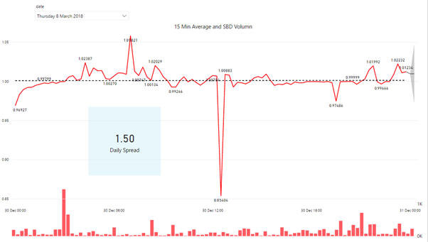
Yesterday 15 min Average Exch. Rate and SBD Volume
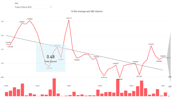
Today 15 min Average Exch. Rate and SBD Volume
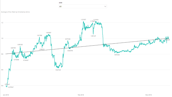
1 Jan ‘18 to Present –Average 1h Exch. Rate
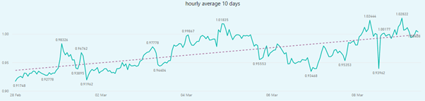
10 Day – Average 1h Exch. Rate
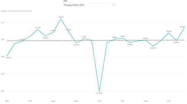
Yesterday – Average 1h Exch. Rate
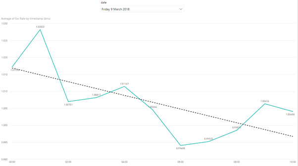
Today – Average 1h Exch. Rate
For further reference on SBD/STEEM do check out the daily @agx Original idea by @aggroed and Developed by @stoodkev
You really, really need to export those graphs significantly larger so that the text becomes legible. They'll get auto scaled down to fit in the column anyway, so right clicking and saying open in a new window or tab will actually open the much larger, more legible graph.
Otherwise, looks pretty solid.
did some work on the graphs, but you still need to right click and open in a new window - todays report has updated graphs. Thank you for the feedback
Yeah, the only way to get around that would be to host the graph files on something like D.pics or Imgur and then include them as Markdown-linked images instead of drag and dropping the actual files.
It's not hard, but it does require an extra step.
I can do one even better ( but still way off where I want to go with this) here is a link to the actual report and you can interact with it
https://app.powerbi.com/view?r=eyJrIjoiZTRkOTE5MjYtOWY2OC00ODYyLThjM2YtN2ZhNDgwNTFlYjI3IiwidCI6ImRhZWNkYWM0LTYyNjgtNGQyNy05Nzk0LWFiMjA0ODdkZTgyNyIsImMiOjh9
Those are fantastic. You definitely should embed the link to the reports in every post, because the live graphs are so much easier and so much more useful.
I'm betting that each individual chart has its own link since there on separate virtual pages, so having each exported PNG capture link to that particular page would be ideal. All the advantages of dynamic schism combined with a quick downloadable mostly-legible image.
I couldn't read it either. To me, I prefer a table of text to graph. Text is surely readable, especially on mobile phone.
Do you feel generally it is better to use the internal market, or should we make the trade through @blocktrades ...
the internal market has zero costs. If you just want to trade SBD for STEEM or STEEM for SBD then the internal market is the way to go
Brilliant work.
Upvoted