Lighting and Compositing In The Style of Disney's Feast Process (My Final Year Project @ MMU)
"Could we try to get it to look like Disney's Feast?" was what my team member said to me while we were discussing the final look for our final year animation that Wednesday evening with a presentation happening Thursday afternoon. This became the art direction that was decided for this test still.
A little backstory, I'm a final year student at Multimedia University, Cyberjaya and working on a 3D animated short film as a final year project with 4 extremely talented people (who are not on SteemIt yet) as my group members. The film is still in the works and my main role is the lead lighting, rendering and compositing artist AKA it's my job the work looks really nice and polished in the end.
Today, ladies and gentlemen, I'd like to share the compositing process that took place to achieve the look you see here. Since this is also my work for university, that is also why you'll see my school's logo in that top right corner of nearly all the images in this post. I'd also like to clarify that I am not a professional. Just sharing my process in terms of approach and problem solving to get the results in the still.
Gotta Get It Right From The Start
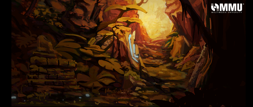
One of the most important elements for this still (and the rest of the animation after) is to get a clear idea what it should clearly look like once that Render button is clicked. This is where concept art comes into play.
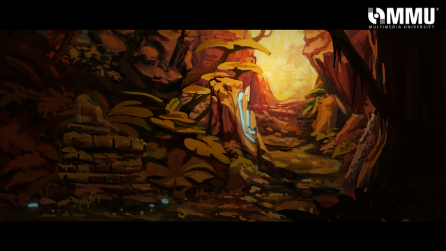
Credit: To my groupmate, Haziq
The concept art basically gives a visual guide on how the final render should look and feel. For this still, the first things I took notice were the very yellow warm ambiance, the intense light from the top of that rocky pathway, and the bits of glowing cyan. I don't take much note of the position of the objects into a lot of consideration but still kept in mind of its overall placement.
Trials and Tribulations
Credit: Models and textures done by a combination of myself, Mirza and Shak
This was the first pass at lighting the scene. It's really rough and very underwhelming compared to the concept art. I did this first pass trying to come up with a way to light the scene without using any actual lights. While the technique worked, it just did not look good at all.
The main mistakes I did when approaching this were a) I did not have a clear visual idea what the scene should look like, b) I wanted to cheat my way out from lighting and compositing it traditionally, and c) I sacrificed quality over time efficiency. And after getting a well-deserved critique of the still by James Wong (our guest panel that day), it was time to pull back and start a game plan...
Game Plan
First thing done was to find an alternative solution to the long render time. The first pass took around 20 minutes to render one frame. That is a lot of time for something that looks so bad. So I looked to alternative renderers, took note of how much time it took to render a singular 3D asset using one light. In the end, it was decided we were gonna use Redshift instead of Maya's native renderer Mental Ray (not that I don't love MR but momma needs something new ='D).
Once that was done, it was time to for me to studeh...
Images credit: Disney/Pixar
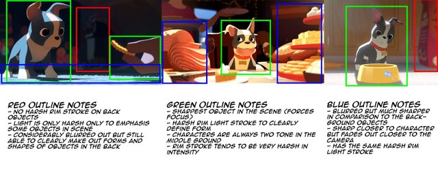
Something I should have done from the start, this is the reference sheet I created analyzing the visual style of Disney's Feast, which was decided to be the goal final look for the animation. Just shows how much I need to actually step back and plan before diving into anything since there was so much I missed in the first pass.
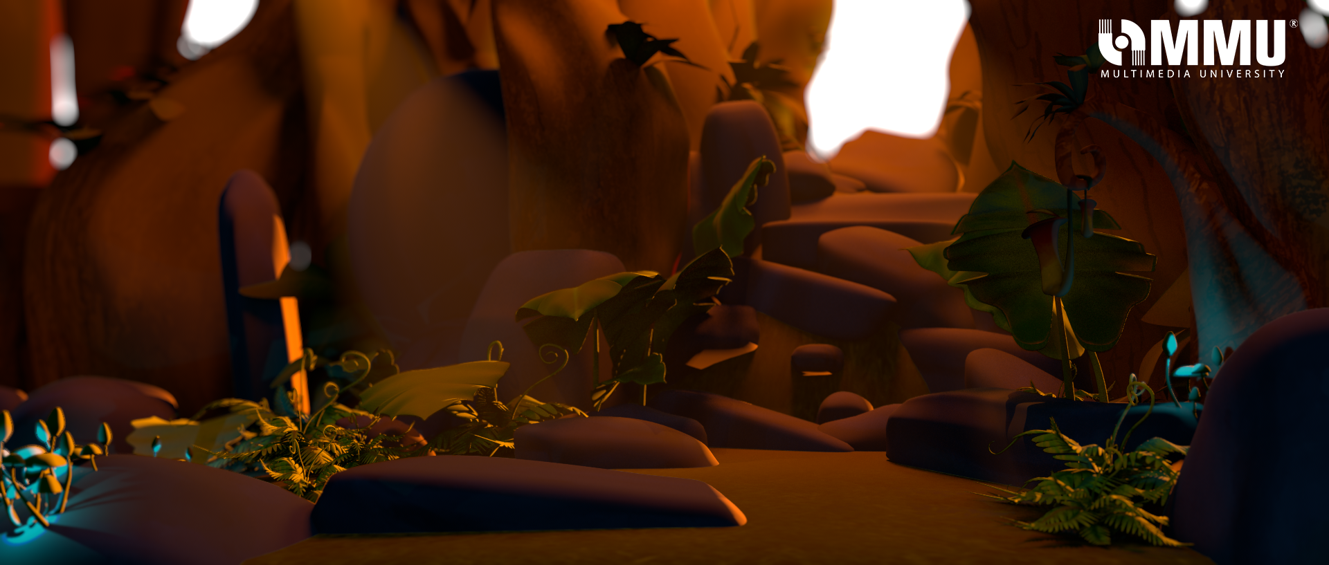
And It's Not Over Yet
While this is something I'm presenting now, things will change throughout the production process. One of the things we still need to fix a number of the textures but for now, I'm just happy that the lighting and compositing look (in my opinion) pretty good so far and hopefully we'll be on the right track.
I'd like to know if there's anything we can improve so far in this still and what the Steemian community thinks of this sort of preview so far in this point of the production. Would love to hear any thoughts and opinions.
See you next post~
looks great! i personally love prepro/dev stuff, so I say keep posting them :D I guess the only critique I'd have: while your final lighting definitely looks much better and more accurately captures the feel of the concept art, im a little confused on where the focus point should be. in the concept art it looks like it should be by the 'entrance' (top right) in your final lighting it looks like it's actually the bottom left (the sun's rays lighten this area up, and the stick in the middle of the leaves is very bright). the entrance being white might not help either bc it blends into the website and my brain removes it from the composition lol. otherwise, great work!
Thanks for the feedback @corinneiskorean ! Will bring this into the final comp later
Guess I was too used to nightmode to consider about the white entrance xP Hopefully can solve the issue in the following weeks 8D
Grats! @hanbun ... now you must open table and treat us... hahaha! Great article...
Open table at mamak 8D
jkjk
Thank you sir @sireh !
The 3D animation level in Malaysia is growing rapidly with new talent on the rise!
Coming from the same industry, I can't wait to see how your final year project turns out :) Especially since you're going for the look and feel of "Feast".
Keep the updates coming!
Thank you @branlee87 =) Will keep posting updates and hope to succeed expectation
This is great Hannah, I can't wait to see your whole animation when you are done with it xD
I love how you talk about your mistake, this way we can also learn from it :)
Thanks @elliebong Do come to our AFX showcase when it comes out. Would love to have you as a guest. Sharing is caring afterall~
I would love to come! Do let us know when the date is set :D
now Im getting afraid thinking about animation stuff XD anyway nice article
Animation can be intimidating but honestly, just embrace it positively and do your best. You'll do fine @shuazir as long as you put in the work 8D
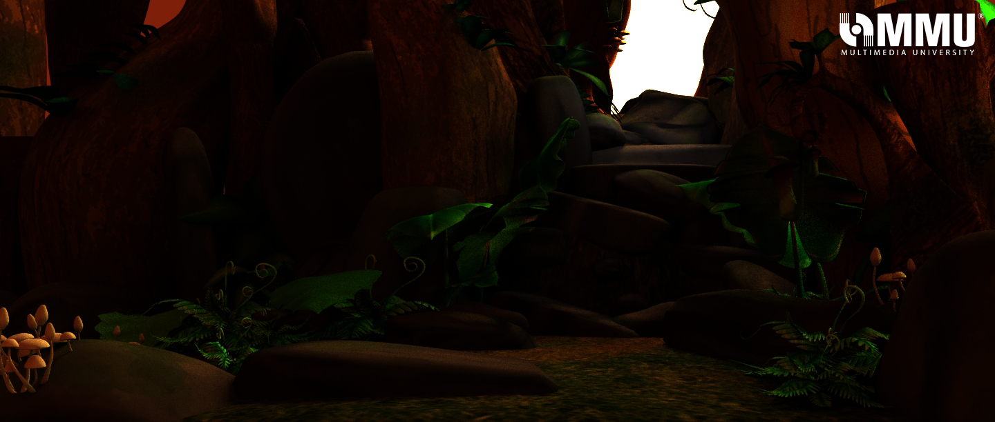
Hi @hanbun, I feel the scene is too evenly lit at the moment that the focal point seem to be lost. Is there a reason for the god's ray on the left of the image?
The light rays were meant to mimic intense light rays you'd find in a forest when it's piercing through the leaves gaps in between the leaves. Admittedly, I had added them last minute when I figured out volumetric lights in Redshift. I'll take note of this to further improve the comp. Thanks for the feedback, @dxn !