Color for the color blind - The science behind the EnChroma glasses
Our senses are fascinating. They’re our window to the world and our means to perceive reality and try to understand it. For the most part, the information we get from the outside world seem to be telling a coherent story, but how do we know that those stories are consistent from one person to another?
How does my perception of reality differ from my neighbor's? Does sugar taste the same to you? Is my green the same as your green?
Interestingly, in some cases, we know they aren’t. One can easily test for color blindness and see that the range in color perception can vary greatly from one human being to another.
Throughout my graduate studies, I’ve had the opportunity to learn a great deal about light and human perception of colors. I remember being amazed by the ingenuity behind the EnChroma glasses. I thought I'd try to break down the science behind those glasses that attempt to make the world colorful for color blind people.
Light and dysfunctional sensors
As you may know, the human eye has three types of photoreceptor cells, two of which contribute to sight: cones and rods. Rods are highly sensitive and are necessary for vision in low light intensity environments.
An interesting fact about rods is that they are mainly located in the peripheral region of the eye, making objects look sharper when not looking at them directly. You can test it for yourself at night. Doing this voluntarily is called averted vision and is sometimes used by astronomers.
Cones are less sensitive, but have their peak intensities at different wavelengths, allowing us to distinguish small spectral variations that we ultimately perceive as changes in colors. Their sensitivity profiles are often represented in terms of the LMS color space, defined by the L, M and S (long, medium and small wavelengths) responsivity curves, which are also referred to as red, green and blue cones respectively.
This means that if an object reflects light of wavelength ~450 nm and absorbs everything else, it will be detected mainly by the S cone and be perceived as blue.
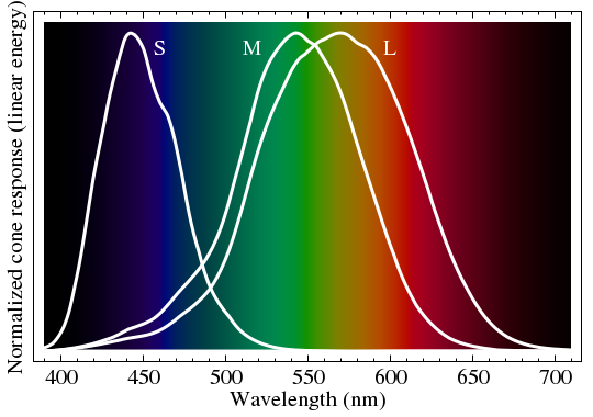
Normalized LMS cone response overlaid on top of their associated colors from the visible spectrum. (Source)
From a physics point of view, the spectral sensitivity of the cones in color blind people’s eyes are either centered at different energies (compared to someone with normal vision) or are completely missing.
The most common type of color blindness is one where the M cone sensibility (green) overlaps greatly with witht the L cone (red). This makes almost any signal in the green/red region of the spectrum cause a similar response for both cones, making those colors much harder to distinguish.
Here’s what the colors of fall might look like to a color blind person:
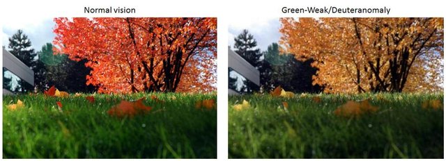
The image on the left was taken from here and the image on the right was produced using this color blindness simulator.
As you can see, the net effect is mainly a change in color saturation for everything that is green/yellow/red. So how do we bring this saturation (also referred to as chroma) level back up? If we could, we should be able to adjust for that lower saturation by counteracting its effect with a similar increase.
Modifying spectra to compensate for misbehaving cones
In Photoshop, one can change from the RGB (Red, Green, Blue) color space to HSL (Hue, Saturation, Lightness), so why not do this here and just drag that saturation level all the way up to compensate? It works on computers alright! The challenge here is to achieve similar effect in real life, for those of us who would want to go a stroll and enjoy the variety colors mother nature has to offer.
This is where EnChroma came in. They specialize in making assistive glasses for the color blind that, according to them, enhance colors and alleviates red-green color blindness. By using sunglasses with an additional specifically designed filter, some colors appear to have a significantly higher saturation level. To understand more precisely how this work, let’s go back to our Photoshop idea.
As it happens, the HSL color space is often more intuitive to understand. In that space, Hue defines a color wheel (red, yellow, green, cyan, blue, magenta), Saturation can be thought of as density of color pigments and Lightness represents the amount of light, with its minimum being black and maximum white.
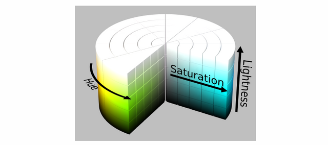
Visual representation of the HSL color space in cylindrical coordinates. (Source)
As mentioned above, each spectrum is perceived as a single color. To control it, one must first understand how spectral distribution plays a role in color changes. Although there are multiple solutions to this problem (different spectra can yield the same color - they’re called metamers), we can compute a set of possible spectra to gain insight on the effect of specific spectrum changes.
The following three animations show spectra that produce a continuous change of color in each of the three dimensions of the HSL space: Hue, Saturation, Lightness.
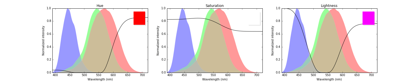
Changes in spectral distributions and their associated color variations. The color changes are chosen such that only one color parameter varies, each of them identified in their title.
For instance, the first animation (left) shows spectra that produce a change in Hue, while keeping Saturation and Lightness constant. The associated perceived color is shown in the top right corner. In the second one, Hue and Lightness are fixed and only Saturation changes. The last one shows the variation in Lightness only.
One important thing to learn from this, is that colors are perceived to be highly saturated when there is a large differential response between at least two cones. In the example above, the spectrum that yields the most saturated magenta is one with high red and blue signals, but very little green.
This can be easily achieved when the cones’ peak sensitivities are at different energies. However, with the increased overlap between L and M sensitivities for color blind people, spectra that excite only the green or only the red cones become increasingly rare. To increase the differential signal response, one needs a filter that removes precisely those overlapping regions, while leaving the rest unchanged. This is precisely what EnChroma did:
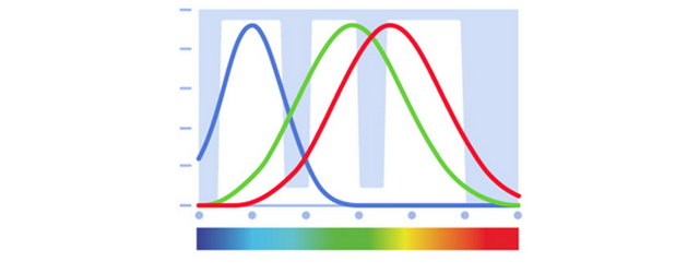
Diagram representing the normalized LMS sensitivities for a color blind person and a possible filter profile to remove L and M cone overlaps. Note that this diagram misrepresents the L and M overlap, which is much worse in actual patients. (Source)
In the above diagram, the shaded regions (notch filters) block a good part of the overlapping cone sensitivities. This leads to an increase in differential cone response, perceived as enhanced Chroma - just as needed!
It’s easy to take color, or any of our senses, for granted. We often wrongly assume that our perception of reality is the same for everyone. Reactions to EnChroma glasses are, for most of us, one of the few ways to make us realize how fortunate we are to perceive colors the way we do. It also makes you wonder what it would be like to have the eyes of a mantis shrimp, with 12 cones for color sensitivity and the ability to perceive polarization.
I’ll leave you with a compilation of reactions from people trying the EnChroma glasses for the first time. I hope you learned a thing or two from this and that it might help you understand and appreciate colors even more.
Are you color blind yourself? Have you ever tried the EnChroma glasses?
Suggestions, comments? Leave them below!
Make sure to follow @owdy if you enjoyed this post!
Hello owdy, we would like to inform you that you have been chosen as a featured author by the @robinhoodwhale initiave. We are currently in alpha testing, if you would like more info join robinhood chat on steemit.chat or pm @repholder.
Great Work- Keep on Steeming!
Thanks guys!
I am aware that most men suffer from color blindness. Whenever I go to small local shop, I have to give directions to the guy to give me the right package of cigarettes lol He feels embarrassed but I try to put him on ease that he is not alone.
Well it's about 8% of men and 0.5% of women, but while I'm not officially color blind, I'm definitely bad at knowing the different shades of greens by name. Is this shirt shamrock green or more chartreuse green? Haha
lol women have also strawberry blonde, dirty blonde, nuts blonder color ¯_(ツ)_/¯
I loved this, especially the video! I shared the link on our discord to try and share it with others :)
This is really cool! I had a vague idea of how they worked, but understanding the details is awesome!