Totalitarian art and Billboard advertising (Part 2)
Part 1 of Totalitarian art and Billboard advertising: https://steemit.com/advertising/@matthew.raymer/totalitarian-art-and-billboard-advertising-part-1
Now let us take a look at how totalitarian art and theory – in the first place looking at Soviet art – which has been especially named rather loosely by the title Soviet Realism. The theory behind the art of Soviet Realism pretty well matches up with the rationale for Corporate Identities, as these rationales are believed to apply by their Corporate creators of them. Also there is the striking similarity of Corporations’ Public Images as presented by themselves to their publics, we consumers, and this close match is able evermore being seen to be clearly manifested; in the press; on TV and in movies; in advertising in general itself and in the way our lives are managed and manipulated by these Corporations and their business aims and manias. This Is the thinking and the driving force behind what is appearing ever more obviously in the brash and direct Corporate advertising now pouring out of many Corporations’ marketing divisions.
Here then below is an image of a Soviet poster of mid 20th century; a pretty readily-identifiable one by its style and content to be of ‘dictatorship of the proletariat’ provenance.
The worker in it is lionised; he is a hero. Note it’s not a photograph; but a graphic artwork. This is important because it acts to ‘everyman’ the worker-hero guy holding out a hand. What I mean is that as a graphic artwork the hero-worker guy is not a particular and actual person such as any photograph of the kind would require. Thus he is able to be generalised so as to be ‘anyone’ and ‘everyone’ who works hard or with their hands in the Soviet Union. Thus everyone’s a winner baby – all heroes all workers hard at it.
(Note here a Lotto UK National Lottery hoarding poster slogan of just a few years ago which used a similar wheeze to persuade common people to buy a ticket and win a small fortune. Here is a billboard poster using the slogan for instance:

The slogan was ‘It could be you.” Here in this poster image this slogan has (also) been a little embellished into “It could be your week.” A drawing, a graphic artwork yet again; and no person who is real or actual being shown at all; only a ‘supernatural and benevolent godly’ finger in the sky pointing in at the window of what is a pretty ordinary terraced house of a British kind to be found all over the nation. A tiny person of indeterminate sex and age is silhouetted by the bedroom light in the window and in a rejoicing and exclamatory posture. This silhouetted person might also be ‘everyman’ or ‘everywoman’ and also ‘anybody’ and ‘anyone’. ‘It could be you.’. The fact of the person, this ‘everyman’ being a dweller in a two-up two-down terraced house is significant; since such house are the houses dwelt in only by ‘other ranks’ in Britain. No-one with money would want to live in one. One has to be seen to have money and this house says ‘undistinguished and commonplace’ all over it.
There is a great deal more to be said about how this poster of The National Lottery works its effects; but sadly not directly relevant to my thread of argument at present. Let the universalisation of the human beings depicted in the Soviet image and in the Lottery poster image stand as enough criticism for the time being.
Back to the Soviet hero-worker.
He, it is a he notice, is young, openhearted, having a large strong arm and hand, smiling, healthy, fit, dressed in worker’s overalls, and with a nice appropriate red shirt. There is a hammer and sickle flag flying behind top right, and a tall crane constructing a building there also. The building behind the hero-worker is a large and typical Soviet block of plain unadorned architecture, nothing baroque or petit bourgeois about it – no way. Utilitarian. Powerful looking. Perhaps the building in which Orwell’s Room 101 subsists?
There is even a clear blue sky without a cloud in sight. The type fonts used in the poster are not ornate but deliberately plain and direct also – sturdy and strong looking fonts, and some large maybe capital letters. The hero-worker sticks out his hand as if without reserve or doubt; whilst with his other hand, which is gloved for work, he is hitching up some object like a piece of concrete to what looks like a hoist chain.. The cloth cap is the final touch of ‘ordinary hero -worker person’
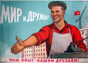
Notice the type fonts on the National Lottery poster above are also plain and unadorned – very easy and in-your-face to read. The great size of the ‘finger of heaven’ is paralleled in the Soviet poster by the close foreground positioning of the hero-worker so that he too, like the finger, takes up most of the graphic space. Such size and positioning in both cases declaims emphasis; emphasis which stresses, underlines, the object for having had the poster made and displayed.
In the Soviet one the object has been to ‘pat on the back heartily’ every ordinary person who works a long and heavy day for the Union (USSR). To portray that every such person as strong, hale, cheerful, committed, outgoing; and very much subscribing to ‘for the good of the cause’ of Soviet socialism.
The poster for the UK National Lottery with its huge skiey finger has as its object that Someone able to direct the winnings to you; and who lives in the sky a giant and is kindly and benevolent, might just pick out YOU to win. The poster appeals to superstition, which a is a hallmark of habitual gamblers. It is a travesty of any godly feeling and reasonable hope.
Both posters focus themselves and their central messages upon that common or garden ordinary guy or girl who walks past in the street and looks up and notices it, and maybe feels good about seeing it?
Let’s now look at a Virgin Inc poster which presently is to be seen in the streets around where I live. It offers an advertisement recommending people to buy Virgin Media TV shows and channels provision of service.

The Virgin Media logo sits in just that position where in the Soviet poster image seats the hammer and sickle flag; which might be called the ‘brand’ of the Soviets.
There is in this Virgin poster ad that same unvariegated use of colour dressed in much the same way as the Soviet poster, Both confine themselves to plain and few colours; in the case of Virgin red and white and black; and in the Soviet poster an aquamarine blue, and red and buff and grey. Both these items, the Virgin Inc item and the Soviet item, carry just enough visual content so to be able to offer their central message clearly, obviously, almost instinctively self-evidently; but yet each works hard not to cloud or to complicate its message. To make its message patently obvious
Both these poster items exude that monolithic presence which is typical of most totalitarian artwork. The Nazis, the Fascists in Spain and in Italy; the Soviets and the Maoists in China; much of Southeast Asia and South and Central America in the late 20th century, display in many of their artworks similar on the surface ‘keep-it-simple technique. Commonplace is the monolithic and plain, unvariegated, uncluttered, ‘message’ in this art; because it is art ‘in service to a political position’ and is art sanctioned and largely controlled by The State. Such is almost a definition for the art movement known as ‘Soviet Realism’. Art as propaganda – which might be a useful term, one able to encompass Corporate Billboard artwork?
Virgin Media’s poster in many ways is more Soviet than are the Soviets. The same large capital letter plain bare fonts. A mass of garish brash red everywhere (appropriately Soviet red). The posture of the ‘fan’ with arms outspread in embrace, and in an expression of having a sense of holding power; compares pretty well with the Soviet worker’s posture; but displaying perhaps even more kinetic energy than that glorious offered Soviet handshake. The ‘fan’ arms akimbo is embracing some kind of joy perhaps and is possibly trying to express a delighted acceptance of what is implicitly alleged by the poster to be a generous boon and offer from Virgin Media. A sense of empowerment. Virgin Media cares about you and your desires.
The big letters blazon the message; which is an advertiser’s ‘hook’ hoping to land prospective customers who are casual viewers of the poster as they drive by or are walking along. This ‘hook’ is a straightforward pandering to a popular wishful thinking – much like the National Lottery poster appeals to ‘lucky me’ – although this Virgin poster is about the sport of soccer, British football, and about the broadcast of matches on TV. Flatteringly the poster exalts the ‘rights’ of soccer fans (prospective customers) who are to be cajoled into feeling that they are ‘entitled’ to watch and ‘deserve every match’. Pretty disgraceful really, as a piece of trash advertising; one which assumes that via a pretty bad faith, by lionising its public Virgin will get more big bucks; that the simple and uneducated passions of ordinary common people, their ‘wish-fulfilment’ faculties, are fierce enough and ‘blind’ enough to persuade them to buy these Virgin Media services.
The scarf of the Virgin soccer ‘fan’ and also the sports ‘top’ he is wearing; are the analogues of the cloth cap and glove and overalls of the Soviet worker. Stereotypical common ordinary person, according to their respective ideologies.The small print in the Virgin poster makes clear that only Virgin Media is able to make this wish-fulfilment a possibility.
Regarding the ‘respective ideologies’, the worldviews, behind the messages of these two posters; while both use persuasion; one to ordinary people to buy Virgin TV and so get access to ‘every match’; the other to ordinary people also to help convince them that Soviet people do have political power, are enfranchised, are valued, are the salt of the earth, are healthy, strong, valiant workers etc etc; different messages indeed; but having in common that use of extreme bad faith by the persons behind the messages, who are knowing about what they are doing; who are acting so as to persuade ordinary people to believe, and to see things, in ways which are point-blank incommensurate with fact and truth. Propaganda.
And perhaps here is the essential and the central mutual characteristic which Consumerist advertising in the Western World has with Totalitarian artwork in general; its quintessential application of a knowing bad faith, which is applied in order so:
a) to make the weaker argument defeat the stronger
b) to try to have its viewers to mistake the truth totally
c) to work by wiles and temptations and flatteries to seduce beholders
d) to gloze over so that all in the garden appears rosy
e) to make capital (political/financial) by these means
f) deliberately to intend to deceive by way of distortion and diversion
g) to appeal by way of large generalisations and apparently ‘simple’ and ‘prima facie’ messages
h) to treat their viewers with something close to a backhanded cavalier ironic disrespect
I) to originate from ‘hothouses’ dedicated wholly to promoting by using these characteristics
There is much more to be said about this topic and its multiplicity of facets; but let us give just one more set of parallel examples so as to show that this phenomenon of parallelisms between Totalitarian and Consumerist Commercial artworks is not just a happenstance, not just lucky coincidence, but that Corporate art departments, their marketing departments, and their total setup as organisations, the images they project of themselves and the nature of their business methods; all are neo-totalitarian in their manifestations and practice; in their intellectual ideologies and in their workings. In these regards please remember how I drew the foundational parallel in my introduction to this discussion of Poster artwork; which lays out how employees are of a similar ilk in regard to their lack of freedom and of their civic rights when they at work working; to those citizens of a totalitarian nation such as was the USSR. And please note these clear and obvious parallels which are to be found in an ordinary person’s living life under a totalitarian political regime and life for the common person, as so many of us live it, working as employees; and especially exponentially so when working for a Corporation in our superficially ‘free societies’.
Here then is a poster ad for Coca-Cola at McDonald’s
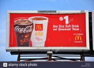
‘I’m happy’ – ‘I’m lovin’ it’. The all too ubiquitous appeal to the ‘feelgood factor’; and reinforced repeatedly by repetitions of them as slogans; or as the older comedians call them ‘catch phrases’. The same plain and large easy-to-read, easy-to-be-understood font letters. The same unvariegated few colours used. Large images proclaiming the essence of the message – i.e. the huge glass of Coke and the huge paper cup of tea. Notice the tea is emphasised in bold font as being ‘sweet’ – the lure of sugar as a comforter and an anodyne.
The MacDonald’s ‘yellow arches’ Trademark flight like the Red Flag and hovering like the Virgin logo there; so as to establish and authenticate the origin of the poster and of its products advertised. Note two big Brand names in cahoots – to add to the lure. Red is a starling colour which draws the eyes to it – especially when it is splashed over like across this poster.
The glass is filled to the brim; and one is able to order ‘any size’ drink. One can see the tea at the brim of the paper cup; how pictures of food and drink, especially when blown up photographically to large size, have their effects on our salivation glands! And the $1.00 price tag. Again in huge plain emboldened letter font. A nice round dollar. Neat, tidy affordable. Just pull that note or coin out of your pocket and pay.
The message? Here is a ‘special offer’. Get down to McDonald’s and hop-up on sugar and get happy – for the time being. To be fair this poster is far less insincere and in not so bad faith as the previous items I have exampled – it works more or less by its sheer appeal to animal appetite – apart from the capital goods in the power in the slogans it is carrying, which are ‘gold dust’ to the advertisers. It’s a straightforward Consumerist commercial ‘dollar for a drink’ offer in many ways.
It yet retains, however, maybe merely subjectively, I don’t know for sure, that presence of emanating great corporate power, which sadly, even in myself I feel, has some unfounded though reassuring sense of grateful gratification passing out of it into its beholders. The totalitarian aspect. It’s that hint the poster has that somehow the McDonald’s Company (and maybe also Coke Company) are doing you a big, big, favour by offering up wholesale this pretty minimal offer. Just being paternally benevolent. Big Brother. Certainly the bottom-drawer reason for MacDonald’s having had the poster pasted up, is being shunted by the poster’s ‘angle of approach’ and pushed right to the back of the poster’s manifest messages. This bottom-drawer reason being to sell, sell, sell, and to make money, make money, make money, and it is excellently well camouflaged herein. It is in this glamour-cast from a Big Friendly Giant set together with an absolute avoidance of ‘mentioning the war’ of not even hinting at maximal profits and best growth for the Companies who are advertising; it is herein, if anywhere, that this poster’s deception and the bad faith resides.
You can also find this article at our anomalist design blog: http://blog.anomalistdesign.com/totalitarian-art-and-billboard-advertising/
great work sir @matthew.raymer