Plots With Python Programming & Seaborn
Hi there. This page is a an overview of plots with the use of the Python programming language with seaborn. The original page can be found on my website here.
To start out, import pandas, pyplot from matplotlib, seaborn and numpy into Python.

# Seaborn Plotting Self-Exercise

# References:
# https://www.tutorialspoint.com/seaborn/seaborn_quick_guide.htm


import pandas as pd
from matplotlib import pyplot as plt
import seaborn as sns
import numpy as np
Sections
- A Bar Graph Example
- A Histogram Example
- Scatterplots
- A Line Graph Example
- Plotting Math Functions
- References
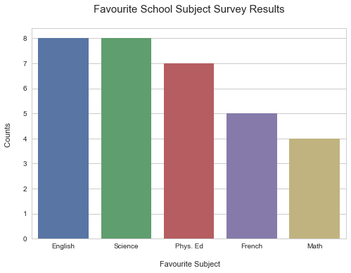
A Bar Graph Example
For the bar graph example, I create fake data for a survey on students' favourite subject. I create a list of subjects and another list of counts. A dictionary is used into a pandas dataframe.
### Bar Graph Example

fav_subject = ["English", "Math", "Phys. Ed", "French", "Science"]

counts = [8, 4, 7, 5, 8]

fav_subjects = {"Favourite Subject": fav_subject,
                "Count": counts}

subjects_df = pd.DataFrame(fav_subjects)


If you run print(subjects_df), you will notice that the columns are not in the desired order. The Count column should be the right column.

print(subjects_df)
   Count Favourite Subject
0      8           English
1      4              Math
2      7          Phys. Ed
3      5            French
4      8           Science
In order to rearrange the column order, a list of column titles is used along with the .reindex() method. For sorting from highest to smallest use .sort_values().
# Rearrange order in dataframe:
# https://stackoverflow.com/questions/41968732/set-order-of-columns-in-pandas-dataframe

columnsTitles = ["Favourite Subject", "Count"]

subjects_df  = subjects_df.reindex(columns=columnsTitles)

subjects_df = subjects_df.sort_values(by = 'Count', ascending = False)

print(subjects_df)

  Favourite Subject  Count
0           English      8
4           Science      8
2          Phys. Ed      7
3            French      5
1              Math      4
In creating the bar graph, I start with sns.set_style("whitegrid") from seaborn. Under the fig variable, there is seaborn's barplot where x is with the Favourite subject and y is with the count. A title and labels are added to the Seaborn plot.
# Reference: https://seaborn.pydata.org/generated/seaborn.barplot.html
# Reference: https://stackoverflow.com/questions/31632637/label-axes-on-seaborn-barplot

sns.set_style("whitegrid")

fig  = sns.barplot(x = "Favourite Subject", y = "Count", data= subjects_df)

plt.xlabel("\n Favourite Subject")
plt.ylabel("Counts \n")
plt.title("Favourite School Subject Survey Results\n ", fontsize = 15)
plt.show(fig)
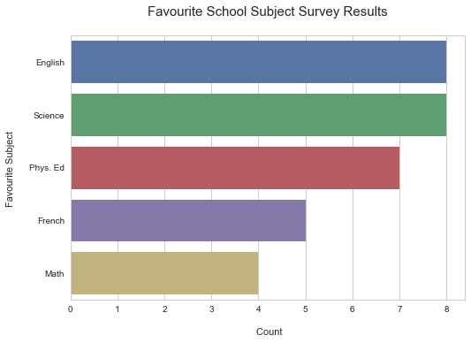
To have horizontal bars, simply switch x and y around.
# Horizontal Bars Graph (Just Switch Order of x and y):

sns.set_style("whitegrid")

fig2  = sns.barplot(x = "Count", y = "Favourite Subject", data = subjects_df)

plt.ylabel("Favourite Subject \n")
plt.xlabel("\n Count")
plt.title("Favourite School Subject Survey Results\n ", fontsize = 15)

plt.show(fig2)
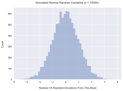
A Histogram Example
For the histogram example, I simulate 10000 standard normal random variables. This time around I use the darkgrid style which looks like R's ggplot2 graphics. To achieve the histogram in seaborn, the distplot is needed.
### Histogram Example
# Reference: https://seaborn.pydata.org/tutorial/distributions.html

normals = np.random.standard_normal(10000)

# Darkgrid style (looks like R's ggplot2):

sns.set_style("darkgrid")

fig  = sns.distplot(normals, kde = False)

plt.xlabel("\n Number Of Standard Deviations From The Mean")
plt.ylabel("Count \n")
plt.title("Simulated Normal Random Variables (n = 10000) \n")
plt.show(fig)
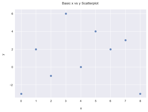
Scatterplots
In this scatterplot example, I create two lists of x and y values. These x and y lists are put into a pandas dataframe. Seaborn's regplot will generate a scatterplot with fit_reg = False.
### Scatterplot
# Reference: https://python-graph-gallery.com/40-basic-scatterplot-seaborn/

x = [0, 1, 2, 3, 4, 5, 6, 7, 8]
y = [-3, 2, -1, 6, 0, 4, 2, 3, -3]

xy_df = pd.DataFrame({"x": x, "y": y})


# Without regression fit:
fig  = sns.regplot(x = xy_df.x, y = xy_df.y, fit_reg=False)

plt.xlabel("\n x")
plt.ylabel("y \n")
plt.title("Basic x vs y Scatterplot \n")
plt.show(fig)

sns.plt.show()
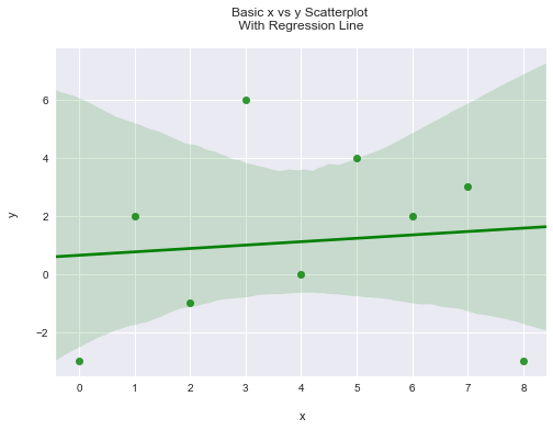
A Scatterplot With A Regression Line
Having fit_reg = True in Seaborn's regplot will generate scatterplots with a linear regression line through the points. (A linear regression line from statistics is basically a line of best fit where the sum of the distance from the line to the points is minimized.)
# With linear regression line:

fig  = sns.regplot(x = xy_df.x, y = xy_df.y, fit_reg = True, color = "g")

plt.xlabel("\n x")
plt.ylabel("y \n")
plt.title("Basic x vs y Scatterplot \n With Regression Line \n")
plt.show(fig)

sns.plt.show()
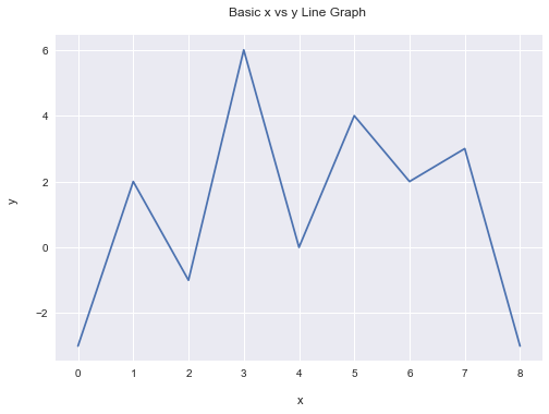
A Line Graph Example
Generating a line graph is not that much different than with the scatterplot example. Instead of seaborn's regplot, I use the plot function from matplotlib's pyplot. All of the points are connected with line segments.
### Line Graph

# Reference: https://python-graph-gallery.com/seaborn/
# https://python-graph-gallery.com/120-line-chart-with-matplotlib/

x = [0, 1, 2, 3, 4, 5, 6, 7, 8]
y = [-3, 2, -1, 6, 0, 4, 2, 3, -3]

xy_df = pd.DataFrame({"x": x, "y": y})

plt.plot('x', 'y', data= xy_df)

plt.xlabel("\n x")
plt.ylabel("y \n")
plt.title("Basic x vs y Line Graph \n")

plt.show()
Plotting Math Functions
Plotting math functions in Python is similar to the code in the line graph plot section. To specify a domain, use numpy's linspace() function.
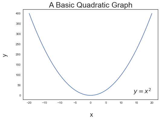
Quadratic Parabola Example
In the quadratic parabola example, I specify the domain from -20 to 20 for x. The y variable is under the variable of quadratic_y.
Like in the line graph plot, pyplot's plot function from matplotlib is used. To include math text in the plot, use plt.text() with the LaTeX like code in there.
### Math Functions Plot
# Reference: https://glowingpython.blogspot.ca/2011/04/how-to-plot-function-using-matplotlib.html
# https://python-graph-gallery.com/193-annotate-matplotlib-chart/

## Quadratic Parabola Example:

x = np.linspace(-20, 20, num = 100)
quadratic_y = x**2

quadratic_df = pd.DataFrame({"x": x, "y": quadratic_y})

sns.set_style("white")
plt.plot('x', 'y', data= quadratic_df)

plt.xlabel("\n x", fontsize = 20)
plt.ylabel("y \n", fontsize = 20)
plt.title("A Basic Quadratic Graph", fontsize = 25)

#  Math Annotation Text
plt.text(14, 10, r'$y = x^2$', fontsize=20)

plt.show()
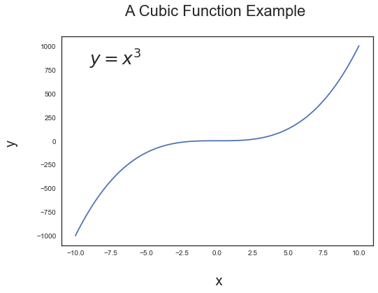
A Cubic Function Example
In this example, I choose a simple cubic function with a domain from -10 to 10 for x.
## Cubic Function Example:

x = np.linspace(-10, 10, num = 100)
cubic_y = x**3

cubic_df = pd.DataFrame({"x": x, "y": cubic_y})


sns.set_style("white")
plt.plot('x', 'y', data= cubic_df)

plt.xlabel("\n x", fontsize = 20)
plt.ylabel("y \n", fontsize = 20)
plt.title("A Cubic Function Example \n", fontsize = 22)

#  Math Annotation Text
plt.text(-9, 800, r'$y = x^3$', fontsize=25)

plt.show()
References
As no one really learns everything alone here are the resources and references that were used.
- https://www.tutorialspoint.com/seaborn/seaborn_quick_guide.htm
- https://stackoverflow.com/questions/41968732/set-order-of-columns-in-pandas-dataframe
- https://seaborn.pydata.org/generated/seaborn.barplot.html
- https://stackoverflow.com/questions/31632637/label-axes-on-seaborn-barplot
- https://seaborn.pydata.org/tutorial/distributions.html
- https://python-graph-gallery.com/40-basic-scatterplot-seaborn/
- https://python-graph-gallery.com/seaborn/
- https://python-graph-gallery.com/120-line-chart-with-matplotlib/
- https://glowingpython.blogspot.ca/2011/04/how-to-plot-function-using-matplotlib.html
- https://python-graph-gallery.com/193-annotate-matplotlib-chart/