Looking At Financial Data In R & Python With Quandl
Hi there. This post is a short guide to Quandl in R and Python.
I first heard about Quandl from Datacamp and through sentdex's Python tutorials on Youtube.
Sections
- What Is Quandl?
- An Example In R With Housing Prices Data
- An Example In Python With Perth Mint Silver Prices
- References
1) What Is Quandl?
Quandl is a source for financial, economic and alternative datasets for those interested in the financial markets, trading and investing. A good handful of the datasets are free while other datasets do require payment.
A lot of the datasets deal with time dependent data (i.e. time series). The data can be extracted and analyzed with Microsoft Excel (with an add-in), R, Python, etc.
You do need an authentication key/token to access the datasets. A free authentication key can be obtained after signing up for a free Quandl account. (Info on authentication)
2) An Example In R With Housing Prices Data
In this R example, I look at housing prices in Clarkson, NY where the data is provided by Zillow. I first load the appropriate packages into R.
# If you need to install Quandl:

# install.packages("Quandl")

# Loading Financial data With Quandl:

library(Quandl)
library(plotly)
library(dplyr)
If you need to install a package into R, use the code install.packages("pkg_name_here").
Instead of the usual ggplot2 data visualization package, I use plotly instead. (plotly can also be used in Python).
Before accessing data from Quandl, you do need a Quandl authorization with the API key. In R, you need the code Quandl.api_key("API_key_here").
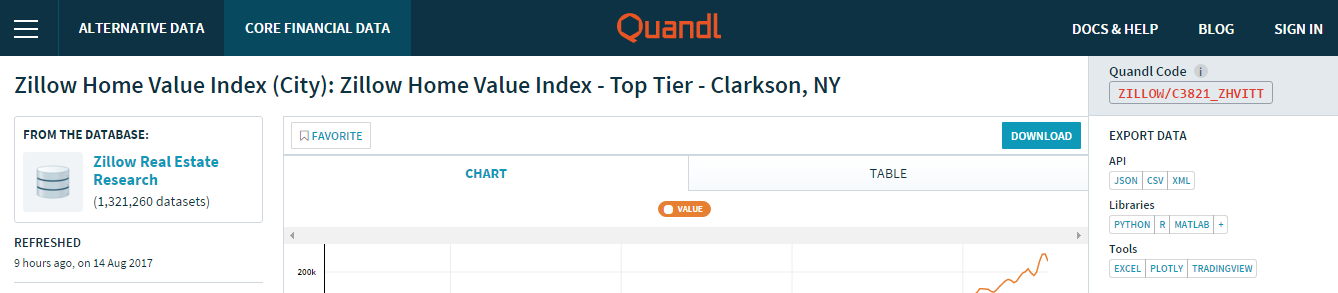
When you go to dataset page, you will notice a Quandl code in the top right. This Quandl code is a unique code for that dataset and is needed to access the data. The first screenshot shows the page with the Quandl code at the top right and the second screenshot shows information about the data.

This Quandl code is used in the Quandl() function in R for data retrieval.
clarkson_ny_prices <- Quandl("ZILLOW/C3821_ZHVITT")

# Preview data:

head(clarkson_ny_prices)

        Date  Value
1 2017-06-30 204400
2 2017-05-31 207200
3 2017-04-30 207100
4 2017-03-31 204300
5 2017-02-28 200100
6 2017-01-31 198800

tail(clarkson_ny_prices)
          Date  Value
250 1996-09-30 125300
251 1996-08-31 126200
252 1996-07-31 126700
253 1996-06-30 126100
254 1996-05-31 125400
255 1996-04-30 125500
I usually like to display plots in R with the ggplot2 package but this time I am using plotly here.
# A simple plotly Plot:
plot_ly(data = clarkson_ny_prices, x = ~Date, y = ~Value) %>%
add_lines(y = clarkson_ny_prices$Value) %>%
layout(xaxis = list(title = "\n Date", titlefont = "Courier New, monospace"),
yaxis = list(title = "Price \n",
titlefont = "Courier New, monospace"),
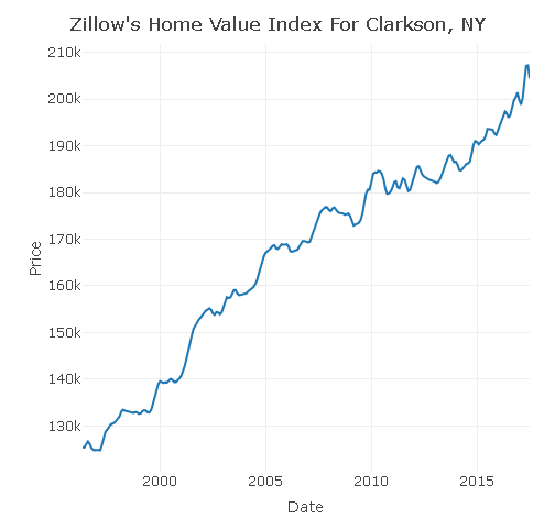
title = "Zillow's Home Value Index For Clarkson, NY \n")
Some Considerations
- Remember that these housing prices are estimates of the median market value in Clarkson, NY. (It is very difficult to get complete and perfect data!)
- A median is a measure where it is in the middle or a sorted number sequence. Half of the values are above and the other half are below the median price.
- The overall trend is that the housing prices are going up.
- Will housing prices still go up? Will prices fall and when?
- What are the types of houses in this data?
3) An Example In Python With Perth Mint Silver Prices
This second example deals with silver prices from the Perth Mint in the Python programming language. I import pandas, matplotlib and quandl into Python.
# Quandl Plots In Python

# Ref: https://www.quandl.com/data/ZILLOW/C3821_ZHVITT-Zillow-Home-Value-Index-City-Zillow-Home-Value-Index-Top-Tier-Clarkson-NY
# https://pythonprogramming.net/using-quandl-data/
# https://www.quandl.com/data/PERTH/SLVR_USD_M-Silver-Spot-Prices-USD-Monthly
# Quick Start Guide: https://blog.quandl.com/getting-started-with-the-quandl-api

import quandl as Quandl
import matplotlib.pyplot as plt
import pandas as pd

auth_token = 'API_key_here'
The command for extracting data from Quandl is the Quandl.get() function.
# Example Two:

perth_silver = Quandl.get("PERTH/SLVR_USD_M", authtoken = auth_token)

# Convert to pandas dataframe:

silver_df = pd.DataFrame(perth_silver)

print(silver_df.head(6))
print(silver_df.tail(6))

            Bid High  Ask High  Bid Low  Ask Low  Bid Average  Ask Average
Date
1991-06-30      4.44      4.46     4.34     4.36         4.39         4.41
1991-07-31      4.57      4.59     4.03     4.05         4.34         4.36
1991-08-31      4.09      4.11     3.83     3.84         3.96         3.98
1991-09-30      4.26      4.28     3.81     3.82         4.03         4.05
1991-10-31      4.20      4.21     4.01     4.03         4.12         4.14
1991-11-30      4.14      4.16     3.99     4.01         4.06         4.08
            Bid High  Ask High  Bid Low  Ask Low  Bid Average  Ask Average
Date
2017-02-28     18.28     18.54    17.14    17.46        17.73        18.01
2017-03-31     18.29     18.57    16.71    17.00        17.47        17.76
2017-04-30     18.49     18.78    17.15    17.40        17.97        18.26
2017-05-31     17.33     17.61    16.01    16.30        16.67        16.95
2017-06-30     17.60     17.86    16.30    16.61        16.84        17.12
2017-07-31     16.62     16.94    15.10    15.39        16.04        16.32
The bid is a price a buyer is willing to pay for while the ask is the price a seller is willing to accept (offer price). In this example, I use the bid average prices and the ask average prices.
In matplotlib, I create a plot where I have the bid average prices and the ask average prices together.
plt.subplot(2, 1, 1)
plt.plot(silver_df.index, silver_df['Bid Average'])

plt.title(''' Perth Mint Monthly Prices For Silver (USD) \n''')

plt.xticks(silver_df.index[0::75],[])
plt.xlabel('\n Year')
plt.ylabel('Avg. Bid Price  \n')

plt.subplot(2, 1, 2)
plt.plot(silver_df.index, silver_df['Ask Average'])


plt.xlabel('\n Year')
plt.ylabel('Avg. Ask Price \n')

plt.show()
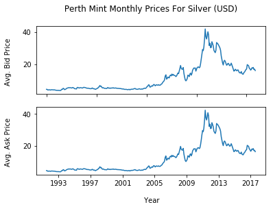
The silver price from 1993 to 2005 has been stable for the most part until the increases around 2006. The peak silver price at just over $40 (USD) occurs at around 2011 (after the 2008 recession). Current silver prices at at the 2011 levels.
Predicting future silver prices based on statistics alone may not be best here. Financial and economic context is needed as markets are not always random and there has been cases of price manipulations (in precious metals, stocks, etc.).
4) References
- https://www.quandl.com/data/ZILLOW/C3821_ZHVITT-Zillow-Home-Value-Index-City-Zillow-Home-Value-Index-Top-Tier-Clarkson-NY
- https://pythonprogramming.net/using-quandl-data/
- https://www.quandl.com/data/PERTH/SLVR_USD_M-Silver-Spot-Prices-USD-Monthly
- Quick Start Guide: https://blog.quandl.com/getting-started-with-the-quandl-api
- https://www.quandl.com/tools/r
- http://dkmathstats.com/a-look-at-a-few-financial-stocks-using-r/
- http://dkmathstats.com/analyzing-financial-data-using-r-quandl-package/
- http://dkmathstats.com/working-with-quandl-financial-data-in-python/
Update & Edit: Wow. Thank you all. I have added a few more reference links.
Great job and thanks a bunch for sharing the results of this work with us all. Namaste :)
You are welcome.
great post. Makes me want to get back into programming again. used to code in Assembly, Clipper, C+ and Pascal back early 90s. upvoted
Quandl also supports programming languages such as C/C++, Java, Julia, etc. Here is a link:
https://www.quandl.com/tools/full-list
Another solid post @dkmathstas. I love Datacamp. I randomly stumbled on it a couple weeks ago (unfortunately after my Python/R assignments were already turned in. It would have probably saved me extra hours of work with having some of their 'cheat sheets' handy while coding...but in some ways, the struggle is where the most learning happens).
But I just did one of their tutorials and am just about finished writing up a Steemit post about it, so I'll have that up here soon.
Just curious, do you prefer Python or R? At first, I exclusively went to R for everything because RStudio was so nice to work with. But once I discovered Python with Spyder, I kind of flip flop between the 2.
Keep these coming! I'm loving them!
I used Datacamp about a year ago with the student pricing. Now I am not sure if the prices are worth it. (Keep in mind USD prices to CAD conversion.) Their cheat sheets are really good. I use the
dplyrdata wrangling one very often.I do prefer R as I am very comfortable with it compared to Python. As of late, I have been trying to improve in Python as there is more utility (I think) compared to R. I do cycle between the two as well.
Great stuff. I think I can use this in the future. Thanks!
Great piece of research! Love to know more such stuff.
Great tutorial!