The ‘Rules’ of Photography
The ‘Rules’ of Photography
The rules of photography are something that you’ve no doubt heard a lot about, it doesn’t matter whether you’ve been shooting for years or just started taking an interest in ‘Making’ a photograph instead of just ‘Taking’ one. The funny thing is that no matter how much photography experience I gain I still come across new ‘rules’, I guess it’s because – as I’ve said many times before – there are no [real] rules! That said there are basic compositional elements that look universally pleasing to the eye. In the same way that human beings – most of the time without realising it - are attracted to symmetrical features in faces. Tell you what, let’s forget the whole notion of ‘rules’, it’s an odd choice of words for a clickbait title but it’s about the only way to succinctly describe what is really just a set of compositional guidelines. It’s by no means exhaustive, but it’s a good place to start, and for the seasoned pro’s (as always) it never hurt to brush up on what you already know.

The Rule of Thirds
This one’s probably one of the simplest and most talked about rules of photography, I mean it’s actually called the RULE of thirds. I guess that makes my article title a little bit more legit at least! So well known is this rule that most modern DSLRs will have the option to have guidelines displayed through the viewfinder to show you where the thirds lie. Don’t worry if you don’t have that feature however, all you need to do is mentally divide the image into 9 little squares. I’ll be honest, that’s a terrible way to do it quickly, but that’s essentially what we’re doing. Placing two horizontal lines across an image to divide it horizontally into three equal sized sections, and the same vertically. The rule of thirds simply means that when objects of interest are placed on these lines, they tend to look good. Well, I can’t guarantee ‘good’, that really depends on what it is you’re photographing, but it pleases the subconscious mind of the viewer to see points of interest placed on the lines of thirds. Even more so if we place them on the intersection points of these lines. It’s like a subconscious mindgasm.
.jpg)
The Eye is Always Drawn to the Lightest Point
Look at any image and you will always be drawn to the lightest point. When we look at an image, I mean properly look, we start to examine the picture as a whole, exploring the light and shade, but the human eye is always drawn towards brightness. Weird isn’t it? I used to be a huge fan of M Night Shyamalan and his unique way of combining supernatural goings on with a more human story. In his book about making ‘Lady in the Water’ he talks about ‘Fear’. He simplified fear in a way that I’ve always thought was as near perfect as possible *Fear is the unknown* What has that got to do with light? Well I’m not really sure WHY we’re drawn to brighter points in an image, but I can’t help but think it has something to do with the amount of people that are afraid of darkness. Heck, I remember swimming in a lake sometime a year or two ago and staring down into the darkness below me. One little thought popped into my head and the whole thing freaked me out for the rest of the swim I digress. Suffice to say people aren’t keen on the dark, and human eyes are drawn towards light. So when it comes to creating composition it’s important to remember that the eye will be drawn to the lightest area. I can’t tell you how many images I’ve seen that would look incredible were it not for a blown out sky or overpowering bright spot on the wrong side of the image. I’m not saying that the brightest part of your image also needs to be the focus, but use that brightness to lead the viewer to the focal point.
.jpg)
Symmetry
Given my earlier point about humans being attracted to symmetry it’s not surprising that symmetry in images looks pleasing to the eye. I think all of us have that little OCD side to ourselves, whether it’s those among us that diligently separate all the elements of their meal on the plate before they eat (…just me then?) or just lining the shoes up neatly in a rack. There’s just something orderly about symmetry. When it comes to photography symmetry doesn’t have to be symmetrical. Now there’s a paradox if ever I wrote one. Symmetry in photography can come in the form of balancing elements, for instance two people of a similar size in a frame, one on each side of the photograph, looks symmetrical. It might not be identical, but it still pleases that little OCD side of our brain that stopped us from turning off the YouTube ‘Most Satisfying Video in the World’ (…AGAIN just me!? Come on dudes!)
(Photo by @vtravels)
Leading Lines
This is another one that gets talked about a lot, but really just ‘lines’ would be enough of a headline for this one. Leading lines typically ‘lead’ the viewer into the image, imagine a path with a person at the end of it, the pathway is the leading line, drawing us into the focal point of the person stood on it. Just this evening I saw a photo by @yumyumseth of someone stood on a path with tall trees either side. It’s the kind of shot I love and a perfect example of powerful use of lines. Lines don’t have to be perfectly straight Redwoods or metal girders, leading lines and pathways can meander across the frame, leading the viewer in and sometimes out of the image. Lines help us create a story within our images, taking the viewer on a journey and elevating a pretty picture into something much more.
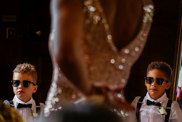
Frames
Framing is one of the most basic compositional tools employed by all photographers, some do it well, some not so well. It’s another one of those OCD things, human beings just like frames. We like putting things in boxes, simplifying things if you will. That could be something as literal as using a mirror in a shot, a technique employed by almost every wedding photographer I’ve ever met. (Side note – Seriously, we are ALL magpies. Watch a wedding photographer and you’ll see them finding every reflective or shiny object they can!) Framing isn’t always about finding actual frames however, it might be framing your subject between trees or foliage, it might be framing a person between other people. Essentially we’re deciding what the focal point of our image is going to be, and framing it as we see fit. Guiding the viewers eye to the correct point in the image – our subject. For me this is usually people, so I’ll use walls, blurred out people in the foreground, tree’s, candles, just about anything. In fact my most recent Wedding Photo of the Day was the shot below, where the bride and her father are framed not only by the incredible décor on either side of the aisle, but by the Perspex candle holders on the registrars desk which I was stood behind.
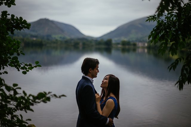
Negative Space – Framing Continued
When we talk about framing our image we usually think about the objects (be they Animal, Mineral or Vegetable) we use to create a composition. But what about Negative Space? I love negative space, it’s a compositional element that seems to be fairly modern, but that has been seen in all kinds of art over the centuries. Negative Space isn’t wasted or unused space, it can amplify an image, or even play tricks on the mind as Fed Ex showed us years ago with the creation of their logo.
![]()
(Another by @vtravels)
Why the ‘Rules’ are important
We all love breaking the rules right? Some of us hide it more than others, but everyone has that rebel in them. I’ve always loved extreme framing, that is to say placing subjects outside of the 3rd lines. Even framing a subject completely central, it’s quite a bold framing choice but it’s always been a big part of my personal style, there’s nothing that thought out about it – I just like the way it looks! After all that’s what Photography is all about right!? But why am I talking about my style? Because the rules, and our use – or abuse – of them, are a part of what make our style unique. Our compositional choices that go into each shot. Sure, we’ll frame things differently every time we shoot, sometimes we do so knowingly and sometimes we just do it because it’s what we find aesthetically pleasing. But understanding what impact our framing choices have on how the viewer sees out image is an important part of creating a deliberate style that you can rely on under pressure. The point is that by understanding the rules and how the human mind views an image we can choose when to follow the rule, and when to break it. We can elevate our images that bit further.
The Influence of Auteurship
Back in my Shyamalan obsessed days of film nerding I remember watching the work of motion pictures great auteurs. Directors who’s look or style is clearly recognisable as their own, directors who aren’t usually too preoccupied with the box office billions (although that’s not to say they haven’t raked in the audiences). Wes Andersons palette and symmetry, Pedro Almodovar’s framing and slow edits or Edgar Wright’s fast edit montages. Recently I mentioned the film Comet to @aweber when we were talking about framing. One of the reasons I love Sam Esmail’s work so much is that I love the way it looks, he uses the same extreme framing that I love to use, he clearly thinks each and every shot through. It’s these directorial extremes that trickle down through the media in all forms. I remember seeing wedding photos over the years that have been eerily similar to shots used years later in Hollywood films. Did the Director or DOP happen to see those photographs? I’ve certainly seen plenty of wedding photos that have replicated framing in films. Don’t tell anyone but I’ve replicated endless shots from the aforementioned Sam Esmail film. In fact I replicated one particular scene, lit with a strong Red/Blue tungsten mix a few years back. Soon after a fellow wedding photographer duplicated my lighting setup to a tee – in fact he probably pulled it off a bit better than I did. My version was inspired by Esmail, the other photographers may well have been inspired by mine. Indeed the lighting setup got quite popular over the next few years (the finale scene in Baywatch springs to mind, along with almost every scene in Riverdale). Esmail wasn’t the first person to use that lighting setup, but style goes in waves. Walking into my Nans house you’re met with a sea of style choices that are questionable at best. But they weren’t ALWAYS dated looking. What about Danny Zuko in Grease, for years I laughed at the hairdo’s on show until recently it seems like every fashionable bloke on TV has a hairdo that would be right at home in the T-Birds. Don’t get me wrong, I still laugh at the hairdo’s, but that’s just a couple of examples of how styles work.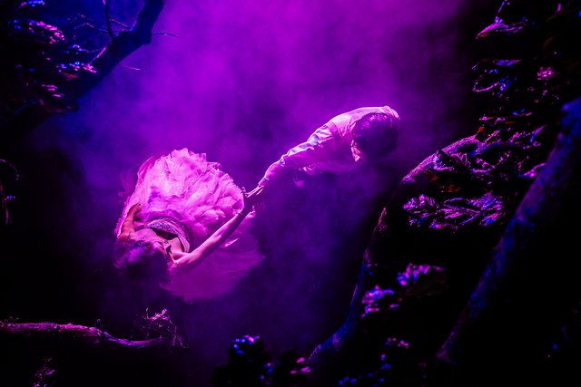
(I couldn't find the Red/Blue shot on my PC, so here's another lighting setup I enjoyed doing. Not to mention the Ninja Skills used to get the angle!)
It’s difficult to predict what the next style will be, keeping on top of that wave of popularity is tricky, indeed nigh on impossible. In my career as a wedding photographer with @vtravels we’ve had times when we felt like we were on the top of that wave, featured in magazines and winning awards, and other times when we felt like the phone just wasn’t ringing. That’s the way it goes with life as an artist, popularity can be fleeting at times. Over the years we’ve found the only way to beat it is to ignore it. Stick to what works for you and own it. Learn about what you do and hone your skills. Learn the rules so you can break the rules.
Great stuff dude! Really good point about the eye being drawn to the brightest point. I'm sure I've heard that before, but it's not something that I'm generally conscious of when shooting and it definitely would be helpful to have in mind! Thanks for sharing.
Also, I totally did not realize there was an arrow in the FedEx logo! So sneaky haha.
Cheers dude! Yeah, I always like that one, if I'm honest I often forget it when I'm shooting, but I always remember it when I'm looking through them!
Haha now try and UNsee it!!
Fair enough! Glad I'm not alone ;)
Haha for real, not a chance.
This post was shared in the Curation Collective Discord community for curators, and upvoted and resteemed by the @c-squared community account after manual review.
Hello c-squared!
Congratulations! This post has been randomly Resteemed! For a chance to get more of your content resteemed join the Steem Engine Team
Great rundown. This is a bit of a tangent, but I’m consistently amazed by how similar the rules of various realms of human communication are, and how significantly they overlap. Storytelling is photography is marketing is UI is filmmaking. I love it, in part, because it’s always helpful to hear the ideas distilled differently for a different discipline—it helps clarify them for whatever medium I happen to be dabbling in.
Really a well written post, and thanks for stressing several times that these aren't really "rules" and in fact a lot of what makes a good photographer is how they push or break the rules in pursuit of interesting composition.
BTW I think you may have intended to put a different photo in, right above the "Negative Space - Framing Continued" header, the text above that photo (photo appears to be a bride and groom, outdoors in front of a lake) is: "In fact my most recent Wedding Photo of the Day was the shot below, where the bride and her father are framed not only by the incredible décor on either side of the aisle, but by the Perspex candle holders on the registrars desk which I was stood behind. " Clearly the photo below does not match that description.
Much love - Carl
Hey @carlgnash. I noticed that too but found the photo in his previous post. Maybe that's the Wedding Photo of the Day he described. It looks like the description at any rate. :)
Hi skiesandsports,
LEARN MORE: Join Curie on Discord chat and check the pinned notes (pushpin icon, upper right) for Curie Whitepaper, FAQ and most recent guidelines.
This is a great post, loved reading it and the pictures are really awesome too!
STOPThis is an excellent article. I don't consciously follow the rules so much but its nice to break down why an image is pleasing (as long as we don't put constrains around them). I never noticed that with the FedEx logo !
I finally got around to read your article, and it’s another great one! Even though many of these things comes quite naturally to me, it’s good to be reminded of the actual rules that often make the image just look nicer than the same scenery that would be taken not following the rules. I think I wing it a little too often, instead of really paying attention to what I do😅
Funny thing, as soon as I started reading about rules, I thought of @vtravels and how she breaks the rules of composition so wonderfully!
I’m always looking forward to these articles, keep doing them!
my foto
es increíble el efecto de las olas!