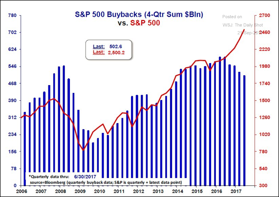
This chart shows the divergence between the stock buyback activity and the S&P 500
This chart shows the divergence between the stock buyback activity and the S&P 500:
Hope it helps,
Román.
This chart shows the divergence between the stock buyback activity and the S&P 500:
Hope it helps,
Román.
Great posts, totally followed!
Thank you!
qué miedito, buy gold Román!!!!
If they' buying back less stock, that means that they think it is overpriced?
Thanks for sharing ,
Upvoted !
By the way ,I started following you and I would appreciate your follow back too .
please visit my blog and vote me too
Its so exciting to be on the ground floor. I think most people don't realize how lucky we are to be a part of this as a community. Things of this magnitude are usually only available to the elite. If the power of the community could be harnessed the growth could be exponential