Graphic Design Class 3 | Colour and Typograpghy.

Principles of Typograpghy.
- Understand the usage of fonts.
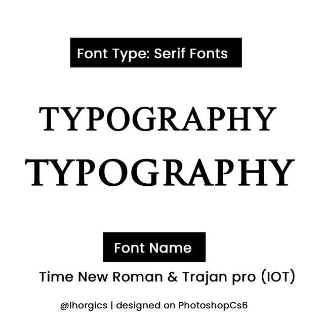
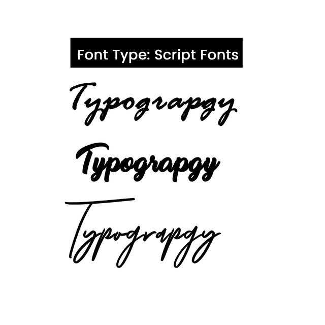
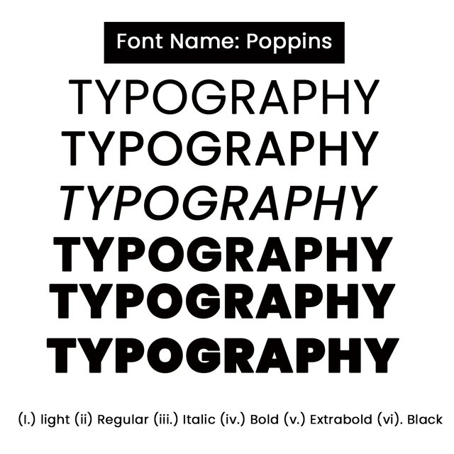
There is no way you discuss typography without talking about font, you need fonts for your write up and the font has to be in line with the type of design you want to do. When designing for kid and want to get their attention, you come up with fonts that looks ‘babyish’ and not official so they can be attracted. Likewise when designing for a corporate body you don’t use ‘script’ fonts which is always stylish, it’s a turn off already for any serious minded person
- Avoid too many fonts.
Try as much as possible to avoid too many fonts when designing, its also turn off in the sense that the viewer will not enjoy transiting between one font to another when trying to grasp the message in your design. Two or maximum of 3 is fine. Personally I prefer using a font with Family(a single font expressed in bold, extrabold, medium etc).
- Understand how to leverage on space
Learning about space and how it works with typography can help spice up your work, always give room for space, your types must not be clustered. A white space in your design can help pass your message effectively .
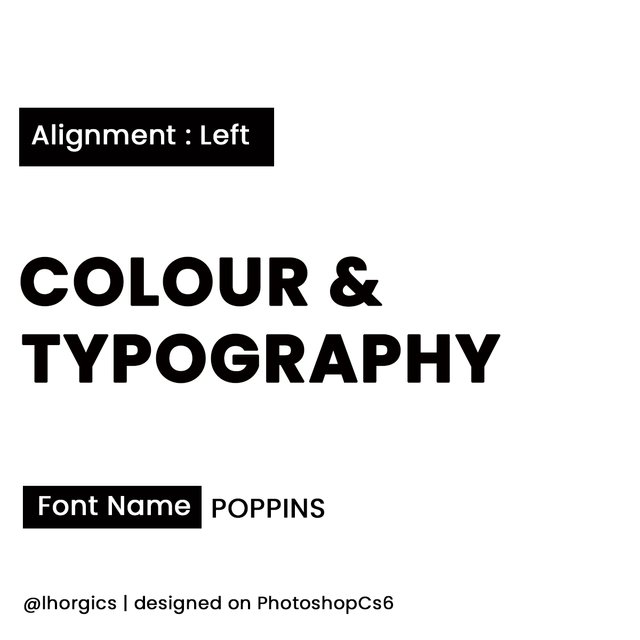
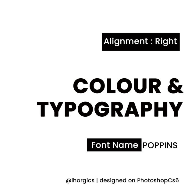
- Alignment.
Alignment makes your types well organized, you can either align your content to the right, to the left or even center it, it all depends on how you want it to look like, not having a definite direction for your content will make it look messy and unappealing to your viewers. In summary, alignment positions the eyes of your viewers.
- Size.
Ensure you give priority to what matters in your design, make sure you give appropriate font size to a particular type you would love your audience to see, which is usually the bait. In short, give priority to the type/word that matters in your design
- Use correct Grammar
Don’t just include types, ensure what you wrote is correct, any slight mistake you make might be a turnoff to your prospect , not doing it right might discourage him or her. It might mean ‘INCOMPETENCE’ to them.
These are just few of the tips I would love to share as touching this aspect. Of course be prepared to get me more principles to broaden your understanding. Lets move to colours and how it can give more life to our designs.
COLOUR.
Types of colour.
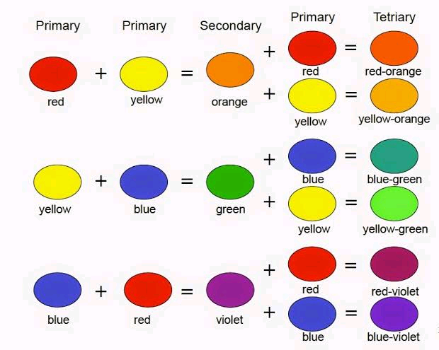
- Primary Colours.
This colours are said to be basic colours and are very original, meaning they were not derived by mixing two or more colours together. Example of these colours are RED, BLUE and YELLOW
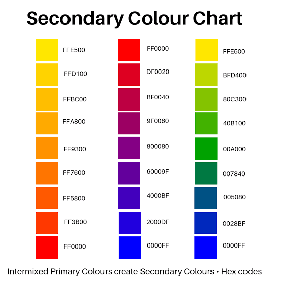
- Secondary colours.
These colours are derived by mixing two primary colours together. When this is done the result includes ORANGE, GREEN and PURPLE.
- Tertiary Colours.
These colours are derive when secondary colours are mixed with primary colours. What you get in the process are Blue-green, Red-Orange, Yellow-green
Colour Psycology
Red
- Energy
- Passion & love
- Danger e.t.c
Orange
- Enthusiasm
- Youthfulness
- Creativity e.t.c
Blue
- Calm
- Trust
- Intelligence e.t.c
Green
- Nature
- Growth
- Harmony e.t.c
Yellow
- Happiness
- Hope
- Spontaneity e.t.c
Black
- Power
- Elegance
- Sophistication
White.
- Simplicity
- Minimalism
Colour Code.
Conclusion
Class Assignment 3
(1)In your own word, explain what you understand by Colour & Typography
(2)Mention 5 colours and what they represent just like you were taught in this class.
(3)Research 3 more fonts each for the following font categories
- Script
- Serif
- San serif
A short note + screenshot on these categories will be appreciated.
(4)Create a simple design showing your understanding about this lesson.
You can use an app i.e pixelab or software like coreldraw/photoshop. However you’re not limited to these graphic tools.
RULE FOR HOMEWORK.
(1) Give your post the title ; Graphic Design Class 3 | Colour and Typograpghy.
(2) Your assignment must be submitted in steem.skillshare community
(3) You have to also tag me in your post for me to easily access it.
(4) Plagiarized content will not be considered
(5) Use hashtag #lhorgictask
(6) The deadline for all entries is 20th of September.
Special regard:
@atim1234
@milakz
@printskill
@niglys
Thank you for the wonderful, well detailed lecture.
I learnt a lot from it.
Will be dropping my assignment soon.
Wow! Such great value you passed to me today! I got a lot of new knowledge from this well packaged class organized by @lhorgic our able "Design Science Teacher"
Well done Sir!
Thanks so much @niglys8... It feels good to know you got value..thanks once again.
This is a well detailed lecture. I didn't realize the importance of typography until now. Thanks for the knowledge shared sir, I really enjoyed this class
@hamzat,am glad you now understand the importance of typography. I await your entry.
Lesson well explained dear teacher! I fully understand the importance of color and typography now. I will submit my assignment soon...
Will be expecting your entry @madilyn02
Amazing post. Well detailed and elaborate.
Thanks @ftz
I love this class! I will soon submit my homework!
Will be expecting your entry.... I saw your post on digital painting,I must say you're good at what you do...keep it up @christianyocte...
Thank you very much, sir!
Very Professional, I like the task you give
Thanks headmaster @atim1234
You're welcome, keep doing your best
I learned so many things on Typography and importance of color combination in Graphics Design. thanks @lhorgic
Am glad you learnt a lot from the lesson...thanks for the feedback @printskill
Thanks so much for this informative class @Ihorgic
I've grasped a better understanding on the importance of typography and colour in graphics design
My entry:
https://steemit.com/hive-197809/@sheza786/graphic-design-class-3-or-or-colour-and-typograpghy-or-or-by-sheza786