WATERCOLOR SCHOOL: Learning to make washes and starting to play with color - ESCUELA DE ACUARELA: Aprendiendo a hacer lavados y empezando a jugar con el color
Hello everyone!
With this post, I begin a series of tutorials, masterclasses and exercises with which I would like to share my knowledge and experience painting watercolors for so many years, and bring this wonderful world closer to everyone.
Watercolor washes
Watercolor washes are one of the fundamental techniques of watercolor. It consists simply in covering a more or less large surface of watercolor paper in a smooth and uniform way. The washes can be of a single color, or you can vary the brightness or hue by adding more water or mixing with other colors. In this video you can see how I do them. First, a single-color wash, then a white graded wash, another black graded wash, which is actually mixing two colors, and finally another wash mixing two primaries colors. Finally, I also do an irregular wash, and show how I mix the primary colors in the palette to get the secondary colors.
When washing, it is necessary to be very careful with the humidity of the paper. Also, be aware of changing the water bowl when necessary so as not to load the brush with dirty water. One thing to keep in mind is that the colors lighten as the watercolor dries. You can see this very well over time in the video.
Lavados de acuarela
Hacer lavados es una de las técnicas fundamentales de la acuarela. Se trata, simplemente, de cubrir una superficie más o menos amplia del papel de acuarela de manera suave y uniforme. Los lavados pueden ser de uno solo color, o se puede variar el brillo o el matiz agregando más agua o mezclando con otros colores. En este vídeo podéis ver cómo los hago yo. Primero, un lavado de un solo color, luego un lavado degradado hacia el blanco, otro degradado hacia el negro, que en realidad viene a ser la fusión de dos colores, y por último otro lavado de mezcla de dos primarios. Por último, también hago un lavado irregular, y muestro cómo mezclo los colores primarios en la paleta para conseguir los secundarios.
A la hora de hacer lavados, hay que estar muy pendientes de la humedad del papel. También de ir cambiando el tarro de agua cuando sea necesario para no cargar el pincel con agua sucia. Una cosa que hay que tener en cuenta es que los colores se van aclarando conforme la acuarela se va secando. Eso se puede ver muy bien con el paso del tiempo en el vídeo.
Music: Felicity, by Scott Buckley (CC-BY)
First of all, it is important that the paper support can be tilted and rotated, since we are going to use the effect of gravity on the water.
The first thing I do is to wet the surface a little to clean the paper of any possible grease it may have and also to facilitate the sliding of the paint. But very little, the washes that I am going to do are, in fact, wet on dry. Therefore, I dry the excess water with absorbent paper.
As you can see, I am making horizontal strokes. By starting at the top, the inclination of the board causes the water loaded with pigment to accumulate at the bottom. And this surplus is used in the next brushstroke. That's why I overlap the edge of the new brushstroke very slightly with the previous one.
Unlike the flat wash, in which I loaded the brush with paint, you can see that in the graded one I only load the first brushstrokes with paint. What I do then is to use water in the following brushstrokes and only use the pigment that accumulates at the bottom of the previous brushstroke, which will be less and less until it disappears and we will only apply water on the paper and we will have the white.
The case of the graded wash to black is an exception. Due to its more opaque nature, I prefer to paint from below. Actually, I have only done it to oppose a gradient to white with a gradient to black, and thus see all the tonal variations that we can get from a primary color, lighter and darker. But, as you will see in the next exercise, black is not usually used in watercolor to darken.
As you can see in the two-color variegated wash, I flipped the board over and it was as if I was making two graded whashes from top to bottom, blending in the center.
Antes de nada, es importante que el soporte del papel se pueda inclinar y rotar, ya que nos vamos a ayudar del efecto de la gravedad sobre el agua.
Lo primero que hago es mojar un poco la superficie para limpiar el papel de la posible grasa que pudiera tener y también para facilitar que se deslice la pintura. Pero muy poco, los lavados que voy a hacer son, en realidad, en húmedo sobre seco. Por eso, el exceso de agua lo seco con papel absorbente.
Como podéis ver, voy dando pinceladas horizontales. Al empezar desde arriba, la inclinación del tablero hace que el agua con el pigmento se acumule en la parte de abajo. Y ese sobrante se aprovecha en la siguiente pincelada. Por eso superpongo muy levemente el filo de la nueva pincelada con la anterior.
Frente al lavado uniforme, en el que cargaba el pincel de pintura, podéis ver que en el degradado solo lo cargo las primeras pinceladas con pintura. Lo que hago después es usar agua en las siguientes pinceladas y solo usar el pigmento que se acumula en la parte de abajo de la pincelada anterior, que cada vez será menor hasta que desaparezca y solo aplicaremos agua sobre el papel y tendremos el blanco.
El caso del degradado hacia el negro es una excepción. Debido a su naturaleza más opaca, prefiero pintar desde abajo. En realidad, este tipo de degradado solo lo he hecho para oponer un degradado hacia blanco con un degradado hacia el negro, y ver así todas las variaciones tonales que se pueden conseguir a partir de un color primario, más claras y más oscuras. Pero, como veréis en el siguiente ejercicio, el negro no se suele usar mucho en acuarela para oscurecer.
Como podéis apreciar en el lavado de una mezcla de dos colores, le he dado la vuelta al tablero y era como si hiciera dos degradados de arriba hacia abajo, que se mezclan en el centro.
Exercise 1: Working with primary colors//Ejercicio 1: Trabajando con los colores primarios
This is an drill for begginers.
Este es un ejercicio para principiantes.
SUPPLIES/MATERIALES
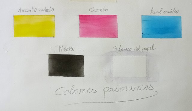
Paint: cadmium yellow, cerulean blue, alizarin crimson and lamp black in tube or pans.
Support: cold pressed watercolor paper (about 300 gr).
Other supplies: hard pencil 2H, thick black marker.
We can consider medium cadmium yellow, alizarin crimson and cerulean blue as primary colors for watercolor. These are the only ones we will use for this exercise. We will also use the paper itself for white, of course, and lamp black.
Pinturas: amarillo cadmion, azul cerúleo y rojo alizarina, en tubo o pastilla.
Soporte: papel de acuarela de grano fino y unos 300 gr.
Otro material: lapicero duro 2H, rotulador grueso de color negro.
Podemos considerar como colores primarios para la acuarela el amarillo cadmio medio, el rojo de alizarina (carmín) y el azul cerúleo. Son os únicos que vamos a utilizar para este ejercicio. También usaremos el blanco del papel, por supuesto, y el negro de humo.
WORKSPACE PREPARATION//PREPARANDO EL ESPACIO
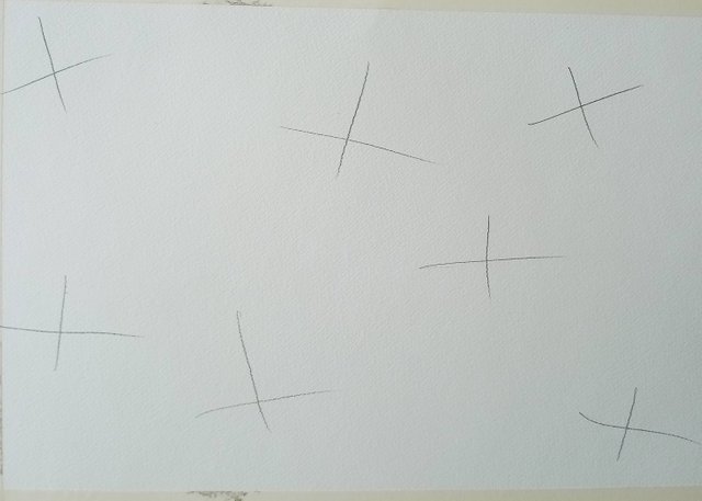
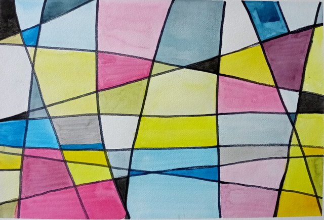
We draw 7 crosses on the paper.
Trazamos 7 cruces en el papel.
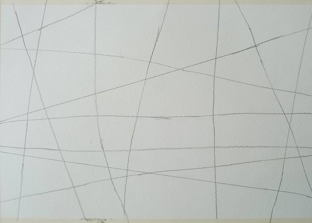
We extend all the arms of the crosses until they go beyond the limits of the paper, so that we will have divided the space into irregular polygons.
Prolongamos todos los brazos de las cruces hasta que se salgan de los límites del papel, de manera que habremos dividido el espacio en polígonos irregulares.
LIGHTENING COLORS//ACLARANDO COLORES
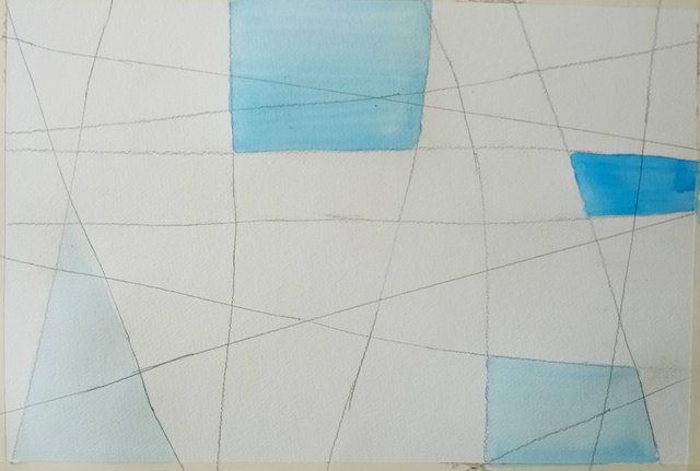
By varying the amount of water added to the paint, it is possible to create a range of different tonal values for each color. The greater the amount of water used to dilute the pigment, we will get lighter and lighter variants.
Variando la cantidad de agua añadida a la pintura, es posible crear una gama de valores tonales diferentes para cada color. Cuanto mayor sea la cantidad de agua utilizada para diluir el pigmento, conseguiremos variantes cada vez más claras.
We are going to fill with cerulean blue several polygons trying not to exceed the edges. In each one we are going to mix the paint with more or less water, but each section should have a homogeneous tone. You can color adjacent sections but with different water intensity, to see the contrast between them.
Rellenamos de azul cerúleo, intentando no salirnos, varios polígonos. En cada uno mezclaremos la pintura con más o menos agua, pero cada sección debe quedar con un tono homogéneo. Se pueden colorear secciones vecinas pero con distinta intensidad, para ver el contraste entre ellas.
We will repeat the same with the cadmium yellow, being careful not to mix it with the blue, as it may be wet and we do not want to create secondary colors yet.
Repetimos lo mismo con el amarillo cadmio, siempre con cuidado de no mezclar con el azul, ya que puede estar tierno y todavía no queremos crear colores secundarios.
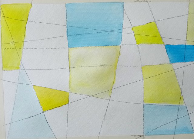
We are going to do the same with the alizarin red: we are going to fill in sections with different intensities.
Hacemos lo mismo con el rojo alizarina: rellenamos secciones con distintas intensidades.
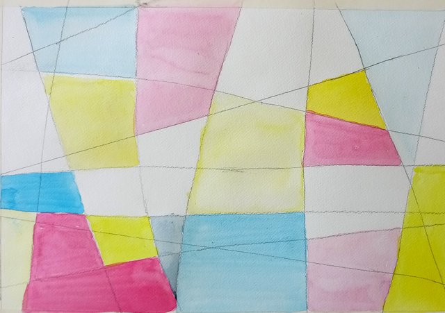
By diluting a color more or less in water, what we are actually doing is mixing the primary pigment with the white (of the paper) with different intensity. Our space has been filled with several varieties of each primary color. In watercolor, to preserve the translucent effect of the paint, it is always necessary to lighten the colors by adding water. White pigment is not usually used, as it would dull the colors.
Al diluir un color más o menos en agua, lo que en realidad estamos haciendo es mezclar el pigmento primario con el blanco (del papel) con diferente intensidad. El espacio se nos ha llenando de diversas variedades de cada color primario. En acuarela, para conservar el efecto translúcido de la pintura, siempre hay que aclarar los colores añadiendo agua. No se suele utilizar pigmento blanco, ya que volvería opacos los colores.
DARKENING COLORS: PRIMARIES+BLACK//OSCURECIENDO COLORES:PRIMARIOS+NEGRO
Let's start playing with black. In some small areas, we are going to spread intense washes of lamp black. In others, we lighten the black by wetting it with water to get different shades of gray.
Ahora vamos a empezar a jugar con el negro. En alguno de los compartimentos, no muy grandes, extendemos lavados intensos del negro humo. En otros, aguamos el negro para aclararlo y conseguir distintos tonos de grises.
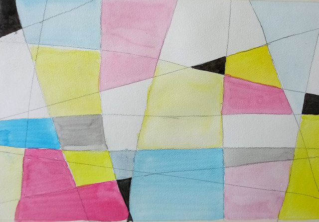
Now we are going to mix the primary colors with more or less intense washes of black. The mixture with yellow will give us a dirty yellow-green; black and carmine, a dirty maroon; and black plus cerulean blue will give us a bluish gray. Remember to always fill each space evenly, trying not to overflow the space.
Ahora mezclamos los colores primarios con aguadas más o menos intensas de negro. La mezcla con amarillo nos dará un amarillo verde sucio; el negro y el carmín, un granate sucio; y el negro más el azul cerúleo nos dará un gris azulado. Recordemos que siempre hay que rellenar cada espacio de manera homogénea, tratando de no salirse.
Each primary color will have given us more or less dark variations, depending on the amount of black added to the water. We can also see that the addition of black in watercolor not only darkens the color, but also produces slight variations in hue. Yellows tend to be greenish, for example.
Cada color nos habrá dado variaciones del color más o menos oscuras, dependiendo de la cantidad de negro añadida al agua. También habremos comprobado que añadir negro en acuarela no solo oscurece el color, sino que produce ligeras variaciones de matiz. Los amarillos tienden hacia los verdosos, por ejemplo.
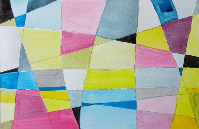
Finally, we delimit the spaces by passing a thick black marker pen over the lines. In this way we create a kind of lattice that separates the colors and covers any errors that may have occurred in the limits when painting.
Delimitamos los espacios pasando un rotulador negro grueso sobre las líneas. Así creamos una especie de enrejado que separa los colores y cubrimos los errores que se hayan podido producir en los límites al pintar.
This is an exercise based on Gestalt that serves to abstract from natural forms, and each time it is executed it gives a unique work.
The following exercises with color will become more interesting, as secondary colors, tertiary colors, broken hue... come into play.
I hope this little class has been to your liking. Do not hesitate to comment if you have any questions. I will be happy to answer.
Este es un ejercicio basado en la Gestalt que sirve para abstraerse de las formas naturales, y cada vez que se ejecuta da una obra única.
Los siguientes ejercicios con color se irán haciendo más interesantes, al entrar en juego los colores secundarios, los terciarios, los colores quebrados…
Espero que esta pequeña clase haya sido de vuestro agrado. No dudéis en comentar si tenéis alguna duda. Estaré encantado de contestar.
Gracias por compartir tu conocimiento, me gusta mucha esta técnica, algunos piensan que puede ser muy fácil, pero la humedad y la limpieza del pincel debe ser muy riguroso prestarle atención, este post será de mucha utilidad para mi hija que le gusta pintar con acuarela.
Saludos y Éxitos.
Muchas gracias por tus palabras. Así es, su trasparencia natural y el uso del agua, que prácticamente impiden hacer cualquier tipo de corrección, la convierten en una técnica bastante exigente. Espero que los diversos tutoriales que vaya poniendo le puedan servir a tu hija. Saludos.
Hi Juan and thank you for your first lesson, it is so good to see the video, you are right watching it people can understand better to to apply the colour, the direction, amount of water and of course that often we should not to mess up with colours.I have included your post into our new WOX Artschool. would you also please use a new tag #woxarschool.
I have a question to the exercise, when you applied the first colour yellow did you wait till the cells completely dried up? Because it looks like that colour are not running one into other.
You post is nominated for „Visual Art“ Support Program, @booming account upvote. Only the posts that are not cross posted, original and posted from Xpilar community page If your post gets approval, then you get upvote within few days. Good luck!
Hi @Stef1! I gather from your comment that you are referring to that group of cells in the central area where the yellow is lighter. There the color is lighter by making the wash with less pigment, almost pure water. But I try to make sure that my brush does not touch the wet area of the cell next to it, otherwise the color would go to that area.
Also, if I am more patient, I can wait and be sure that the color will not run, but watercolor requires spontaneity, speed, gestuality in the stains and brushstrokes and that is achieved if the execution is fast. But all this is learned later.
Congratulations !!!