Inspire People Community logo done!

The community aims to become a hive for writers where readers and writers alike can share life experiences and talk about things that uplift and inspire one's soul. And with that in mind, we knew that it has to have a logo - a symbol representing the people in its community.
The Logo Process
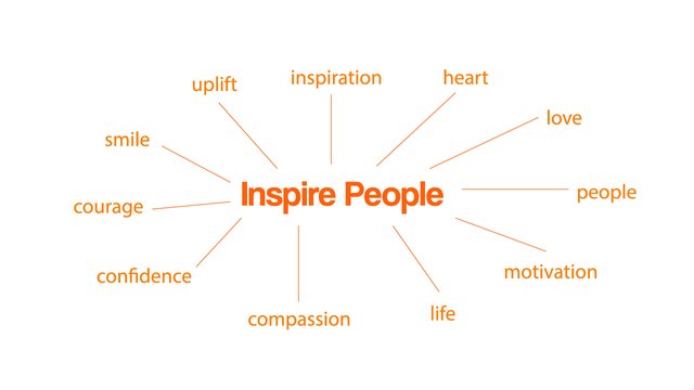
First, we started thinking of some words you could think of when you hear the community's name - Inspire People. And it might not be that hard to guess one, but mind you, it is necessary so that it would be easy to navigate better with the idea when it's time for the designing process.
After knowing the direction of the logo, the following process would be to brainstorm how it should look. From shapes to colors, everything has to have a good cohesion to make up the logo. Here are the chosen colors and their representations.


Initial Logo Option
Supposedly, this is the logo that came into mind upon the initial design. You can see parts of the symbol filled in different colors to portray the colors we've picked beforehand. Also, we added a dark-blue outline to give more definition to the image of the logo.
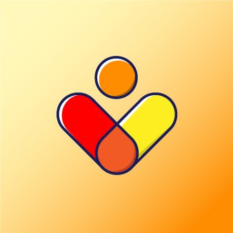
But upon looking at it more, we realized that something was off. What was it? We noticed that when you scale it down, the logo loses its structure, and what you can only see are the outlines. So we had to provide a simpler version.
Logo Versions
Here you can see how it transitioned from the original to an even simpler version.
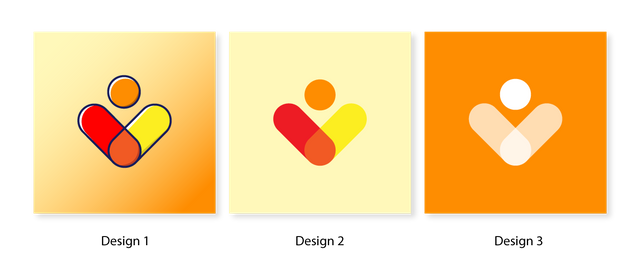
On design 2, we removed the outline, the highlights, and the shadows that you can see from the previous original design. On the other hand, design 3 is a total alteration of the logo. We tried to fill the background with a solid color and decided to simplify the logo itself.
Choosing the Official Logo
Although it's somewhat clear what design look went well, we have tried to test and see what is more fitting as the profile and official logo of the community. And it's clear by now that design 3 was the top choice among the three.

The logo may look familiar to some, but we want it to represent the community. As simple as it may seem, we believe that the meaning and purpose are much more meaningful than having an intricately designed logo. Simplicity is beauty.
But of course, we don't close our doors to the idea that the logo could change in time. As of now, this will serve as the logo and symbol for the Inspire People Community.
We can't wait to meet more users joining the community and sharing more inspiring experiences from stories of different people. The world is vast and everyone has their own story to tell.
Spread love and gratitude. Share a smile. Encourage others and inspire more.


💚
You chose the right logo for this dear community, I do believe in simplicity, I have always been taught to live a simple life.
This logo really represents the community well.
Thank you for the kind compliment @madilyn02! It was really hard for me to decide on what I should go for, but I still found an answer to my hesitations and this is it.
I hope and I pray that the community can grow and become a beacon of hope where people can draw inspiration from. I'll be looking forward to the day that we get to talk about the community with your fellow moderators.
10 moderators is the goal.